All blogs
.avif "Strapi V5: Easing content revisions in production")
Strapi V5: Easing content revisions in production
A Content Management System (CMS) is a software platform that enables users to create, manage, and publish digital content, typically for websites, without needing deep technical expertise. CMS platforms provide tools to organize and edit content, streamline workflows, and ensure consistency across web pages.
Importance of content revisioning in a CMS
- Version Control: Tracks changes to content, allowing for easy rollback to previous versions.
- Collaboration: Facilitates team collaboration by keeping a history of who made changes and when.
- Error Recovery: Helps in recovering from mistakes by reverting to a known good state.
- Approval Workflow: Ensures content undergoes necessary reviews before being published.
Content-Versioning handled with Strapi V4
When I was working on a project were need a way to handle my content version or manage my content flow with a log of history changes, that time content-versioning not introduced officially in strapi v4 but somehow I found a plugin where I can make the things possible for me to handle the versioning feature.
You can find the plugin installation and other guides to use the feature from here . The plugin is not working properly for me as I expected. So, I discard the use of the plugin and will be waiting for a better approach to handle the content.
You can see below what are the features plugin provided and the glitch which I was facing during that time .

As you can see above, the save functionality is not working properly as expected. Also the version history showing in the list only contains a single content version which is not possible for me to handle the versioning of the content as well as the draft and published states too.
Manual ways to manage content-versioning
1. Custom implementation
- Draft/Publish System: Strapi v4 offers a basic draft and publish system. It allows for a simple workflow where content can be saved as a draft before publishing it. However, this does not provide true versioning, where you can track changes or revert to previous versions.
- Custom History Models: One way to achieve content versioning is by creating a custom content type that stores the versions of an entity. Every time content is updated, you can store a new entry in this model to represent the state of the content at that point in time.
2. Using plugins
- Community Plugins: Some community plugins have been developed to provide versioning capabilities. These plugins allow you to track content changes, save multiple versions, and revert to previous versions. However, such plugins may require further testing and adjustments to fit specific use cases.
3. Limitations in Strapi v4
- While Strapi v4 provides the infrastructure for creating custom content workflows (e.g., lifecycle hooks to track changes), it lacks a native, built-in solution for full content versioning like those found in other CMS platforms.
- Changes made in Strapi v4 often require manual approaches or custom database models to track previous content states.
Revolutionize your workflow with Content-Versioning with Strapi V5
- Strapi v5 officially introduces a built-in versioning system, allowing you to track changes made to content over time. You can create, view, and manage different versions of the same content entry.
- You can view the entire history of changes made to content, including the ability to compare versions and see who made changes. This feature is essential for auditing and understanding content evolution.
- Strapi v5 enables you to revert content to any previous version with a single click. This is a significant improvement over v4, where such functionality would require custom development.
- Multiple collaborators can now work on content more seamlessly with the versioning system, as Strapi v5 offers better change tracking and visibility into the workflow. This helps content teams coordinate updates without losing track of edits.
- Users can manage multiple versions of content, label or tag them for easier identification, and ensure that the right version goes live. This can be particularly helpful for long-term content planning or iterative updates.
- Content moderation is enhanced with improved workflows that allow moderators to review and approve specific versions of content, making it easier to handle content revisions before publishing.
Unfortunately this feature is accessible for the Strapi Customers having Enterprise License. We cannot test it personally yet, but we can see the material provided by strapi .

Challenges of content revisioning in production deployment
- Performance Overhead: Maintaining version histories can slow down production environments due to increased database size and complex queries.
- Complex Workflows: Revisioning introduces approval and moderation workflows, which can delay publishing and complicate content pipelines.
- Data Integrity: Rolling back versions can risk data inconsistency, especially when linked to other dynamic content or APIs.
- Concurrency Issues: Multiple users editing or approving content simultaneously can lead to conflicts or overwrites.
- Deployment Complexity: Handling different content versions alongside code updates complicates the CI/CD pipeline.
How Strapi V5 addresses it
- Optimized Content Revisioning: Strapi V5 introduces an enhanced content versioning system with better database performance, ensuring smoother production environments.
- Workflow Enhancements: It includes improved moderation and approval workflows, reducing complexity and delays.
- Enhanced API Handling: Strapi V5 ensures better API management when working with multiple content versions, maintaining data consistency.
- Modular Architecture: The new version is designed with scalability in mind, allowing users to handle content revisions without overloading the system or deployment processes.
Conclusion
Strapi V5 brings much-needed improvements for managing content revisions in production. By introducing content versioning, content history, and enhanced API performance, it offers users a smoother and more reliable workflow for drafting, publishing, and rolling back content.
These features, along with a revamped interface, make Strapi V5 an efficient tool for content managers, improving both user experience and content control.
If you want to explore more checkout the official Strapi v5 documentation.That’s all about Strapi content-versioning features we have covered. See you next time, and if you found this guide helpful, please share. Happy coding!
.avif "Understanding some of the routing mechanisms using App Router in Next.js 14")
Understanding some of the routing mechanisms using App Router in Next.js 14
Routing is a core aspect of web development, enabling smooth navigation across pages within an application. This article focuses on introducing a powerful new feature: the App Router in Next.js 14. This addition aims to enhance the way developers manage routing and navigation in their applications.
In this blog, we will explore the App Router concept, its benefits, and how to implement it using code snippets.
Project Set-up
To get started, create a new Next.js project with the latest version using the below commands:
npx create-next-app@latest my-next-app
cd my-next-app
npm run dev
Open the code in your preferred code editor and navigate to the src folder. For a clean start, delete the app folder to begin setting up routes from the ground up.
Getting Started with Routing
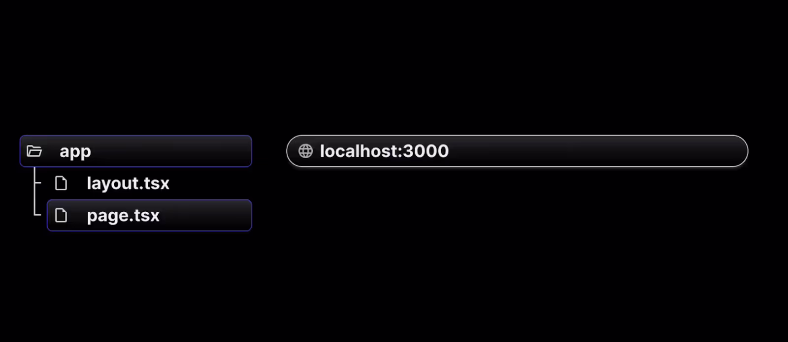
Next.js has a file-system-based routing system built on concepts of files and folders. When a file is named page.js or page.tsx is added to the app directory which is present in the src directory, it's automatically available as a route. We will learn more about routing below:
1. Creating a root route
To set up a route, follow the below steps:
- Create a folder named app (the name of the folder should be app as per Next.js convention ) inside the src directory.
- Inside the app folder, add a page.tsx/page.js file, which will define the route.
- In the page.tsx/page.js file, write a simple React component to represent the "Home" page.
- Not all files within the app directory are considered routes. Only files named page.tsx or page.js are treated as routes.
// src/app/page.js
export default function Home() {
  return <h1>Welcome home!</h1>;
}
Navigate to localhost:3000 in the browser by running the npm run dev command. The above page is treated as the route for the root URL (localhost:3000) and we can see Welcome home! message in the browser.
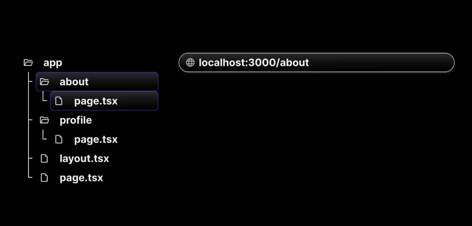
2. Creating additional routes
To create more additional routes for /about and /profile , follow the below steps.
- Create a folder named about inside the app directory.
- Inside the about folder, add a page.tsx/page.js file, which will define the route.
- In the page.tsx/page.js file, write a simple React component to represent the "About" page.
- Not all files within the about directory are considered routes. Only files named page.tsx or page.js are treated as routes.
// src/app/about/page.js

export default function About() {
  return <h1>About me</h1>;
}
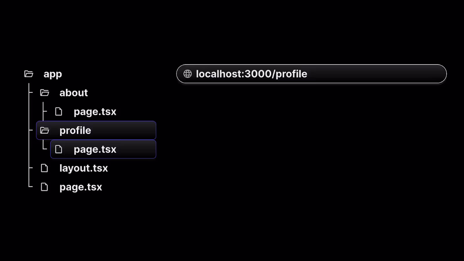
9. Similarly create a folder inside the app directory as a profile.
10. Add corresponding page.tsx or page.js to represent /profile route component.
// src/app/profile/page.js

export default function Profile() {
  return <h1>My profile</h1>;
}
When you visit the root URL, localhost:3000, the home page will appear as expected. However, if you go to localhost:3000/about, the "About me" page will be displayed. Likewise, navigating to /profile will show the "My profile" page.
3. Nested routes
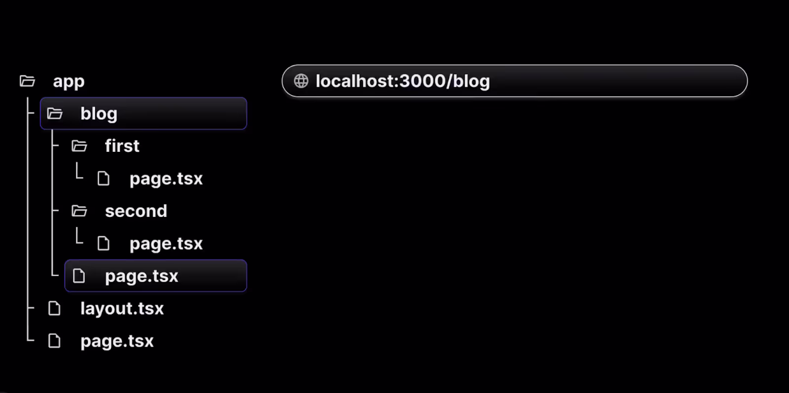
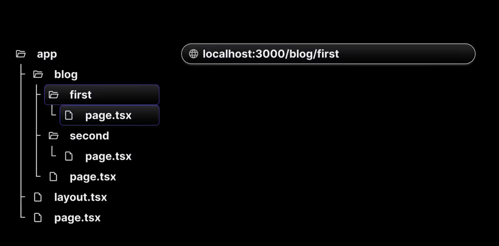
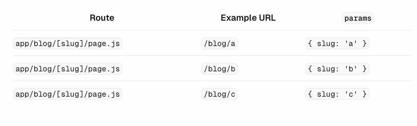
To create a nested route, you can nest folders inside each other. For example, you can add a new /blog/first route by nesting two new folders in the app directory.
The /blog/first route is composed of three segments:
- / ------ (Root segment)
- blog —--- (Segment)
- first —--- (Leaf segment)
To create nested above routes, follow the below steps.
- Create a folder named a blog inside the app directory.
- Inside the blog folder, add a page.tsx/page.js file, which will define the route /blog.
// src/app/blog/page.js

export default function Blog() {
  return <h1>My blog</h1>;
}
- Now inside the blog folder create folder names as first ,where adding page.tsx/page.js file,and writing a simple React component to represent the “/blog/first” page.
// src/app/blog/first/page.js

export default function FirstBlog() {
  return <h1>First blog post</h1>;
}
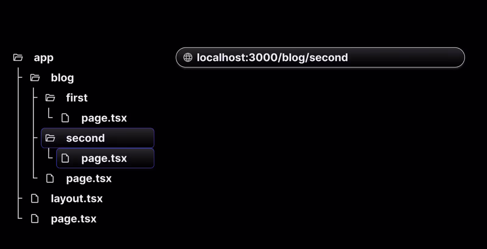
Now navigating to localhost:3000/blog , the blog page will be displayed. However, if you navigate to localhost:3000/blog/first, you will see the First Blog page. Similarly, we can create localhost:3000/blog/second or localhost:3000/blog/third and so on by creating nested folders inside the blog folder as above.
In a complex application with hundreds of blogs, manually creating routes for each blog can become cumbersome and impractical. To address this, dynamic routes offer a more efficient solution.
4. Dynamic routes
To create dynamic routes, follow below steps:
- Create a src/app/products folder.
- Inside the products folder, create a page.tsx/page.js file to display a list of three products.
// src/app/products/page.js

export default function ProductList() {
  return (
    <>
      <h1>Product List</h1>
      <h2>Product 1</h2>
      <h2>Product 2</h2>
      <h2>Product 3</h2>
    </>
  );
}
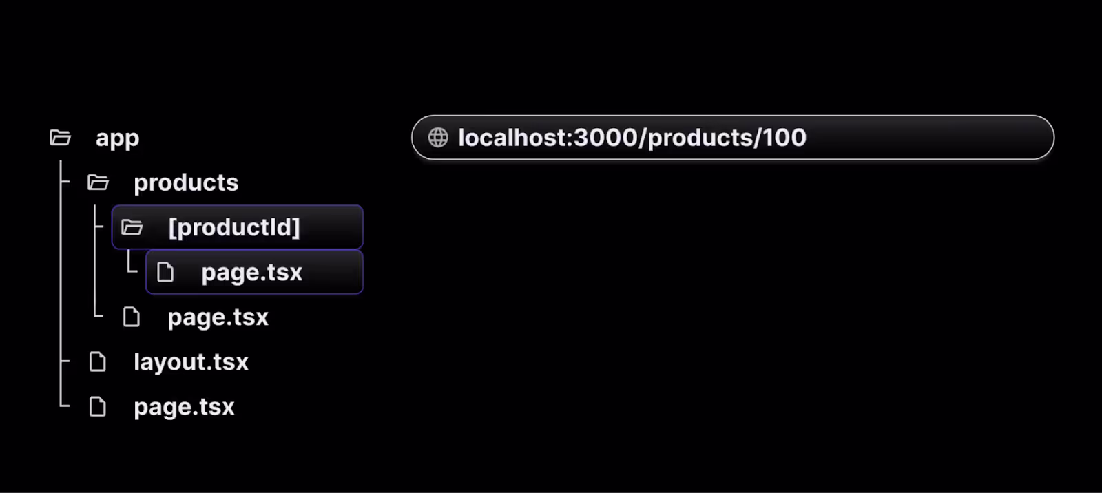
When you navigate to localhost:3000/products in your browser, a list of products will be displayed. To create a details page for each product, follow these steps:
- Within the products folder, create a new folder called [productId]. The square brackets indicate a dynamic route segment.
- Inside the [productId] folder, add a page.js file with the following code:
// src/app/products/[productId]/page.js

export default function ProductDetail() {
  return <h1>Details about the product</h1>;
}
- Now, when you visit localhost:3000/products/1, you'll see the product details page. Similarly, visiting URLs like /products/2, /products/3, or /products/100 will render the same details page. The [productId] folder acts as a dynamic route segment that can handle different values such as 1, 2, 3, etc.
- To display the specific product ID, use the params object, which is accessible on every page. Update the component like this:
// src/app/products/[productId]/page.js

export default function ProductDetail({
  params,
}) {
  return <h1>Details about product {params.productId}</h1>;
}
- Now, when you navigate to localhost:3000/products/1, the page will show details for product 1.
- Similarly, visiting /products/100 will display details for product 100.
Dynamic routes are especially useful when implementing the list-detail pattern in UI applications. Understanding how to create dynamic routes in Next.js allows you to build adaptable and scalable applications that handle a wide range of user interactions.
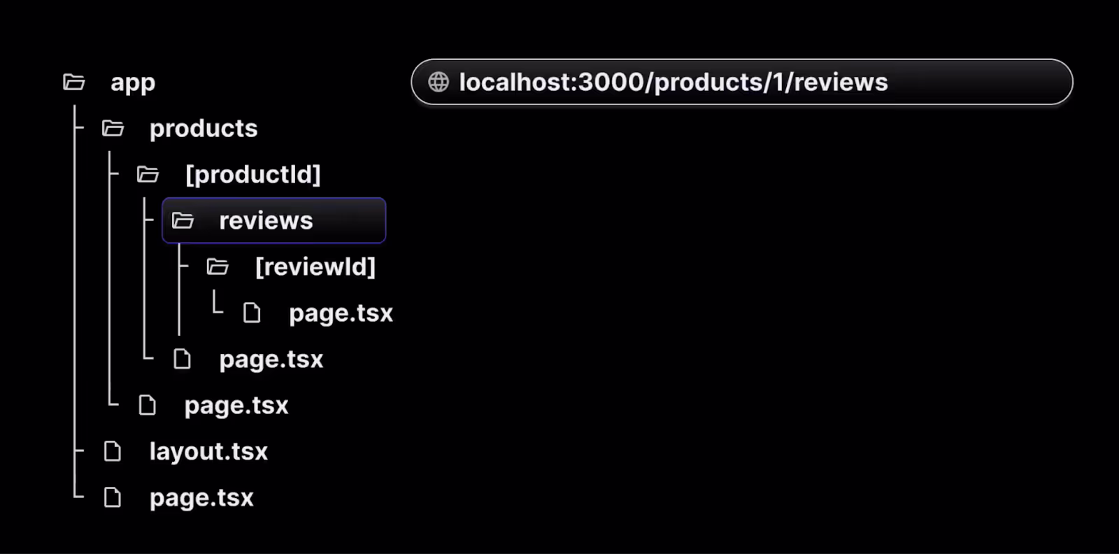
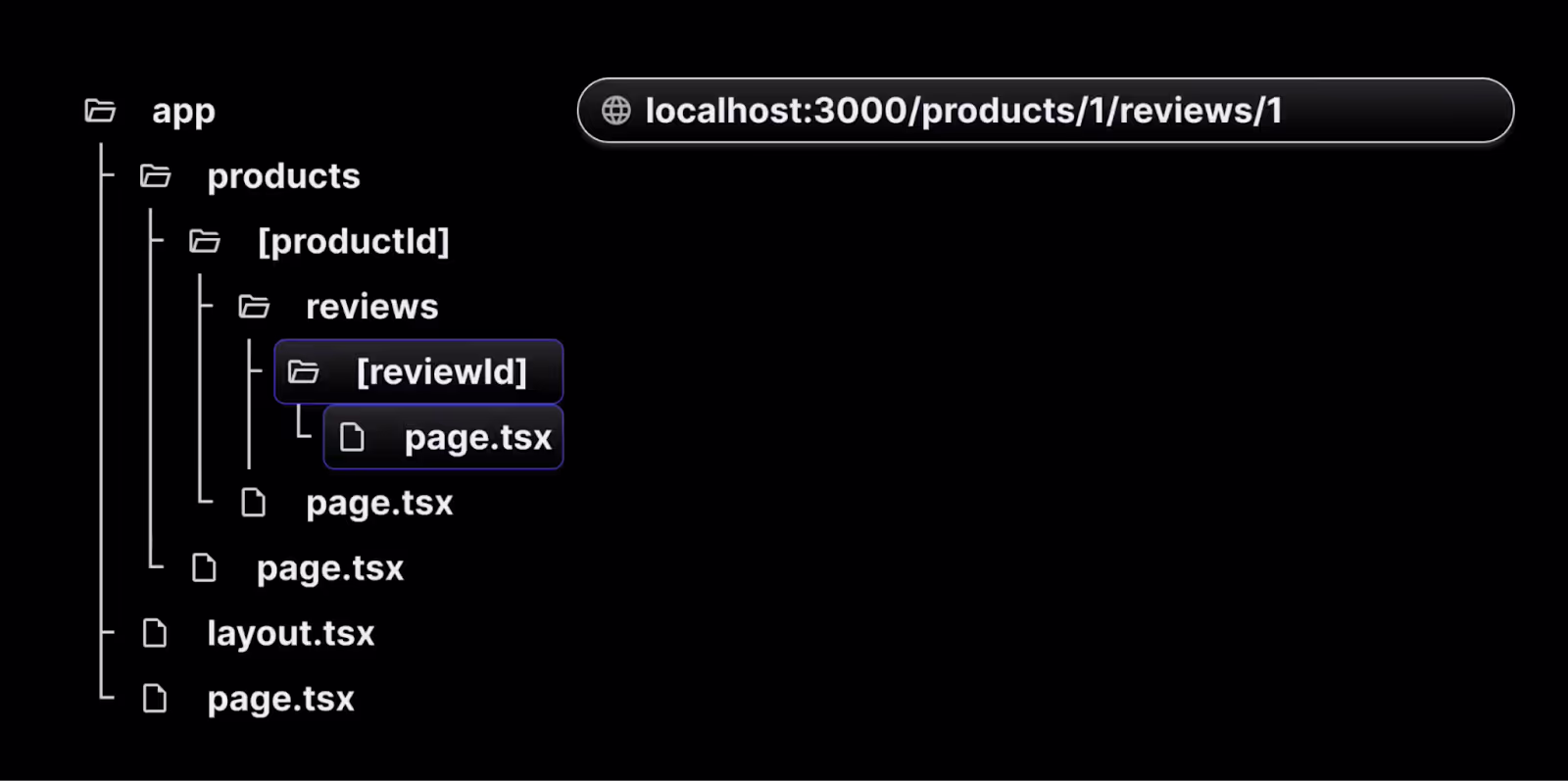
5. Nested Dynamic routes
- Complex applications often require multiple dynamic route segments. For instance, when navigating to /products/1, the user expects to see the details for product 1.
- Similarly, visiting /products/1000/reviews/1 should display the first review of a product with productId1000.
- This can be achieved by creating a folder inside the [productId] folder with the name as reviews.
- Creating page.js file inside reviews folder will route to localhost:3000/products/[productId]/reviews
- Creating a page.js file inside the [reviewId] folder which is present inside reviews folder we can catch all the reviews of all products . See the visual representation below to understand more.
In more complex applications, where you need to display a list of product categories and each category's details, you can use the same dynamic route approach as for product reviews.
However, if the number of subfolders increases significantly for each product, manually creating folders for every category and subcategory can become overly complicated and inefficient.These can be overcome by catching all routes.
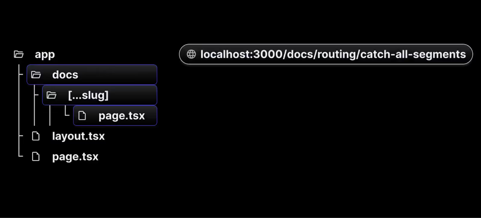
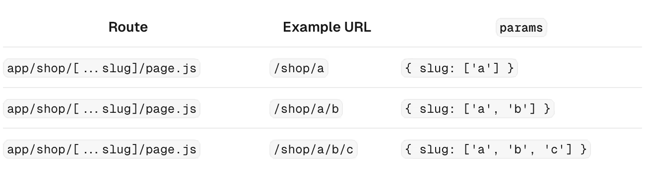
6. Catch all routes
Next.js offers the catch-all segments feature, enabling flexible routing. For example, if you want to create a documentation site with multiple features and concepts, where each concept has its own route, you don't need to create separate files for each route. Instead, you can use the catch-all segments route.
To implement catch-all segments, follow below steps:
- Create a src/app/docs folder and create page.tsx/page.ts.
// src/app/docs/page.js

export default function Doc() {
  return <h1>Docs home page</h1>;
}
- Inside the docs folder, create a new folder with a special name recognized by Next.js. Use square brackets and three dots (e.g., [...slug]) to define a dynamic segment.
- Within the [...slug] folder, create a page.tsx/page.ts file that contains a basic React component to represent the documentation home page.
- With this structure, the page.tsx/page.ts file will match any URL containing the /docs segment, allowing you to manage all route segments using a single file.
- To access the individual segments in the URL, you can use the params object provided by Next.js. For instance, visiting localhost:3000/docs/routing/catch-all-segments can render the following component:
// src/app/docs/[...slug]/page.js

export default function Doc({ params }) {
  if (params.slug.length === 2) {
    return (
      <h1>
        Viewing docs for feature {params.slug[0]} and concept {params.slug[1]}
      </h1>
    );
  } else if (params.slug.length === 1) {
    return <h1>Viewing docs for feature {params.slug[0]}</h1>;
  }
  return <h1>Docs home page</h1>;
}
Benefits of the App Router
Improved Organization
The App Router allows for a clear and organized project structure, making it easier to manage and navigate through complex applications.
Enhanced Reusability
With shared layouts, you can define components once and reuse them across multiple routes, reducing redundancy and improving maintainability.
Better Performance
The App Router is optimized for performance, ensuring fast page loads and smooth navigation experiences.
Conclusion
The App Router in Next.js 14 is a significant enhancement for developers looking to build scalable, organized, and high-performance applications.
By utilizing nested routes, route groups, and advanced layouts, you can create more maintainable code and deliver a better user experience.
Try integrating the App Router in your next Next.js project and experience the benefits firsthand!
For more detailed information, you can refer to the official Next.js documentation.

Optimizing your Next.js application: using analytics, metadata, and Bundle Analyser
To improve a Next.js application, you have to work on its performance, user experience and resource usage optimisation. This blog post gives you three strong instruments which are Next.js Analytics, Metadata Management and Bundle Analyser in order to reach these purposes.
We will explain each tool’s functionality then offer real-life examples with code to show how it works.
Leveraging Next.js Analytics
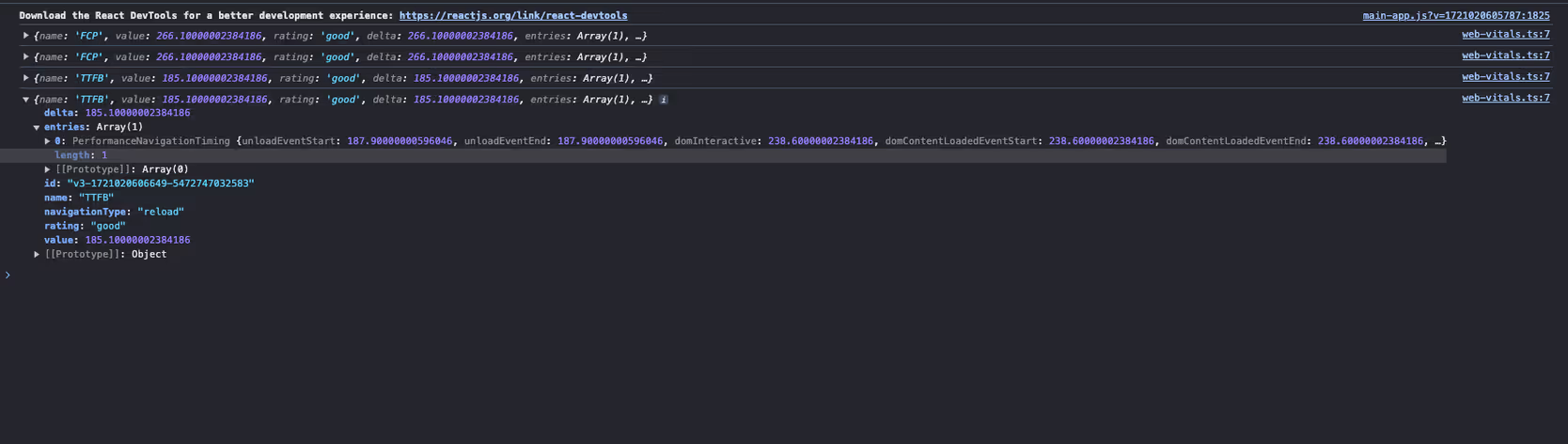
Before we Understand the the Analytics we must understood the Web vitals
Web Vitals are a set of performance metrics introduced by Google to measure the quality of user experience on the web. These include:
- Largest Contentful Paint (LCP): Measures loading performance.
- First Input Delay (FID): Measures interactivity.
- Cumulative Layout Shift (CLS): Measures visual stability.
Getting started with Next.js Analytics
Next.js simplifies the process of collecting and reporting these metrics. You can either use th to manage reporting yourself or leverage Vercel’s managed service for automatic collection and visualization.
Step-by-Step implementation
Step 1: Create the Web Vitals component
First, create a new component to handle the reporting of web vitals. This component will use the useReportWebVitals hook provided by Next.js.
Create a file named web-vitals.js in your _components directory and add the following code:
By keeping the use client directive confined to the WebVitals component, you ensure optimal performance and maintain a clear separation of concerns.
'use client'

import { useReportWebVitals } from 'next/web-vitals'

export function WebVitals() {
  useReportWebVitals((metric) => {
    console.log(metric)
    // You can also send the metrics to your analytics server here
  })
}
Step 2: Integrate Web Vitals component into layout
Next, integrate this component into your root layout. By doing so, you ensure that web vitals are reported throughout your entire application.
Edit your layout.js file as follows:
import { WebVitals } from './_components/web-vitals'

export default function Layout({ children }) {
  return (
    <html>
      <body>
        <WebVitals />
        {children}
      </body>
    </html>
  )
Step 3: Viewing metrics
Once your application is running, you’ll start seeing the performance metrics logged to the console. For a more detailed analysis, you can send these metrics to an analytics server or use Vercel’s managed service to visualize them.
Benefits of using Next.js Analytics
1. Identify performance bottlenecks:
Collecting web vitals helps in identifying which parts of your application are causing slowdowns. This information is crucial for optimising the user experience.
2. Improve user experience:
By monitoring metrics like LCP, FID, and CLS, you can make informed decisions to improve the loading, interactivity, and visual stability of your application.
3. Enhanced SEO:
Google considers web vitals as a ranking factor. By optimizing these metrics, you can improve your site’s SEO and attract more organic traffic.
4. Easy integration with Analytics Platforms:
The hook provides an easy way to send performance data to analytics platforms, giving you a centralised view of your application's performance.
Enhancing SEO with Metadata management
Importance of Metadata management
The Next.js Metadata API enables developers to specify the application metadata they want, including meta and link tags, in the head element of their HTML.
This API offers two primary methods for adding metadata to your application:
- Config-based Metadata: Export a static metadata object or a dynamic generateMetadata function in a layout.js or page.js file.
- File-based Metadata: Add static or dynamically generated special files to route segments.
Both approaches will cause Next.js to generate the appropriate elements inside the <head> for each page automatically.
Config-based Metadata
It allows you to define metadata at page or layout level with configuration-based metadata. Export a static metadata object or a dynamic generateMetadata function for this purpose.
Static Metadata
The simplest way is to declare static metadata right in your layout.js or page.js file. This is a convenient method if pages have immutable content.
// app/layout.js
'use client';

import { useEffect } from 'react';
import { Analytics } from '@next/analytics';

export const metadata = {
  title: 'My Next.js App',
  description: 'A description of my Next.js app',
  openGraph: {
    title: 'My Next.js App',
    description: 'A description of my Next.js app',
    images: [
      {
        url: '/path/to/image.jpg',
        width: 800,
        height: 600,
        alt: 'My Next.js App',
      },
    ],
  },
  twitter: {
    card: 'summary_large_image',
  },
};

export default function RootLayout({ children }) {

  return (
    <html lang="en">
      <body>{children}</body>
    </html>
  );
Next.js will automatically add the relevant meta tags to your page's head based on the metadata object.
Dynamic Metadata
On pages where the content changes, the generateMetadata function can be used to produce metadata from props, context or external data.
// app/[id]/metadata.js
import type { Metadata } from 'next';

async function fetchData(id) {
  // Replace this with your actual data fetching logic
  return {
    title: `Post ${id} Title`,
    description: `Description for post ${id}`,
    image: '/path/to/image.jpg',
  };
}

export async function generateMetadata({ params }): Promise<Metadata> {
  const data = await fetchData(params.id);
  return {
    title: data.title,
    description: data.description,
    openGraph: {
      title: data.title,
      description: data.description,
      images: [
        {
          url: data.image,
          width: 800,
          height: 600,
          alt: data.title,
        },
      ],
    },
    twitter: {
      card: 'summary_large_image',
         },
  };
}
Benefits of Metadata optimization
- Getting more traffic through the use of meta tags because this will help them know about your site content better than before so as to boost its rating among search engine result pages (SERPs).
- People can share your article or blog on social media platforms easily if you have added the required metadata for that particular content thus increasing their involvement levels with it.
- When individuals search something online they always want quick answers and this is what can be achieved by having correct meta descriptions which provide users with instant information, making their experience great overall.
Optimizing Bundle size with Bundle Analyser
Why use the Bundle Analyser?
Assist in simplifying your application's performance in optimisation through module sizes visualisation using Next.js Bundle Analyser. Faster load times and improved app performance are some of the outcomes that can be realised when you identify bigger bundles for size reduction.
Setting up and using the Bundle Analyser
1.Install the Bundle Analyser Package:
npm install @next/bundle-analyzer2.Configure the Bundle Analyser in next.config.js:
// next.config.js
const withBundleAnalyzer = require('@next/bundle-analyzer')({
  enabled: process.env.ANALYZE === 'true',
});

module.exports = withBundleAnalyzer({
  // Your existing Next.js configuration
});3.Run the Bundle Analyser
To analyse your bundle, run the following command(As per your Package manager):
ANALYZE=true npm run build
# or
ANALYZE=true yarn build
# or
ANALYZE=true pnpm build
Using the Bundle Analyser
After you run the build command with the environment variable ANALYSER set to true, it will open a new browser window containing an interactive treemap of your bundle. This visualisation is helpful in finding large modules that may require optimisation.
Interpreting the Bundle Analyser Results
The treemap gives a visual representation of the modules in your application. A rectangle stands for each module and its size shows how much space it takes up in the bundle. You should look for modules which make the most impact on bundle size when looking at this visualization and try to optimize them.
Optimisation Techniques
1.Code Splitting:
Split your code into smaller chunks to load only what is necessary. Next.js automatically splits code at the page level, but you can manually split components if needed.
// Example of dynamic import
import dynamic from 'next/dynamic';

const HeavyComponent = dynamic(() => import('../components/HeavyComponent'), {
  loading: () => <p>Loading...</p>,
});

export default function Home() {
  return (
    <div>
      <h1>Home Page</h1>
      <HeavyComponent />
    </div>
  );
}
2.Tree Shaking:
Ensure your project is configured to remove unused code. This is typically handled by your build tool (e.g., Webpack) but ensure that you are not importing entire libraries when only a subset of functionality is needed.
// Importing specific functions instead of the entire lodash library
import debounce from 'lodash/debounce';
3.Minification:
Ensure your JavaScript and CSS are minified. This is generally handled by Next.js during the build process.
4.Removing Unused Dependencies:
Regularly audit your dependencies to remove any that are no longer used or are unnecessarily large.
Benefits of Bundle Optimisation
- Smaller bundles load faster, so your users get a better experience of your sites.
- Optimised bundles reduce JS amounts that require parsing and execution.
- Faster websites may rank higher in search engines.
Conclusion
Optimising your Next.js application is crucial for providing a fast and seamless user experience. By leveraging Next.js Analytics, Metadata Management, and the Bundle Analyser, you can gain valuable insights, enhance SEO, and reduce bundle size.
Implementing these tools and techniques will help ensure your application performs efficiently and effectively, providing users with the best possible experience.
Summary
- Next.js Analytics: Track performance metrics and user interactions to identify and address bottlenecks.
- Metadata Management:Improve SEO and social media sharing through proper metadata configuration.
- Bundle Analyser: Visualise and optimise your application's bundle size for faster load times and improved performance.
Additional Resources
Reorganise your process of writing Next.js to incorporate these methods and tools, resulting in a fast and responsive application that users will love.

How to use Git in VS code
Visual Studio Code is a popular, lightweight, and open-source code editor that provides a wide range of features for coding, debugging, and version control. One of the most powerful features of VS Code is its integration with Git, a popular version control system. In this blog, we'll explore how to use Git in VS Code, covering the basics of Git and how to perform common Git operations within the VS Code environment.
How to set up Git in VS code
To use Git and Github in VS Code, you first need to install Git on your system. Once done, sign into VS Code with your GitHub account by clicking on the Account button at the lower right side, then click on the “Sign in to sync settings” button.
This will redirect you to your browser where you can click on the “Authorize visual-studio-code” button. After this, you can clone repositories from GitHub in VS Code.
Open Git repository in vs code
To clone a repository from GitHub, execute the Ctrl + Shift + P keys and type “git clone:” in the search bar. You will see the option “Clone from GitHub” in the drop-down menu. Click on it to show all the repository URLs, then select clone and pick a folder. VS Code will open the folder once the repository is cloned on your local machine.
Git add, commit, and push in vs code
Now that your local Git repository is in VS Code, any changes you make to the repository folder will appear on the left side in the source control section. This section provides the file list of all the changes.
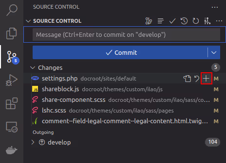
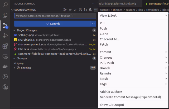
To add a file to the stage, click on the “+” sign as shown in the screenshot. This will move all your files into the staged area.
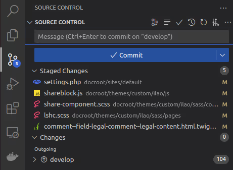
Next, type the commit message in the message box and click the checkmark “✓” button to commit the changes. To push the code, click on the “More actions” button (which looks like “…”), then select “Push” from the dropdown menu.
Git stash in vs code
When switching between branches or tasks, the git stash command comes in handy. It allows you to temporarily store your uncommitted local changes and re-apply them at any branch. To stash your changes, go to the source control on the left side of VS Code and click the ‘more actions’ button (represented by “…”). Then select Stash > Stash (Include Untracked) and add a relevant message before pressing enter. This will stash your file changes locally.

To bring the stash changes to your branch, go to source control and click on the “…” button, then select Stash > Apply Latest Stash.
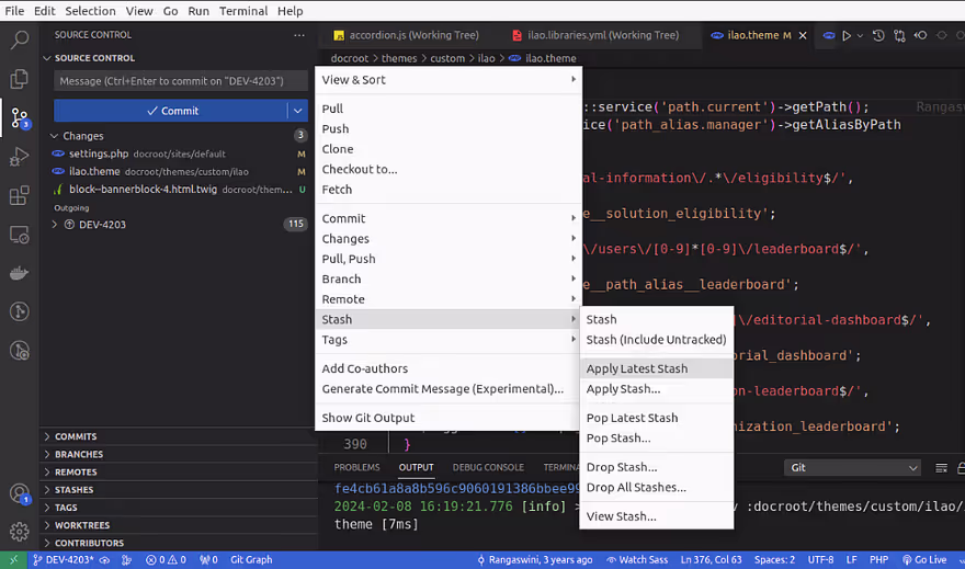
What is the difference between “Stash” and “Stash (Include Untracked)”?
- “Stash” saves only modified file changes.
- “Stash (Include Untracked)” saves all file changes, including untracked files and modified files.
What is the difference between “Apply Latest Stash” and “Apply Stash”?
- “Apply Latest Stash” applies the last stash to the current working branch and saves the topmost stash on the stash list, so you can use it later.
- “Apply Stash” provides a list of stashes, and you need to select which stash changes you want to include in your working branch.
What is the difference between “Pop Latest Stash” and “Pop Stash”?
- “Pop Latest Stash” applies the last stash to the current working branch and removes the latest or topmost stash.
- “Pop Stash” removes a specific stash from the list when you select the changes you want to include in your working branch.
What is the difference between “Drop Stash” and “Drop All Stashes”?
- “Drop Stash” allows you to drop a specific stash from the list.
- “Drop All Stashes” removes all stashes.
Note that you can apply stashes to any branch it is not specific to the branch where the stash was created.
Git cherry pick in vs code
Git cherry-picking is a process of selecting one or multiple commits from one branch and applying them to another branch. Let’s say you have a project with two branches: master and develop. The master branch has three commits (DEV-001, DEV-002, DEV-003), and the develop branch has two commits (DEV-004, DEV-005).
Now, if you want to transfer the DEV-005 branch code from the develop branch to your master branch, you need to checkout to the master branch and go to the branches section and right click on the DEV-005 commit that you want to cherry-pick, and select “cherry-pick commit”.
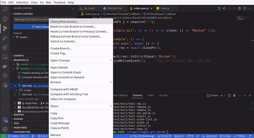
The cherry-pick was successful and DEV-005 commits are now visible in the master branch. Hopefully, this overview has helped you understand the basics of using Git and GitHub in VS Code.
Conclusion
Using Git integration in Visual Studio Code seamlessly incorporates version control into your development process. The built-in Source Control panel and terminal allow you to efficiently manage everything from initializing a repository to pushing changes to a remote repository without leaving the editor.
Hope this information helps, Happy Coding :)
%20(2).avif "Exploring routing flexibility with Next.js Parallel Routes")
Exploring routing flexibility with Next.js Parallel Routes
Next.js, a powerful React framework, offers two essential features - Parallel Routes and Intercepting Routes - that enable developers to create highly dynamic and seamless user experiences in their applications. In this blog post, we will explore Parallel Routes highlighting their functionalities, use cases, and how it can be combined to enhance application routing.
What are parallel routes?
Parallel routes are most useful when rendering complex, dynamic sections of an application, such as in a dashboard with multiple independent sections or a modal.
The image below is an illustration of a dashboard page from the Next documentation that demonstrates the intricacies of parallel routes:

How to use parallel routes
Parallel routes in Next.js are defined using a feature known as slots. Slots help structure our content in a modular fashion. To define a slot, we use the @folder naming convention. Each slot is then passed as a prop to its corresponding layout.tsx file .
In the context of our dashboard example, we would define two distinct slots within the app folder: @team for the team section, @analytics for the analytics section.

For simplicity, we will include content within the slots as follows:
 // app/@team/page.tsx
     export default function Team() {
       return <div>Team</div>;
     }


     // app/@analytics/page.tsx
     export default function Analytics() {
       return <div>Analytics</div>;
     }
The layout component in app/layout.js will accept the @team and @analytics slots as props and render them alongside the children prop. Here's an example of the layout component:
export default function Layout({
       children,
       team,
       analytics,
     }) {
       return (
         <>
           {children}
           {team}
           {analytics}
         </>
       )
     }
It is important to note that slots are not route segments and do not affect the URL structure.
Why Use Parallel Routes
A clear benefit of parallel routes is their ability to split a single layout into various slots, making the code more manageable. This is particularly advantageous when different teams work on various sections of the page.
However, the true benefit of parallel routes lies in their capacity for independent route handling and sub-navigation. Let’s take a closer look at these benefits.
Independent route handling
Each parallel route is streamed independently to the layout, allowing for individual loading and error states, completely isolated from other parts of the layout.
For instance, if a section like analytics takes longer to load than other dashboard sections, a loading indicator can be displayed for that section alone, while the remaining sections remain fully interactive.
We can achieve this by defining loading.tsx and error.tsx files within each slot, as demonstrated in the illustration below:

For instance, if the analytics data takes longer to load, you can display a loading spinner specifically for that section, while other parts of the dashboard remain interactive. Similarly, if there's an error in the fetching team, you can show an error message in that specific section without affecting the rest of the dashboard. This level of detail in handling states not only improves the user experience but also simplifies debugging and maintenance.
Sub-navigation in routes
The independent attribute of a slot extends beyond the loading and error state. Each route operates as a standalone entity, complete with its own state management and navigation, thus making each section of the user interface (in this context, the dashboard) operate as a standalone application.
This implies that we can create sub-folders that are associated with the @folder/sub-folder file path within the slots and navigate back and forth without altering the state or rendition of the other sections on the dashboard.
For example, if we wish to implement sub-navigation within the @analytics slot, we can create a subfolder as follows:


This setup allows seamless navigation between the analytics and notification views, without impacting other sections of the home page.
However, it's important to consider how this affects other parts of the home page, particularly the behavior of the children, team slots since they don't have an notification folder defined.
Handling unmatched routes
By default, the content rendered within a slot matches the current URL. In our folder, we have two slots: team, analytics.
All these slots render their defined content when visiting localhost:3000/. However, when navigating to localhost:3000/notification, only the analytics slot has a matching route. The other slot - team - becomes unmatched.
When dealing with an unmatched slot, the content rendered by Next.js depends on the routing approach:
- Navigation from the UI: In the case of navigation within the UI, Next.js retains the previously active state of a slot regardless of changes in the URL. This means when you navigate between the default analytics at localhost:3000/ and notifications at localhost:3000/notification within the analytics slot, the other slots @team remain unaffected.These slots continue to display whatever content they were showing before
- Page Reloads: In the case of a page reload, Next.js immediately searches for a default.tsx file within each unmatched slot. The presence of this file is critical, as it provides the default content that Next.js will render in the user interface. If this default.tsx file is missing in any of the unmatched slots for the current route, Next.js will render a 404 error.
Let’s take a closer look at including the default.tsx file in our dashboard route.
default.tsx
The default.tsx file in Next.js serves as a fallback to render content when the framework cannot retrieve a slot's active state from the current URL. You have complete freedom to define the UI for unmatched routes: you can either mirror the content found in page.tsx or craft an entirely custom view.
Now, when we engage in a hard navigation to the /notification route, the page will load correctly and render the default view for unmatched routes.
Conclusion
Next.js Parallel offers powerful methods for enhancing the routing capabilities of your applications. With Parallel Routes, multiple pages can be seamlessly integrated within a shared layout, simplifying navigation and enhancing user experience.
Key Takeaways:
- Parallel routes allow simultaneous rendering of different pages within the same layout.
- Parallel routes are defined using slots.
- Slots organize content in a modular fashion, making code more manageable.
- The use of default.tsx for unmatched routes ensures a consistent user experience, even when certain content sections don't have a direct match in the URL.
- Parallel Routes can be used to implement conditional routing.
.avif "A Comprehensive guide to integrate Redux Toolkit with React using counter example")
A Comprehensive guide to integrate Redux Toolkit with React using counter example
Redux is a powerful tool for managing state in JavaScript applications, but it can be complex and verbose.Redux Toolkit – a library that simplifies Redux development with a set of tools and best practices.It has revolutionized state management in React applications by simplifying Redux logic and reducing boilerplate code.
In this blog post, we'll explore Redux Toolkit by building a simple counter application. We'll cover the essential concepts, provide a detailed code example, and explain each part step by step.
What is Redux toolkit?
Redux Toolkit (RTK) is the official, recommended way to write Redux logic. It provides:
- Simple configuration: Easy setup with pre-configured store and middleware.
- Reduced boilerplate: Simplified syntax for actions and reducers.
- Powerful tools: Built-in tools for common tasks like asynchronous logic , redux dev tools and immutability .
Setting Up
First, let's set up a new React application with Redux Toolkit. If you haven't already, you'll need to install the necessary packages:
npx create-react-app redux-toolkit-counter
cd redux-toolkit-counter
npm install @reduxjs/toolkit react-redux
Creating the counter slice
In Redux Toolkit, a slice is a collection of reducer logic and actions for a single feature of your app and managed independently. Let's create a counter slice using createSlice from redux toolkit.
createSlice is a higher-order function that takes an initial state, an object containing reducer functions, and a slice name. It automatically generates action creators and action types that match the reducers and state.
In Redux Toolkit, the createSlice method assists in creating a slice of the Redux store. This function aims to minimize the boilerplate code needed to add data to Redux in the standard manner. Internally, it utilizes createAction and createReducer.
- Create a new file counterSlice.js in the src folder:
Step 1: First, import the createSlice method from the Redux Toolkit library.
Step 2 :Use the createSlice method to define your slice.
Step 3: The counterSlice created contains all the necessary values to set up a reducer. Now, we need to export the actions and the reducer.
// src/counterSlice.js
import { createSlice } from '@reduxjs/toolkit';

const counterSlice = createSlice({
  name: 'counter',
  initialState: { value: 0 },
  reducers: {
    increment: state => {
      state.value += 1;
    },
    decrement: state => {
      state.value -= 1;
    },
    incrementByAmount: (state, action) => {
      state.value += action.payload;
    }
  }
});

export const { increment, decrement, incrementByAmount } = counterSlice.actions;
export default counterSlice.reducer;
createSlice examines all the functions defined in the reducers field and generates an action creator(which returns an action object ) for each case, using the name of the slice and name of reducer object keys as the action type.
In the code above, the increment reducer becomes an action type of counter/increment, and the increment() action creator will return an action with that type.Similarly for decrement as counter/decrement and incrementByAmount as counter/incrementByAmount.
Configuring the store
Next, we'll configure the Redux store to include our counter slice.
- Create a new file store.js in the src folder:
// src/store.js
import { configureStore } from '@reduxjs/toolkit';
import counterReducer from './counterSlice';

const store = configureStore({
  reducer: {
    counter: counterReducer
  }
});

export default store;
configureStore({}) wraps createStore() to streamline the configuration process. createStore() is a Redux store that maintains the entire state tree of your app.
- Update index.js to provide the store to your React application:
Now we need to connect our store to the app.This can be done by Provider from react-redux.
The <Provider> component provides the Redux store to any nested components that need access to it.
Because any React component in a React Redux app can connect to the store, most applications place a <Provider> at the top level, encapsulating the entire app's component tree.
The <Provider> component accepts store as a prop.
// src/index.js
import React from 'react';
import ReactDOM from 'react-dom';
import { Provider } from 'react-redux';
import store from './store';
import App from './App';

ReactDOM.render(
  <Provider store={store}>
    <App />
  </Provider>,
  document.getElementById('root')
);
Creating the counter component
Now, let's create a Counter component that interacts with our Redux state.
- Create a new file Counter.js in the src folder:
Now, we should utilize the React hooks useSelector to retrieve the state and useDispatch to dispatch the actions created in the slice.
useSelector is a React Redux hook designed for components to retrieve and access data from the Redux store. It subscribes the component to the Redux store, ensuring that any updates in the state trigger a re-render of the component to reflect these changes. This hook returns the selected data from the Redux store, allowing you to incorporate it directly within your component.
useDispatch is a React Redux hook that enables components to dispatch actions to the Redux store. It provides a reference to the dispatch function of the Redux store, allowing components to initiate state changes.
// src/Counter.js
import React, { useState } from 'react';
import { useSelector, useDispatch } from 'react-redux';
import { increment, decrement, incrementByAmount } from './counterSlice';

const Counter = () => {
  const count = useSelector(state => state.counter.value);
  const dispatch = useDispatch();
  const [incrementAmount, setIncrementAmount] = useState(0);

  return (
    <div>
      <h1>{count}</h1>
      <button onClick={() => dispatch(increment())}>Increment</button>
      <button onClick={() => dispatch(decrement())}>Decrement</button>
      <input
        type="number"
        value={incrementAmount}
        onChange={(e) => setIncrementAmount(Number(e.target.value))}
      />
      <button onClick={() => dispatch(incrementByAmount(incrementAmount))}>
        Increment by Amount
      </button>
    </div>
  );
};

export default Counter;
Adding the counter component to the app
Finally, we'll add the Counter component to our App component.
- Update App.js to include the Counter component:
// src/App.js
import React from 'react';
import Counter from './Counter';

const App = () => {
  return (
    <div className="App">
      <Counter />
    </div>
  );
}

export default App;
Running the application
Now, you can start your application and see Redux Toolkit in action:
npm startNavigate to http://localhost:3000 in your browser, and you should see your counter application working. You can increment, decrement, and increment by a specified amount.
Conclusion
Redux Toolkit makes managing state in your React applications easier and more efficient. By reducing boilerplate and providing powerful tools out of the box, it simplifies the process of writing Redux logic. In this blog post, we built a simple counter application using Redux Toolkit, demonstrating its core features and benefits.
Feel free to extend this example and explore other features of Redux Toolkit, such as asynchronous logic with createAsyncThunk and more advanced use cases. Happy coding!
%20(1).avif "Migrating page router to app router in Next.js 14")
Migrating page router to app router in Next.js 14
In React development, Next.js has always been a game-changer, especially for folks who appreciate a powerful and manageable framework. With the release of Next.js 14, things have gotten even more exciting. However, change can be challenging, and migration can be a bit daunting. Let's do this process step-by-step.
Upgrade Next.js
Step 1: Upgrade Next.js
To update to the Next.js version run the following command using your preferred package manager:
npm install next@latest react@latest react-dom@latestStep 2: Migrating Pages to the App Directory
The first step in upgrading our website was to migrate our pages into the new app directory. This was a fairly straightforward task as we only have a single-page template to render every page on our site (we rely heavily on catch-all segments to render our pages dynamically).

Step 3: Migrating Data Fetching Methods
The next step in the migration was changing how we fetch data. In Next.js 12 we relied on the getServerSideProps function to fetch data from our backend and feed that data into our components.
Next.js 14 removes this function in favor of fetching data directly inside your component. This is also a fairly easy change as we just needed to move our data fetching code into our page component.
Our old Next.js code looked something like this (please note that this code is drastically simplified for demonstration purposes),
 // app/page.jsx
export default async function Home({ data }) {
 return (
   <div>
     <h1>Posts</h1>
     <ul>
       {data.map((post) => (
         <li key="{post.id}">{post.title}</li>
       ))}
     </ul>
   </div>
 );
}


export async function getServerSideProps() {
 const response = await fetch('https://jsonplaceholder.typicode.com/posts');
 const data = await response.json();
 return {
   props: {
     data: data,
   },
 };
}
After the migration to Next.js 14, we had something like this:
  // app/page.jsx
export default async function Home() {
 const response = await fetch('https://jsonplaceholder.typicode.com/posts');
 const data = await response.json();
 return (
   <div>
     <h1>Posts</h1>
     <ul>
       {data.map((post) => (
         <li key={post.id}>{post.title}</li>
       ))}
     </ul>
   </div>
 );
}
Step 4: Migrating Metadata
In Next.js 12, we would use the next/head component to render our metadata, but that was removed in favor of the generateMetadata function in Next.js 14.
Old Code looks like,
<Head>
       <title>{metadata.title}</title>
       <meta name="description" content={metadata.description} />
</Head>;
After Migration,
  const metadata = {
       title: metadata.title,
       description: metadata.description,
     };
Step 5: Migrate routing hooks
A new router has been added to support the new behavior in the app directory.
In the app, you should use the three new hooks imported from next/navigation: useRouter(), usePathname(), and useSearchParams(). The new useRouter hook is imported from next/navigation and has different behavior to the useRouter hook in pages which is imported from next/router. The useRouter hook imported from next/router is not supported in the app directory but can continue to be used in the pages directory.
Step 6: Layouts
Next.js 13+ introduced the concept of layout files – components that wrap multiple pages on your website.
In Next.js 12, we set up layouts by simply wrapping every page in a layout component.
In Next.js 13+, we could eliminate the need to manually wrap our pages in a layout component by using a layout file. This was a fairly easy change as we just needed to move our existing layout components into a layout.tsx file.
Other Changes
- Adding the “use client” directive to any of our client components that required state or interactivity.
- Convert getStaticPaths method to generateStaticParams.
- The next export command has been removed in favor of output: ‘export’ config.
Conclusion
Next.js 14 is a large paradigm shift from the previous versions, but learning and embracing those changes can bring huge advantages to your website. Not only does it make it easier to manage layouts, routing, and caching, but it also comes with significant performance improvements.

How to create a custom snackbar in Next.js 14 using Tailwind CSS
Snackbars are an essential part of modern web applications. They provide quick, at-a-glance feedback to users, often informing them of the success or failure of an action.
However, when searching for libraries in React or Next.js to create snackbars, we often encounter heavy component libraries that can lead to performance issues or outdated libraries built with older versions of React.
In this blog post, we’ll walk through how to create a custom Snackbar component using Next.js 14, TypeScript, and Tailwind CSS that is customizable and lightweight.
Prerequisites
- Node.js
- Next.js 14
- TypeScript
- Tailwind CSS
Setting Up Next.js 14 with TypeScript and Tailwind CSS
First, let’s set up a new Next.js project with TypeScript. If you haven’t already done so, you can create a new Next.js project with the following commands:
npx create-next-app your-project-name --typescript
cd your-project-name
Install the necessary dependencies:
npm install classnames react-iconsclassnames is is used for conditional class management. If you prefer, you can use the ternary operator to add conditional classes instead. react-icons is used to include the close icon inside the snackbar.
Now, let’s configure Tailwind CSS. Follow the official Tailwind CSS installation guide for Next.js.
Creating the Snackbar Component
We’ll start by creating a Snackbar component and its context. This component will be responsible for displaying messages to the user.
Step 1: Create a Context:
Create a new file called SnackbarContext.tsx in the context directory.
// src/context/SnackbarContext.tsx

import { createContext, ReactNode } from 'react';

// Define types for SnackbarContext and SnackbarProvider props
interface SnackbarContextType {
  (message: string, variant?: 'success' | 'error' | 'warning' | 'info'): void;
}

interface SnackbarProviderProps {
  children: ReactNode;
}

interface SnackbarState {
  show: boolean;
  message: string;
  variant: 'success' | 'error' | 'warning' | 'info';
}

const SnackbarContext = createContext<SnackbarContextType | undefined>(undefined);
Here, we define the types for the snackbar context and provider props. SnackbarContextType defines the shape of the context function, and SnackbarProviderProps establishes the shape of the provider's props. SnackbarState represents the state of the snackbar.
Step 2: Create the SnackbarProvider Component:
Define the SnackbarProvider component to provide the snackbar context to its children.
export const SnackbarProvider: React.FC<SnackbarProviderProps> = ({
  children,
}) => {
  const [snackbar, setSnackbar] = useState<SnackbarState>({
    show: false,
    message: '',
    variant: 'success',
  });

  const handleSnackbarClose = () => {
    setSnackbar((prev) => ({ ...prev, show: false }));
  };

  const showSnackbar = useCallback<SnackbarContextType>(
    (message, variant = 'success') => {
      setSnackbar({ show: true, message, variant });
    },
    []
  );

  return (
    <SnackbarContext.Provider value={showSnackbar}>
      {children}

      <div
        className={classNames(
          'transition-transform bottom-8 font-medium text-white left-8 fixed flex justify-between gap-2 items-center shadow-md min-h-[48px] max-w-[50vw] px-4 py-2 rounded-lg min-w-[300px] text-sm truncate whitespace-nowrap',
          {
            ['bg-successBg ']: snackbar?.variant === 'success',
            ['bg-errorBg ']: snackbar?.variant === 'error',
            ['bg-warningBg ']: snackbar?.variant === 'warning',
            ['bg-infoBg ']: snackbar?.variant === 'info',
            ['-translate-x-[200%]']: !snackbar?.show,
            ['translate-x-0']: snackbar?.show,
          }
        )}
      >
        {snackbar?.message}
        <div
          className="hover:bg-black/20 p-1 rounded-full cursor-pointer"
          onClick={handleSnackbarClose}
        >
          <IoMdClose size={20} />
        </div>
      </div>
    </SnackbarContext.Provider>
  );
};
In this component, we use useState to manage the snackbar state. The showSnackbar function displays the snackbar with a message and variant. The handleSnackbarClose function hides the snackbar.
Now, To automatically close the snackbar after some time, we’ll add a timeout. We can use setTimeout inside the showSnackbar function to trigger the close function after 5 seconds.
const SNACKBAR_TIMER = 5000;

// Set a new timer to hide the snackbar after 5 seconds
setTimeout(() => {
 handleSnackbarClose();
}, SNACKBAR_TIMER);
It will now close the snackbar after 5 seconds. However, if we open a second snackbar within those 5 seconds, the timer for the second snackbar won’t reset.
For example, if we open a success snackbar, the timer is set to close it in 5 seconds. If we trigger an error snackbar 3 seconds later, the snackbar content and variant will change, but it will close in the remaining 2 seconds.
To solve this issue, we use useRef to store the timer and clear it if another snackbar opens before the 5 seconds timeout. This ensures the timer resets each time a new snackbar is triggered. Here’s the updated code:
const timerRef = useRef<ReturnType<typeof setTimeout> | null>(null);

  const SNACKBAR_TIMER = 5000;

  const showSnackbar = useCallback<SnackbarContextType>(
    (message, variant = 'success') => {
      setSnackbar({ show: true, message, variant });

      // Clear the existing timer if it exists
      if (timerRef.current) {
        clearTimeout(timerRef.current);
      }

      // Set a new timer to hide the snackbar after 5 seconds
      timerRef.current = setTimeout(() => {
        handleSnackbarClose();
        timerRef.current = null;
      }, SNACKBAR_TIMER);
    },
    []
  );

  useEffect(() => {
    // Clean up the timer when the component unmounts
    return () => {
      if (timerRef.current) {
        clearTimeout(timerRef.current);
      }
    };
  }, []);
Step 3: Create a Hook to Use the Snackbar Context:
Define a hook to use the snackbar context in other components.
export const useSnackbar = (): SnackbarContextType => {
  const context = useContext(SnackbarContext);
  if (!context) {
    throw new Error('useSnackbar must be used within a SnackbarProvider');
  }
  return context;
};
This hook ensures that the context is used within a SnackbarProvider.
Here’s the final SnackbarContext.tsx file:
// src/context/SnackbarContext.tsx

'use client';

import classNames from 'classnames';
import {
  ReactNode,
  createContext,
  useCallback,
  useContext,
  useEffect,
  useRef,
  useState,
} from 'react';
import { IoMdClose } from 'react-icons/io';

interface SnackbarContextType {
  (message: string, variant?: 'success' | 'error' | 'warning' | 'info'): void;
}

interface SnackbarProviderProps {
  children: ReactNode;
}

interface SnackbarState {
  show: boolean;
  message: string;
  variant: 'success' | 'error' | 'warning' | 'info';
}

const SnackbarContext = createContext<SnackbarContextType | undefined>(
  undefined
);

const SNACKBAR_TIMER = 5000;

export const SnackbarProvider: React.FC<SnackbarProviderProps> = ({
  children,
}) => {
  const [snackbar, setSnackbar] = useState<SnackbarState>({
    show: false,
    message: '',
    variant: 'success',
  });
  const timerRef = useRef<ReturnType<typeof setTimeout> | null>(null);

  const handleSnackbarClose = () => {
    setSnackbar((prev) => ({ ...prev, show: false }));
  };

  const showSnackbar = useCallback<SnackbarContextType>(
    (message, variant = 'success') => {
      setSnackbar({ show: true, message, variant });

      // Clear the existing timer if it exists
      if (timerRef.current) {
        clearTimeout(timerRef.current);
      }

      // Set a new timer to hide the snackbar after 5 seconds
      timerRef.current = setTimeout(() => {
        handleSnackbarClose();
        timerRef.current = null;
      }, SNACKBAR_TIMER);
    },
    []
  );

  useEffect(() => {
    // Clean up the timer when the component unmounts
    return () => {
      if (timerRef.current) {
        clearTimeout(timerRef.current);
      }
    };
  }, []);

  return (
    <SnackbarContext.Provider value={showSnackbar}>
      {children}

      <div
        className={classNames(
          'transition-transform bottom-8 font-medium text-white left-8 fixed flex justify-between gap-2 items-center shadow-md min-h-[48px] max-w-[50vw] px-4 py-2 rounded-lg min-w-[300px] text-sm truncate whitespace-nowrap',
          {
            ['bg-successBg ']: snackbar?.variant === 'success',
            ['bg-errorBg ']: snackbar?.variant === 'error',
            ['bg-warningBg ']: snackbar?.variant === 'warning',
            ['bg-infoBg ']: snackbar?.variant === 'info',
            ['-translate-x-[200%]']: !snackbar?.show,
            ['translate-x-0']: snackbar?.show,
          }
        )}
      >
        {snackbar?.message}
        <div
          className="hover:bg-black/20 p-1 rounded-full cursor-pointer"
          onClick={handleSnackbarClose}
        >
          <IoMdClose size={20} />
        </div>
      </div>
    </SnackbarContext.Provider>
  );
};

export const useSnackbar = (): SnackbarContextType => {
  const context = useContext(SnackbarContext);
  if (!context) {
    throw new Error('useSnackbar must be used within a SnackbarProvider');
  }
  return context;
};
Using the Snackbar Context in Your Application
Now that we have our Snackbar context and provider, we can use it in our application. Wrap your application’s layout component with the SnackbarProvider like this:
// app/layout.tsx
import './globals.css';
import { SnackbarProvider } from '@/context/SnackbarContext';

export default function RootLayout({ children }: { children: React.ReactNode }) {
  return (
    <html lang="en">
      <body>
        <SnackbarProvider>
          {children}
        </SnackbarProvider>
      </body>
    </html>
  );
}
Adding Tailwind CSS Styles
In your tailwind.config.js file, add this line in the content array to apply the tailwind classes in snackbar component.
'./src/context/**/*.{js,ts,jsx,tsx,mdx}'Add custom styles for the snackbar:
// tailwind.config.js

import type { Config } from 'tailwindcss';
const config: Config = {
  content: [
    './src/pages/**/*.{js,ts,jsx,tsx,mdx}',
    './src/components/**/*.{js,ts,jsx,tsx,mdx}',
    './src/app/**/*.{js,ts,jsx,tsx,mdx}',
    './src/context/**/*.{js,ts,jsx,tsx,mdx}',
  ],
  theme: {
    extend: {
      colors: {
        successBg: '#4caf50',
        errorBg: '#f44336',
        warningBg: '#ff9800',
        infoBg: '#2196f3',
      },
    },
  },
  plugins: [],
};
export default config;
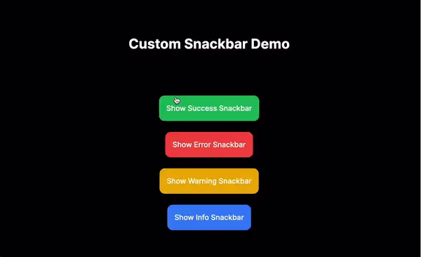
Triggering the Snackbar
You can now use the useSnackbar hook to trigger the snackbar from any component. I'm using the code from this demo project as an example here:
// app/page.tsx

'use client';
import { useSnackbar } from '@/context/SnackbarContext';

export default function Home() {
  const showSnackbar = useSnackbar();

  const handleClick = (variant: 'success' | 'error' | 'warning' | 'info') => {
    showSnackbar(`This is a ${variant} message!`, variant);
  };

  return (
    <main className="p-10 min-h-screen text-center">
      <h1 className="mt-10 font-bold text-3xl xl:text-4xl">
        Custom Snackbar Demo
      </h1>
      <div className="flex flex-col justify-center items-center gap-6 px-5 sm:px-24 py-24 font-medium">
        <button
          className="bg-green-500 p-4 rounded-xl text-white"
          onClick={() => handleClick('success')}
        >
          Show Success Snackbar
        </button>
        <button
          className="bg-red-500 p-4 rounded-xl font-medium text-white"
          onClick={() => handleClick('error')}
        >
          Show Error Snackbar
        </button>
        <button
          className="bg-yellow-500 p-4 rounded-xl font-medium text-white"
          onClick={() => handleClick('warning')}
        >
          Show Warning Snackbar
        </button>
        <button
          className="bg-blue-500 p-4 rounded-xl font-medium text-white"
          onClick={() => handleClick('info')}
        >
          Show Info Snackbar
        </button>
      </div>
    </main>
  );
}
Conclusion
In this blog post, we’ve created a custom Snackbar component in a Next.js 14 application using TypeScript and Tailwind CSS. By following these steps, you can easily provide users with feedback on their actions, enhancing the overall user experience of your application.
Check out the production deployment here.
You can find the complete source code on my GitHub repo.
That’s it for this guide. See you next time, and if you found this guide helpful, please leave a like 👍. Happy coding!

A comprehensive guide to deploying apps to TestFlight for seamless testing
Introduction:
In the fast-paced world of app development, ensuring a smooth and bug-free user experience is paramount. One crucial step in achieving this is thorough testing, and TestFlight stands out as a reliable platform for iOS app testing. This blog will walk you through everything you need to know
about deploying apps to TestFlight, covering requirements, and benefits, and providing a step-by-step guide for a hassle-free deployment process.
Understanding TestFlight:
What is TestFlight?
TestFlight is Apple's official beta testing service that allows developers to distribute pre-release versions of their iOS apps to a selected group of testers for thorough testing before the app goes live on the App Store.
Benefits of Using TestFlight:
1. Early Feedback:
Enables developers to gather valuable feedback from a diverse group of testers before releasing the app to the general public.
2. Real-world Testing:
Provides the opportunity to test the app in real-world scenarios, uncovering potential issues that might not be apparent in a controlled environment.
3. Security and Privacy:
Ensures that the beta testing process is secure and respects the privacy of both developers and testers.
4. App Store Preview:
Allows developers to create a polished App Store page with screenshots, descriptions, and other information before the official release.
Requirements for Deploying Apps to TestFlight:
1. Apple Developer Account:
Ensure you have an active Apple Developer account. This is a prerequisite for accessing TestFlight.
2. Xcode:
Install the latest version of Xcode, Apple's integrated development environment (IDE).
3. Appropriate Certificates and Profiles:
Generate and configure necessary certificates and provisioning profiles in the Apple Developer Center to sign your app.
4. Testers' Apple IDs:
Collect Apple IDs from individuals who will be testing your app.
Step-by-Step Guide to Uploading Apps to TestFlight:
Step 1: Prepare Your App in Xcode
1. Launch Xcode:
Open Xcode and load your project.
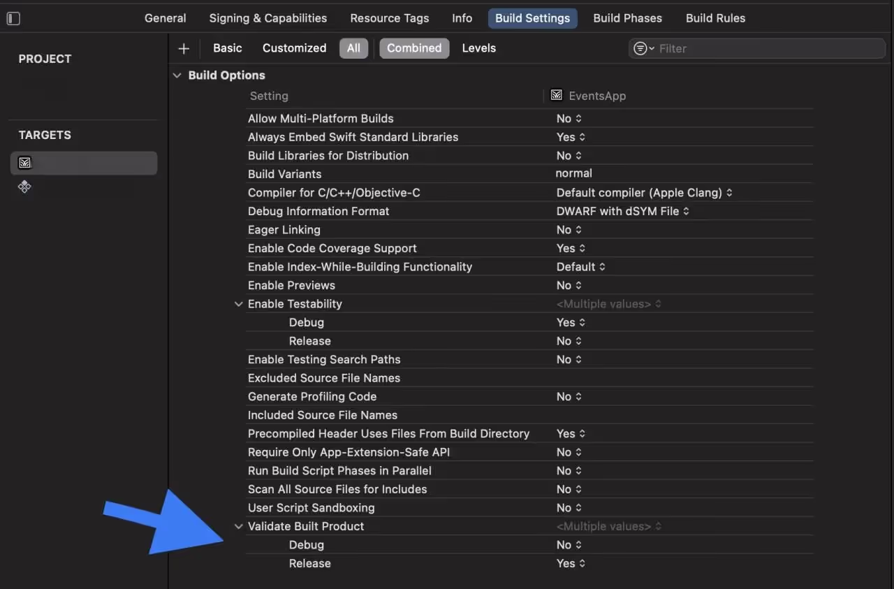
2. Configure Build Settings:
In the "Project Navigator," select your project, go to "Build Settings," and set the build configuration to 'Release.' This optimizes your app for distribution.
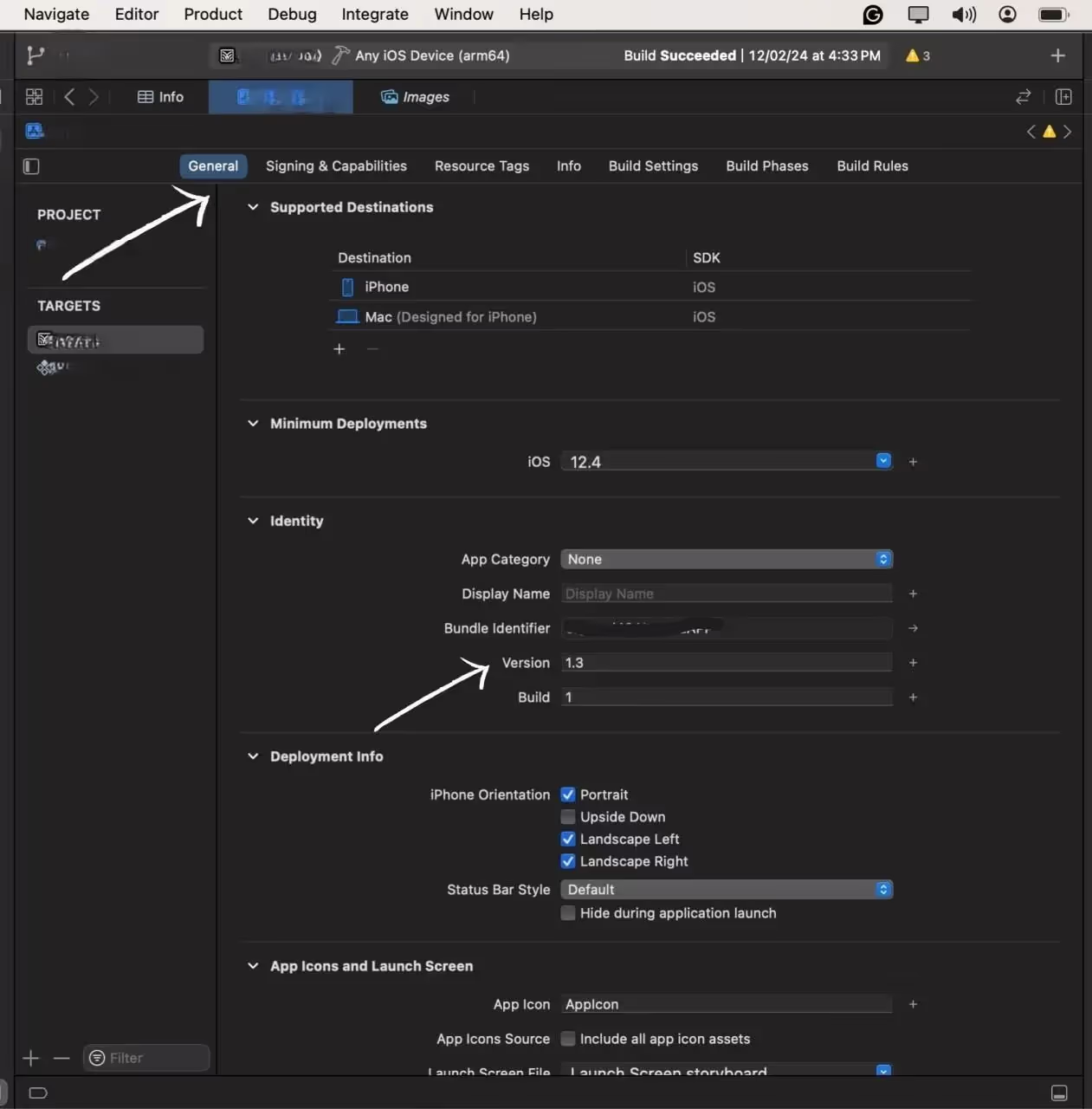
3. Versioning:
Navigate to the 'General' tab and adjust the version number and build number. This step is crucial for tracking different versions of your app.
Step 2: Archive Your App
1. Generate Build:
From the top menu, select your target device as "Any iOS Device" to generate a build suitable for distribution.
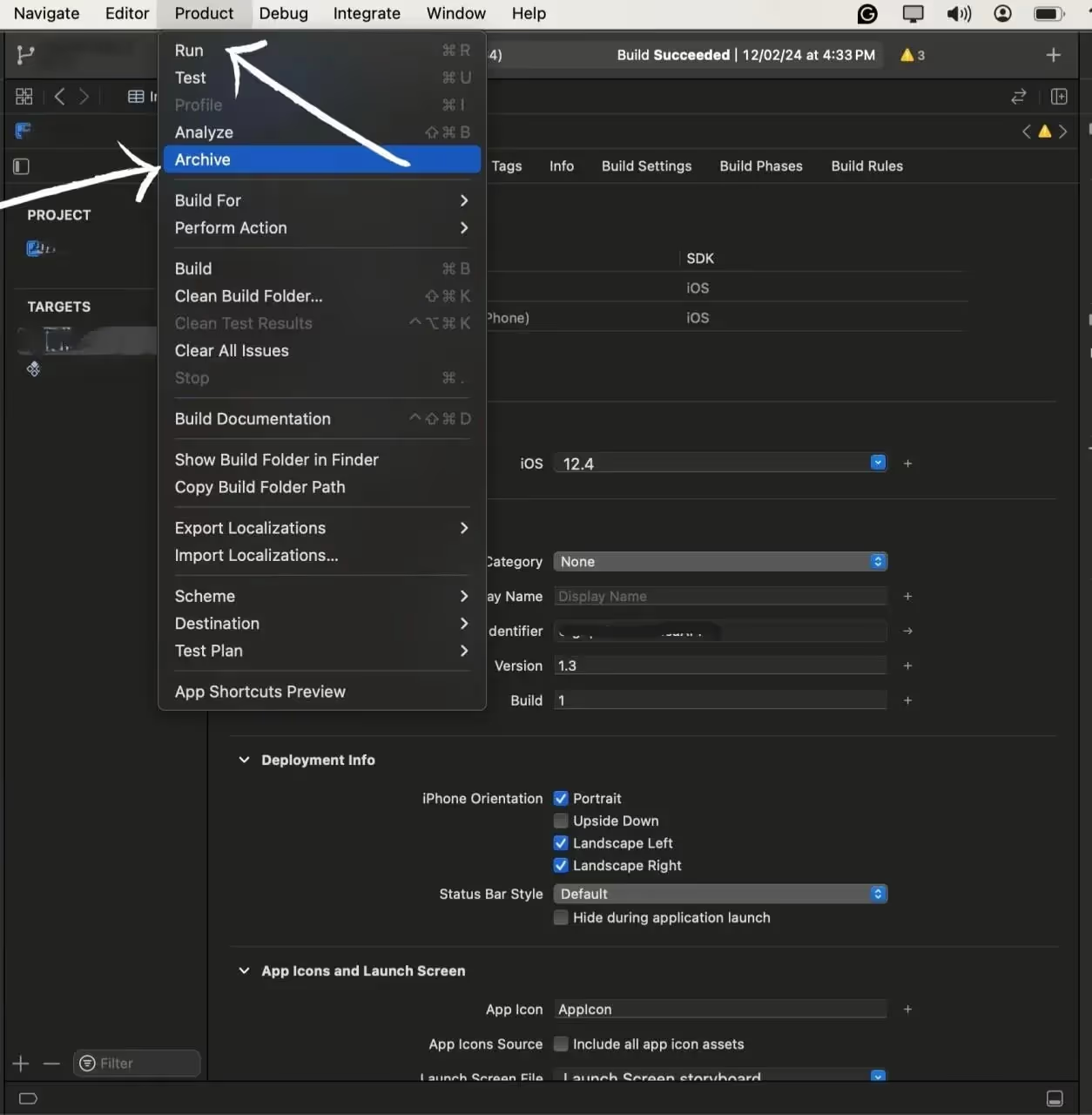
2. Archive the Build:
Go to "Product" > "Archive" to Start the process of Archiving.
Archive is the process of preparing our app for uploading to the test flight, in-short it creates the compressed version of our app for the appropriate upload
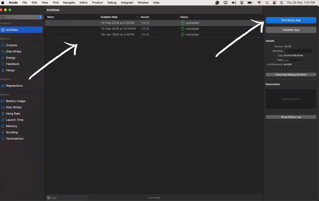
Step 3: Distribute the App
1. Select the version of the app to Distribute
After the archive process is completed you will be redirected to the All Archives page, here select the archive you want to deploy to the Test flight,
After selecting the archive hit the Distribute button to start the process.
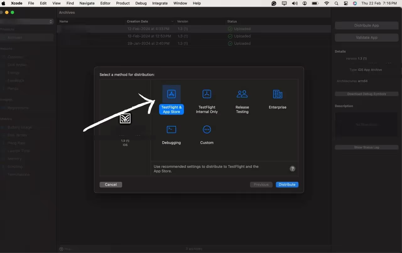
2. Configure the Options:
After hitting the Distribute App option you will be prompted with the option of how you want to deploy the app. You can select the option according to your needs and the purpose of the app, We will go with the Test flight option for this blog.
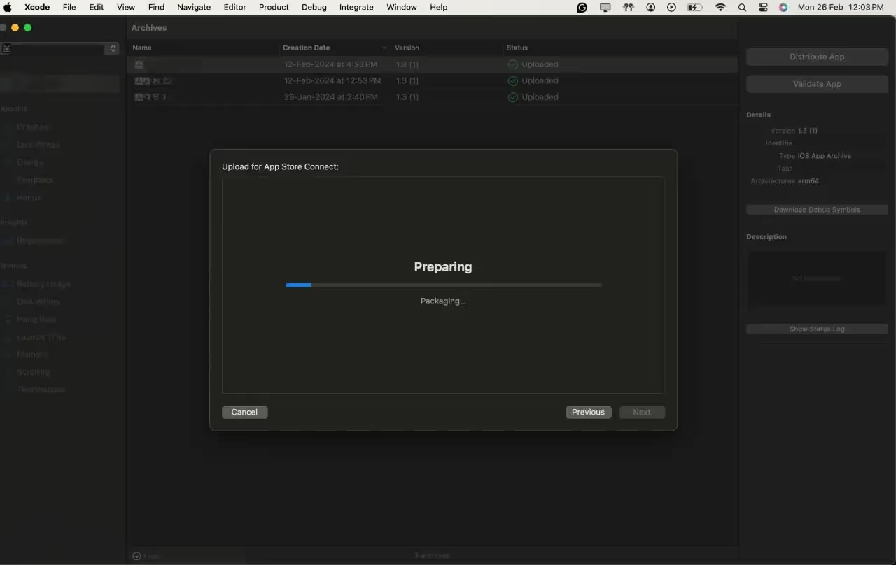
3. Start Uploading the Build
After selecting all the configuration options we can start the distribution by Pressing the Distribute button.
Step 4: Tester Onboarding
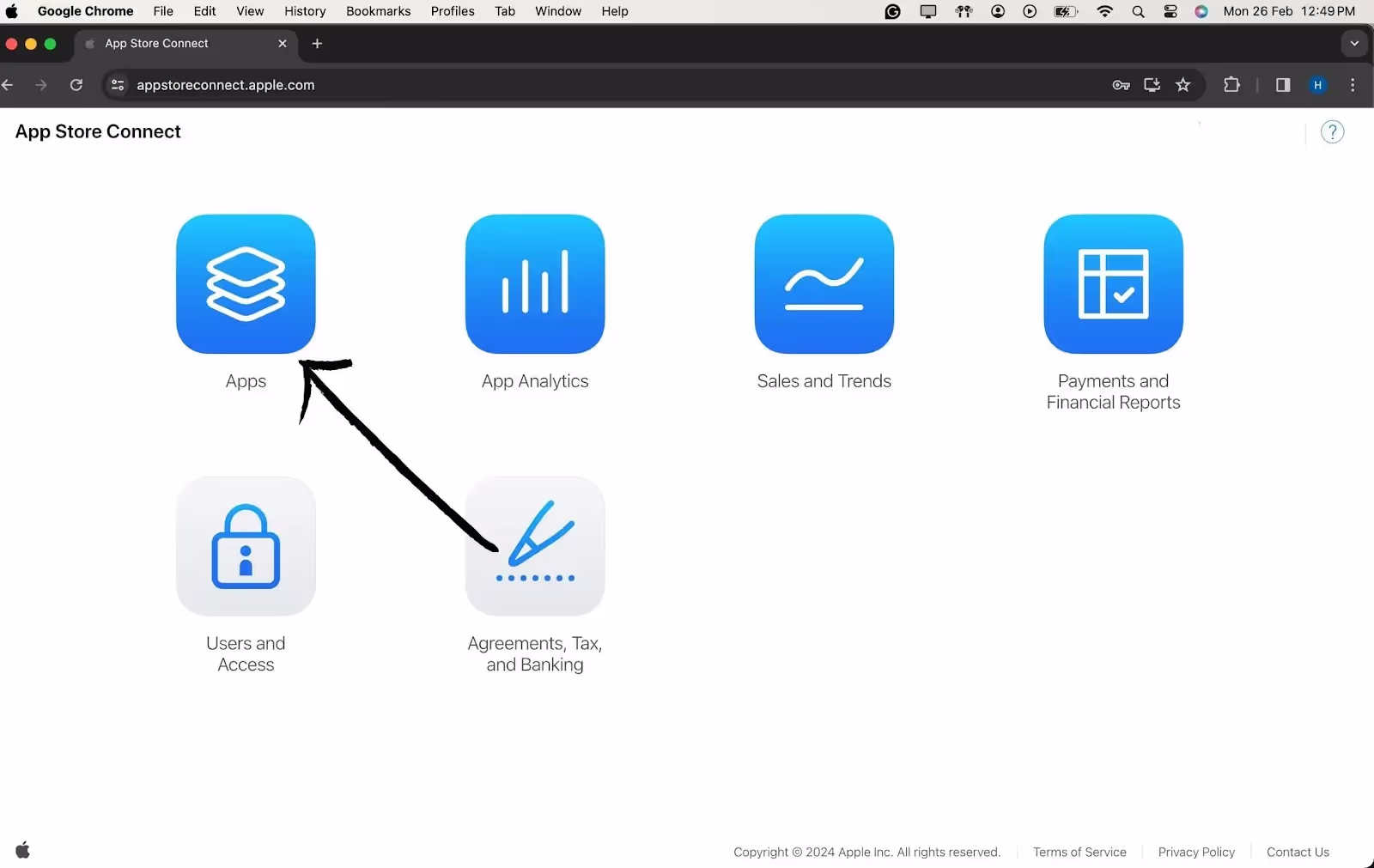
1. Access the Login Page:
Open your preferred web browser and navigate to App Store Connect.
2. Enter Apple Developer Credentials:
Log in using your Apple Developer account credentials. Ensure you have the necessary permissions for managing users and builds.
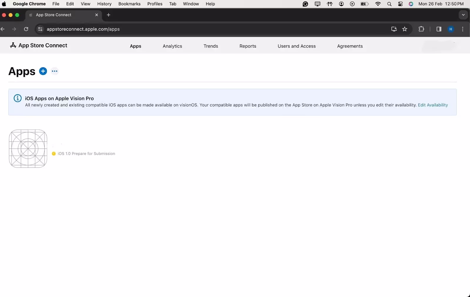
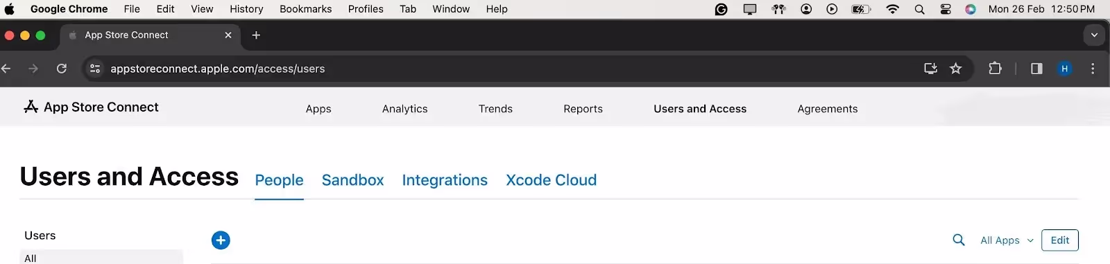
3. Access TestFlight Section:
Once logged in, you'll be on the App Store Connect dashboard. Navigate to the "My Apps" section and select your app. In the left sidebar, find and click on "TestFlight."
4. Select Internal or External Testing:
In the TestFlight section, choose either "Internal Testing" for your development team or "External Testing" for a wider audience.
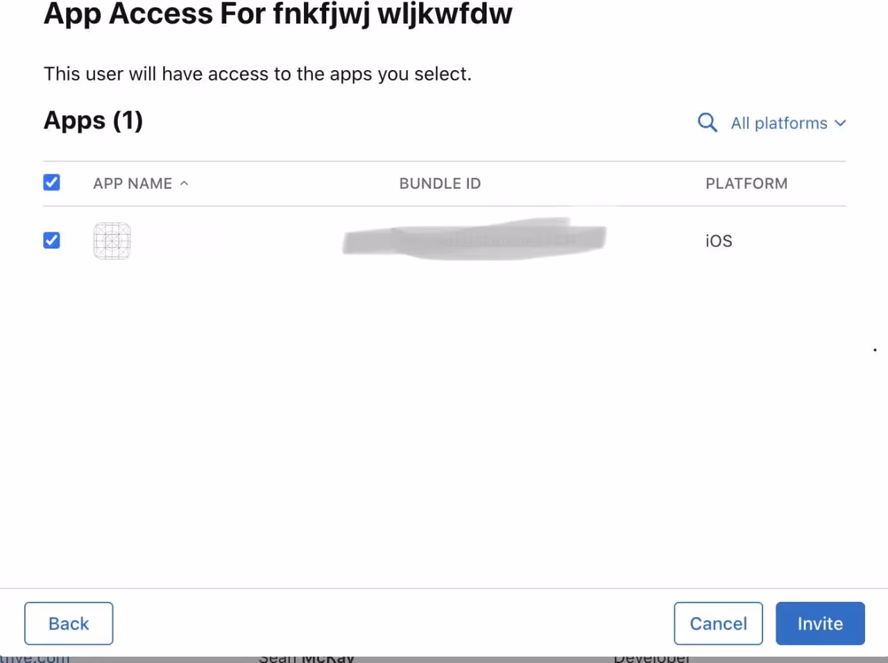
5. Add Testers Using Apple IDs:
Click on the "+" (plus) icon to add testers. Enter the Apple IDs of the individuals you want to invite as testers. For internal testing, use the Apple IDs associated with your development team. For external testing, use the Apple IDs of external users.
6. Configure Tester Information:
Provide additional information about each tester, such as their first name, last name, and email address. This ensures that testers receive invitations with accurate information.
7. Define Tester Roles and Notifications:
Specify the tester's role (App Manager, Developer, Marketer, or Tester) and select the desired notification options. This step allows you to tailor the testing experience based on individual roles.

8. Send Invitations:
Once all details are filled, click "Invite" to send invitations to the added testers. Testers will receive an email invitation to join the testing group.
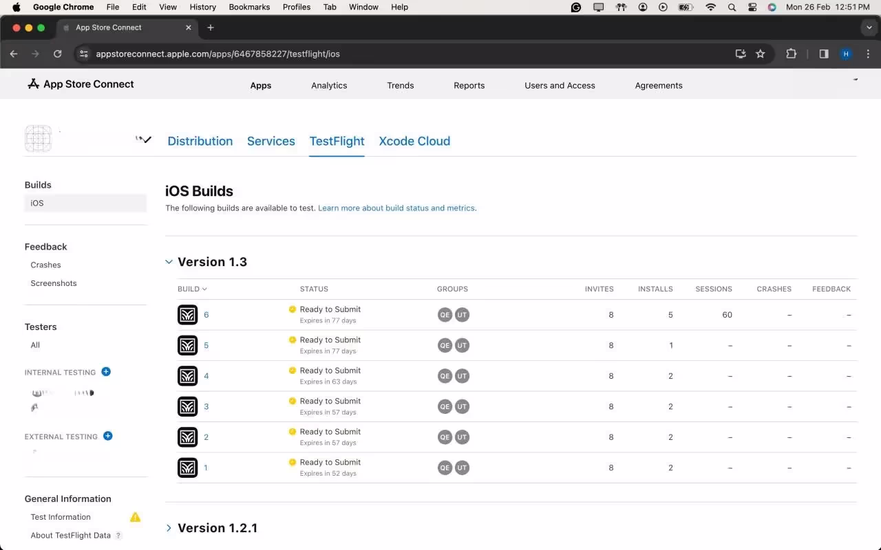
Step 5: Adding the Build for Testing
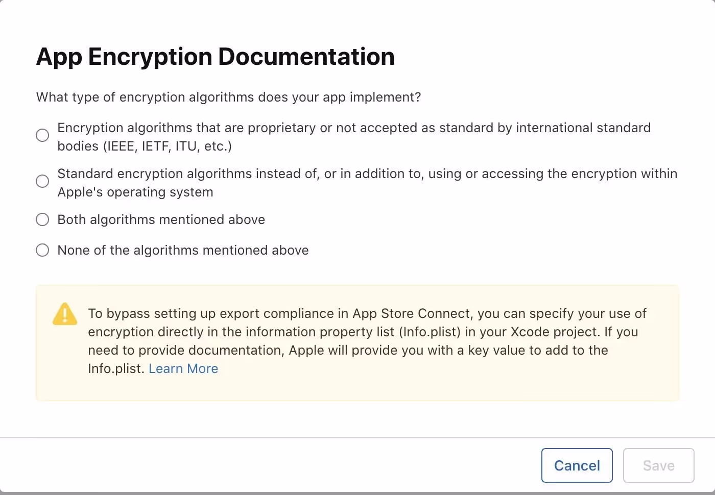
After the uploading is successful, the latest version will show up in the IOS Builds section
It will contain some Options for compliance for the app which which will ask for basic app details like if your app includes any kind of Authentication, if yes then which kind of it is?
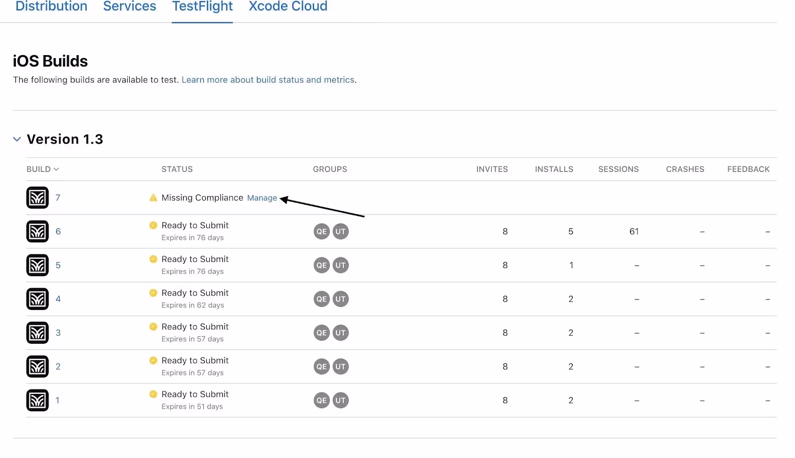
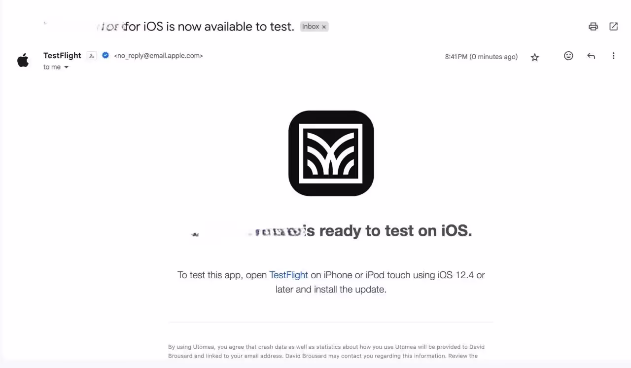
As a final step, once you check all the compliance, the app will automatically be available to testers for testing purposes in the test flight App.
Testers will receive an E-mail notifying them that, a new build is available to test.
Step 6: Submit for Review(Optional For Testing)
1. Complete App Information:
Fill in all mandatory information on App Store Connect. Include details such as app description, keywords, and screenshots.
2. Submit for Beta App Review:
Submit your app for beta App Review. This ensures your app complies with Apple's guidelines.
Troubleshooting Deployment: Navigating Common Issues with TestFlight
Even with meticulous preparation, the world of app deployment can be unpredictable. Understanding and resolving common issues is an essential skill for any developer. Here, we delve into potential challenges that may arise during the TestFlight deployment process and provide detailed solutions.
1. Code Signing Issues:
Symptoms:
Error messages related to provisioning profiles or code signing during the build process.
Solution:
1. Revisit Apple Developer Center: Ensure that your certificates and provisioning profiles are correctly set up. Sometimes, a simple refresh or recreation of these in the Apple Developer Center can resolve issues.
2. Xcode Preferences: Check Xcode preferences to make sure the correct developer account is selected, and the associated provisioning profiles are up to date.
2. Build Rejections in App Store Connect:
Symptoms:
Your build is rejected during the beta App Review.
Solution:
1. Review Apple's Guidelines: Thoroughly review the App Store Review Guidelines to identify any violations.
2. Update Metadata: Make sure all app metadata, including descriptions, screenshots, and keywords, complies with App Store guidelines.
3. TestFlight Invitation Issues:
Symptoms:
Testers cannot access the app or face issues with TestFlight invitations.
Solution:
1. Verify Tester Email: Double-check that the email addresses of your testers are accurate, and they have accepted the TestFlight invitation.
2. Expired Builds: If testers are trying to access an older build, ensure that the build is still valid and hasn't expired.
4. Problems with Beta App Review:
Symptoms:
Delays or rejections during the beta App Review process.
Solution:
1. Communication with Apple: If you face delays or rejections, reach out to Apple through the Resolution Center in App Store Connect for clarification.
2. Adhere to Guidelines: Ensure your app follows all guidelines. Apple provides specific feedback during the review process, which can guide you in addressing issues.
5. Issues with TestFlight Distribution:
Symptoms:
Testers cannot download or install the app from TestFlight.
Solution:
1. Check Tester's Device: Ensure that the tester's device meets the minimum requirements for the app.
2. TestFlight App Version: Confirm that the TestFlight app on the tester's device is up to date.
6. Network or Connectivity Problems:
Symptoms:
Slow uploads, timeouts, or other network-related issues.
Solution:
1. Stable Internet Connection: Use a stable and high-speed internet connection to avoid interruptions during the upload process.
2. Retry: If issues persist, try uploading your build during non-peak hours or using a different network.
7. Issues with External Testers:
Symptoms:
External testers encountering difficulties joining or accessing the beta.
Solution:
1. Double-check Email Invitations: Ensure that the email invitations sent to external testers are accurate, and that they follow the provided instructions.
2. Resend Invitations: If testers are having trouble, consider revoking and reissuing invitations.
8. New Terms Agreement:
Symptoms:
A prompt for new terms or agreements in App Store Connect.
Solution:
1. Review and Accept: If prompted to agree to new terms or agreements in App Store Connect, carefully review the terms and conditions. Accept them to continue using the platform.
2. Clear Cache and Cookies: In some cases, clearing your browser's cache and cookies may resolve issues related to accepting new terms.
Conclusion:
Deploying apps to TestFlight is a crucial step in ensuring a successful app launch. By following this comprehensive guide, you'll be well-equipped to navigate the TestFlight deployment process, harness its benefits, and gather valuable feedback to refine your app before it reaches the wider audience on the App Store. Happy testing!
Here are some links to official Apple documentation for reference on How to deploy the apps to the test flight:

Creating a custom CKEditor 5 plugin for Svelte
Svelte is an open-source JavaScript framework that helps to create interactive web pages. The Svelte plugin enables users to embed its components seamlessly into their content.
In this blog, we will consider how to create a custom plugin to integrate Svelte components into CKEditor 5, a powerful and extensible rich text editor that allows developers to tailor it to their specific needs.
To begin with, check out the directory structure that houses the essential components of the Svelte plugin.
Directory structure

Essential components of the Svelte plugin
1. package.json
Download the necessary CKEditor5 node modules for compiling custom plugins.
2. webpack.config.js
The Webpack.config.js file is a script designed to automate the build process for CKEditor 5 plugins located in the js/ckeditor5_plugins directory. It employs the webpack module bundler to produce plugin files that are ready for production.
This configuration script is structured to bundle CKEditor 5 plugins individually, leveraging the capabilities of the getDirectories function. This function dynamically retrieves all subdirectories within the specified path (./js/ckeditor5_plugins). For each identified directory, a distinct Webpack configuration is generated and seamlessly integrated into the module.exports array.
3. index.js
This file exports an object as the default export of the ‘index.js’ file. The object possesses a property named Svelte, and its value is the imported Svelte plugin. This is how CKEditor 5 will identify and uncover the Svelte plugin during the execution of the build process. The exported object functions as a map of available plugins that CKEditor 5 can utilize.
4. svelte.js
The Svelte class serves as the glue that integrates the editing and UI components of the plugin. It extends CKEditor's Plugin class and specifies its dependencies.
The static get requires() method in this context specifies that the Svelte master plugin requires both SvelteEditing and SvelteUI. Although these components extend the Plugin class, CKEditor 5 will not consider them as individual plugins unless explicitly exported in index.js. This emphasizes the importance of explicit export to ensure that CKEditor 5 recognizes these components as plugins.
5. SvelteEditing - Handling the model
The SvelteEditing class defines the data model for the Svelte element and the converters for handling its conversion to and from DOM markup.
The init method initializes the plugin, calling two helper methods: _defineSchema and _defineConverters, to set up the schema and converters for the Svelte model. Additionally, it adds the 'insertSvelte' command to the editor, associating it with the InsertSvelteCommand class.
The _defineSchema method sets up the schema for the Svelte model, registering the model type and specifying that it behaves like a self-contained object (isObject: true). It also defines where the model is allowed (allowWhere), where its content is allowed (allowContentOf), and the allowed attributes (allowAttributes), in this case, the 'src' attribute.
The _defineConverters method sets up the converters for the Svelte model, using the CKEditor conversion object to register converters for upcasting and downcasting.
This section registers an upcast converter, determining how existing HTML is interpreted by the editor when it loads. It specifies that when encountering an HTML iframe element with the class '-svelte-embed,' it should be upcasted to a Svelte model element.
This section registers a downcast converter for data, defining how the Svelte model should be converted to DOM markup. If the model has a 'src' attribute, it uses that value; otherwise, it defaults to 'https://www.google.com'. It creates an iframe element with the specified class and source, which is then returned.
This section registers an editing downcast converter, defining how the Svelte model should be converted to editable DOM markup. It creates an iframe element similar to the data downcast converter and then uses toWidgetEditable to wrap it as a widget in the editable view.
6. SvelteUI - User interface integration
The SvelteUI class registers the toolbar button for Svelte embeds, complete with an icon and dropdown functionality. It listens for user interactions and triggers the insertion of Svelte components into the editor.
This section adds the Svelte component to the CKEditor UI, creating a dropdown view using the createDropdown function. It sets its button view with an icon and associates it with the specified locale.
Here, a collection of items is created, representing the Svelte components to be displayed in the dropdown. It iterates through the directories obtained from the editor's configuration and adds each Svelte component as a button to the collection.
This line adds the list of Svelte components to the previously created dropdown view using the addListToDropdown function.
This section sets up an event listener using 'this.listenTo' to listen for the 'execute' event on the dropdown view. When an item is selected, it extracts the src and label from the selected item, modifies the src path, and then executes the 'insertSvelte' command on the editor with the modified src.
Finally, the init method returns the configured dropdown view, completing the initialization of the SvelteUI plugin.
7. insertsveltecommand
The heart of our plugin lies in the InsertSvelteCommand class. This command executes when the toolbar button for embedding Svelte components is pressed, utilizing CKEditor's model to insert the desired content into the editor.
This line declares the InsertSvelteCommand class, extending the CKEditor 5 Command class. This class encapsulates the logic executed when the toolbar button is pressed.
The execute method is part of the Command class and contains the logic to be executed when the command is invoked. It takes a src parameter, representing the source content to be inserted.
- const { model } = this.editor;: Destructures the model property from the editor object. The editor object represents the CKEditor instance.
- model.change((writer) => { ... });: Initiates a model change, ensuring that the changes are handled as a single transaction. The writer parameter provides methods for modifying the model.
- model.insertContent(createSvelte(writer, src));: Inserts content into the model, calling the createSvelte function to generate the content to be inserted.
The createSvelte function generates a CKEditor 5 model element representing the Svelte component. It uses the writer.createElement method to create an element with the specified name ('Svelte') and attributes (in this case, the src attribute). The created element is then returned.
The final look
After enabling the module in Drupal, you should see the screen below:
.avif)
In this requirement, we are passing the folders inside a specific directory from Drupal to the CKEditor5 plugin. When you access any content-type page with full HTML, you will start seeing this:
On clicking the "View Source" option, the type casting of CKEditor5 will display the iframe tag with the src attribute set to the folder's index.html.
.avif)
Conclusion
Creating a custom CKEditor 5 plugin to embed Svelte components adds a new dimension to content creation. The Svelte plugin seamlessly integrates into the editor, providing users with a streamlined experience for incorporating dynamic Svelte content.
If you want to know how to integrate CKEditor 5 in Drupal 9, you can find all the important steps here.
Happy editing with Svelte !

Data portal mapping the future of climate migration
As our planet changes, a complex challenge that has emerged is climate change-induced human migration. Millions are being forced to leave their homes, seeking safety and stability. Recognizing this critical issue, the United Nations (UN) leads coordinated efforts to support vulnerable communities.
The International Organization for Migration (IOM), the UN migration agency, promotes orderly and humane migration that benefits all. We had a great opportunity to join forces with IOM, contributing our expertise to a data-driven solution that sheds light and raises awareness on this complex issue.
IOM's commitment
.avif)
Recognizing the urgency of climate change and its profound impact on human mobility, IOM has taken a leading role in addressing this global challenge. At the recent COP28 (28th United Nations Climate Change Conference) summit in Dubai, IOM aimed to foster international collaboration and drive ambitious action towards a low-emission and climate-resilient future.
As part of its strategic approach, IOM’s Global Data Institute (GDI) wanted a data-driven solution that leverages analytics to forecast where and when populations worldwide will be exposed to mobility-related climate hazards, such as floods, storms, and droughts so that decisions can be made based on evidence. This initiative helps the world understand climate-related displacement risk better and explore ideas to address it properly.
We designed and developed an interactive data visualization solution that IOM could use to present its research and approach at the COP28 summit.
The power of data and insights
We used the power of data and its ability to reveal hidden patterns and insights. Our solution processes large datasets and employs advanced analytics techniques to visually represent the complex dynamics of mobility-related climate hazards. It analyzes future trends and identifies emerging patterns based on state-of-the-art climatic, demographic, and economic datasets.
Take a look at GDI’s Climate Mobility Impacts dashboard on the Global Migration Data Portal. Users can explore and analyze how different climate hazards are expected to affect humans in the future.

This data-driven visualization approach provides a vital foundation to allocate resources and make informed policy decisions. International organizations can now interactively explore where and when climate hazard exposure, high population densities, and economic vulnerability will coincide in the future. It enables them to provide effective and targeted support for vulnerable populations.
This shift towards evidence-based decision-making ensures that aid and resources reach those who need it most, maximizing their impact and fostering a more resilient future for all.
Collaborative effort and action
This was a high-priority project for us with tight deadlines to meet. We had to design a portal that reads climate change data and presents it in interactive 2D and 3D maps, graphs, and bar charts.
This project demanded strong collaboration and dedication from a diverse team of experts. Our team of designers and JavaScript developers closely worked with the IOM team to research extensively, design, and develop a solution that meets current goals and is scalable for future goals.

Agile methodologies were at the core of our approach, and we were able to adapt to emerging challenges and navigate complexities with remarkable efficiency. Our team’s commitment to agility proved invaluable, enabling us to successfully deliver the project on time and within budget.
Summing up
We will delve deeper into the design and development of our data visualization portal, offering insights into its features and unique capabilities in our case study. We believe that by sharing our knowledge and expertise, we can inspire further collaboration and advancement with data as a catalyst for positive change.
We are glad that we could help IOM present its data and approach visually to empower communities to navigate the complexities of climate change-induced migration. We look forward to working on more solutions that will positively impact lives worldwide. Talk to our experts to know more about how we can customize digital solutions that fit your needs.

How to use the GraphQL useMutation hook of Apollo in ReactJS
GraphQL is a powerful query language that allows more flexibility and efficiency in data-driven applications compared to REST.
In simple words, while querying with a RESTful API, we demand extra data that is not required at that moment. Here’s where GraphQL comes in handy for requesting only the required data from the server.
Apollo is like the glue layer allowing us to use GraphQL in the front end (ReactJS in our example). We can make queries from React to our Graph of data in the server and retrieve data to present on the browser.

Prerequisites
- Basic knowledge of Apollo Client library, GraphQL, and Schemas
- Setup of GraphQL in NodeJS using express , express-graphql, and graphql
- Setup of Apollo client and GraphQL in ReactJS using @apollo/client and graphql
- MongoDB (mongodb and mongoose) or any other database
Mutations and GraphiQL
Mutations allow us to mutate/change our data by performing CRUD operations. According to the official website of GraphQL, a mutation is defined as:
- A GraphQL operation that creates, modifies, or destroys data.
We need to explicitly define mutations in the GraphQL server just like we define our RootQuery.
For example, a mutation schema definition to add an author and a book to our database would look something like this in NodeJS:
Here, the fields object contains all the mutation operations which we would like to perform. addAuthor is one such operation. AuthorType is the schema defined for the author with fields, such as ID, name, age, and books. args is the data we want to save in the database and ensure the correct datatypes.
Author is a mongoDB model, which is created using Mongoose. The resolve method is used to fetch/access, send, and mutate data in the database. The save() method is a Mongoose method that adds new author to the database. The same is the case of the addBook operation.
A mutation operation to add a book and an author sent from GraphiQL would look something like this:
The query execution can be verified from the browser network tab with the name “graphql” (an example given at the end of this article).
GraphiQL is like a dummy frontend app that allows us to test our GraphQL server. The setup can be done from the main file or app file on our server. It is suggested specify whether we are using the production or development mode.
The useMutation hook
Let’s discuss about the functionality of the useMutation() hook! It is used on the client end to send our mutation to the server.
Assuming that we have done the setup (explained later), we need to follow the steps below:
Step 0: Setting up Apollo Client in React application is done by installing @apollo/client, and creating a client object. It is a GraphQL client library using which we can make queries to the server like HTTP or Axios.
The uri is the server endpoint to which requests are made. ApolloProvider wraps our React app and helps inject whatever data is received from the server to our frontend.
Step 1: Import gql template literal from @apollo/client library.
Step 2: Define the mutation as ADD_BOOK using gql in a separate file to ensure modularity in the project. For example, in the queries/index.js file, a mutation takes in data in the form of variables with a $ sign.
Step 3: Import the useMutation()hook in the component mutation and request the above mutation to the server. This request is executed on an event of a button click to add a book. Here is where the useMutation() hook comes into picture.
This hook takes the mutation ADD_BOOK that we just created as the first parameter and some options in an object, such as variables, and ignoreResults as the second parameter.
It also returns two elements, where the first is a mutate function (addBook), and the second is an object with details on the mutation - loading, error, and data.
It is important to make a call to this mutate function to perform the mutate operation because only calling the hook does not execute the mutation automatically (unlike GraphQL queries).
- Variables can either be passed while calling the mutate function or while calling the useMutation hook.
- The ignoreResults property, if set true, the mutation's data property is not updated with the mutation's result.
- The refetchQueries property allows us the refetch certain queries once the mutation is complete.
Loading and error states are used to update the UI based on the mutation progress. They help display loading spinners or error messages while waiting for the mutation to complete or handling any encountered errors.
Finally, this is what our app and the mutation operation look like.

This is how our MongoDB database would look in the compass tool.

Difference between useQuery and useMutation
There are two differences between the hooks:
- useQuery is a read-only operation used to fetch data, while useMutation is a write-only operation used to edit data and perform CRUD operations.
- The useQuery hook runs automatically on component render, whereas the useMutation hook returns a mutate function which is needed to be triggered.
Below is an example of a query to fetch all authors and their details in GraphiQL (after we add them using the mutation specified above).

Resources
- Complete source code for the example used in the blog
- Github GraphQL APIs for mutations
- Mutations in GraphQL using Apollo
- Refetching queries
- Full tutorial on GraphQL with NodeJS and ReactJS
- Mongoose documentation
- Latest module for GraphQL setup
Summary
The Apollo client introduces a remarkable tool: useMutation. This modern approach surpasses conventional methods. Additional libraries like apollo boost might not be required because @apollo/client comprehensive on its own. For hands on experience, Apollo offers tutorial challenges to practice with the useMutation hook before incorporating it into the project.
Notably, the graphql-http package has taken the place of express-graphql - something that can be explored. In a nutshell, the Apollo useMutation hook streamlines the process of handling GraphQL mutations, making the construction of resilient and engaging React applications simpler.

A Beginner's Guide to React Native
React Native, a popular javascript-based framework built by Facebook in 2015, uses a Single Codebase applicable for developing apps on Android and iOS. The usage of this framework has increased developer productivity and minimized the learning requirements of other languages such as Objective C, Swift, Java Kotlin, etc. which are needed for Android/iOS app development.
Instead of using HTML and DOM as building blocks for the UI, React Native uses the native core components such as Button, View, Switch, etc. which you’ll find on iOS and Android. The philosophy is to learn once and write anywhere. Today, apps such as Instagram, Facebook, UberEats, Pinterest, Skype, and much more use React Native. You can also integrate this framework with your existing mobile applications!
Note: Written in JavaScript. Runs on React. Rendered with Native Code
Prerequisites
- JavaScript Fundamentals
- ReactJS
- CSS basics
- ECMAScript 6 (ES6)
Topics Covered
- How does React Native Work
- Setup
- Assumptions
- Adding CSS in React Native
- Understanding the React Native Core Components
- FlexBox in React Native
- Adding Custom Fonts to React Native
- Conclusion & Future Work
How does React Native Work: Views
In Mobile development, a View is the basic building block of UI: a small rectangular element on the screen that can be used to display text, images, or respond to user input. Even the smallest visual elements of an app, like a line of text or a button, are kinds of views.
According to the React Native site's introduction, you invoke the views with JavaScript using React components. React Native creates the corresponding Android and iOS views at runtime for those components. Because React Native components are backed by the same views as Android and iOS, React Native apps look, feel, and perform like any other app.
Setup
- Install expo-CLI globally using sudo npm install -g expo-cli
- Initialize project expo init my-first-react-native-project. This will create a basic project setup with all the initial files like package.json, etc.
- Go to the project directory in your favorite editor cd my-first-react-native-project/
- Run the expo-cli server using yarn start OR expo start
- In case it shows this error on the web browser - “Expo Developer Tools is disconnected from Expo CLI”, (EMFILE: too many open files) then install watchman: brew install watchman
- Download the expo client app on your mobile.
- Scan the QR code provided in the web browser, and you can view the Javascript running.
💡 As a result of the automatic fast reload feature of React Native, there is no need to restart manually after the completion of all these steps.
The app.js file contains the main component, which can be edited as per the project requirements.
Assumptions
- The code is written with respect to the React Functional components.
- All core components have to be initially imported from react-native in your code –
Adding CSS in React Native
- React Native does not use CSS. It only emulates the idea of CSS. Therefore, we implement CSS using the style prop in the component, which refers to the CSS properties stored in an object.
- A StyleSheet is an abstraction similar to CSS StyleSheets. This makes the code easier to understand and in case of any error in the style properties, it is shown at compile time rather than run time.
- The idea of inheritance of CSS properties does not work in the case of React Native. One needs to specify styles for each element. With one exception - Text widgets within Text widgets.
Understanding the React Native Core Components
Core components are a set of essential, ready-to-use native components for quick and easy mobile application development
- <View> is used to wrap other elements.
- <Text> is used to display any textual content
- You cannot write anything without the React Native core components. Not even HTML tags such as <p> can be used. This will result in an error.
- In react native, <Button/> is a self closing tag. And you can send data as prop to this element. For example, <Button title='update state'/>. This will have some styles by default, but you cannot add styles property to a button in react native, hence it should be wrapped around a <View> tag to add styles to it.
- <TextInput> is used to take inputs from a user. It has the following props available -
- placeholder prop
- multiline for text with multiple lines for form input
- onChange and onChangeText event listeners. onChange is useful when we need access to underlying native-event containing target, eventCount and text. While onChangeText only provides access to underlying text that changed
- keyboardType prop is useful to set the type of inputs that a user can provide. For instance a phone number will only contain numbers. Email address should follow a regex, etc.
1. numeric
2. email_address
- Lists of data can be rendered using the JS method map(). Same as it is done in other JS frameworks. Similarly, you need to have a key for each list item. When the list or any content exceeds the page dimensions, you need to add <ScrollView>, wrapping up the content that should get scrolled. This is suitable for shorter lists.
- <FlatList/> is quite similar to ScrollView, except that it performs much better in terms of memory and processing time. Since it renders items lazily, when they are about to appear, and removes items that scroll way off-screen, therefore, it is better for longer lists. It automatically looks for the key property in each item in a list. Few mostly used properties of FlatList are as follows-
- data: pass the list/array that has to be rendered.
- renderItem: renders the items of the list mentioned in the data prop.
- keyExtractor: used in case the name of the key is something other than a key.
- numColumns: tells the number of columns in which the data should be rendered.
- <TouchableOpacity> is used when you want an element to go opaque, or fade out a little bit when touched. You can also use the onPress() property for adding other functionalities.
- <Alert> is used to launch an alert dialog with the specified title and message. It can also have multiple buttons as option, providing different functionalities using the onPress() handler.
- <TouchableWithoutFeedback> wraps a single component based on the requirement. When pressed, the functionality provided in the onPress() handler shall execute.
- The Keyboard module used in the above example listens to native events and handles them using methods such as dismiss().
FlexBox in React Native
- A flex-box takes up the whole space available on the mobile screen. It can be set in styles using -
- The default behavior of flex is 'column'. You can set it as flexDirection:'row' for horizontal alignment of data.
- Setting flexDirection without flex:1 takes only the required space and not the whole screen.
- The justifyContent property enables us to set the item positions in a flexbox to the center, left (default), right, spread (space-around and space-between), etc.
- The alignItems property sets the alignment of the flexbox items w.r.t to their position.
- The space for the items is divided based on each element's flex properties, like flex:2 for one element, flex:3 for another, etc.
Adding Custom Fonts to React Native
To add custom fonts to your react-native project, the expo-font library can be used. With the help of this, fonts can be loaded from the web and then be used in React Native components. One can download the required fonts, copy them into the assets folder, and include them in the App.js or other JS file using the loadAsync() method.
Apps.js
loadAsync() is a highly efficient built-in method, that loads font from a static resource. Any string can be used as the font-family name. Secondly, you need to add these fonts to the styles of your components.
MyComponent.js
It is a good UI approach (for better optimization) to display components to the screen only when the assets such as custom fonts, icons, and logo images are completely loaded. Therefore, state management (the useState hook) is applicable here, along with another expo library called expo-app-loading which tells the expo-splash-screen to keep the screen visible while the AppLoading component is mounted. You can read more about it here.
Install the library using - expo install expo-app-loading
Apps.js
The AppLoading component makes a call to the getFonts() method, and when the fonts are finished loading, we call the setFontLoaded() method and set fontLoaded to true causing re-rendering. Thus, <MyComponent/> gets rendered.
Conclusion & Future Work
With React Native, programmers can create multi-platform applications with one technology - React, making the product cost-efficient. The Core components that we just discussed and many more, map directly to the platform’s native UI building blocks. This was just an introductory blog, and there is much more to learn in React Native, such as Navigation, Error handling, Images, Forms, etc. that shall be covered soon by us. Stay tuned for more updates!
React Native, a popular javascript-based framework built by Facebook in 2015, uses a Single Codebase applicable for developing apps on Android and iOS. The usage of this framework has increased developer productivity and minimized the learning requirements of other languages such as Objective C, Swift, Java Kotlin, etc. which are needed for Android/iOS app development.

Styling your Next.js application
Next.js is opinionated about how to organize your JavaScript code, but it's not opinionated about whether your styling should belong in JavaScript or not. As CSS-in-JS is becoming more and more popular due to some of its great advantages over css, there are people who outrightly hate the idea of CSS-in-JS. The **Differing Perspectives on CSS-in-JS** give a sneak peek into the over-opinionated world of what you should use.This blogpost though won't go into explaining this love and hate debate about css-in-js. The goal of this blogpost is to explain how we can use different styling methods to style our Next.js application and also mention the Pro's and Con's of using these methods.
Vanilla CSS/ Global CSS
Of course, you don't need to install anything to start to write your CSS styles. Just place your .css files inside the _app.js file, and you're ready to use it.

Drawbacks of Vanilla CSS/ Global CSS
Anybody who has worked with using vanilla css knows how daunting and tedious working with Vanilla CSS can become. Some of the drawbacks are using Vanilla CSS are:
- Styling can be inconsistent due to Global Namespace as you can easily unintentionally target too many elements.
- Since styles are not scoped to the component, you'll have to be very cautious about deleting your code safely.
CSS modules
Next.js has built in support for CSS modules. You can make use the [name].module.css file naming convention.Just rename your .css files with the .module.css suffix, and you're ready to import them inside of your JSX files!
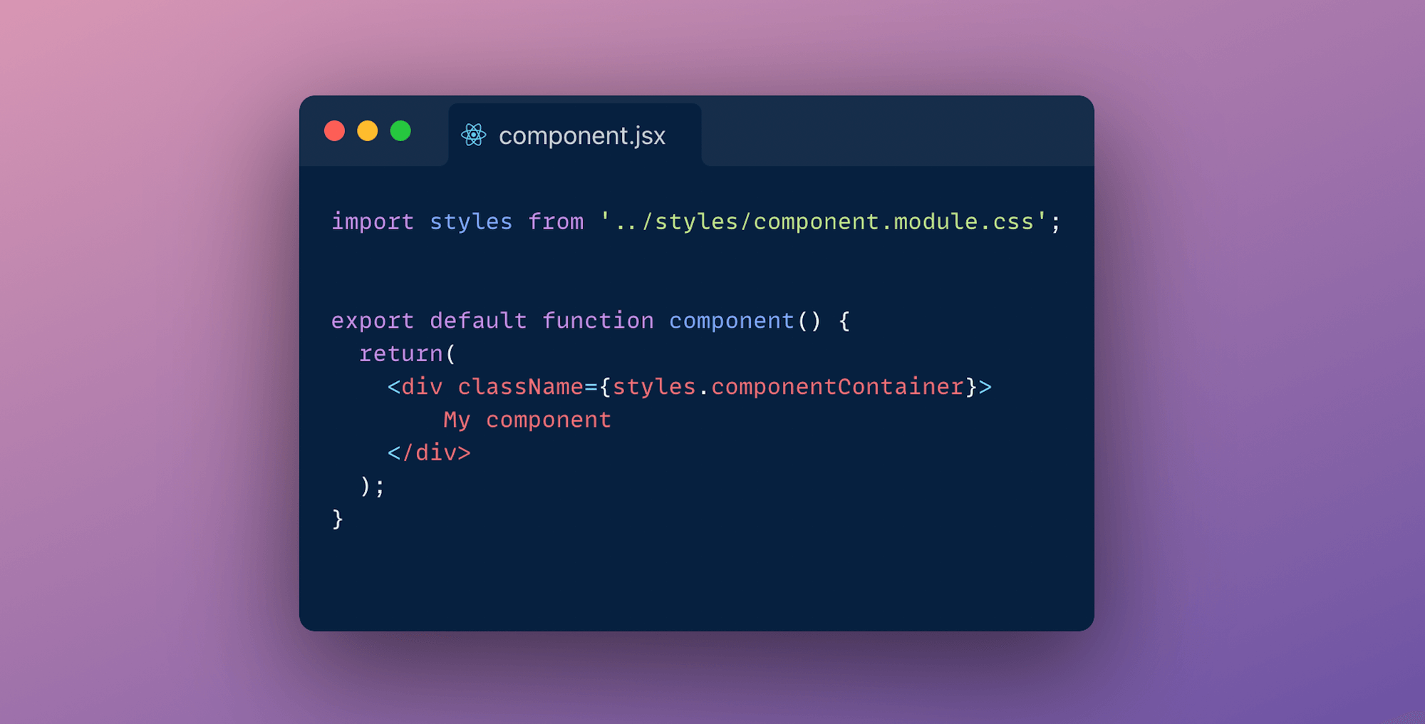
Since CSS Modules are locally scope they give you the ability to control your element styles in a more granular way as you don't need to worry about style collisions. Next.js takes care of optimising your CSS by minifying and code-splitting your css files. This is an ideal way of writing your CSS:
- You css in not dependent on JavaScript
- Zero-barrier to entry as you'll be writing Vanilla CSS
- Class-names are scoped
Drawbacks of CSS modules
- Nesting is not supported by default. You'll have to use PostCSS for that
- If you are sharing components across applications, using CSS modules may not best approach to go with
- Describing global styles, you have to use a syntax that does not belong to the CSS specification
Sass
Sass is one of the most popular preprocessors out there. It allows you to write more reusable, maintainable CSS. All need to do to get started is to run yarn add sass, rename your <file>.module.css files to <file>.module.scss, and you're ready to use SASS (or SCSS) syntaxes in your CSS Modules! You can configure your SASS options by editing the default next.config.js file as shown in the image.

Sass makes it easy for you to automate repetitive task and create reusable code snippet with some of it's widely used features like:
- Mixins: Create reusable code snippets
- Variables: Allows you to to store information that you want to reuse throughout your stylesheet
- Modules: Allows you to split your css files into more maintainable css files
Drawbacks of Sass
- Entry barrier: You need learn new features present in this preprocessor before using it
- Browser support: Some of the features aren't supported across browsers
- Although you can make use BEM methodology to name your classes. Naming can still be hard and you might need to look up a dictionary to name your classes
CSS-in-JS
CSS in JS is probably the most popular way of theming react applications right now. Almost every other day a new library pops-up. Some of the most popular libraries are: Styled components, EMOTION and Radium. There's also zero-runtime solutions like Vanilla-extract ,where CSS is extracted to CSS files at build-time.
CSS-in-JS lets you author CSS in JavaScript syntax. Let's look into 2 approaches of styling your application with CSS-in-JS:
Styled components
To use styled components we need to install babel-plugin-styled-components and styled-components. Next edit your _document.js file. Your should look somewhat identical to code shown in the below image.
Next update your .babelrc file to include the next/babel preset and include the styled-components plugin, with server-side-rendering (ssr) enabled.
We are done with all the configuration. Usage fairly simple. You just create a variable with the help of tagged-template-literals and then use it.
Some of the advantages of using Styled components are:
- CSS rules are automatically vendor prefixed
- As with all the CSS-in-JS libraries you don't need worry about colocation
- Specificity is solved by auto-generated class names
You can learn more about it's official documentation.
Styled JSX
As easy as writing vanilla CSS, Next-js also has an inbuilt support for styled jsx. It allows you to write CSS using Javascript directly inside your components.
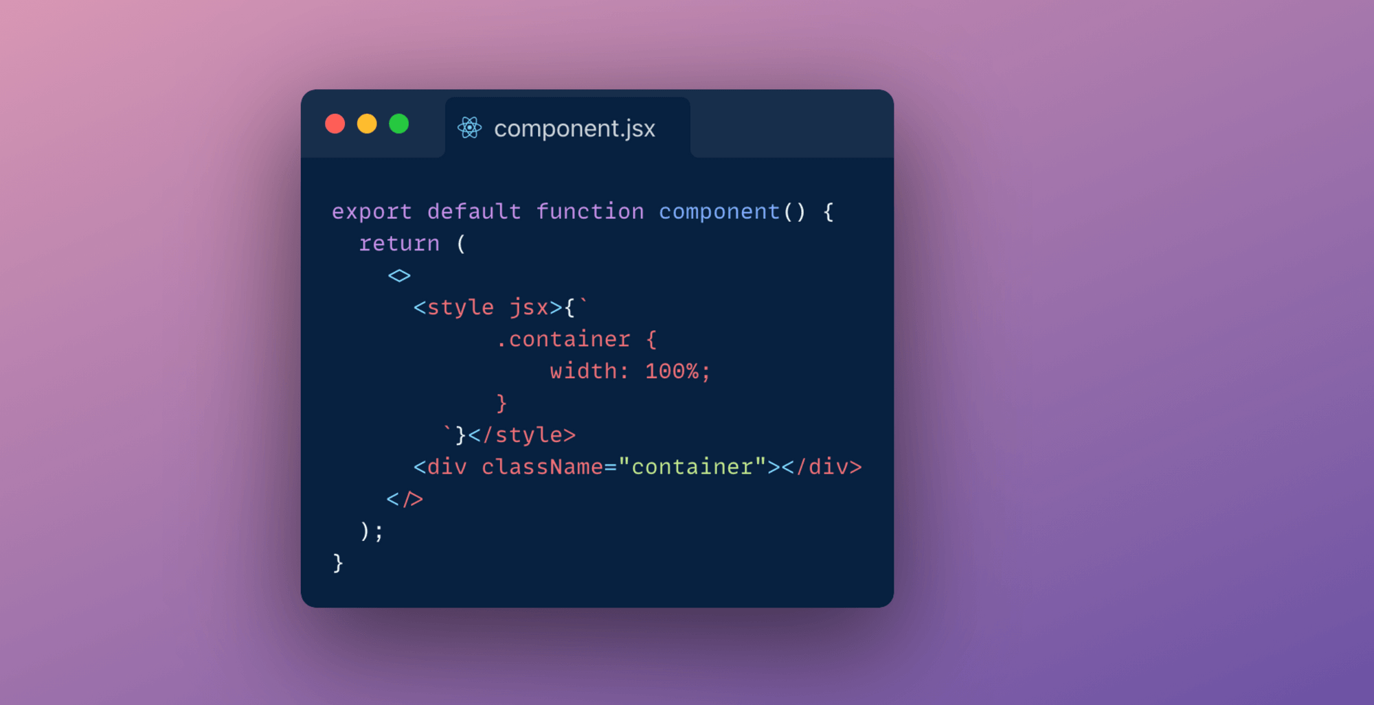
Alternatively you can also make use of libraries like Chakra, ThemeUI or Tailwind to implement a component library and design system.
Conclusion
Each method has it's own pros and cons. After evaluating these pros and cons you will have to settle for one approach in the end. I think you are the best of judge of what styling methodology you should be using for your application. I for one have been making use of styled components and global stylesheets to theme my Next.js application.

Data Fetching and Next.js
Next.js has evolved enormously over the past couple of years. From last year only it has introduced different data fetching techniques like Static Site Generation (SSG) and Incremental Static Regeneration(ISR) making it a default solution to build large scale web applications for most people.
In older days websites that were built were all really just a folder with HTML files that could be requested by a browser. After sometime as the web evolved, web severs came into use and how content was being served changed from static html files to generating the html at every user request. Then Javascript was invented and how content on a website would look and behave completely changed.
With the evolution of JavaScript and as the joke goes "JavaScript has become the main cause for making websites!" the approach of building web applications has changed. Rather than everything coupled together websites are built to be flexible, decoupled from the content and split up depending on what kind of data you need to serve to user.
In its journey of evolution, endless number of JS frameworks have been created which have played a key part in the success of Javascript. Next.js is also one of its creations. Build on top react, it's main goal is to help developers create production-ready applications with minimal need for configuration and boilerplate code.
To create production ready applications with ease Next.js offers several different data fetching strategies. This post will cover the basic understanding of different data rendering methods and how you can choose the right solution on a per-page basis to build a hybrid web app in Next.js.
SSG- Static site generation
In essence, SSG simply means that the HTML is generated at build-time and is reused in each request. So whenever someone visits the statically generated page, there is no need to fetch some tidbit from a database or wait for some library to render a template and the the user doesn't need to wait for the Javascript to download and execute before being able to see the initial content.
In Next.js you will use the next build command that will build the production application in your .next folder, you can deploy your application on hosting platform like netlify and vercel. Below image demonstrates the build process.

How to do it?
To build a static page Next.js provides us getStaticProps method:
ISR - Incremental static regeneration
Incremental static regeneration can help alleviate longer build times which becomes quite a headache when you consider rebuilding a very large scale e-commerce site. Traditionally in static site generation if we wanted to make any change, no matter how big or small, we would need to trigger a build that would entirely rebuild our site. This is where ISR comes into picture. This feature of Next.js aims at providing benefits of SSR with SSG by automatically re-rendering of statically exported pages without a full rebuild.
To understand how this works in practise, let's look into the implementation:
In getStaticProps which is used to build a page with static data you'll be able to return a revalidate property that tells Next.js that this page needs to be incrementally generated after given amount of time. The page defines what timeout is reasonable, this could be as low as 1 second.
Below image illustrates what happens when user requests a page using ISR fetching technique:

- When user requests a page statically generated page is served.
- After 30 seconds the first user to request the page will be served with a stale page.
- Next.js generates a new version of the page in the background and updates the static file for future requests.
- When a next request comes in the updated static file is served.
Note: ISR differs from server-rendering with Cache-Control headers. ISR is based on cache-control stale-while-revalidate http header. You can read more about it here.
SSR - Server side rendering
This is a pretty old technique. All of your processing is done on the server, every single time a request comes in. Every time a user makes a request the page is served on demand-talking to DB, API'S. This ensures that your user always sees the latest updated data.

How does Next.js do it?
CSR - Client Side rendering
CSR is the most common way of rendering these days. This is also how NextJS by default, renders the page, assuming you do not have a getServerSideProps method exported from your page. The following process unfolds when user requests a resource page :
- The browser requests the HTML file
- The browser requests the JS file.
- Performs Client-side rendering (CSR)
CSR is the easiest and fastest way for developers to build SPA(single page applications).

How to choose?
Generally you will be using combination of all the rendering techniques to build a real-world application. There is no one way high way solution. Each way of rendering data has it's own pros and cons. E.g: SSG might be Great for SEO and incredibly fast to serve but for larger applications you might want to consider using ISR as slow rebuild for large applications doesn't make it the best solution to serve static data. Similarly to address the cons of SSR you need might want to go with SSG. It just depends on the use case.
If you want to pick one of our experts brain to understand what suites best for your application ,you can contact us here!

Frontend build tool with PostCSS and Gulp
Frontend build tools can save a lot of valuable time and make a frontend developers life much easier. They can do almost anything: download libraries, run tests, bundle packages, automatize tasks, and so much more. Lately, PostCSS and Gulp v4 are the talks of the town when it comes to the frontend side of web development. To ride this wave, we've built a frontend build tool coupling PostCSS and Gulp. This frontend build too essentially helps with frontend tasks such as compiling, linting & image optimization. Let's dive into how we built this frontend build tool!
What is PostCSS?
PostCSS is a tool that gives access to a bunch of CSS related plugins to help improve the workflow and writing CSS. This enables a developer to start with a blank slate and select the additional plugins as required. If you are familiar with JavaScript tooling, then you can think of PostCSS as Babel for CSS.
What is Gulp?
Gulp is a JavaScript toolkit that helps in implementing multiple front end tasks during web development. Gulp is one of the most popular build tools that help with several tasks when it comes to web development.
Pre-requisites for using the tool
Ensure that you are using the latest LTS release of Node.js. Start by installing and running Node.js.
To install the required packages, use
Now that the pre-requisites are in order, let’s take a look at some of the features of this tool categorized by the front-end tasks.
Features and functionalities of our frontend build tool
- The tool uses PostCSS for managing variables and provides the needed browser support
- With the extension .css, we can use SCSS/PostCSS syntax or it's features
- The tool provides partial file support like SASS and nested CSS support like SASS
- We included the RTL feature which converts LTR CSS to RTL for directional CSS
- The tool provides the BEM classes feature too
- You can define your Placeholder and @extend it, for example, src/css/utils/_placeholders.css. Here's how to use a placeholder -
src/css/components/navbar.css. For more details on how to use a placeholder visit - postcss-extend-rule. - Our tool also facilitates PX to REM conversion. The default base for conversion is 1rem = 16px and the default output unit for <value>px is rem. For more information visit - postcss-pixels-to-rem
- The tool provides media query breakpoints for mobile/iPad/desktop devices, for example - src/css/utils/_breakpoints.css. Here's how to use the media query breakpoints - src/css/components/header.css
- The tool also comprises CleanCSS & Auto-prefixer
Script for CSS
Script for JavaScript
Our frontend build tool uses ES6 for managing javascript with the 'Drupal.behaviors' code standard.
Linting JS and CSS
Linting Javascript and CSS files along with fixing Linting errors & formatting.
Script to lint JS:
Script to fix JavaScript errors & format JS file:
Script to lint CSS:
Script to fix CSS linting errors:
Image optimization
The images designated for the custom theme can be placed in the images/ folder. We have a gulp task to optimize images.
Run multiple tasks
Run multiple tasks at one time. Like build/compile CSS, JS & optimise images.
Continuous file watch:
OR
Conclusion
Our frontend build tool makes frontend developers life easier by assisting in frontend tasks such as compiling, linting & image optimization. Check out our frontend build tool here - gulp-postcss.
Thank you for reading!

A quick guide to MongoDB Indexing
Databases are the backbone of any modern application, be it mobile or web. The database helps store useful information so that it can be queried whenever needed. Let’s assume the database is like a book. It’s easy to read through and find certain things that you like if a book has fewer pages. But for a book with a large number of pages, it will take a substantial amount of time to revisit your favourite quotes, act, chapter, etc. To our rescue, we have pages like “Table of Contents”, “Index” that help us traverse through pages easily.
What is indexing?
Creating an index on a field creates another data structure that holds the field value and a pointer to the original record. In MongoDB whenever an index is created it is sorted in ascending or descending order. Given below is an example of how you will create an index on a User’s collection sorted by descending order of age.
Why should we use indexes?
Indexes help in the fast retrieval of documents(records). They can drastically reduce query time for large data sets. Without indexes MongoDB performs a collection scan i.e. MongoDB will scan every document and it can be expensive if your application doesn’t need every data or a good chunk.
Example: Fetching a single user’s details from user collection using an id or email that is not indexed. Mongo will scan every document every time whenever that particular query is executed.
Side Note
- Command to get all indexes on a particular collection
- To run a diagnostic on a particular query
Types of indexes in MongoDB
- Single field index: MongoDB allows the creation of an index on a single field and for sort operations. For single-field indexes sort order defined doesn’t matter because MongoDB can traverse the index in both directions.
- Compound Index: MongoDB supports indexes on multiple fields for instance {email: 1, age: -1}. The order of fields in a compound key has significance. Let’s execute it and see what it actually means. On execution of the following query:
Under queryPlanner > winningPlan > inputStage > stage the value is “IXSCAN” which means an indexed scan was the winning plan and not the whole collection was searched. Let’s now execute the same query but now with fields reversed.
And the result was as following:
Here in the “winning plan”, we can see the whole collection was scanned.
Note: For a query to use a compound index for a sort, the specified sort direction for all keys in the cursor.sort() document must match the index key pattern or match the inverse of the index key pattern. This means for the above example both {email: -1, age: 1} and {email: 1, age -1} is supported but not {email: 1, age: 1} or {email: -1, age: -1}.
- Partial Index: Partial indexes are somewhat like compound indexes and sparse indexes but with a little more power. For partial indexes, we mention conditions or expressions based on which documents are indexed. However, for the sparse index, if the indexed field is missing then that document is skipped from the indexing process i.e sparse indexes only check for the existence of a key.
Query to create Partial Index:
- Query Coverage: For the index created above MongoDB will not use the index if the result is an incomplete set. For example: On executing query mentioned below.
In the execution statistics mentioned below, the winning plan was “COLLSCAN” because we created a partial index for indexing documents having a “score” above 33, and our query is searching for a value above 32 therefore MongoDB rejects index scan and performs collection scan to avoid the incomplete result.

- TTL(Time-to-live) index: In the case of collections where documents should be deleted after a period of time. TTL index is the best way to go about it. TTL index works on date fields. To create a TTL index 2 parameters are necessary, firstly a date field and secondly the amount of time after which indexed documents will be automatically removed. Query to create a TTL index.
- Text Indexes: Text indexes are used to index
To search a collection having a text-based index, the query looks something like this:
Word Exclusion: MongoDB also has the feature to exclude words from the search query. Simply add subtract before the word that is to be excluded.
For example:
Result: The document having the name property “Age is just a number” is excluded.
Using indexes carefully

Now I get it. If we index all our fields it will make our application fast. Not true!!!
Indexes come at a cost, it takes substantial time when creating new documents when a collection have various indexes set on it. All the existing indexes will be re-calibrated every time a document is added. Also one should not use indexes if a query returns a major chunk of your collection because it adds an extra step of going through indexed fields and fetching corresponding documents.
Conclusion
Above mentioned indexes are some of the widely used indexing methods. Indexes can be introduced and used at any point of time in the development cycle. So, play with indexes create them, drop them and find out their execution status to choose what best works for your application.
Happy Coding!!!

Decoupling Drupal Commerce with Next.js
Hoping you all are familiar with the term Headless/Decoupled Drupal, I won't be diving into the details. However, if you'd want to know more about what Headless Drupal is, you are just one click away from finding the secrets of the Headless world! Today we will demonstrate how Drupal's JSON API can be leveraged to create a Decoupled application with Next.js as our rendering layer and Drupal Commerce as the content hub.
As a starter here is what we will be covering in this blog post:
- Setting up your Drupal commerce site
- Setting up the Next.js site and fetching data from the Drupal site
- Working with the data (Create pages dynamically)
Note: We will follow this up and cover checkout functionality in another blog post.Here is a link to the starter package. This is still a work in progress but good to get you started
Set up your Drupal Commerce site
Drupal Commerce provides you with a starter project. This will make your content work easier as it provides you with some preconfigured products. Alternatively, you can set up your site from scratch by following the Commerce documentation here.
Once you are done installing the site, you need to do a few more things:
- Enable JSON API, JSON:API Resources, JSON API Hypermedia, and Commerce API module. You can also add the Simple OAuth module for authentication
- Add JSON resources cross bundle module and enable it or you can also create a custom resource for the listing of all products. (Note: The cross bundle module is not compatible with JSON API Extras.)
- Allow read and write permissions for JSON API
- Edit your services.yml file to allow cross-origin headers
Fetching data from the Drupal site
Here is a link to the starter package. This is still a work in progress but good to get you started. Go through the readme file to check how to set up your Next.js site.
This is how your homepage should look like:

Let me walk you through the folder structure and the code:
- Pages folder: As the name suggests this is where you are going to be adding your pages. Each page is associated with a route based on its file name. Next.js also supports dynamic page routing.
- Components folder: This is where we will abstract our functionality into different components.
- api.js file: This is where all the magic happens. This page contains all the code responsible for manipulating the API data.
- next.config.js: This file is not included in the browser build and is used by the server. You can read more about it here.
- .env file: This is where all your environment variables will be stored.
Creating pages
Here are some of the Next.js functions we will be using to fetch data at the build and run time.
- getStaticProps (Static Generation): Fetches data at build time
- getStaticPaths (Static Generation): Specifies dynamic routes to pre-render pages based on data
- getServerSideProps (Server-side Rendering): Fetches data on each request
- getInitialProps: Enables server-side rendering in a page and allows you to do initial data population, which means sending the page with the data already populated from the server. getInitialProps will disable Automatic Static Optimization For the initial page load, getInitialProps will run on the server only. getInitialProps will then run on the client when navigating to a different route via the next/link component or by using next/router. However, if getInitialProps is used in a custom _app.js, and the page being navigated to implements getServerSideProps, then getInitialProps will run on the server.
Creating Static Routes
As mentioned above each page in Next.js is associated with a route based on its file name. So the index.js file inside the pages folder will work as our homepage.
In getStaticProps, we are using our JSON:API Client (you can find the relevant code in the api.js file) to fetch the relevant data and filter it as per our needs. getStaticProps function returns the data as props to our default component which is further manipulated to get the desired result.
Creating dynamic routes
Next.js also supports dynamic page routing. In Next.js you can add brackets to a page ([param]) to create a dynamic route. Inside the product folder in the pages folder, we have created a file [id].js which will be responsible for creating our product detail pages.
Here, getStaticPaths fetches the products id's for us and passes them as params to getStaticProps and get static props to pass the product data as props to the default product component.
Note that we are using the product id here. Because with JSON:API in Drupal you can't filter by path alias due to technical limitations. JSON:API filters translate to entity queries on field values; because Drupal path aliases aren't fields you can't use the filter query param to look up articles by their alias.
So to overcome this limitation we can use modules like:
- Decoupled Router: Which provides a new endpoint where a client can query a path for any possible JSON:API resources.
- Fieldable Path: Which provides a new entity field (and thus queryable via the filter query param) that is designed to mimic the entity's path (with Pathauto support). We will cover this in another blog post.
Another thing to note here is that for better a developer experience in development mode, getStaticProps and getStaticPaths run on every request otherwise they only run at build time.
Conclusion
This is it! You have set up a Decoupled site with a simple listing page and detail pages. As this is still a work in progress. If you face any difficulties please add your queries in the comments section below and I will be happy to answer!