

AX or digital accessibility experience is designed for people with and without impairments to access, absorb and understand information on the web. Disabilities are not always permanent; they can also be transient or situational. Individuals with disabilities, whether chronic or temporary, can enjoy the same benefits as everyone else by building an intuitive user experience for everyone.
An accessible website allows a person with disabilities to interact with a product more freely. People with impairments can interact and obtain information more easily when a website is accessible. Making accessibility a focus has the benefit of ensuring that everyone has a pleasant user experience, ascertain that accessibility is incorporated into the design process from the start.
The AX Rule Book
Studies suggest accessible websites not just provide better search results but are known to have better usability, faster download time, and encourage good coding practices. Given below is a list of some accessibility rules to put forth in a website to ensure it is accessible and usable to more people - with or without disabilities.
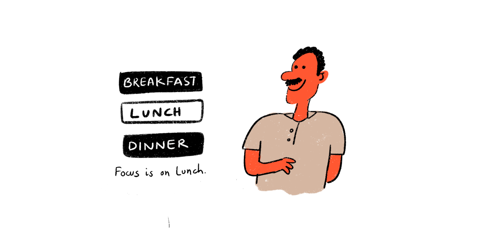
Avoid the use of only color as a tool to emphasize crucial information
When attempting to highlight an activity, communicate something essential, or prompt a response, don't rely just on color. Attempting to interpret such information is tough for people with vision difficulties. Instead, use indicators like patterns and text labels and visual cues like underlined text styles to highlight links and font weight.
When color is employed as the only distinguisher, elements that convey more complicated information, such as charts and graphics, can be more difficult to grasp. Labels, varied sizes, and shapes, among other visual elements, can help communicate information more effectively.

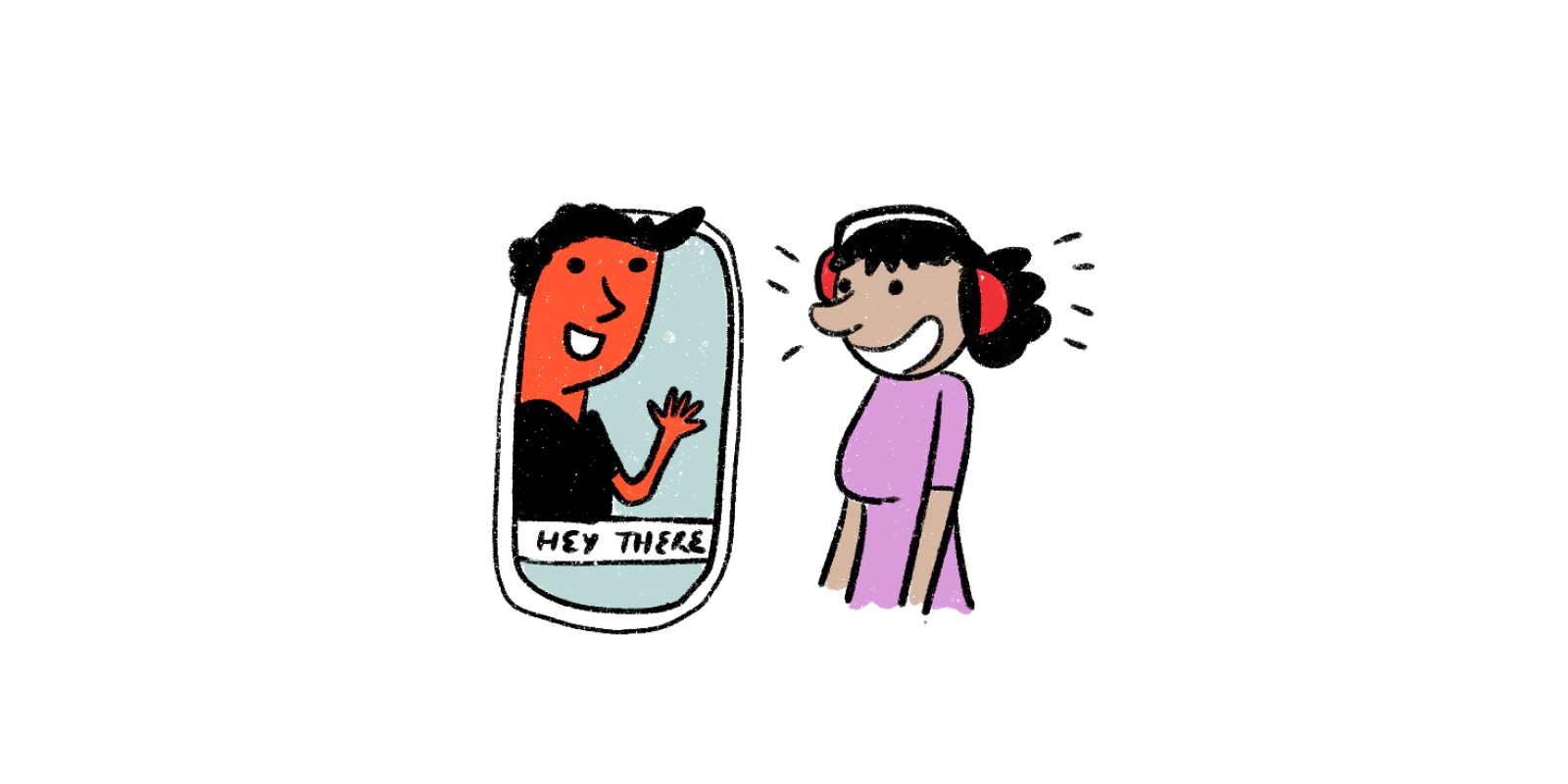
Providing closed captions for audio and visual media
Captions in media files become accessible to everyone. Closed captions should be included with all audio-visual media on a website. This not only improves accessibility for disabled and non-disabled people but can also assist those who are unable to access audio/video. Text descriptions for audio elements help search engines to process the information and also aid individuals who can't hear the audio due to situational, permanent, and temporary.
Using adequate color distinctions
Colour contrasts are one of the most overlooked problems related to web accessibility. People with low vision tend to face difficulty when reading texts on backgrounds with low contrasts. A World Health Organisation survey states that around 217 million people around the world have moderate to severe vision impairments which makes sufficient color contrast between texts and backgrounds a crucial necessity for all web platforms.
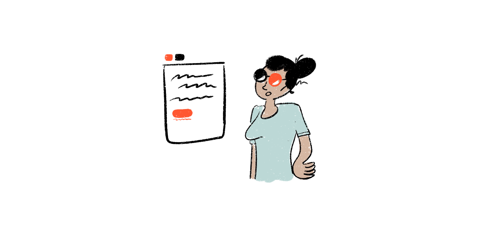
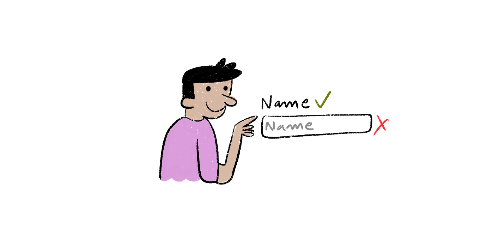
Using labels and instructions for form fields and inputs
Use of placeholder texts as labels can be one of the biggest errors when designing a form. Placeholder texts usually have a grey shade to them and have low contrast, making them difficult to read. People opting for screen readers usually navigate through a website opt to jump through sites using the Tab key to jump through form controls. So, any non-label text that’s present as placeholder text gets skipped.
The idea is to help people understand what they should do by writing it down in a form. When designers opt to hide directions and descriptions in forms by opting for simplicity, they compromise on usability. By providing essential cues, a person is easily able to complete a task with less to no friction.
Designing practical focus indicators
The blue outlines that surround links, buttons, and controls as highlights are known as focus indicators. When navigating a website, these help people understand where they are. They're especially useful for people who are blind or have limited movement and need to use screen readers.
Focus indicators serve to differentiate certain elements, such as hyperlinks, widgets, buttons, and menu items, from the rest of the page. They should be designed to match the website's and brand's style, with strong contrast and visibility.
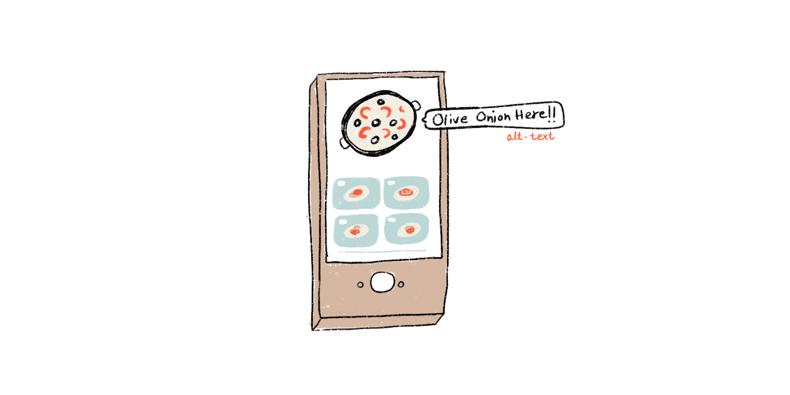
Writing alt. text for images as well as other non-text content
People who have low visibility often take the help of screen readers to hear an image and other non-text elements. Such tools help to convert text to speech so that the person is able to ‘hear’ the image. This can be done in two ways -
- within the <alt> attribute of an image itself
- within the context or surroundings of an image
Describing what an image conveys and how it relates to the narrative, helps in finding context to what is provided on a site. If an alt. text isn't provided, the screen reader simply reads the file name to the person and that provides a terrible experience to the person with a visual disability. By manually providing text that gives meaning to images, a person is better able to grasp the content and context of a page.
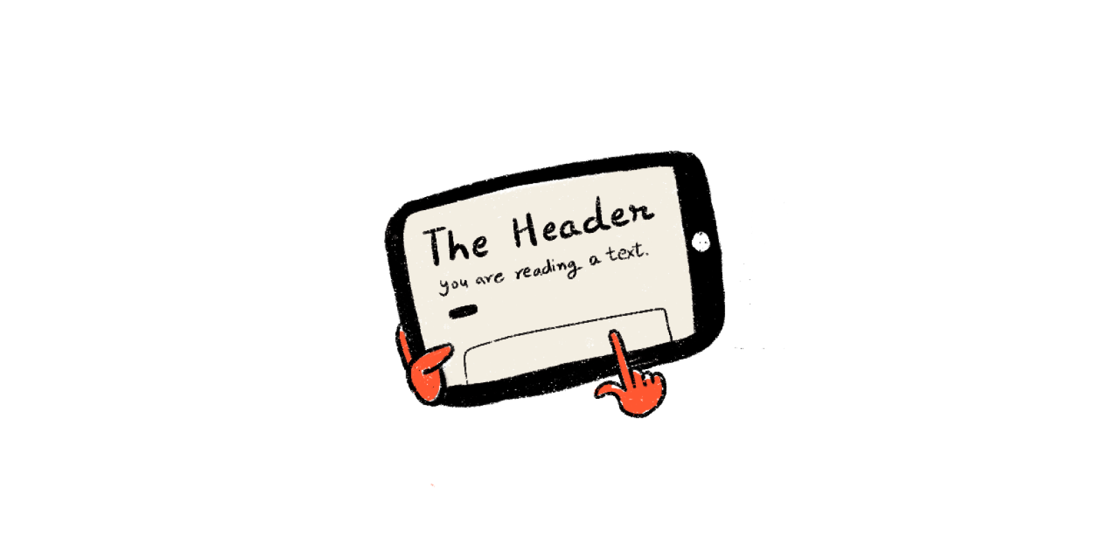
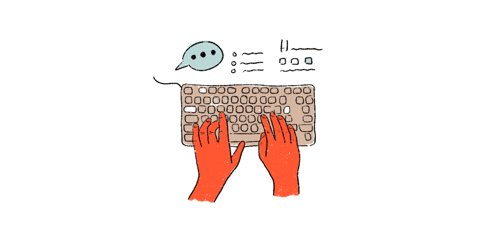
Using correct markups to a given content
Headings are the tags that are used to describe the intent and style of the text. They mark the beginning of the content. Headings are also useful for creating the hierarchy of text on a page. Readers can better understand content orders with larger font sizes. Heading tags are also used by screen readers to read the content. By reading the headlines in a hierarchal flow, those with low visibility can acquire a summary of the page.
Using the right structural elements while building a site helps to communicate to the browser what kind of material it includes and how it should be treated. The incorrect usage of markups can have a significant impact on accessibility. People using the site can simply access and hop material based on their needs and flexibility because assistive technologies navigate webpages hierarchically based on the structure of the heading.
Providing supportive keyboard navigation
Keyboard accessibility is one of the primary aspects of web accessibility. People who are visually impaired, have difficulty in coordinated muscle movements, and have motor disabilities mostly rely on the keyboard to access and navigate content.
When navigating through a page, the order in which the interactive elements are placed is crucial, as the navigation needs to be logical as well as intuitive. The tab order needs to follow the visual flow of the page, i.e. - header, main navigation, content buttons and inputs, and footer.
It would be a good idea to evaluate the site solely with a keyboard. This will assist in ensuring that all interactive elements are in working order. If the navigation can be done solely with a keyboard, the website's accessibility is already excellent. However, the size of the navigation should be kept in mind, as tabbing through lengthy menus can be too taxing for those with motor issues, and hearing long links can be exhausting for screen readers.
In conclusion
Designing for accessibility is a constantly evolving process. But, as designers, it is our moral obligation to champion digital accessibility experience, first and always. It helps to not just aid in the usability of the digital product but ensures relief to all users irrespective of their abilities, social and economic situation, age, location, and education.
Designing responsibly helps to ensure everyone has equal access to the web and its content. Providing accessible friendly options right from the inception of a product to its final release helps in ensuring that accessibility is a part of an idea throughout the development, right up to its release. Talk to our experts to know more about how we can customize design solutions that fit your accessibility needs.