

Front-end developers are responsible for the presentation and layout of the images on a website's user interface. It is the front-end developer's job to provide a positive user experience by following best practices for image implementation on the website. This blog will help with two essential aspects of image optimization techniques by showcasing the usage of the Drupal module Responsive Image and Image Widget Crop. It aims to make images look great and load quickly on various devices like desktops, laptops, tablets, and mobile phones.
However, challenges arise when the same image needs to be used across diverse components with distinct size requirements. These challenges impact storage, server load, maintenance, and overall user experience.
Challenges in Image Management:
1. Storage Redundancy:
Uploading the same image for different components may lead to Drupal generating multiple copies at various sizes, causing unnecessary disk space usage.
2. Server Load and Performance:
Generating and delivering multiple image derivatives can strain the server, especially on high-traffic sites, compromising overall performance.
3. Maintenance Complexity:
Updates or changes to the image become intricate when used across multiple components, requiring consistency across all instances.
4. Page Load Impact:
Loading multiple versions of the same image with significant size differences can result in slower page load times, diminishing the overall user experience.
5. SEO Implications:
Multiple versions of the same image may generate additional URLs, complicating search engines' ability to determine relevance.
6. Workflow Challenges for Content Creators:
Handling numerous images in Drupal can be time-consuming, intensifying the workload for content creators.
In Drupal, to address these challenges and enhance image management, leveraging features such as Drupal's image styles, responsive images, crop styles, and the media library can significantly improve the situation.
Implement Crop Styles with Ratios:
Drupal allows you to create crop styles that define how images are cropped to fit specific dimensions. Instead of creating multiple crop styles for each component, consider using crop styles with ratios.
Define a ratio for each crop style, and Drupal will automatically adjust the crop based on the specified ratio. This ensures consistency across different components while reducing the number of individual crop styles you need to create.
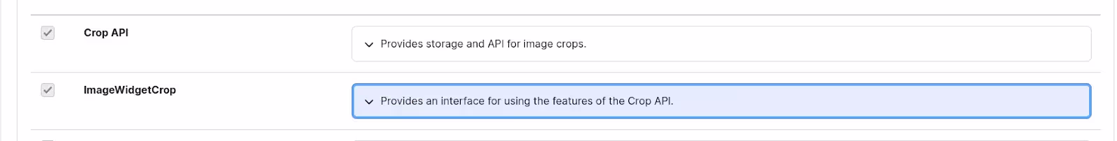
Implement ImageWidgetCrop module:
To enhance the management of images in Drupal and empower content creators with more control, the integration of the ImageWidgetCrop module can be seamlessly achieved alongside responsive image styles and crop styles with ratios. By installing and enabling the ImageWidgetCrop module, content creators gain the ability to visually crop images directly within specified aspect ratios. Responsive image styles can be configured to accommodate various breakpoints or device sizes, ensuring that images adapt appropriately to different screens. Concurrently, crop styles with ratios define consistent aspect ratios for images, minimizing the need for multiple crop configurations.
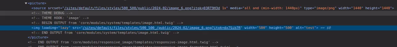
Use Responsive Image Styles:
Responsive images are images on websites that automatically change and adjust their size and dimensions based on different screen sizes or devices. Instead of creating multiple image styles for different components, you can create responsive image styles. Responsive image styles allow you to define multiple breakpoints and corresponding image styles for each breakpoint.
By using responsive image styles, you can serve different image sizes based on the user's device or screen size, optimizing the delivery of images without redundancy.
Here's a guide on how to set the ImageWidgetCrop and Responsive Image Style module in Drupal:
1. Image Widget Crop Module:
Step 1: Installing & Enabling Image Widget Crop Feature
- Download and install the ImageWidgetCrop module from the official Drupal website or by using Composer.
https://www.drupal.org/project/image_widget_crop
composer require 'drupal/image_widget_crop:^2.4'
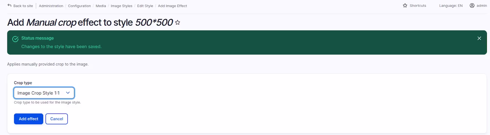
Step 2: Creating Crop Types
- Navigate to the "Configuration" page in your Drupal admin interface
Select ‘Media’ and then ‘crop type’
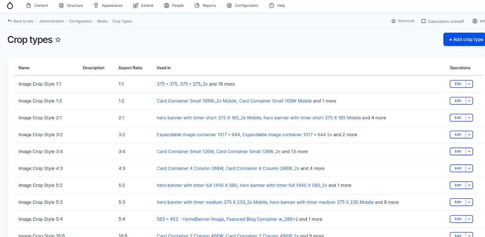
- Click on add crop type and mention name and aspect ratio
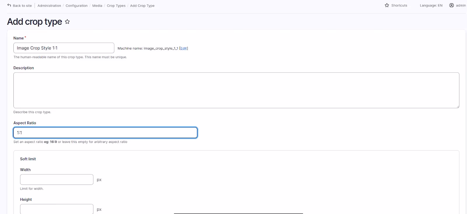
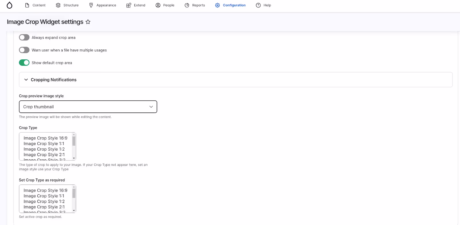
- Select Configuration > "Content Authoring" and then "ImageWidgetCrop."
Configure the default crop types or add new ones based on your requirements.
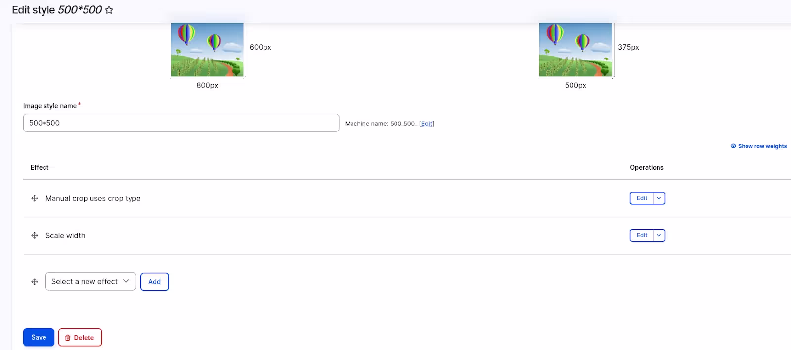
Step 3: Creating Drupal Image styles
Image styles are the tools that define how images are processed and displayed on your website. Here’s how you can configure them:
- Go to Configuration > Media > Image styles> ‘Add image style’
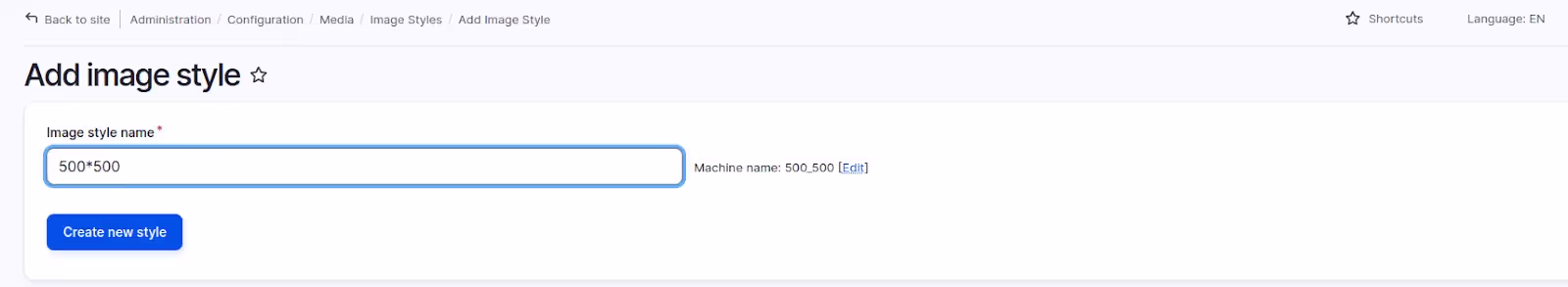
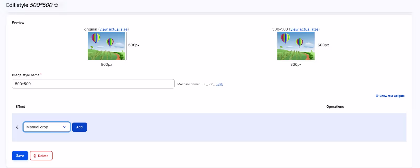
- Select Manual crop type option and choose crop type
- Once crop type is selected, Add Scale effect with the required width
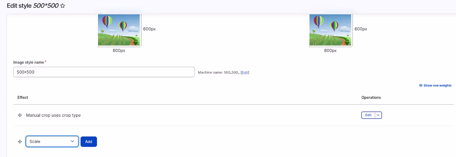
- Mention width value and keeping height value blank
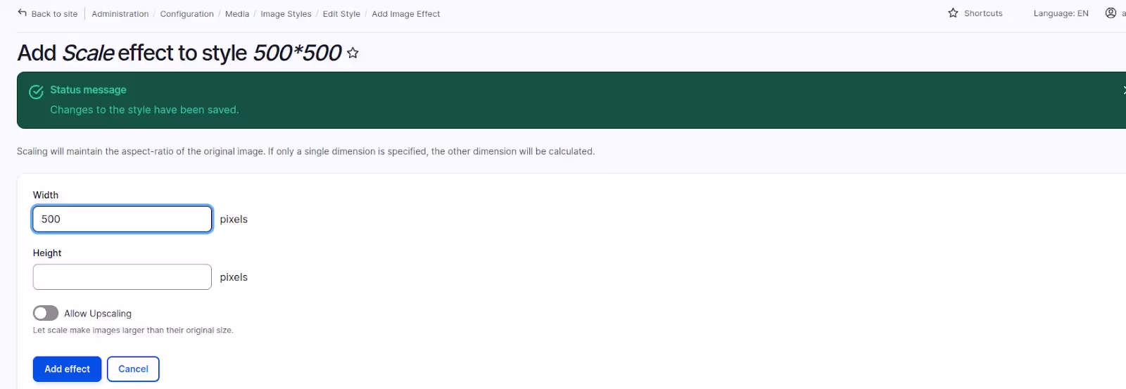
- Once cropping and scaling effects are added then just save it
2. Responsive Image Style Module:
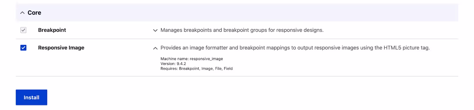
Step 1: Turn on the Responsive Image Feature
The Responsive Image module is now a core module for Drupal 8 and newer versions. By default, the responsive image module is disabled, so you just need to enable it to start using its features.
Step 2: Setting Breakpoints in your custom theme
Breakpoints are essential for deciding when images should change based on different screen sizes. If you're using the default theme, breakpoints might already be set. But if you have a custom theme, you'll have to define these breakpoints yourself.
Here's how to do it:
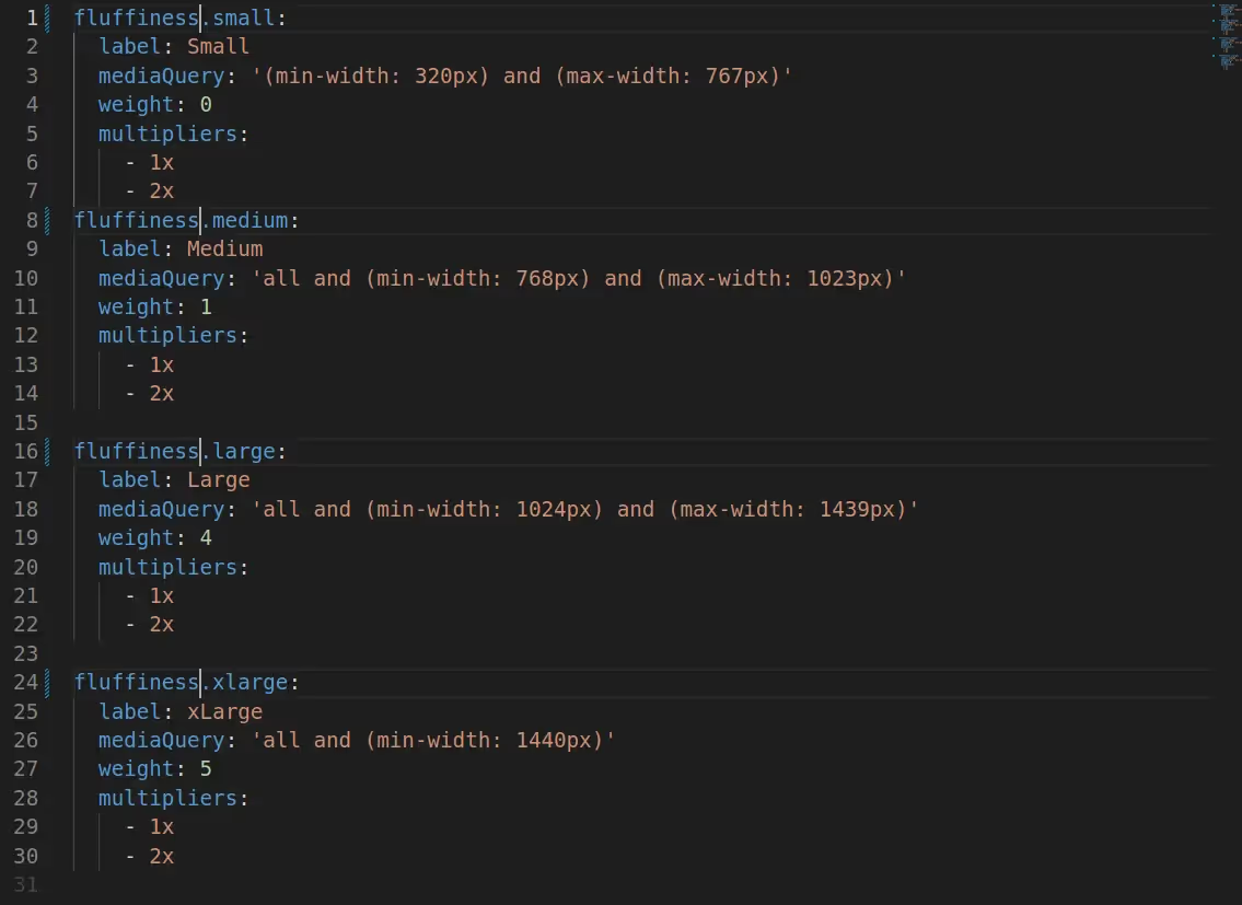
- Create or edit a YAML file named {theme-name}.breakpoints.yml in your theme's folder.
- Inside this file, define various breakpoints along with labels, media queries, weights, and multipliers.
Label: A label is like a name we give to different screen sizes. It helps us figure out how big or small the image should be rendered for each type of device.
Media queries: A media query is like a set of rules that decide when specific changes should happen on a website based on the device you're using. It's the condition that says, 'If the screen is this large then apply a particular layout or style.
Weight: Weight is like setting the order of instructions. It tells the website which rule to follow first in a specific sequence.
Multipliers: Multipliers show how much larger or smaller an image should be on different screens. For example, "retina" displays have a 2x multiplier, meaning they have twice the pixel density of standard displays.
For instance:
These entries assign different rules to different breakpoints, such as "Small," "Medium," and "Large." They specify when images should change based on screen sizes and the respective multipliers for varying resolutions.
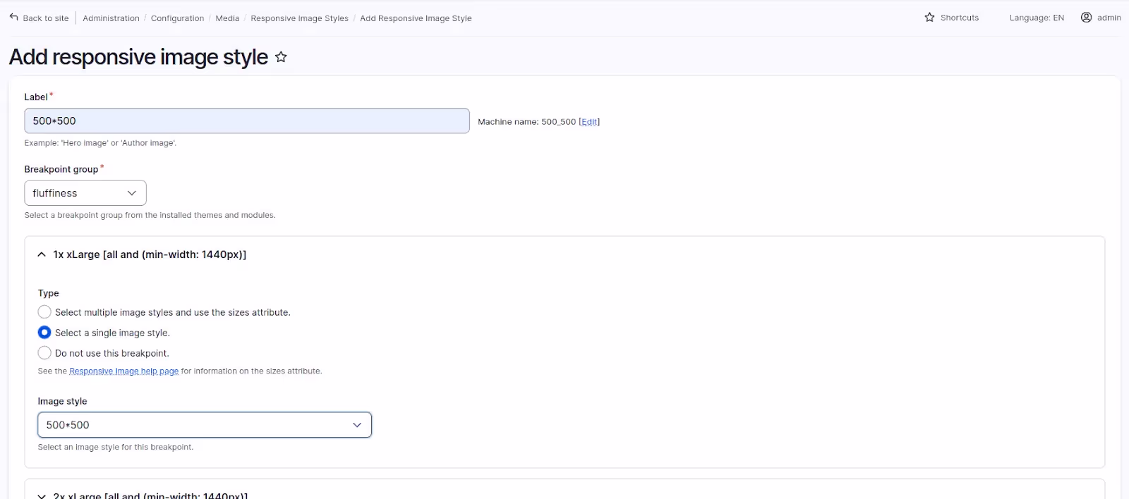
Step 3: Creating & Configuring Responsive image style - Mapping Image Styles with Breakpoints
Once you've established breakpoints and defined image styles, the next step is to create and configure a responsive image style that links these breakpoints and image styles. This ensures that the appropriate image style is applied based on the device's screen size.
To accomplish this in Drupal, follow these steps:
- Go to Configuration > Media > Responsive image styles.
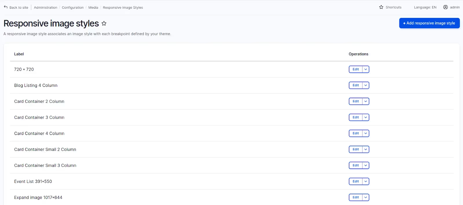
- Create a new responsive image style.
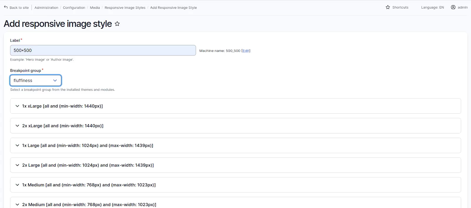
- Map breakpoints to specific image styles based on the defined screen size ranges.
Step 4: Using the Responsive Image Style in an image field
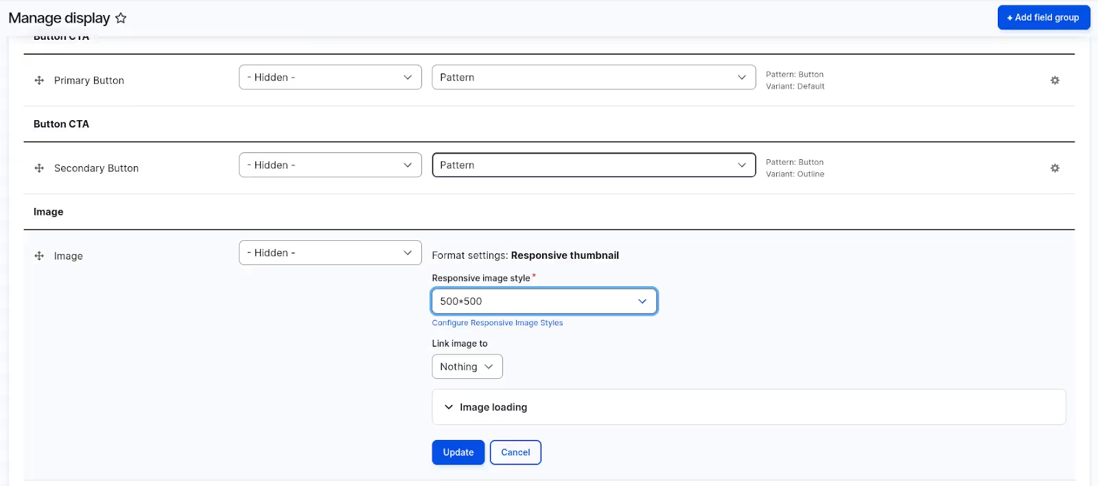
Now that you've created and configured the responsive image style, it's time to apply it to your actual content. This is typically done through an image field in your content types. Here's how:
- Edit or create a content type that includes an image field.
- In the image field settings, select the responsive image style you previously configured.
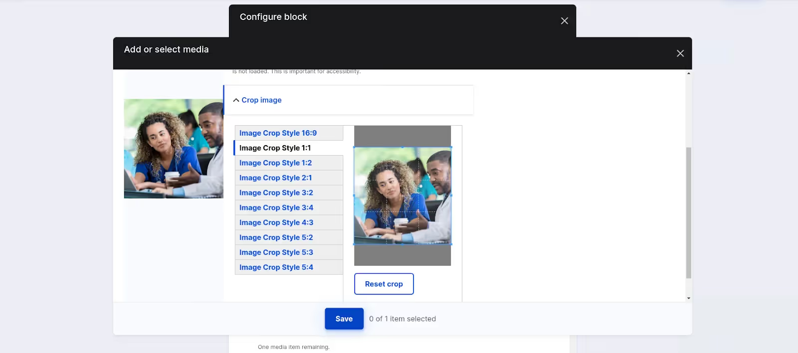
Step 5: Applying Crop Styles
Create or edit content with images and verify that the ImageWidgetCrop functionality is available on the image field, allowing users to crop images directly within the form.
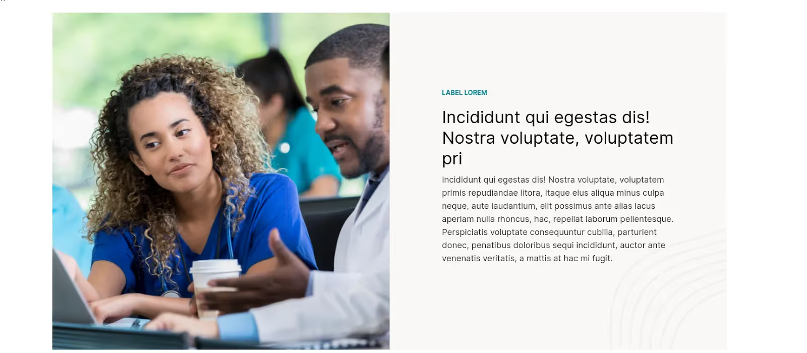
Result
Conclusion
In summary, our encounter with image-related challenges in Drupal – encompassing limited editing options, inconsistent sizes, manual cropping demands, and responsive design intricacies – underscored the crucial necessity for a comprehensive solution. Incorporating the ImageWidgetCrop module, particularly when paired with the responsive image module, stands out as a transformative remedy. This update not only effectively tackles our specific issues but also significantly streamlines the content creation process within the Drupal framework.
The ImageWidgetCrop module proves to be a pivotal advancement, providing enhanced editing functionalities, resolving sizing discrepancies, and simplifying manual cropping requirements. Its seamless collaboration with the responsive image module ensures consistent visual appeal across various devices. This transformative enhancement not only meets but surpasses expectations, exemplifying Drupal's adaptability and signaling a positive shift in our ability to deliver an optimized user experience.
This will make the user experience better, speed up loading times, and make sure images look good on different devices. It all adds up to a good browsing experience for everyone visiting your site.