

The Idea - React Native Custom Navigation Tabs
I was browsing through the internet in search of some custom navigation tabs needed for my React Native app. I found out that there are no good options available on the npm that provide good animations or customizations to the user. So, I thought of making an open-source module called ‘react-native-custom-navigation-tabs’ which enables the users to customize the tabs according to their needs and supports 5 different styling types with amazing animations.
This blog is a walkthrough of its development process and its usage. I will briefly talk about the APIs and other modules that I used for implementing animations. I hope you find this blog engaging and as a valuable addition to your knowledge.
Prerequisites
Nothing special is needed to develop this module apart from the react-native-pose module that is needed to perform some animations. But for most of it, I have used the Animated API of React Native.
The Development Process
Apart from conventional development, the animations are an added feature. I defined the TabBar component for each type and added the animations to the active route. A whole lot of things are passed as props to the TabBar when we pass it as tabBarComponent to the createBottomTabNavigator (you can see it in the Usage section below). The navigation prop is the one that contains all the routes and information about the active route.
Here we get all the routes and the activeRouteIndex from navigation prop. So while mapping the routes, we check for the active route.
Now based on this, we can pass our animated variable to the transform property of the style attribute.
The animated variable is initialized inside the constructor using the Animated API and its value is controlled by the functions that I have covered in the Animations section.
Animations
All the animations that you see in the gifs in the Usage section below are implemented using the Animated API of React Native. At first, it was a bit tricky to understand but the process became quite simple once I got the idea.
You may have seen that the active icon is a bit larger than the inactive ones or you can say it is a bit zoomed in. This zooming effect is implemented using the react-native-pose module. It could have also been implemented using Animated API but I wanted to test out this module and it's pretty simple to use.
react-native-pose
This module can create an animated version of any component and has built-in support for View, Text, ScrollView, and Image elements of React Native.
We can pass a configuration object to the posed component according to our requirement. Here, I am scaling my component to a value of 1.4 times the original in case it is active.
And in the JSX you just need to wrap your component inside the newly created animated component -
So, if a particular route is active, the Scaler will pick up the active configuration defined earlier otherwise will pick the inactive one.
It can do almost everything that the Animated API of React Native does, and maybe in a much simpler way. I am yet to explore more about it and if you wish to try, then do refer to these docs first, just to get a better idea of what this library is all about.
Animated API
Other animations like rotating the icon, animating the tab bar horizontally etc. are implemented using the Animated API. Some of the functions used are -
Animated.sequence([ ]) - to perform animations in a sequence i.e one after the other
Animated.parallel([ ]) - to perform animations simultaneously
Animated.timing() - to perform an animation over a period of time as shown in the above code example
Animated.spring() - to perform a simple spring animation
These are some of the glimpses of how Animated API works. If you wish to explore more about this API, then you can refer to my dedicated blog about it and also the official docs.
Clean and Simple Usage
I have developed 5 types of navigation tabs and the cool thing is, that the user can switch from one type to another just by changing a prop in the implementation.
- Import the TabBar component from react-native-custom-navigations-tabs
This imported component needs to be passed to the tabBarComponent of the createBottomTabNavigator as shown in the example below -
Let’s see tabBarOptions{} for all types one by one -
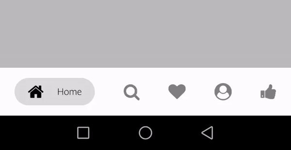
Tab type - light

tabBarOptions{} -
Tab type - dark

tabBarOptions{} -
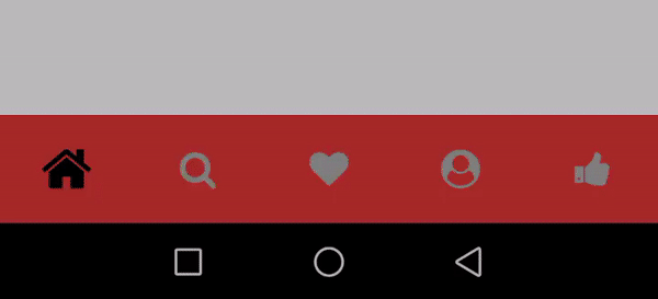
Tab type - colorFillTab
tabBarOptions{} -
NOTE: activeBackgroundColor is the background colour that each active tab takes. And in the case of colorFillTab, the keys should be the same as the labels of each screen/route with the first letter in CAPITAL.
tabBarBackgroundColor is the colour that the whole tab bar takes for e.g it is ‘#000000’ in case of ‘dark’ tab type and ‘#ffffff’ in case of ‘light’ tab type.
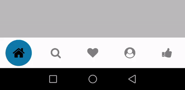
Tab type - bubbleTab
tabBarOptions{} -
Tab type - zoomInOut
tabBarOptions{} -
Important Links
Find react-native-custom-navigation-tabs on the following platforms -
The next step that I have in mind for this module is to add animations to the closing tab as the user moves on to the next one. This module will get timely updates making it more optimized and user friendly. Being an open-source module it is also open for contributions!
Looking forward to people trying and reviewing this module.
That’s all for today. See you in the next one!
Keep Learning!The Idea - React Native Custom Navigation Tabs