

Colors are a way of generating emotions and have the ability to engage consumers. When it comes to designing an engaging user interface, color is considered to be the most important aspect. The understanding of color theory can be a challenge, but when used in the right context, colors can convey enhanced meaning and add value to web products.
As we also explained in our previous blog post — From Hue to Color Story - A Basic Understanding of Colors — color is a powerful tool to communicate a specific mood and evoke feelings in consumers and the right use of colors makes a website or an application look more natural and put together.
As touch becomes restricted, it's important to consider how to make a website or an application more noticeable, promote business and engage the right users on the screen through colors.
The Effects of Using the Right Colors.
1. Colors coordinate the basic experience for web products.
The basic mood, overtone, undertone, experience and the concept of an application or a website are coordinated through colors. Colors create an overall harmony and set a recognisable powerful language for a brand.
A Research by the Institute of color research - CCICOLOR reveals that people make a subconscious judgment about a person, environment, or product within 90 seconds of initial viewing and that between 62% and 90% of that assessment is based on color alone.
For more detail on the CCICOLOR research -- https://www.colorcom.com/research/why-color-matters
2. Colors Influence Clarity.
The right selection of colors is an important aspect for readability and accessibility of the web products. Aesthetically stimulating color palette and balanced color stories influence usability, navigation, interactions and provide clarity of content to users.
3. Designing for a Specific Gender.
According to Kissmetrics, both men and women had the same general preference when it came to light and dark colors. The experiment also showed that women gravitate toward soft colors, while men like bright ones. What works on one site or app, doesn’t necessarily work on another. A color palette based on research as per gender results in captivating websites and apps.
For more detail on the Kissmetrics research -- https://blog.kissmetrics.com/wp-content/uploads/2011/03/true-colors1.pdf
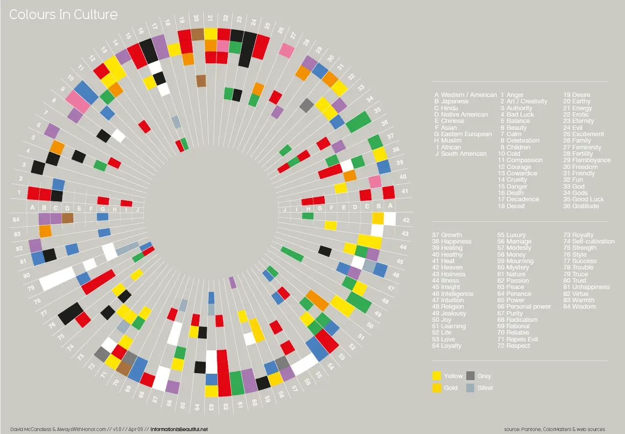
4. Designing for a Specific Culture.
The color psychology as we know differs from location to location, culture to culture and society to society. When it comes to designing a web product for a specific culture, it's important to consider the traditions and beliefs of the place to make the right selection and make sure that the colors are interpreted as they are designed to be.
Colors have absolutely opposite meaning according to the region they are placed in. For example, In some of the Asian countries, white color implies sorrow and is often used during obsequies while in European countries white signifies purity and is often seen during weddings. By acknowledging a culture's perception of color UI designers could engage right users by avoiding any possible misinterpretation about the product.
Make Right Color Selections.
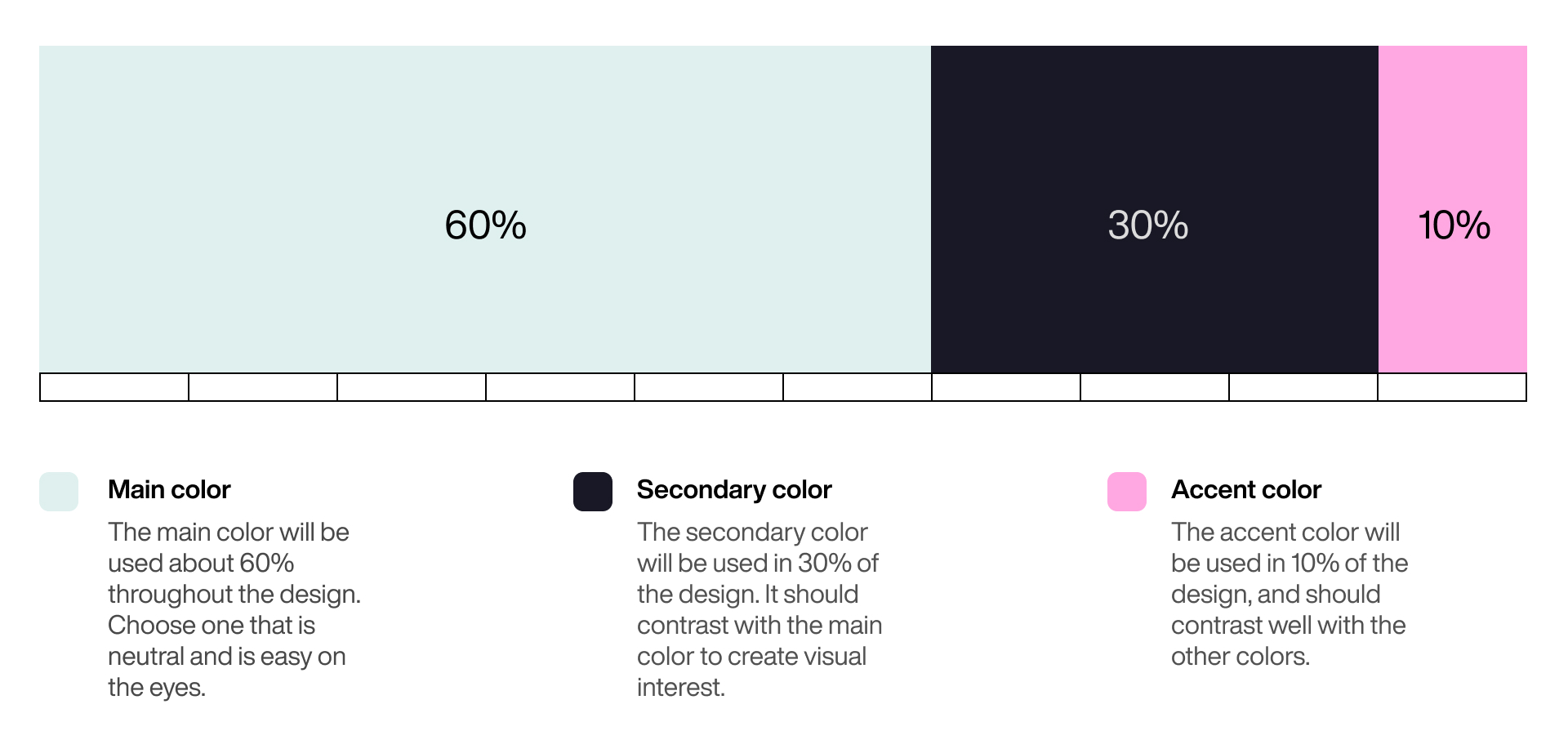
1. The Golden Ratio of Colors
The golden ration creates harmony and proportion through colors. It can be applied to many compositional elements in UI design.
While using the 6:3:1 Rule, designers have to choose a dominant color and use it in 60% of the space, a secondary color in 30% and a final color in the remaining 10%. The 6:3:1 rule eases the eye of users to move from one point to another comfortably.
Read in detail about the Golden ratio in color -- https://www.canva.com/learn/what-is-the-golden-ratio/
2. Blue Works
Blue is the lifesaver color in UI design and has a significant value in design. It is a cool color and some of the most frequent websites and applications - Facebook, Microsoft, Safari, Twitter, Shazam etc. have used shades and tints of blue as their base colors because blue as a color influences trust, is easily accepted and gives a sense of virtual realism to the users. Many surveys also show the majority of people see blue as their favourite color. Most common types of colorblindness (Protanopia and Deuteranopia) can also see the color blue.


3. Use Colors with a Purpose
No color is bad except when the wrong color is combined with the wrong UI design. All colors have unique characteristics and should be used with a purpose. When designers, design interfaces, the color libraries mostly have established meaning for colors such as red, green and yellow to show specific information such as error, notification, and caution.
The characteristics of a color used with another color help change that meaning completely. Is why it's important to understand how different color schemes create different harmonies, create a language for branding and deliver the right message through the web product meaningfully. As for example soft pastels and naturally derived colours have the ability to relax and calm the body and mind. These can be used on wellness websites and applications.

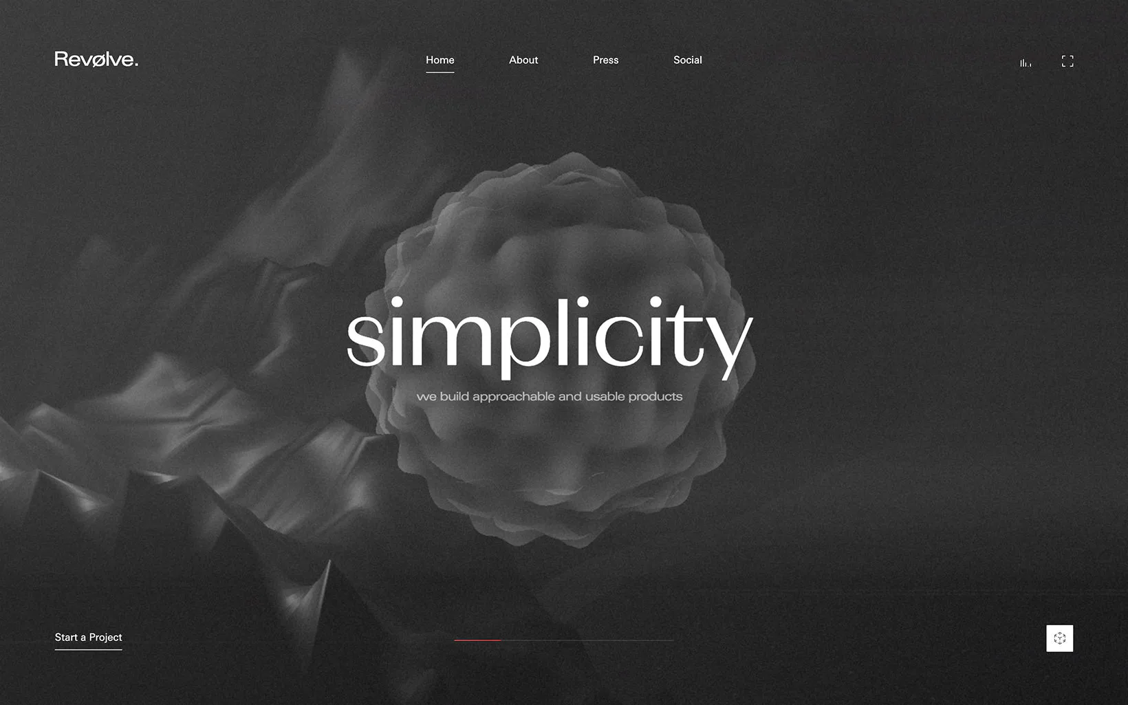
4. Simplicity
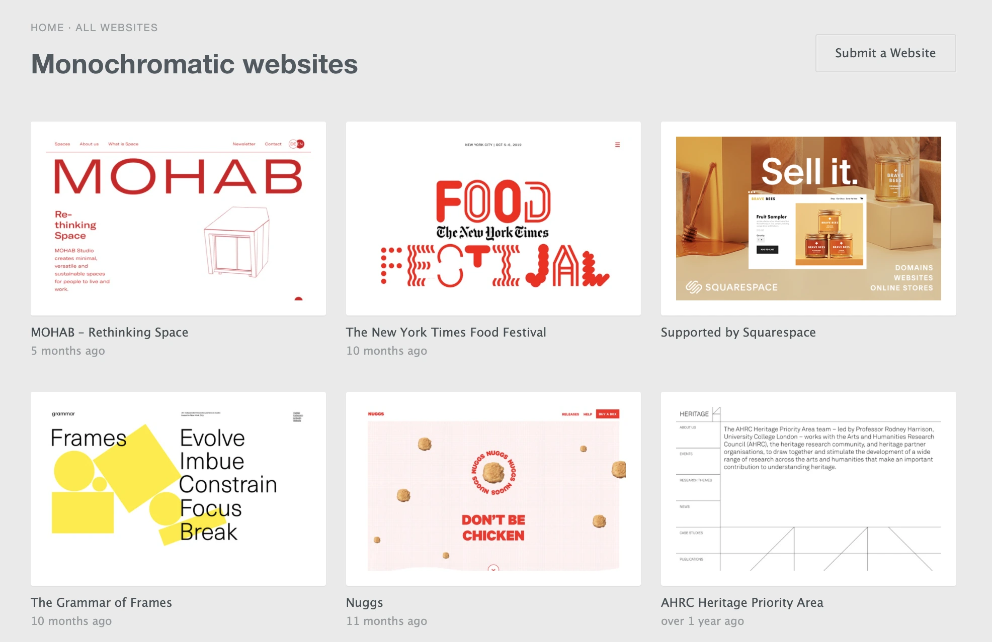
Simple color combinations improve user experience. If the human mind finds an application is easy to look at half of the job as a designer is done. A simple color scheme involving two contrasting colors or a monochromatic color scheme isn’t overwhelming to the eye and makes content easier to consume. Conversely, having too many colors in too many places creates a complicated interface and confuses the user.
For example using black and white colors make a websites and apps appear classic and simple. A monochromatic color scheme with shades and tints of purple can exude a magical. A monochromatic yellows palette depicts happiness and represent joy, intelligence, brightness, energy, optimism, and happiness. Different characteristics can be achieved with different hues depending on the initial concept and requirement of the project.
Selection of colors based on Color Schemes
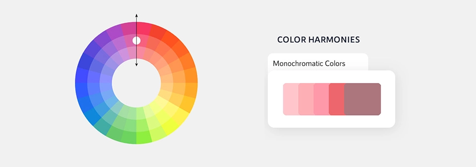
Monochromatic
Monochromatic is the simplest of all color schemes, as each color of the palette is derived from the same hue. This scheme goes well with concepts looking for a clean and cohesive look.
Possibilities for creating colors through a monochromatic color scheme is infinite. While creating shades for this color palette — darken the hue with black, for tones — desaturate with grey and to create tints lighten the base color with white.

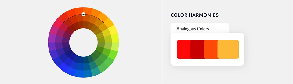
Analogous
An analogous color palette is designed with picking up colors with low contrast values of the same vibrancy. It is commonly used as a background for web pages and banners.

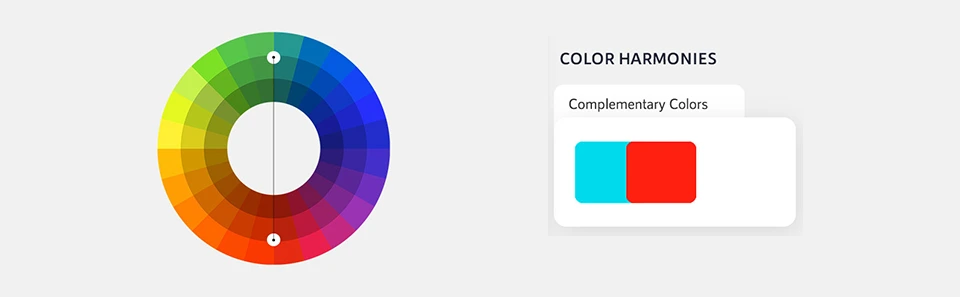
Complementary
Complementary colors are opposite colors with strong contrasting values. This color palette comprises of colors which are placed in front of each other on the color wheel. It is used when components in UI design need undivided attention. For example, A red button on a white background is likely to stand out on any interface than aqua or shades of grey.

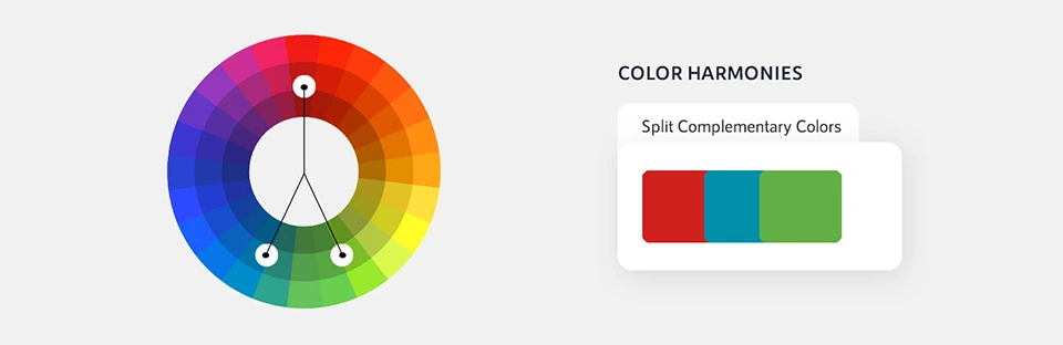
Split-Complementary
A split complementary color scheme is one where one primary color is used with the two analogous colors.
The palette is formed by picking two opposite bold colors and a third color next to any one of them. For example yellow works well with red-purple, blue-green, turquoise-violet and red looks good with green-blue-purple. These are fairly some of the examples, the possibilities with the split-complimentary color scheme are endless and depends on the concept of the web product and designer's perception of the end result.
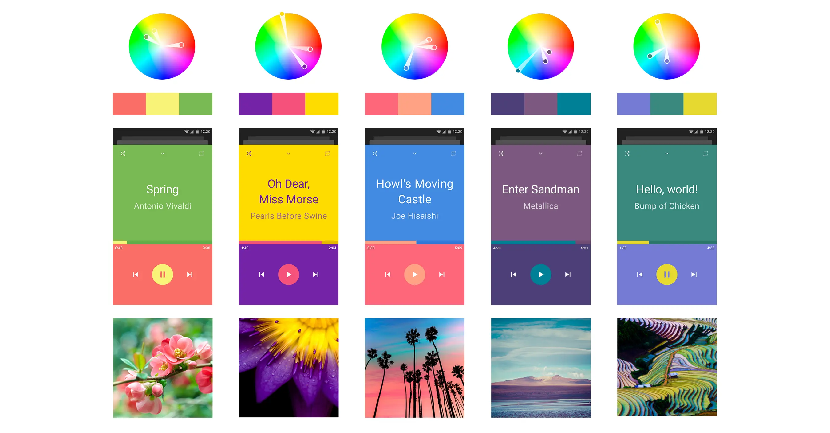
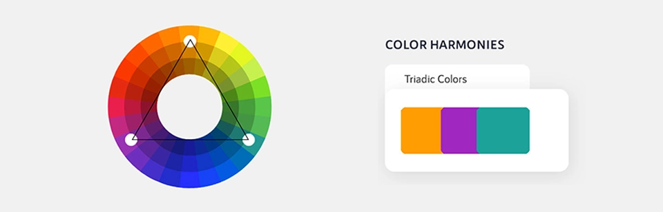
Triadic
Triadic color scheme is designed with three colors which are placed equidistant from each other on the color wheel. Triadic is considered to be one of most diverse and difficult color scheme. Most designers who use this color scheme select either two warm colors and one cool, or two cool colors and one warm. Trident color scheme usually creates overwhelming and visually muddled UI interface designs.
.webp)
Tetradic/Double Complementary
The tetradic color scheme is commonly used by experienced designers since it's slightly hard to balance palette with this scheme. It is created by using two sets of complementary pairs. The four colors from the color wheel should form a rectangle to achieve a balance tetradic color scheme. This hard to create scheme creates an appealing vibrant effect.
Custom Color Palette
Creating a color palette as per the concept isn't as hard as it sounds like for the UI designers. Nature is a reliable source of inspiration for the same. A picture of a landscape reveals how colors fit in together naturally and in the right proportion to each other and are visually soothing and relatable for users. A color palette can also be created with the help of various tools available online.

Adobe Color CC— Create color schemes with the color wheel or browse thousands of color combinations from the Color community
Coolors.co - The super fast color schemes generator— Generate perfect color combinations for your designs
Paletton - The Color Scheme Designer— In love with colors, since 2002. A designer tool for creating color combinations that work together well.
Designing For Color Blindness
Around 8% of men and 0.5% of women in the world are colorblind. How the app or a web page appears to the users with visual impairments is extremely necessary.
UI designers should responsibly design multiple visual cues to communicate important states. Colorblind users see the colors different from as they are which is why colors solely shouldn't define consumable information instead use other elements like strokes, patterns, text, texture and pattern to describe the action of the content.
Adobe Photoshop has useful tools to simulate colorblindness, the different feature of photoshop allows designers to see the screen as it will look like to users with a different form of colorblindness.
Other colour-blindness simulators that can be used while designing for accessibility —
Stark — a paid Sketch plugin that will let you simulate different types of color blindness.
Color Oracle — a free color blindness simulator. It uses the algorithm for simulating color vision impairment, so you can see colors as they are seen by colorblind people.
Toptal’s color filter — this online tool lets you test your website and shows you how people with different color blindness will see your pages.
Conclusion
As visually appealing as the colors must be they should also contribute to designing usable and clear interface. For a UI designer, the basic tool for the selection of appropriate colors is a good color wheel. The primary colors of the color wheel comprise of Red, Blue, Green and the secondary colors are Green, Orange, Purple. UI designer should avoid colour-coding small elements with complicated colors, and instead use black, white and grey for fine details.
Color choice can be personal, cultural or conceptual and color theories are a part of complex science. Implementation of both art and science creates effective designs with complete knowledge and understanding of the final color palette.