

The presence of any website or application has a purpose. It either provides solutions, services, products, entertainment, or knowledge. To avail or add to these, it generally requires a user to click on a component called ‘Buttons’. Buttons help us do things. It helps us complete tasks and aids in interacting with the web.
Buttons are one of the most versatile components in a design system; they initiate actions such as adding, removing, confirming, jumping to pages and completing tasks. Buttons help make important decisions and are often suggestive of options to choose from. Buttons tell users what they can do and help them interact with a product. Buttons aid users in taking control and interacting with a platform.
Buttons are where one implements a design language's foundational attributes in ways that sweep through more complex components later.
Buttons are interactive components that allow users to take an action.
When setting up the foundation for buttons in a design system, it is crucial to make it easily identifiable. Each button serves a specific purpose. To build a strong foundation for buttons in the design system it's important to understand the various types of buttons. The different types of buttons depict the nature and the function of the button respectively.
Primary buttons
These are default buttons. Primary buttons are those buttons that the user is likely to select or a website is likely to suggest. It includes primary actions that a user is expected to take most often. These buttons will reflect the brand’s voice which will have a domino effect on the rest of the buttons and hence, the overall look. They should have good visibility and should be an expression of a system’s style.
Secondary buttons
Secondary buttons are those buttons that are presented to the user, should the user choose not to go with the primary button. These are optional buttons that need to be placed next to primary buttons. The idea is to give this button a minimalistic essence of the brand’s color. These buttons should not be saturated with the choice of the brand’s color.
Link buttons
Link buttons help users to navigate to different pages. They are either underlined or depicted in a different color or both. We generally place these buttons where additional information cannot be displayed. This is done to avoid the users from getting overwhelmed. Additionally, it redirects users to a different page.

Ghost buttons
Some buttons do the job that other buttons cannot. Ghost buttons are positioned in places that help users easily eye-track for extra information. It is a clean UI that declutters real estate and informs the users of potentially possible options that lurk in the background. They are versatile and should be used tactfully.

Floating action buttons
These buttons are used as primary action buttons and do not contain text. They are widely recognised as round-shaped buttons with an icon on them. Sometimes, they are static buttons that appear on-screen even if the users scroll through the application or website. These buttons do the necessary conversions. They are positioned in convenient visible spots.

Specifications of Buttons
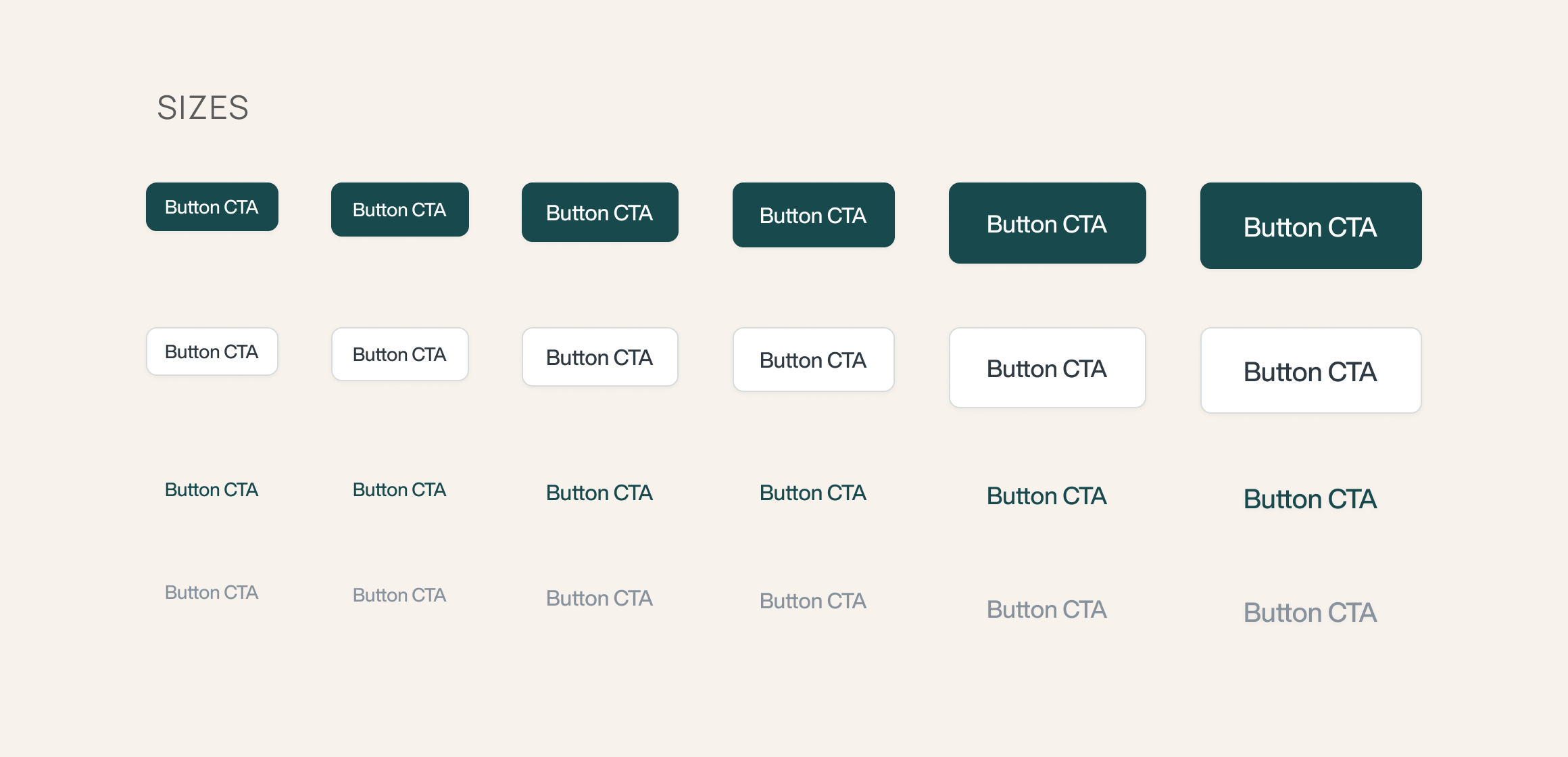
Sizes
The future is uncertain but for now, we can make responsive buttons that can adapt themselves to the change in the environment. Creating a range of buttons to accommodate different screen sizes and proportions helps to easily adapt.
It is also important to space buttons properly. You do not want to tap on a button only to find the neighboring button has been clicked. So, space and size them out well.
Hierarchy
The hierarchy of buttons depicts in which format the buttons are arranged in the design system. They could be arranged according to their use, depending on the products they are going to serve (if known), simple to complex, or according to their preferences.
Example: For an online grocery store, the button hierarchy will dictate two kinds of buttons, i.e - One is adding to a cart, second is checking out. Based on this use case, the template will have buttons presented according to their usage preference.
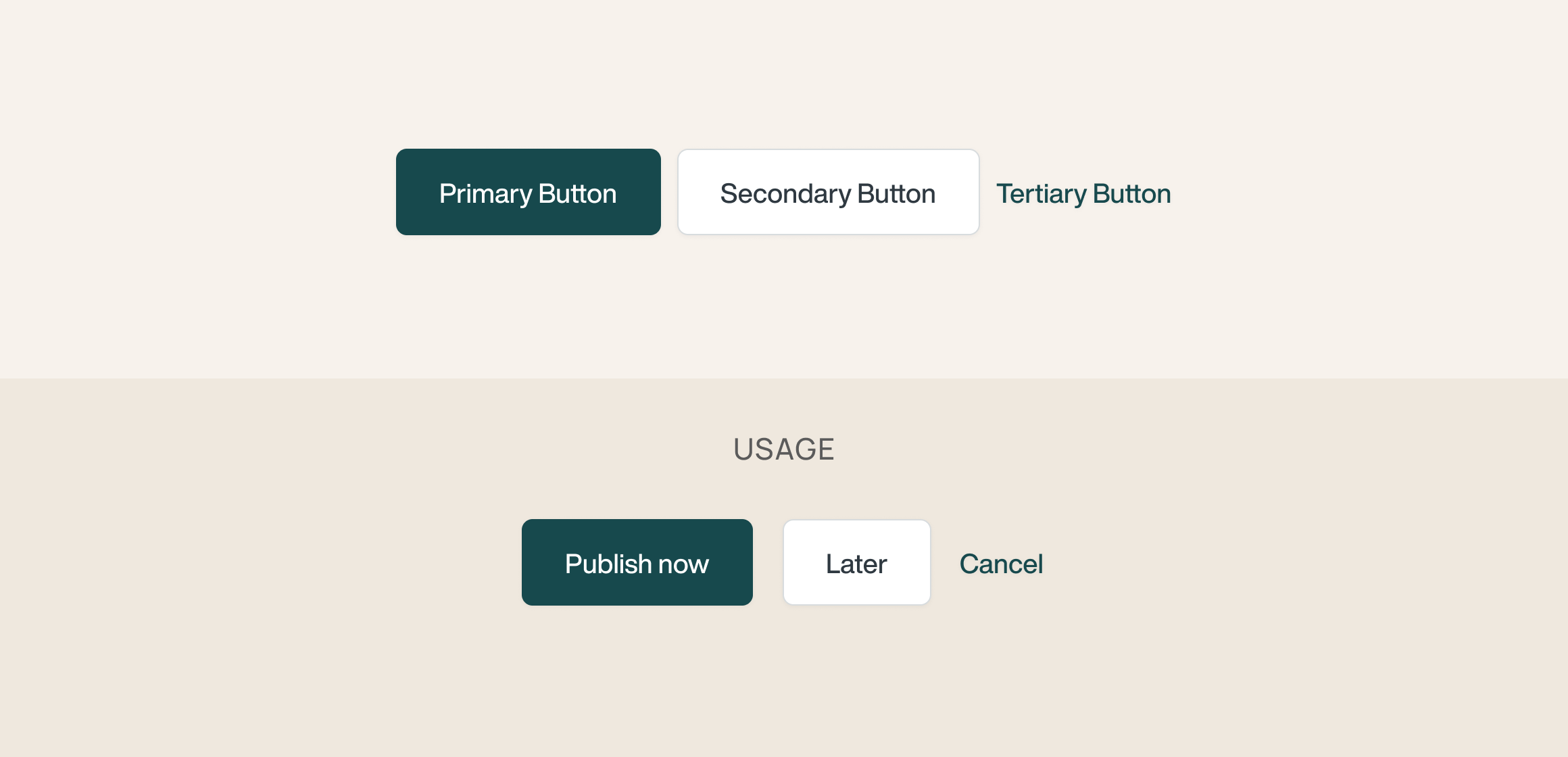
Variants
Variants are the different versions of the same button that are available to the users. Sometimes design patterns warrant a light or dark theme. Based on this, an alternative button is available that increases accessibility.

States
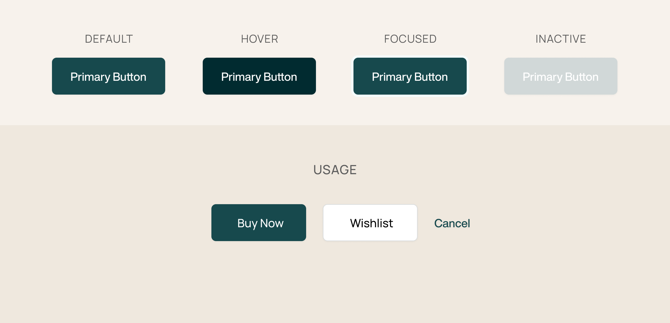
When documenting buttons in a design system, it is essential to add additional appearance details such as the state of the button. This makes for a seamless user experience as it gives the idea to the user about the button’s state. It depicts the various ways a button is represented in different forms. It can be expressed in different ways - by altering colors, shadows, icons, etc.
The state of the button informs users of what a button looks like in a hover state, the appearance of a button when it is inactive, how to know if a button has been activated, and whether the action is taking time to process aka the loading or the in-progress state.
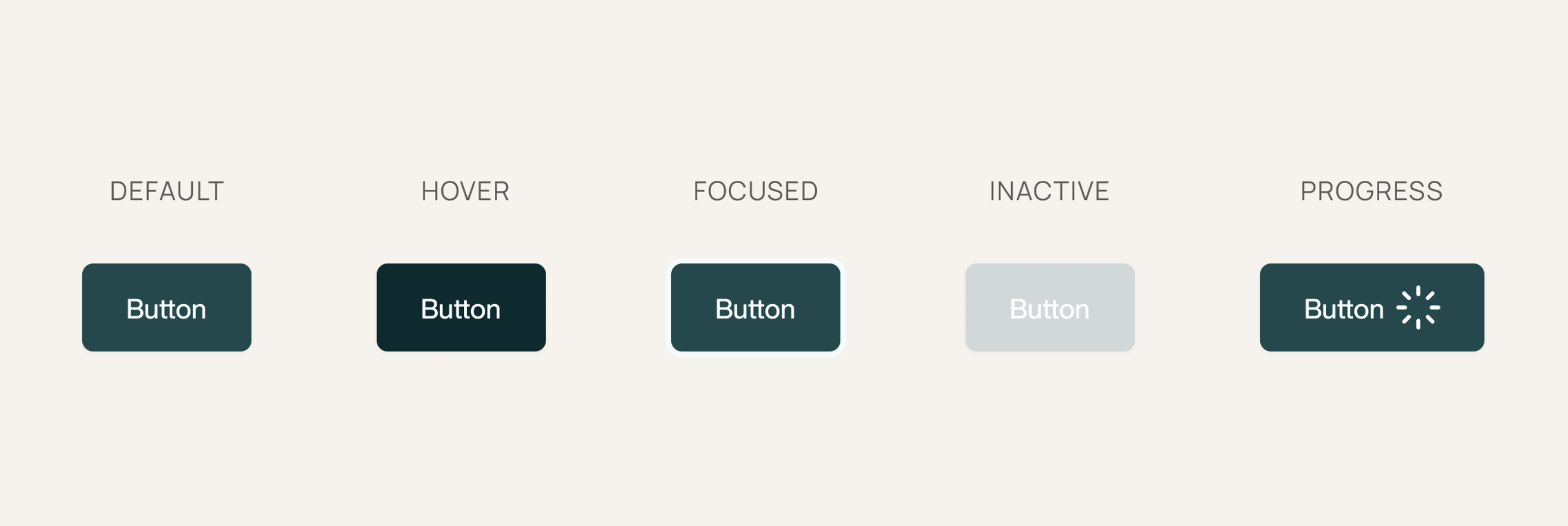
There are different states of buttons and they are depicted the following way:
Default state — State of the button when idle or no interaction has taken place.
Hover state — State of the button when users hover the mouse on it. The hover state is not applicable on tablets or mobile phones.
Focused state — It denotes the active state of the button when users click on it.
Inactive state — State of the button when it is unavailable to the user for interaction. When a page requires a user’s attention for payment or confirmation, inactive state draws attention by asking users to confirm an action before proceeding. The inactive buttons are disabled states that get active only after the user has confirmed an action. These are present to give a decision time to users that prevent future mishaps. They are crucial buttons that prevent mistakes from occurring.
For example: If I ordered 10 items from an apparel website and the total amount exceeds my budget, an inactive button gives the users a small window to decide what to do - Remove some items or continue with the payment.
Progress state — State of the button when an action is triggered and in the process of being completed.
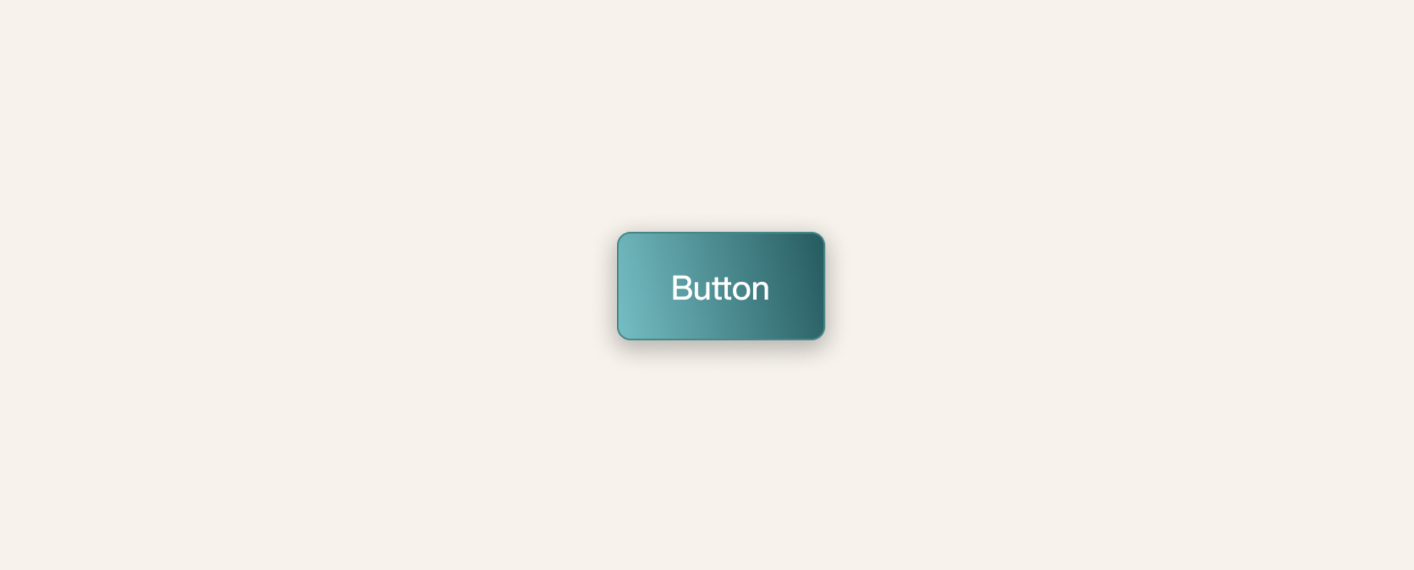
Shadows & Gradients
Adding shadows and gradients to buttons helps make it more realistic and aids in making it stand out from the background. It makes users feel at ease and gives a layered effect. This is called skeuomorphism wherein a design mimics its real-world counterparts.
Buttoning it up
Buttons are the quintessential component of a design system. For a button to serve its purpose, it should be designed to be easily identifiable, placed in view where they are quickly discoverable, and adaptable with different design attributes and devices.
When documenting and designing buttons in a design system, mention the types of buttons available, their functions, and other detailed specifications mentioned above.
It is of great significance to keep in mind that buttons are the first of the simpler components that cover the niche brand attributes. These help to define the initial style of a product.
Buttons are where you cross the bridge from basic to refined elements. A button, when designed properly, boosts the overall financial health of the system. When designing buttons, we reckon with both the existence and identity of the same.