

If we begin to understand colors in the way science describes than it would be that "color are the light wavelengths that the human eye receives and processes from a reflected source". Complicated right? Well at least to speak about, In design, a good color palette is what looks good to the eye and how it makes you feel when you see a particular composition of colors. So let's speak of it and also obviously look at it since we are speaking about colors from the implementation point of view.
Understanding different kind of colors is crucial to effective composition in interface design and having a rational understanding of color creates a color story that speaks for itself.
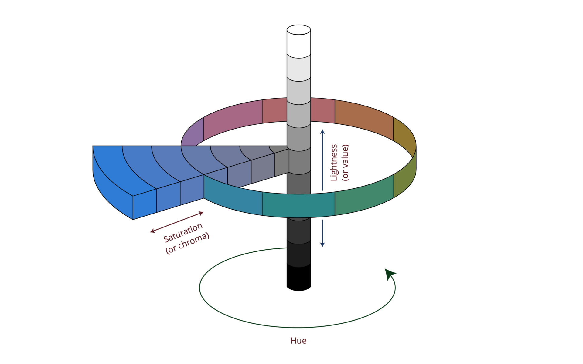
Hue

Hue is how it looks. It's the identification of color as it appears on the classical color wheel "its the purest form and essentially refers to a color having full saturation"
The pure spectrum colors commonly referred by the color names are- red, orange, yellow, blue, green violet. All hues can be mixed from three basic hues, known as primaries — red, green and blue. Colors with the same hue are distinguished with adjectives referring to their saturation and lightness.
Value
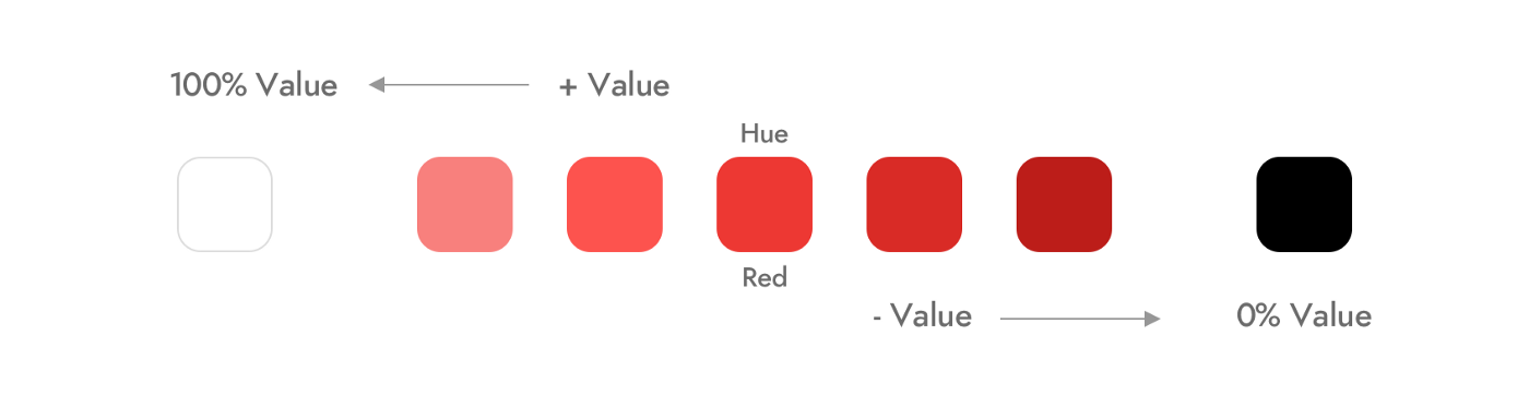
A value of color is the first step in further defining a color beyond its hue. It is described as the relative lightness and darkness of a color. The value also indicates the quantity of light reflected. When referring to pigments, dark values are called “shades” of a particular hue. Light values with white pigment added are called “tints” of one specific hue. The contrast of value separates objects in space, while gradation of value suggests mass and contour of a surface.
Designing with color schemes based on varying color values helps to create a balanced color palette.
Intensity
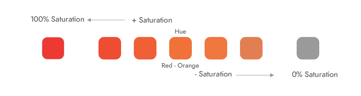
Intensity, on a definitive level, is the amount of purity in the hue itself. Primary colors are considered to be the most “pure” in intensity. Saturation is the intensity of color and the intensity of a color also refers to its saturation level. Highly intense colors are bright and low-intensity colors are muted. The intensity of a color is adjusted by adding additional colors to the pure hue.
Temperature
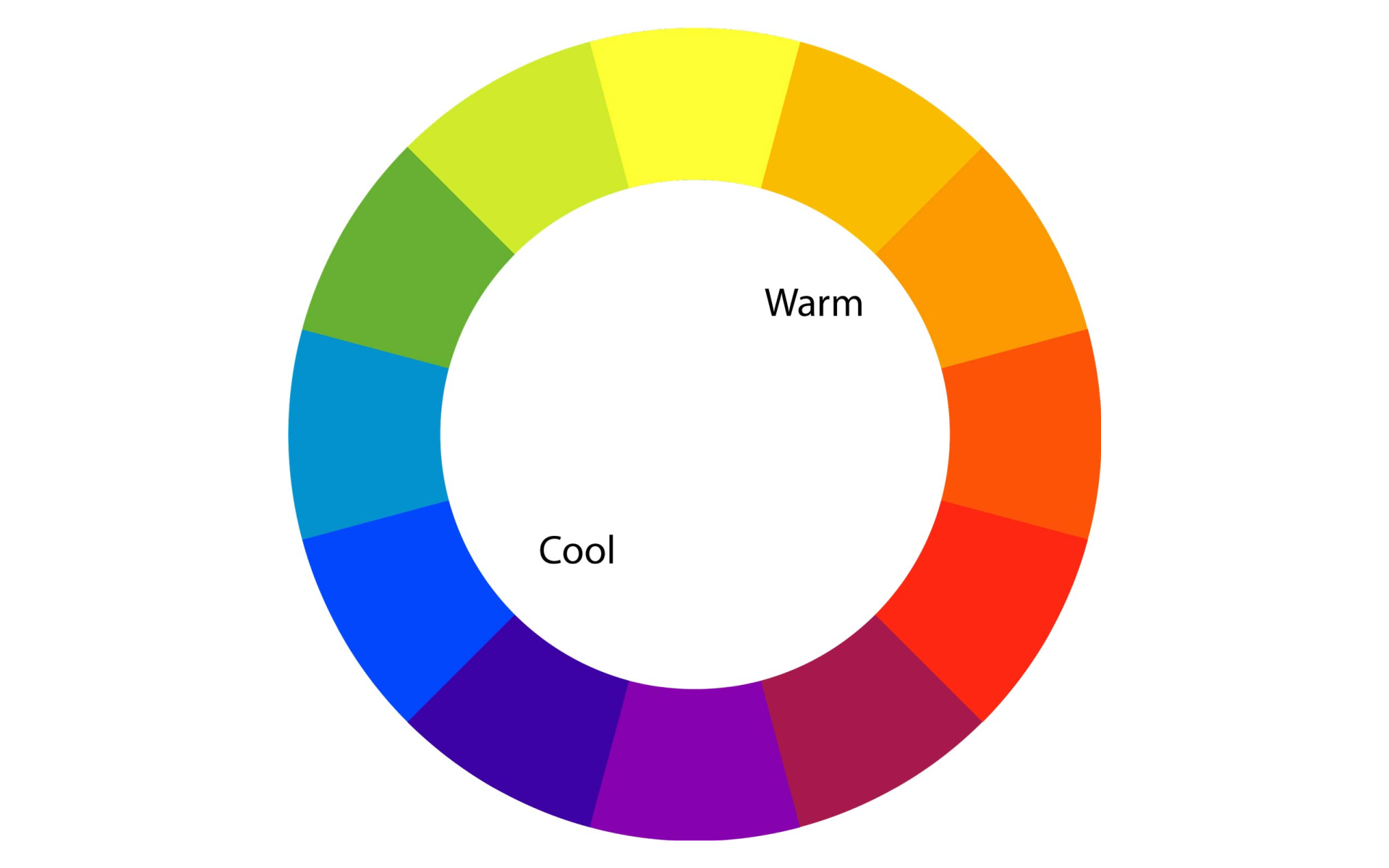
The color temperature is the most subjective and visceral way of describing colors. It refers to how “warm” or “cool” a color is, reds, oranges and yellows are considered as warm colors, and blues and greens are considered as cool colors which are triggered usually by psychological influences — as water, ice and clear blue sky are associated with the calmness of blue and red is associated with environments and objects that influence warmth such as fire, blood and sunsets.
The temperature of light plays a determining factor in the color temperature. The hue we see under a warm light is vastly different from how we see in under cool lights. Creating color palettes based on color temperature is a way of evoking feelings which are more tactile than visual.
Color Pigment
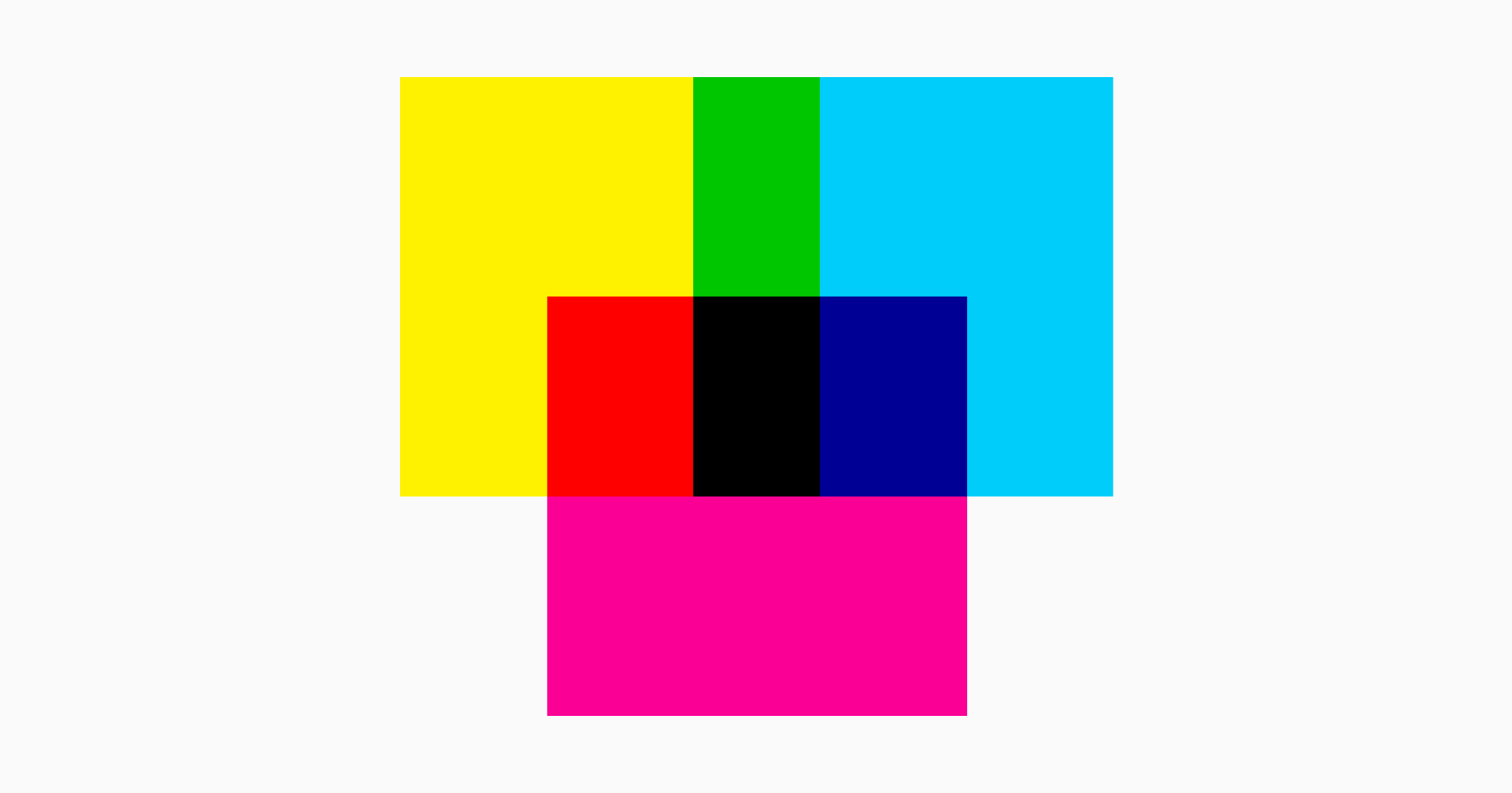
An important system of colors that needs focus pigments. Usually, the design process involves drawing on paper and converting the same into a computer screen. The same design could also be converted into an object or a printing on paper. It's difficult and sometimes nearly impossible to get the exact similar colour from one medium after another. Here is why, the computer screen exhibits colors in RGB mode which is — red, green and blue whereas printing utilises and works on the CMYK mode which is an abbreviation for four inks used in the paper printing process — cyan, magenta, yellow and key or key of the Black key plate.
One of the most difficult aspects of this conversion is properly converting RGB colors to CMYK colors so that what gets printed looks the same as what appears on the computer screens.
Color Trend
Colors are a form of expression. Forecasters create color trends based on details analysis of consumer psychographic, demographic and other details which usually takes about a year or more to get created and is always way ahead of a particular season or year. What's set to become a standout colour for the season — the saturated and intense hue of orchid flower or is there a shift to optimist brights? Which colors are likely to gain a strong appeal inciting feelings of positivity and vitality? All the answers to curious questions about colors can be found in the forecast studies and selection of color trends should be studied, perceived and used as per the industry involved.
Digital platforms provide new meanings and possibilities for brands. These platforms are a huge way of consumption for the consumer now than ever. A consumer's entire perception of a brand can change over the right and on-trend use of colors which also saves the market from unexpected directions.
Setting up a Color Story
A perfect color story is precise and created by using the language of the concept. Pay close attention to perennial and carry-over colors – especially between earthy hues, blues, brights and pastels. Think closely about which archive shades can be revisited and will best support the final design. Look to fresh interpretations around your season of launch. Work into commercial core and speak for the brand inclusively.
While presenting the color story there has to be an understanding of colors from the screen to sample, colors should be presented on a neutral background in the context of the total color treatment. This certainly allows the final product to completely reflect the colour intended to use in design. The impact of colors is also relative to the area it covers, so color chips on screen and on paper should be presented in the proportion of their usage.
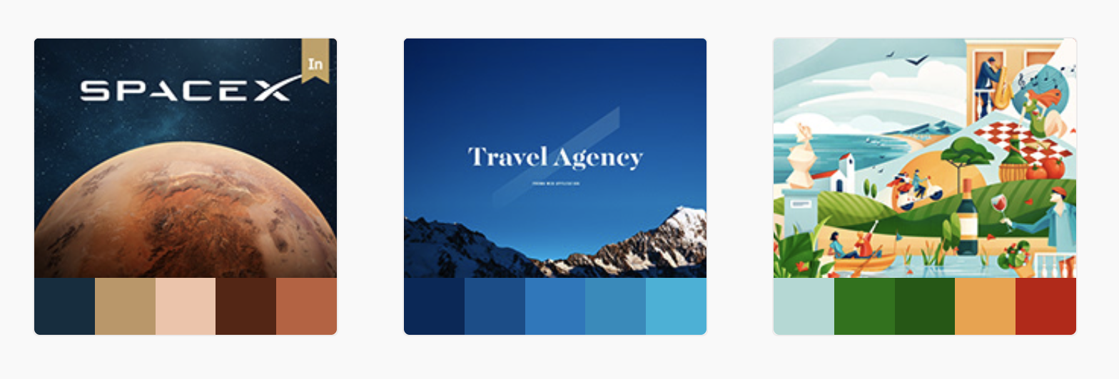
Creating a color story that makes the interface look nice, clean and elegant isn't always easy but is easy with one step at a time. The following sites can be used to help create a balanced color palette. These great help tools use images and designs to illustrate how different colors work together.
https://color.adobe.com/trends
Color is a powerful tool to communicate a specific mood and evoke feelings in consumers and if used in the right way it can increase brand recognition. The right use of colors makes a website or an application look more natural and put together. Since we have spoken about the basics here we hope it helps you create an impactful color story. There is more to color theory and we will make sure we post more about it.
Happy Designing!