36 days of type is a project challenging visual artists to create a letter or number a day for 36 days, exploring different media and pushing the boundaries of creative expression. It also marks a great time for illustrators, typographers, and graphic designers to experiment with their craft and it also provides a platform to make a statement with one’s work.

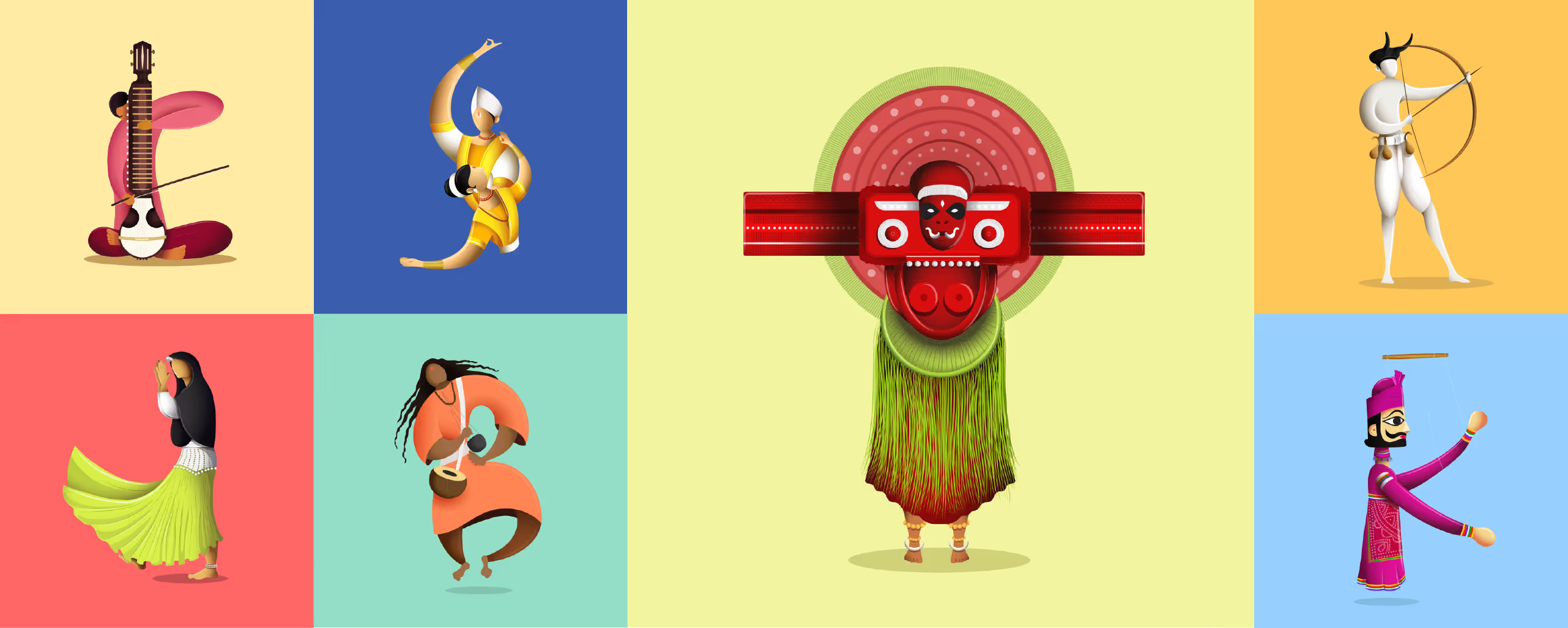
This was our first time participating in the worldwide phenomenon of #36DaysOfType2017 - fourth edition, and we were more than excited to take up this challenge! Since it is an open challenge and the amount of experiment that we could do was infinite, it took some time to decide the theme that we would be choosing. We wanted to give this project an illustrative spin and also wanted to showcase India’s cultural extravaganza. That’s how we decided to illustrate the performing arts of India through letters and numbers. These performing arts include dance, music, theatre and martial arts practiced in all the states of India.
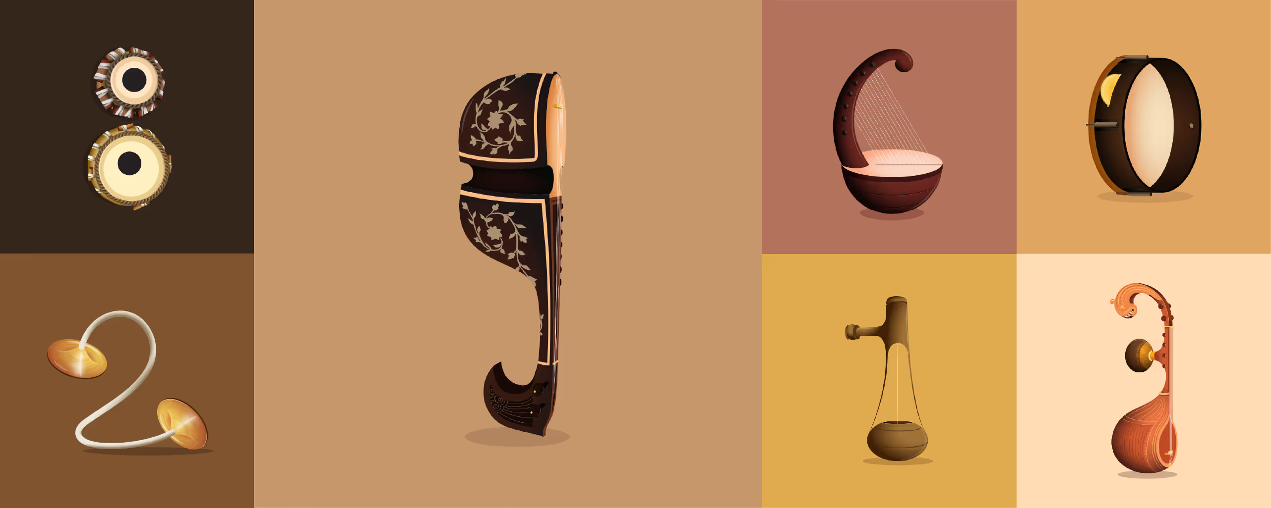
This series is meant to highlight India and the diverse manifestations of India’s cultural beauty. It also aims to identify even the art forms that many people are not aware of or the dying art forms of our country. The letters have been directly or indirectly represented as a form of dance, music, theatre or martial arts while the numbers have been represented as Indian classical musical instruments.
Why we took this challenge
We’ve been asked a few times - what was the reason behind taking up the 36 days of type challenge? Well, to describe it in a sentence, creative expression knows no bounds and we should not let any opportunity slip away that lets this creative energy expand.
However, we had more reasons to participate in this challenge. It requires everyone who is participating, to post something everyday. This helps us to be pragmatic, sensitive to time and maintain a design discipline. It is a challenge to express our creative thoughts being within certain limitations. Letters and numbers have a predefined structure and form, which defines a boundary of expression. Thus, this challenge is a great way to express with shapes, forms and constitutional limitations.
Since, we were showcasing performing arts of India, all the characters required extraordinary amount but time bound research which made us better in researching about a topic in a short span of time. All the ideas that we build in our head might go to waste if they are not transformed into a tangible form.
And in order to do so, we must present these ideas properly for the world to see our perspective. Attention to details is a concept well understood in design community but often overlooked and our objective is to strike a balance between the ideas and details.
Our experience
The development of this series involved an intensive research about the various performing art forms, studying their aspects and brainstorming sketches for the same. Some days we were successful in creating a great blend between letter form and the art form, others were a struggle, but we racked our talented brains until we were happy with our design.

We had a lot of fun playing around with the letters and numbers. We would give and take feedback from each other too, and learned a lot of new things in the process. Some of our favourite letters from the series are ‘B’ (Baul folk music from West Bengal), ‘K’ (Kathputli from Rajasthan), ’T’ (Theyyam, a colourful ritual dance of Kerala).
We enjoyed every minute of the journey and looking forward to doing it again!

