

JavaScript provides several ways of iterating over a collection, from simple for loops to map() and filter(). Iterators and generators bring the concept of iteration directly into the core language and provide a mechanism for customizing the behaviour of ‘for...of loops’. Iterators and generators usually come as a secondary thought when writing code, but if you can take a few minutes to think about how to use them to simplify your code, they'll save you from a lot of debugging and complexities.
When we have an array, we typically use the ‘for loop’ to iterate over its element.
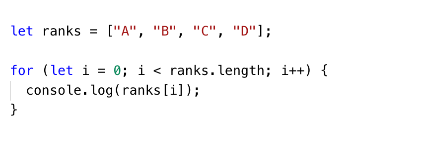
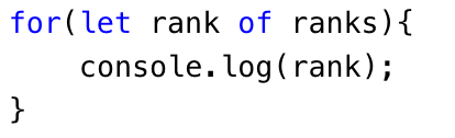
The ‘for...of the loop’ can create a loop over any iterable object, not just an array.
The following values are iterable –
Plain objects are not iterable and hence the 'for...of' uses the Symbol.iterator.
The Symbol.iterator is a special-purpose symbol made especially for accessing an object's internal iterator. So, you could use it to retrieve a function that iterates over an array object, like so –

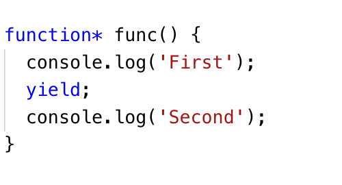
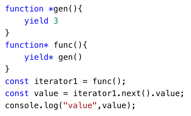
Generator functions once called, returns the Generator object, which holds the entire Generator iterable and can be iterated using next() method. Every next() call on the generator executes every line of code until it encounters the next yield and suspends its execution temporarily.
Generators are a special type of function in JavaScript that can pause and resume state. A Generator function returns an iterator, which can be used to stop the function in the middle, do something, and then resume it whenever.
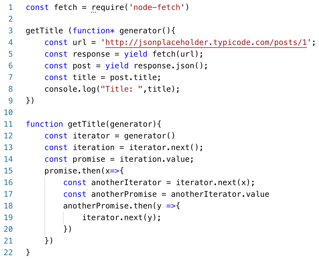
Fun Fact – async/await can be based on generators
Generator functions/yield and Async functions/await can both be used to write asynchronous code that 'waits', which means code that looks as if it was synchronous, even though it is asynchronous. ... An async function can be decomposed into a generator and promise implementation which is good to know stuff.
Generator functions are written using the function* syntax –
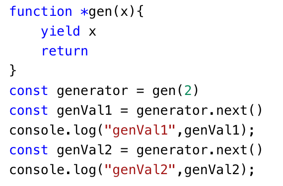
Additionally, generators can also receive input and send output via yield. In short, a generator appears to be a function but it behaves like an iterator.
A generator is a function that returns an object on which you can call next(). Every invocation of next() will return an object of shape —
Output

Apart from returning values, the yield can also call a function –

Output

Output

As a Title –
Output

This is an evaluation model that delays the evaluation of an expression until its value is needed. That is, if the value is not needed, it will not exist. It is calculated on demand.
A direct outcome of Lazy Evaluation is that generators are memory efficient.
The only values generated are those that are needed. With normal functions, all the values must be pre-generated and kept around case they need to be used later.
We have learned the following things about iterators and generators –
.png "Implementing Scroll Based Animations using React and GSAP")
As computers are getting more powerful it is getting easier to achieve complex animations without compromising the fluidity and user experience. There are various JavaScript animation libraries available and most of them are pretty good. We at QED42 tried some of them and for the most part, we used GSAP which we think is kind of becoming an industry standard. GSAP is highly configurable and is just the right tool if you want to have scroll-based animations.
One thing that is eye-catching and easy to achieve, is smoothly changing background colour while scrolling. To implement this, we will change the wrapper component’s background colour as its child components move in and out of the viewport.
.webp)
Source:qed42-js.netlify.app
Step 1: Create a context that will wrap our components and provide the necessary functionality

Step 2:We will then import child components (named First, Second and Third), GSAP, and AnimationContext in our main app component. We are monitoring “currentBg” in the “useEffect” hook and whenever its value changes, the GSAP function gets executed. GSAP will change the background in 1 second which gives the fade-in effect.

Step 3: To implement scroll-based triggers for the second and third components we will use GSAP.
The second component returns the following JSX, having a reference to wrapper element and text.


Next, we will create a GSAP timeline and use a scroll trigger to target an element, and set the start and endpoint for animation.

ScrollTrigger has onEnter and onLeaveBack function which gets triggered when the trigger element passes through the scroll markers. That is where we change our background using context.
Note: The same effect can be achieved using gsap.to(), gsap.from() and other methods instead of gsap.timeline().

The code for the above demo can be found at the following Github link.
What we learned from our hands-on experience is that animations should enforce, enhance the user behaviour and experience. The animations should not hinder action items in a way that it takes more time for users to interact with them. Therefore the background animation we saw above is very subtle and doesn’t cause any such hindrance.

As our planet changes, a complex challenge that has emerged is climate change-induced human migration. Millions are being forced to leave their homes, seeking safety and stability. Recognizing this critical issue, the United Nations (UN) leads coordinated efforts to support vulnerable communities.
The International Organization for Migration (IOM), the UN migration agency, promotes orderly and humane migration that benefits all. We had a great opportunity to join forces with IOM, contributing our expertise to a data-driven solution that sheds light and raises awareness on this complex issue.
.webp)
Recognizing the urgency of climate change and its profound impact on human mobility, IOM has taken a leading role in addressing this global challenge. At the recent COP28 (28th United Nations Climate Change Conference) summit in Dubai, IOM aimed to foster international collaboration and drive ambitious action towards a low-emission and climate-resilient future.
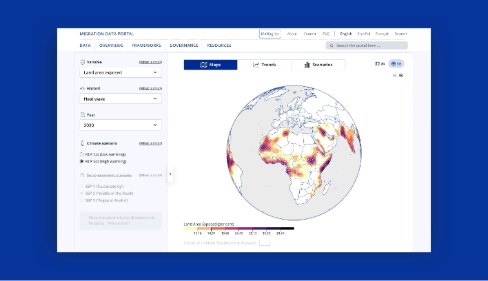
As part of its strategic approach, IOM’s Global Data Institute (GDI) wanted a data-driven solution that leverages analytics to forecast where and when populations worldwide will be exposed to mobility-related climate hazards, such as floods, storms, and droughts so that decisions can be made based on evidence. This initiative helps the world understand climate-related displacement risk better and explore ideas to address it properly.
We designed and developed an interactive data visualization solution that IOM could use to present its research and approach at the COP28 summit.
We used the power of data and its ability to reveal hidden patterns and insights. Our solution processes large datasets and employs advanced analytics techniques to visually represent the complex dynamics of mobility-related climate hazards. It analyzes future trends and identifies emerging patterns based on state-of-the-art climatic, demographic, and economic datasets.
Take a look at GDI’s Climate Mobility Impacts dashboard on the Global Migration Data Portal. Users can explore and analyze how different climate hazards are expected to affect humans in the future.
This data-driven visualization approach provides a vital foundation to allocate resources and make informed policy decisions. International organizations can now interactively explore where and when climate hazard exposure, high population densities, and economic vulnerability will coincide in the future. It enables them to provide effective and targeted support for vulnerable populations.
This shift towards evidence-based decision-making ensures that aid and resources reach those who need it most, maximizing their impact and fostering a more resilient future for all.
This was a high-priority project for us with tight deadlines to meet. We had to design a portal that reads climate change data and presents it in interactive 2D and 3D maps, graphs, and bar charts.
This project demanded strong collaboration and dedication from a diverse team of experts. Our team of designers and JavaScript developers closely worked with the IOM team to research extensively, design, and develop a solution that meets current goals and is scalable for future goals.
Agile methodologies were at the core of our approach, and we were able to adapt to emerging challenges and navigate complexities with remarkable efficiency. Our team’s commitment to agility proved invaluable, enabling us to successfully deliver the project on time and within budget.
We will delve deeper into the design and development of our data visualization portal, offering insights into its features and unique capabilities in our case study. We believe that by sharing our knowledge and expertise, we can inspire further collaboration and advancement with data as a catalyst for positive change.
We are glad that we could help IOM present its data and approach visually to empower communities to navigate the complexities of climate change-induced migration. We look forward to working on more solutions that will positively impact lives worldwide. Talk to our experts to know more about how we can customize digital solutions that fit your needs.

Svelte is an open-source JavaScript framework that helps to create interactive web pages. The Svelte plugin enables users to embed its components seamlessly into their content.
In this blog, we will consider how to create a custom plugin to integrate Svelte components into CKEditor 5, a powerful and extensible rich text editor that allows developers to tailor it to their specific needs.
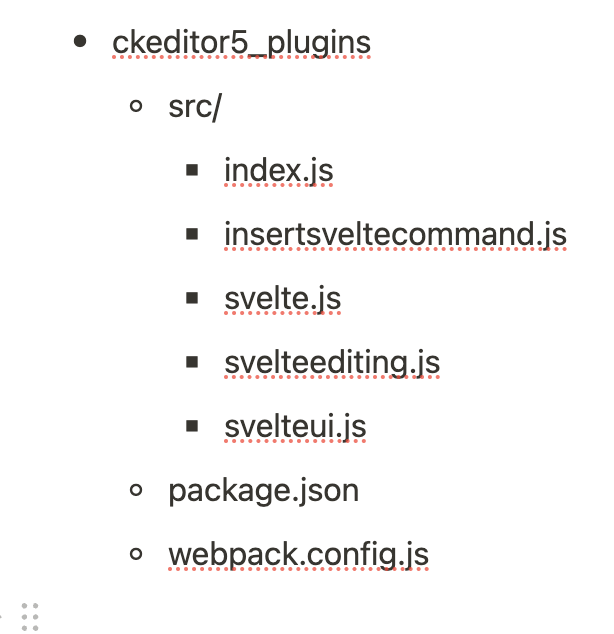
To begin with, check out the directory structure that houses the essential components of the Svelte plugin.
Download the necessary CKEditor5 node modules for compiling custom plugins.
The Webpack.config.js file is a script designed to automate the build process for CKEditor 5 plugins located in the js/ckeditor5_plugins directory. It employs the webpack module bundler to produce plugin files that are ready for production.
This configuration script is structured to bundle CKEditor 5 plugins individually, leveraging the capabilities of the getDirectories function. This function dynamically retrieves all subdirectories within the specified path (./js/ckeditor5_plugins). For each identified directory, a distinct Webpack configuration is generated and seamlessly integrated into the module.exports array.
This file exports an object as the default export of the ‘index.js’ file. The object possesses a property named Svelte, and its value is the imported Svelte plugin. This is how CKEditor 5 will identify and uncover the Svelte plugin during the execution of the build process. The exported object functions as a map of available plugins that CKEditor 5 can utilize.
The Svelte class serves as the glue that integrates the editing and UI components of the plugin. It extends CKEditor's Plugin class and specifies its dependencies.
The static get requires() method in this context specifies that the Svelte master plugin requires both SvelteEditing and SvelteUI. Although these components extend the Plugin class, CKEditor 5 will not consider them as individual plugins unless explicitly exported in index.js. This emphasizes the importance of explicit export to ensure that CKEditor 5 recognizes these components as plugins.
The SvelteEditing class defines the data model for the Svelte element and the converters for handling its conversion to and from DOM markup.
The init method initializes the plugin, calling two helper methods: _defineSchema and _defineConverters, to set up the schema and converters for the Svelte model. Additionally, it adds the 'insertSvelte' command to the editor, associating it with the InsertSvelteCommand class.
The _defineSchema method sets up the schema for the Svelte model, registering the model type and specifying that it behaves like a self-contained object (isObject: true). It also defines where the model is allowed (allowWhere), where its content is allowed (allowContentOf), and the allowed attributes (allowAttributes), in this case, the 'src' attribute.
The _defineConverters method sets up the converters for the Svelte model, using the CKEditor conversion object to register converters for upcasting and downcasting.
This section registers an upcast converter, determining how existing HTML is interpreted by the editor when it loads. It specifies that when encountering an HTML iframe element with the class '-svelte-embed,' it should be upcasted to a Svelte model element.
This section registers a downcast converter for data, defining how the Svelte model should be converted to DOM markup. If the model has a 'src' attribute, it uses that value; otherwise, it defaults to 'https://www.google.com'. It creates an iframe element with the specified class and source, which is then returned.
This section registers an editing downcast converter, defining how the Svelte model should be converted to editable DOM markup. It creates an iframe element similar to the data downcast converter and then uses toWidgetEditable to wrap it as a widget in the editable view.
The SvelteUI class registers the toolbar button for Svelte embeds, complete with an icon and dropdown functionality. It listens for user interactions and triggers the insertion of Svelte components into the editor.
This section adds the Svelte component to the CKEditor UI, creating a dropdown view using the createDropdown function. It sets its button view with an icon and associates it with the specified locale.
Here, a collection of items is created, representing the Svelte components to be displayed in the dropdown. It iterates through the directories obtained from the editor's configuration and adds each Svelte component as a button to the collection.
This line adds the list of Svelte components to the previously created dropdown view using the addListToDropdown function.
This section sets up an event listener using 'this.listenTo' to listen for the 'execute' event on the dropdown view. When an item is selected, it extracts the src and label from the selected item, modifies the src path, and then executes the 'insertSvelte' command on the editor with the modified src.
Finally, the init method returns the configured dropdown view, completing the initialization of the SvelteUI plugin.
The heart of our plugin lies in the InsertSvelteCommand class. This command executes when the toolbar button for embedding Svelte components is pressed, utilizing CKEditor's model to insert the desired content into the editor.
This line declares the InsertSvelteCommand class, extending the CKEditor 5 Command class. This class encapsulates the logic executed when the toolbar button is pressed.
The execute method is part of the Command class and contains the logic to be executed when the command is invoked. It takes a src parameter, representing the source content to be inserted.
The createSvelte function generates a CKEditor 5 model element representing the Svelte component. It uses the writer.createElement method to create an element with the specified name ('Svelte') and attributes (in this case, the src attribute). The created element is then returned.
After enabling the module in Drupal, you should see the screen below:
.png)
In this requirement, we are passing the folders inside a specific directory from Drupal to the CKEditor5 plugin. When you access any content-type page with full HTML, you will start seeing this:
On clicking the "View Source" option, the type casting of CKEditor5 will display the iframe tag with the src attribute set to the folder's index.html.
.png)
Creating a custom CKEditor 5 plugin to embed Svelte components adds a new dimension to content creation. The Svelte plugin seamlessly integrates into the editor, providing users with a streamlined experience for incorporating dynamic Svelte content.
If you want to know how to integrate CKEditor 5 in Drupal 9, you can find all the important steps here.
Happy editing with Svelte !

In the fast-paced world of app development, ensuring a smooth and bug-free user experience is paramount. One crucial step in achieving this is thorough testing, and TestFlight stands out as a reliable platform for iOS app testing. This blog will walk you through everything you need to know
about deploying apps to TestFlight, covering requirements, and benefits, and providing a step-by-step guide for a hassle-free deployment process.
TestFlight is Apple's official beta testing service that allows developers to distribute pre-release versions of their iOS apps to a selected group of testers for thorough testing before the app goes live on the App Store.
Enables developers to gather valuable feedback from a diverse group of testers before releasing the app to the general public.
Provides the opportunity to test the app in real-world scenarios, uncovering potential issues that might not be apparent in a controlled environment.
Ensures that the beta testing process is secure and respects the privacy of both developers and testers.
Allows developers to create a polished App Store page with screenshots, descriptions, and other information before the official release.
Ensure you have an active Apple Developer account. This is a prerequisite for accessing TestFlight.
Install the latest version of Xcode, Apple's integrated development environment (IDE).
Generate and configure necessary certificates and provisioning profiles in the Apple Developer Center to sign your app.
Collect Apple IDs from individuals who will be testing your app.
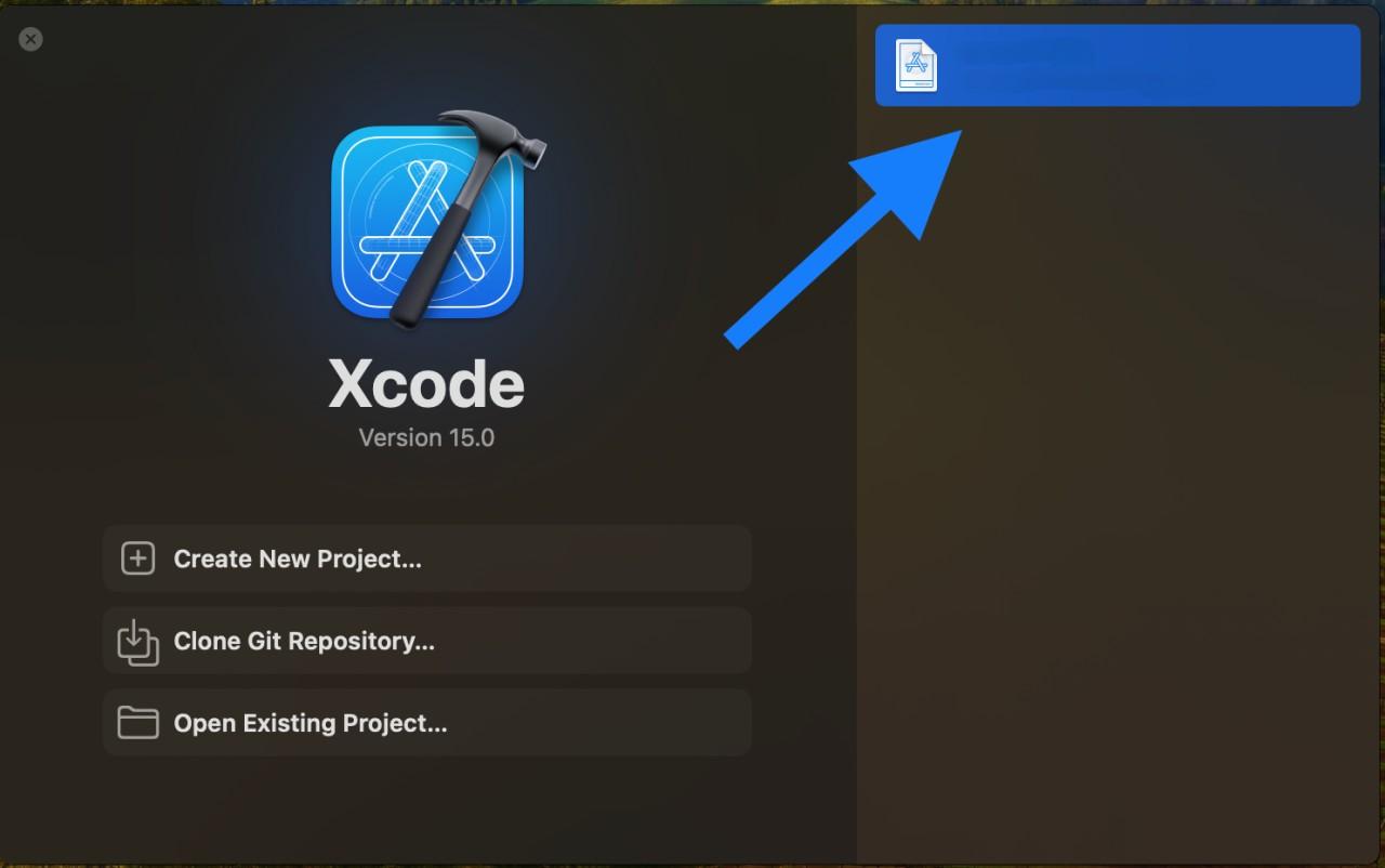
Open Xcode and load your project.
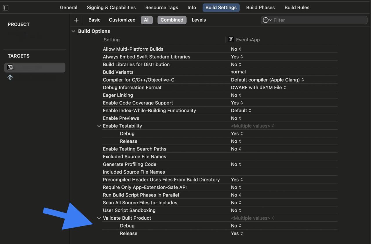
In the "Project Navigator," select your project, go to "Build Settings," and set the build configuration to 'Release.' This optimizes your app for distribution.
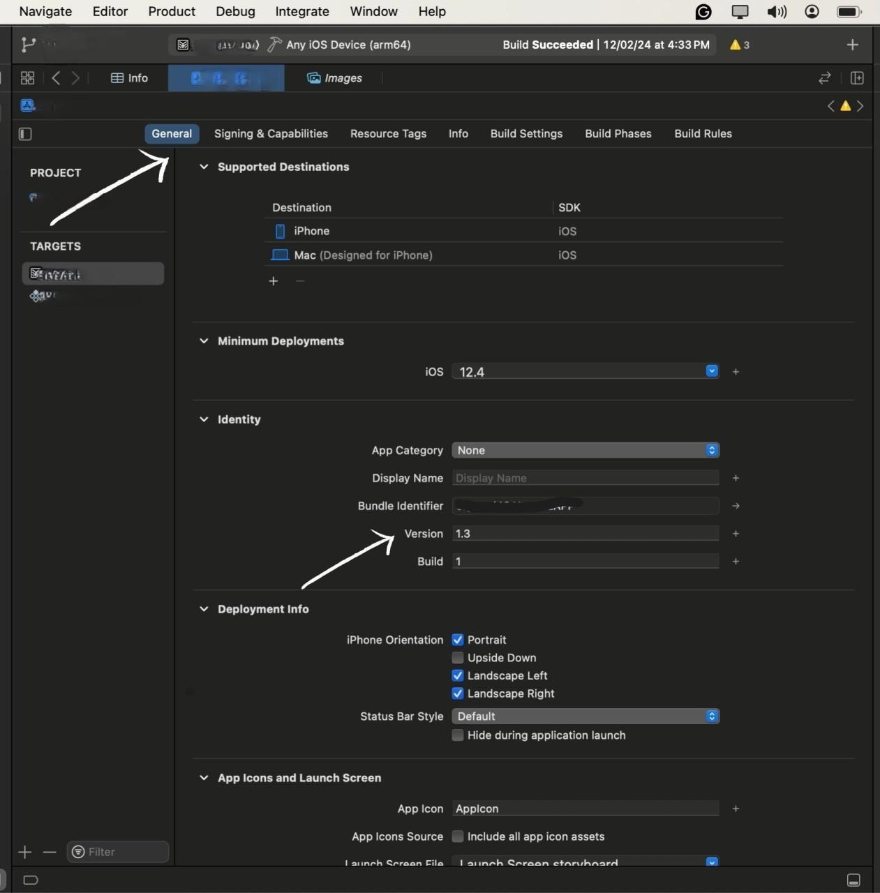
Navigate to the 'General' tab and adjust the version number and build number. This step is crucial for tracking different versions of your app.
From the top menu, select your target device as "Any iOS Device" to generate a build suitable for distribution.
Go to "Product" > "Archive" to Start the process of Archiving.
Archive is the process of preparing our app for uploading to the test flight, in-short it creates the compressed version of our app for the appropriate upload
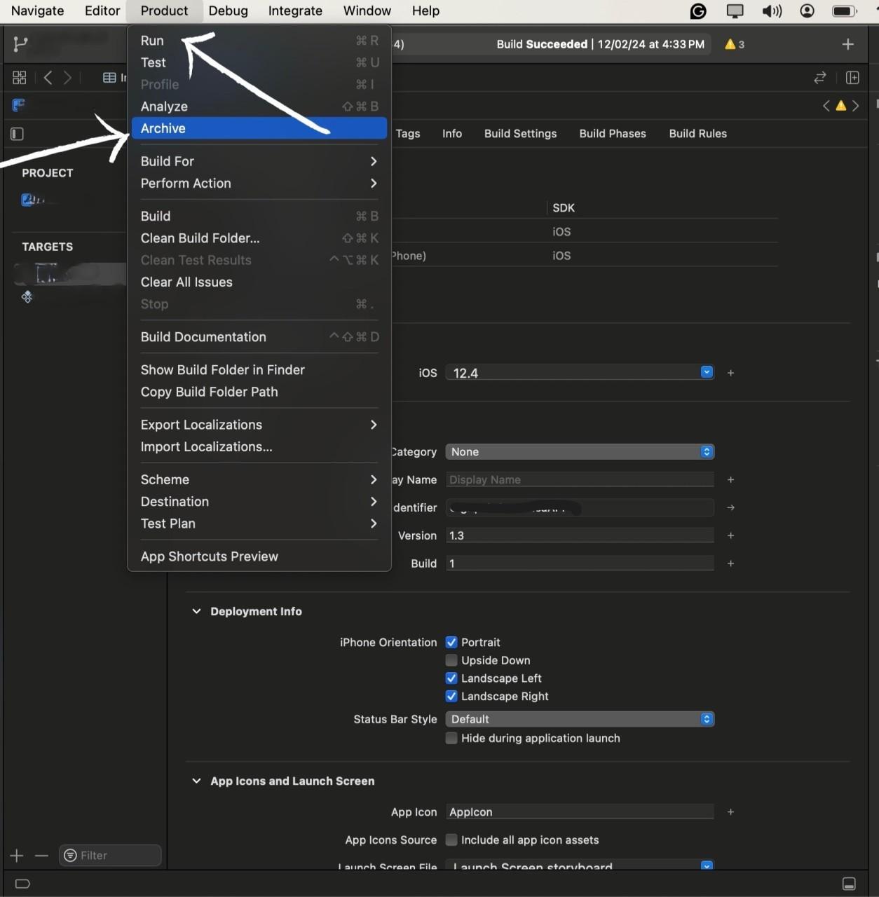
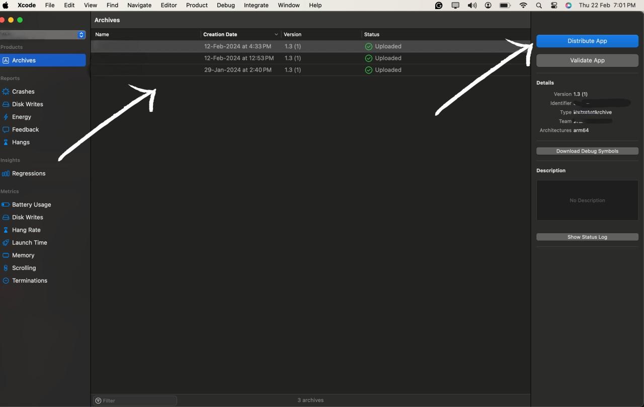
After the archive process is completed you will be redirected to the All Archives page, here select the archive you want to deploy to the Test flight,
After selecting the archive hit the Distribute button to start the process.
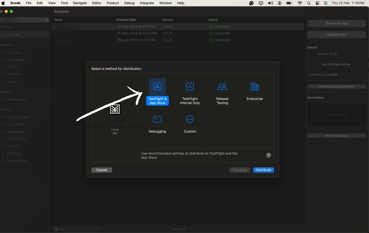
After hitting the Distribute App option you will be prompted with the option of how you want to deploy the app. You can select the option according to your needs and the purpose of the app, We will go with the Test flight option for this blog.
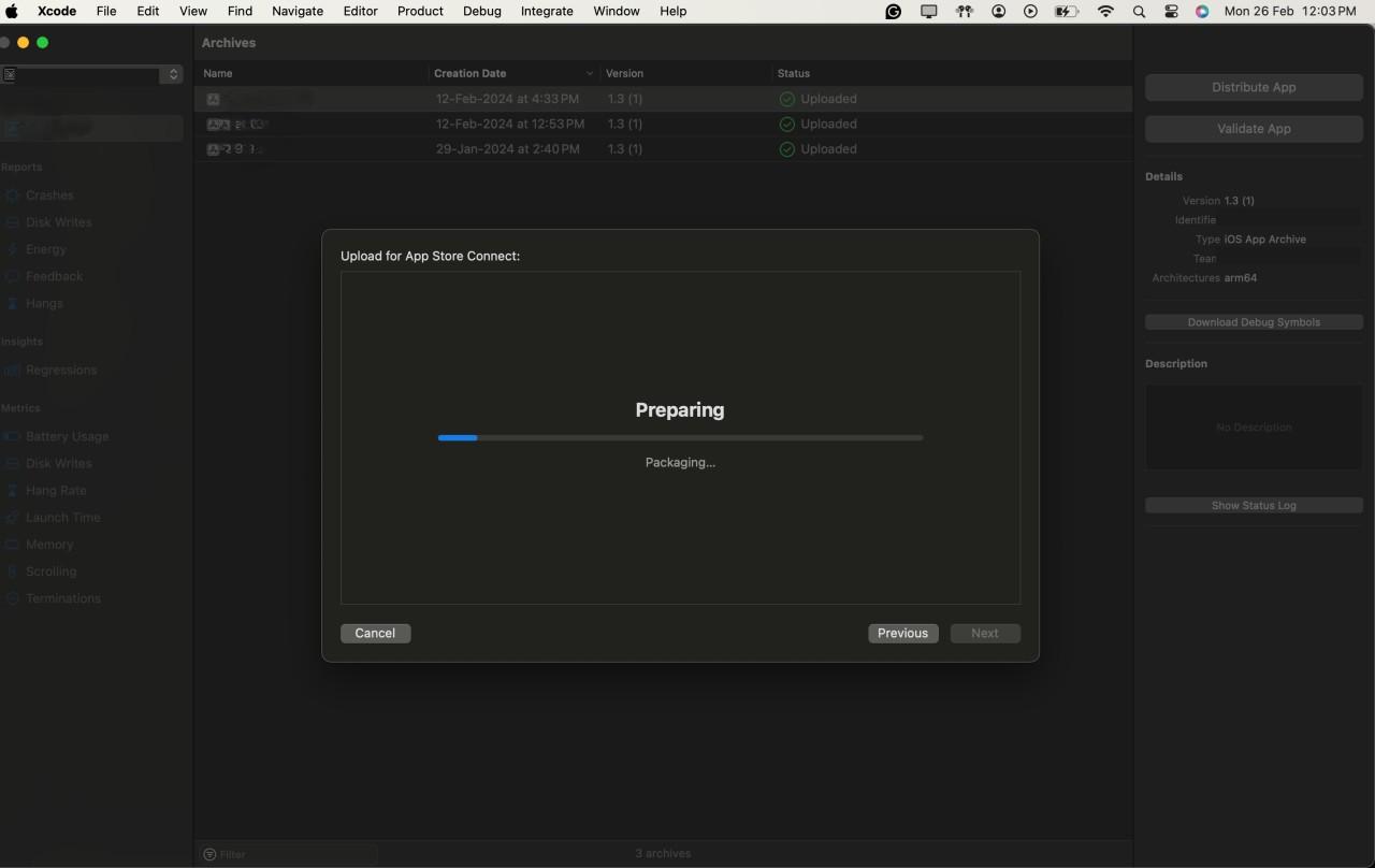
After selecting all the configuration options we can start the distribution by Pressing the Distribute button.
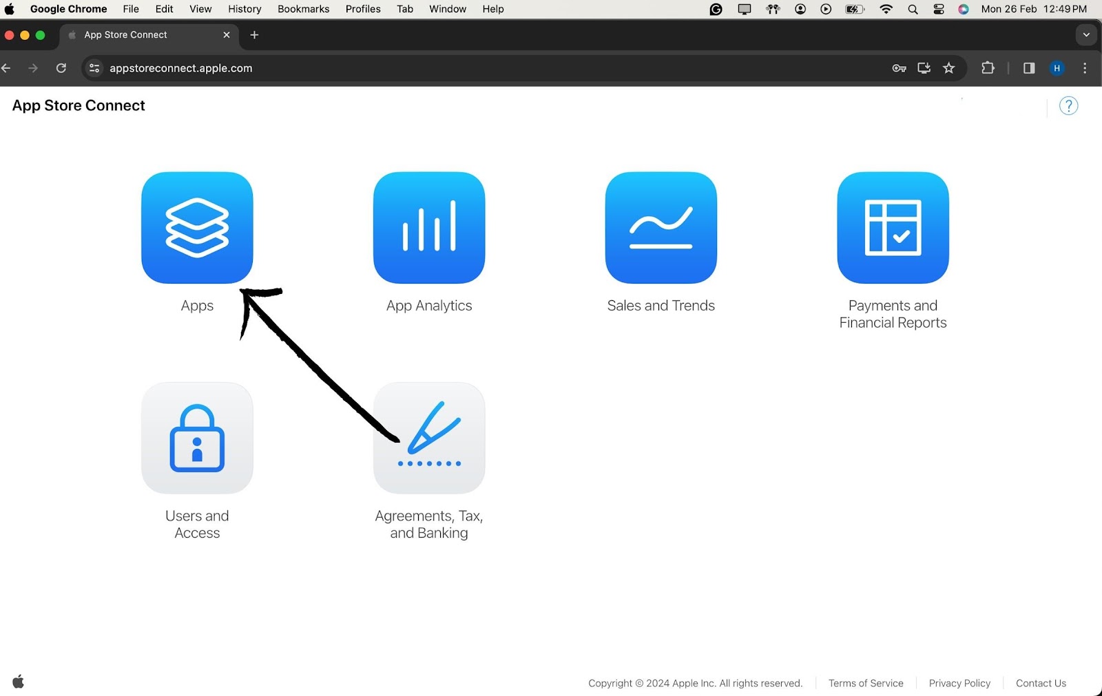
Open your preferred web browser and navigate to App Store Connect.
Log in using your Apple Developer account credentials. Ensure you have the necessary permissions for managing users and builds.
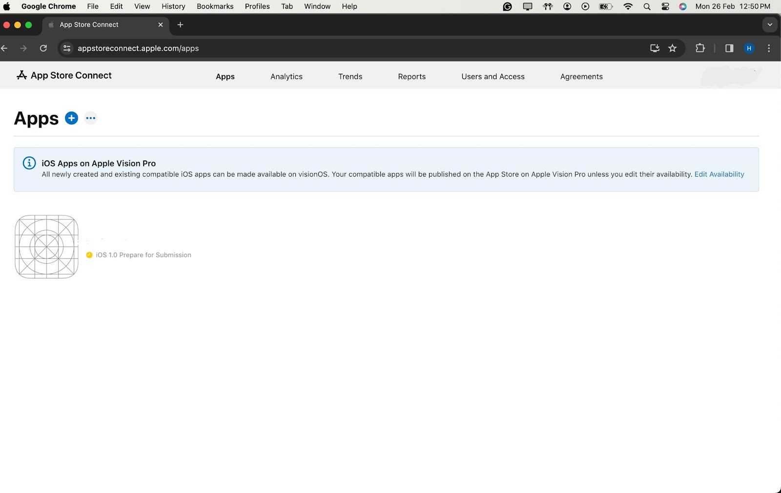
Once logged in, you'll be on the App Store Connect dashboard. Navigate to the "My Apps" section and select your app. In the left sidebar, find and click on "TestFlight."
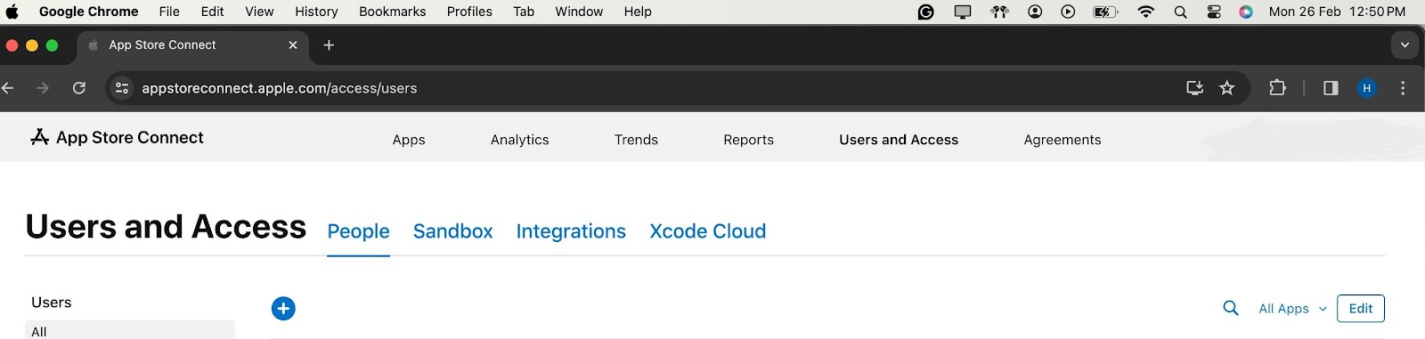
In the TestFlight section, choose either "Internal Testing" for your development team or "External Testing" for a wider audience.
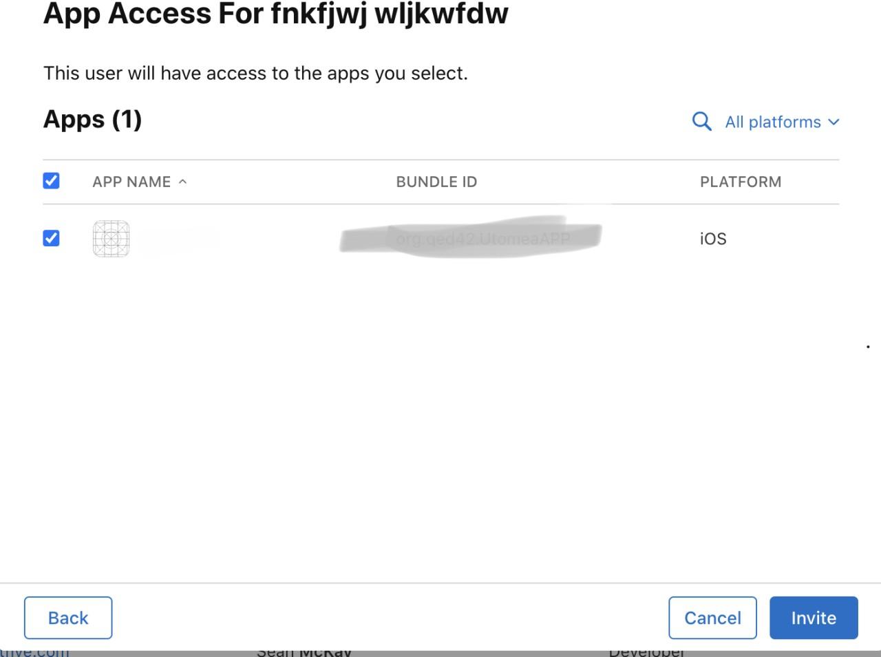
Click on the "+" (plus) icon to add testers. Enter the Apple IDs of the individuals you want to invite as testers. For internal testing, use the Apple IDs associated with your development team. For external testing, use the Apple IDs of external users.
Provide additional information about each tester, such as their first name, last name, and email address. This ensures that testers receive invitations with accurate information.
Specify the tester's role (App Manager, Developer, Marketer, or Tester) and select the desired notification options. This step allows you to tailor the testing experience based on individual roles.

Once all details are filled, click "Invite" to send invitations to the added testers. Testers will receive an email invitation to join the testing group.
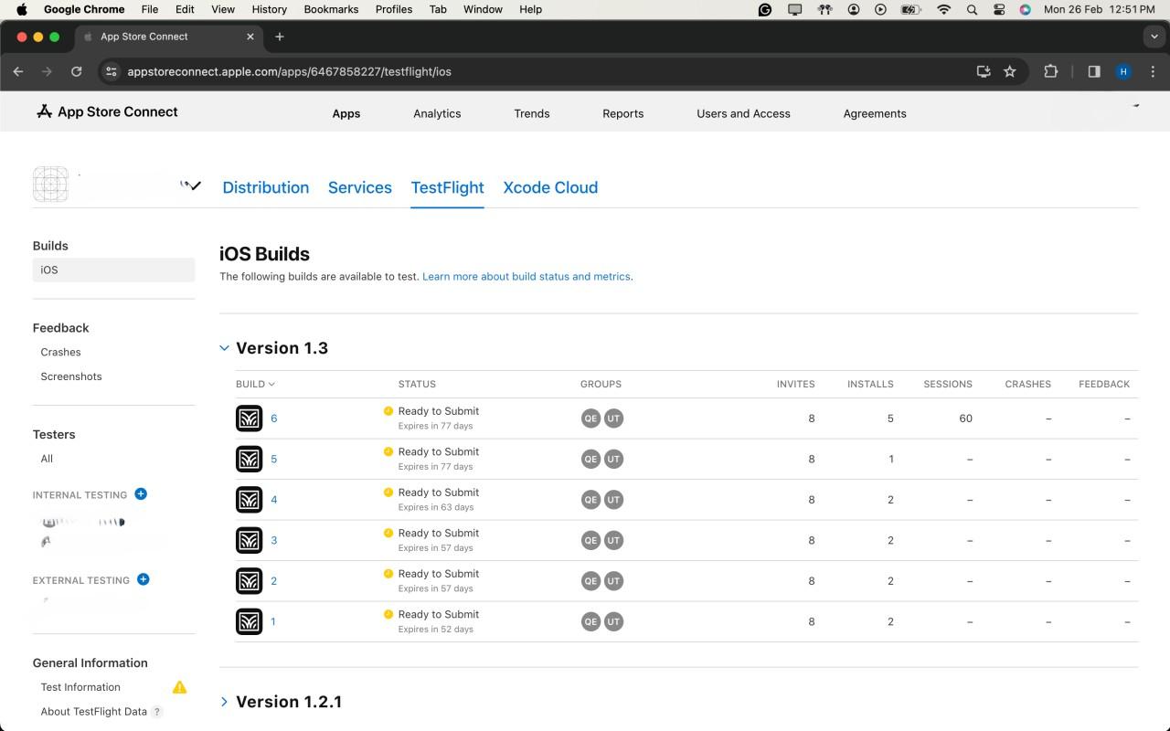
After the uploading is successful, the latest version will show up in the IOS Builds section
It will contain some Options for compliance for the app which which will ask for basic app details like if your app includes any kind of Authentication, if yes then which kind of it is?
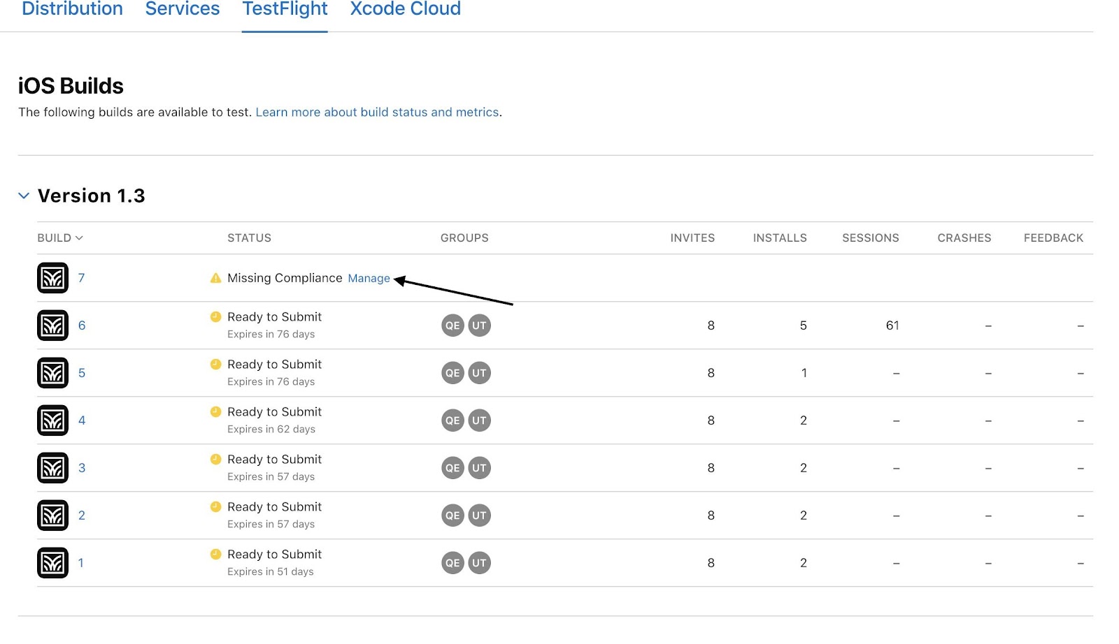
As a final step, once you check all the compliance, the app will automatically be available to testers for testing purposes in the test flight App.

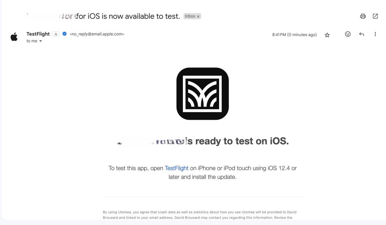
Testers will receive an E-mail notifying them that, a new build is available to test.
Fill in all mandatory information on App Store Connect. Include details such as app description, keywords, and screenshots.
Submit your app for beta App Review. This ensures your app complies with Apple's guidelines.
Even with meticulous preparation, the world of app deployment can be unpredictable. Understanding and resolving common issues is an essential skill for any developer. Here, we delve into potential challenges that may arise during the TestFlight deployment process and provide detailed solutions.
1. Code Signing Issues:
Symptoms:
Error messages related to provisioning profiles or code signing during the build process.
Solution:
1. Revisit Apple Developer Center: Ensure that your certificates and provisioning profiles are correctly set up. Sometimes, a simple refresh or recreation of these in the Apple Developer Center can resolve issues.
2. Xcode Preferences: Check Xcode preferences to make sure the correct developer account is selected, and the associated provisioning profiles are up to date.
2. Build Rejections in App Store Connect:
Symptoms:
Your build is rejected during the beta App Review.
Solution:
1. Review Apple's Guidelines: Thoroughly review the App Store Review Guidelines to identify any violations.
2. Update Metadata: Make sure all app metadata, including descriptions, screenshots, and keywords, complies with App Store guidelines.
3. TestFlight Invitation Issues:
Symptoms:
Testers cannot access the app or face issues with TestFlight invitations.
Solution:
1. Verify Tester Email: Double-check that the email addresses of your testers are accurate, and they have accepted the TestFlight invitation.
2. Expired Builds: If testers are trying to access an older build, ensure that the build is still valid and hasn't expired.
4. Problems with Beta App Review:
Symptoms:
Delays or rejections during the beta App Review process.
Solution:
1. Communication with Apple: If you face delays or rejections, reach out to Apple through the Resolution Center in App Store Connect for clarification.
2. Adhere to Guidelines: Ensure your app follows all guidelines. Apple provides specific feedback during the review process, which can guide you in addressing issues.
5. Issues with TestFlight Distribution:
Symptoms:
Testers cannot download or install the app from TestFlight.
Solution:
1. Check Tester's Device: Ensure that the tester's device meets the minimum requirements for the app.
2. TestFlight App Version: Confirm that the TestFlight app on the tester's device is up to date.
6. Network or Connectivity Problems:
Symptoms:
Slow uploads, timeouts, or other network-related issues.
Solution:
1. Stable Internet Connection: Use a stable and high-speed internet connection to avoid interruptions during the upload process.
2. Retry: If issues persist, try uploading your build during non-peak hours or using a different network.
7. Issues with External Testers:
Symptoms:
External testers encountering difficulties joining or accessing the beta.
Solution:
1. Double-check Email Invitations: Ensure that the email invitations sent to external testers are accurate, and that they follow the provided instructions.
2. Resend Invitations: If testers are having trouble, consider revoking and reissuing invitations.
8. New Terms Agreement:
Symptoms:
A prompt for new terms or agreements in App Store Connect.
Solution:
1. Review and Accept: If prompted to agree to new terms or agreements in App Store Connect, carefully review the terms and conditions. Accept them to continue using the platform.
2. Clear Cache and Cookies: In some cases, clearing your browser's cache and cookies may resolve issues related to accepting new terms.
Deploying apps to TestFlight is a crucial step in ensuring a successful app launch. By following this comprehensive guide, you'll be well-equipped to navigate the TestFlight deployment process, harness its benefits, and gather valuable feedback to refine your app before it reaches the wider audience on the App Store. Happy testing!
Here are some links to official Apple documentation for reference on How to deploy the apps to the test flight:

GraphQL is a powerful query language that allows more flexibility and efficiency in data-driven applications compared to REST.
In simple words, while querying with a RESTful API, we demand extra data that is not required at that moment. Here’s where GraphQL comes in handy for requesting only the required data from the server.
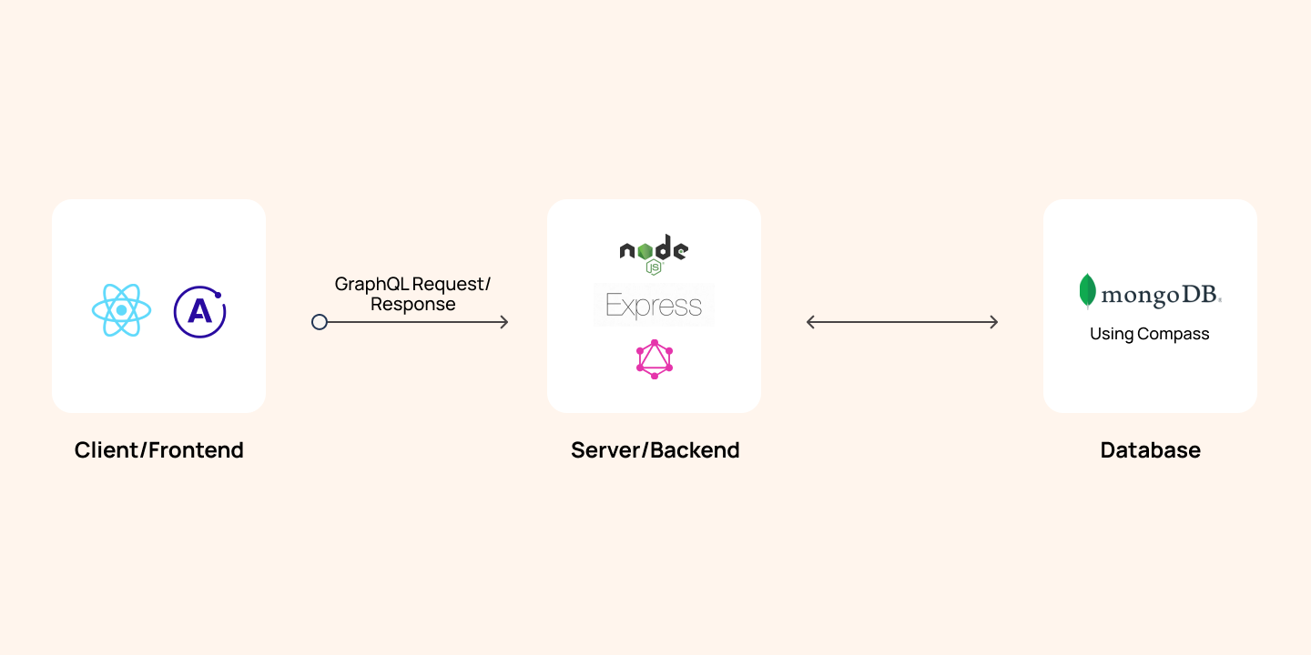
Apollo is like the glue layer allowing us to use GraphQL in the front end (ReactJS in our example). We can make queries from React to our Graph of data in the server and retrieve data to present on the browser.
Mutations allow us to mutate/change our data by performing CRUD operations. According to the official website of GraphQL, a mutation is defined as:
We need to explicitly define mutations in the GraphQL server just like we define our RootQuery.
For example, a mutation schema definition to add an author and a book to our database would look something like this in NodeJS:
Here, the fields object contains all the mutation operations which we would like to perform. addAuthor is one such operation. AuthorType is the schema defined for the author with fields, such as ID, name, age, and books. args is the data we want to save in the database and ensure the correct datatypes.
Author is a mongoDB model, which is created using Mongoose. The resolve method is used to fetch/access, send, and mutate data in the database. The save() method is a Mongoose method that adds new author to the database. The same is the case of the addBook operation.
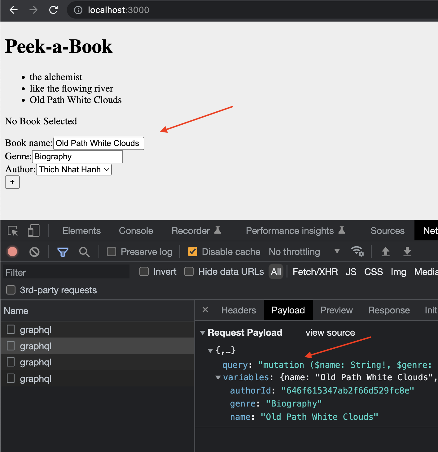
A mutation operation to add a book and an author sent from GraphiQL would look something like this:
The query execution can be verified from the browser network tab with the name “graphql” (an example given at the end of this article).
GraphiQL is like a dummy frontend app that allows us to test our GraphQL server. The setup can be done from the main file or app file on our server. It is suggested specify whether we are using the production or development mode.
Let’s discuss about the functionality of the useMutation() hook! It is used on the client end to send our mutation to the server.
Assuming that we have done the setup (explained later), we need to follow the steps below:
Step 0: Setting up Apollo Client in React application is done by installing @apollo/client, and creating a client object. It is a GraphQL client library using which we can make queries to the server like HTTP or Axios.
The uri is the server endpoint to which requests are made. ApolloProvider wraps our React app and helps inject whatever data is received from the server to our frontend.
Step 1: Import gql template literal from @apollo/client library.
Step 2: Define the mutation as ADD_BOOK using gql in a separate file to ensure modularity in the project. For example, in the queries/index.js file, a mutation takes in data in the form of variables with a $ sign.
Step 3: Import the useMutation()hook in the component mutation and request the above mutation to the server. This request is executed on an event of a button click to add a book. Here is where the useMutation() hook comes into picture.
This hook takes the mutation ADD_BOOK that we just created as the first parameter and some options in an object, such as variables, and ignoreResults as the second parameter.
It also returns two elements, where the first is a mutate function (addBook), and the second is an object with details on the mutation - loading, error, and data.
It is important to make a call to this mutate function to perform the mutate operation because only calling the hook does not execute the mutation automatically (unlike GraphQL queries).
Loading and error states are used to update the UI based on the mutation progress. They help display loading spinners or error messages while waiting for the mutation to complete or handling any encountered errors.
Finally, this is what our app and the mutation operation look like.
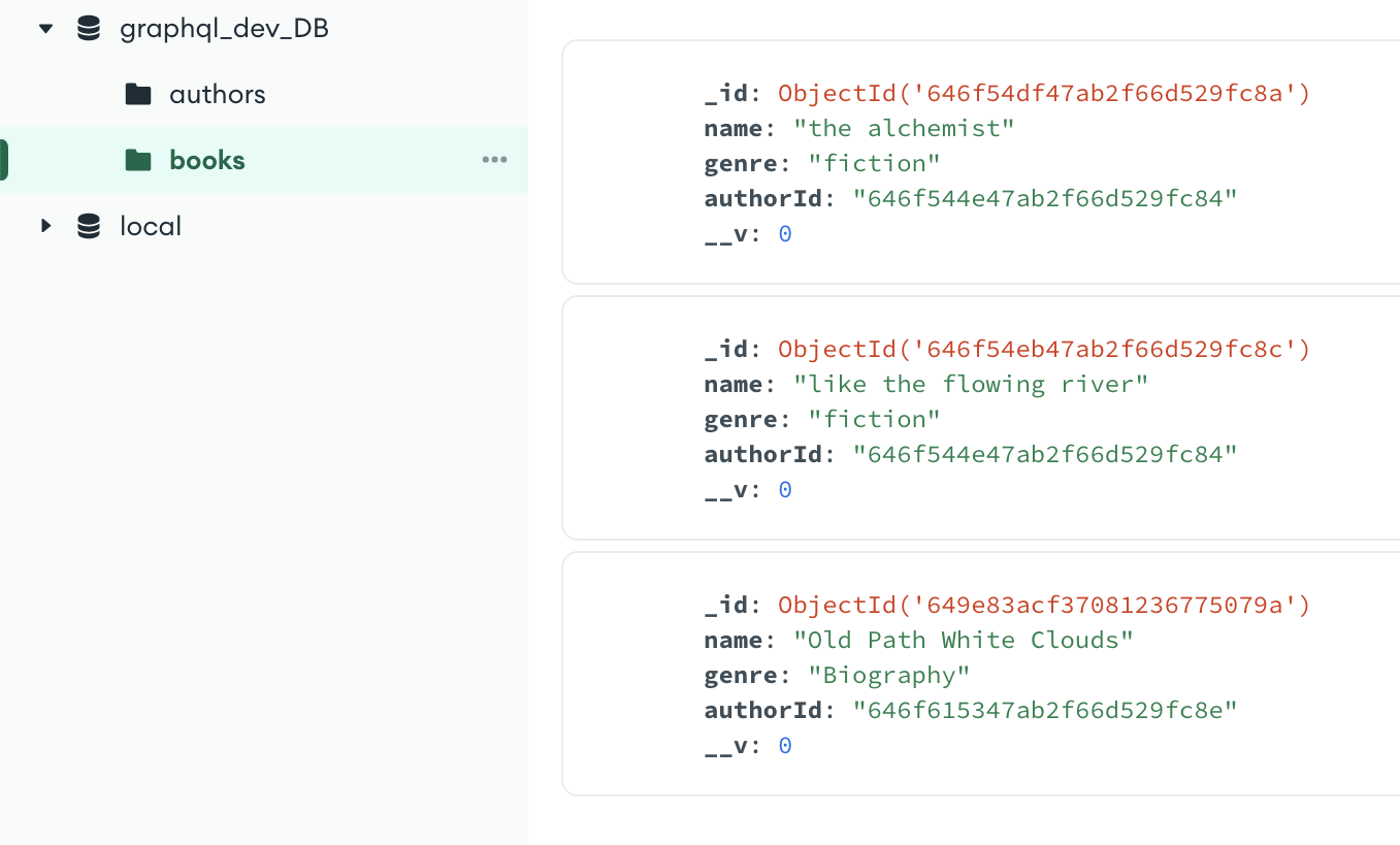
This is how our MongoDB database would look in the compass tool.
There are two differences between the hooks:
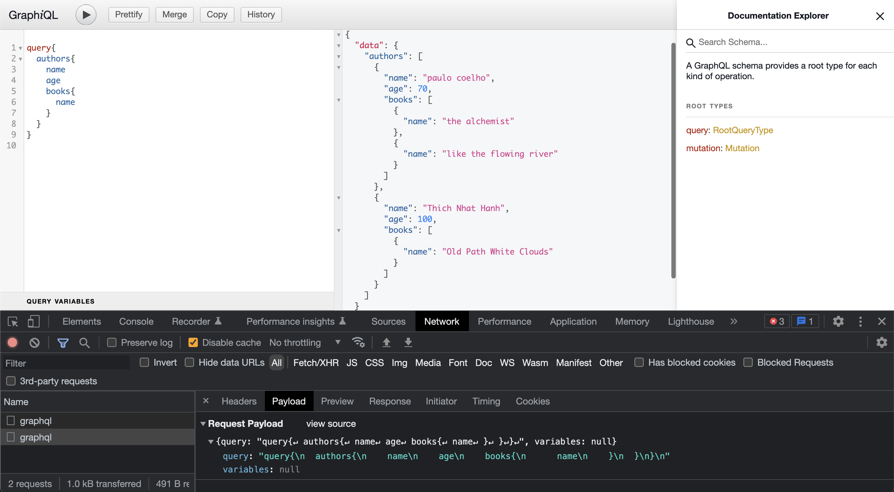
Below is an example of a query to fetch all authors and their details in GraphiQL (after we add them using the mutation specified above).
The Apollo client introduces a remarkable tool: useMutation. This modern approach surpasses conventional methods. Additional libraries like apollo boost might not be required because @apollo/client comprehensive on its own. For hands on experience, Apollo offers tutorial challenges to practice with the useMutation hook before incorporating it into the project.
Notably, the graphql-http package has taken the place of express-graphql - something that can be explored. In a nutshell, the Apollo useMutation hook streamlines the process of handling GraphQL mutations, making the construction of resilient and engaging React applications simpler.

React Native, a popular javascript-based framework built by Facebook in 2015, uses a Single Codebase applicable for developing apps on Android and iOS. The usage of this framework has increased developer productivity and minimized the learning requirements of other languages such as Objective C, Swift, Java Kotlin, etc. which are needed for Android/iOS app development.
Instead of using HTML and DOM as building blocks for the UI, React Native uses the native core components such as Button, View, Switch, etc. which you’ll find on iOS and Android. The philosophy is to learn once and write anywhere. Today, apps such as Instagram, Facebook, UberEats, Pinterest, Skype, and much more use React Native. You can also integrate this framework with your existing mobile applications!
Note: Written in JavaScript. Runs on React. Rendered with Native Code
In Mobile development, a View is the basic building block of UI: a small rectangular element on the screen that can be used to display text, images, or respond to user input. Even the smallest visual elements of an app, like a line of text or a button, are kinds of views.

According to the React Native site's introduction, you invoke the views with JavaScript using React components. React Native creates the corresponding Android and iOS views at runtime for those components. Because React Native components are backed by the same views as Android and iOS, React Native apps look, feel, and perform like any other app.
💡 As a result of the automatic fast reload feature of React Native, there is no need to restart manually after the completion of all these steps.
The app.js file contains the main component, which can be edited as per the project requirements.
Core components are a set of essential, ready-to-use native components for quick and easy mobile application development
1. numeric
2. email_address
To add custom fonts to your react-native project, the expo-font library can be used. With the help of this, fonts can be loaded from the web and then be used in React Native components. One can download the required fonts, copy them into the assets folder, and include them in the App.js or other JS file using the loadAsync() method.
Apps.js
loadAsync() is a highly efficient built-in method, that loads font from a static resource. Any string can be used as the font-family name. Secondly, you need to add these fonts to the styles of your components.
MyComponent.js
It is a good UI approach (for better optimization) to display components to the screen only when the assets such as custom fonts, icons, and logo images are completely loaded. Therefore, state management (the useState hook) is applicable here, along with another expo library called expo-app-loading which tells the expo-splash-screen to keep the screen visible while the AppLoading component is mounted. You can read more about it here.
Install the library using - expo install expo-app-loading
Apps.js
The AppLoading component makes a call to the getFonts() method, and when the fonts are finished loading, we call the setFontLoaded() method and set fontLoaded to true causing re-rendering. Thus, <MyComponent/> gets rendered.
With React Native, programmers can create multi-platform applications with one technology - React, making the product cost-efficient. The Core components that we just discussed and many more, map directly to the platform’s native UI building blocks. This was just an introductory blog, and there is much more to learn in React Native, such as Navigation, Error handling, Images, Forms, etc. that shall be covered soon by us. Stay tuned for more updates!
React Native, a popular javascript-based framework built by Facebook in 2015, uses a Single Codebase applicable for developing apps on Android and iOS. The usage of this framework has increased developer productivity and minimized the learning requirements of other languages such as Objective C, Swift, Java Kotlin, etc. which are needed for Android/iOS app development.

Next.js is opinionated about how to organize your JavaScript code, but it's not opinionated about whether your styling should belong in JavaScript or not. As CSS-in-JS is becoming more and more popular due to some of its great advantages over css, there are people who outrightly hate the idea of CSS-in-JS. The **Differing Perspectives on CSS-in-JS** give a sneak peek into the over-opinionated world of what you should use.This blogpost though won't go into explaining this love and hate debate about css-in-js. The goal of this blogpost is to explain how we can use different styling methods to style our Next.js application and also mention the Pro's and Con's of using these methods.
Of course, you don't need to install anything to start to write your CSS styles. Just place your .css files inside the _app.js file, and you're ready to use it.

Anybody who has worked with using vanilla css knows how daunting and tedious working with Vanilla CSS can become. Some of the drawbacks are using Vanilla CSS are:
Next.js has built in support for CSS modules. You can make use the [name].module.css file naming convention.Just rename your .css files with the .module.css suffix, and you're ready to import them inside of your JSX files!

Since CSS Modules are locally scope they give you the ability to control your element styles in a more granular way as you don't need to worry about style collisions. Next.js takes care of optimising your CSS by minifying and code-splitting your css files. This is an ideal way of writing your CSS:
Sass is one of the most popular preprocessors out there. It allows you to write more reusable, maintainable CSS. All need to do to get started is to run yarn add sass, rename your <file>.module.css files to <file>.module.scss, and you're ready to use SASS (or SCSS) syntaxes in your CSS Modules! You can configure your SASS options by editing the default next.config.js file as shown in the image.

Sass makes it easy for you to automate repetitive task and create reusable code snippet with some of it's widely used features like:
CSS in JS is probably the most popular way of theming react applications right now. Almost every other day a new library pops-up. Some of the most popular libraries are: Styled components, EMOTION and Radium. There's also zero-runtime solutions like Vanilla-extract ,where CSS is extracted to CSS files at build-time.
CSS-in-JS lets you author CSS in JavaScript syntax. Let's look into 2 approaches of styling your application with CSS-in-JS:
To use styled components we need to install babel-plugin-styled-components and styled-components. Next edit your _document.js file. Your should look somewhat identical to code shown in the below image.

Next update your .babelrc file to include the next/babel preset and include the styled-components plugin, with server-side-rendering (ssr) enabled.

We are done with all the configuration. Usage fairly simple. You just create a variable with the help of tagged-template-literals and then use it.

Some of the advantages of using Styled components are:
You can learn more about it's official documentation.
As easy as writing vanilla CSS, Next-js also has an inbuilt support for styled jsx. It allows you to write CSS using Javascript directly inside your components.
Alternatively you can also make use of libraries like Chakra, ThemeUI or Tailwind to implement a component library and design system.
Each method has it's own pros and cons. After evaluating these pros and cons you will have to settle for one approach in the end. I think you are the best of judge of what styling methodology you should be using for your application. I for one have been making use of styled components and global stylesheets to theme my Next.js application.

Next.js has evolved enormously over the past couple of years. From last year only it has introduced different data fetching techniques like Static Site Generation (SSG) and Incremental Static Regeneration(ISR) making it a default solution to build large scale web applications for most people.
In older days websites that were built were all really just a folder with HTML files that could be requested by a browser. After sometime as the web evolved, web severs came into use and how content was being served changed from static html files to generating the html at every user request. Then Javascript was invented and how content on a website would look and behave completely changed.
With the evolution of JavaScript and as the joke goes "JavaScript has become the main cause for making websites!" the approach of building web applications has changed. Rather than everything coupled together websites are built to be flexible, decoupled from the content and split up depending on what kind of data you need to serve to user.
In its journey of evolution, endless number of JS frameworks have been created which have played a key part in the success of Javascript. Next.js is also one of its creations. Build on top react, it's main goal is to help developers create production-ready applications with minimal need for configuration and boilerplate code.
To create production ready applications with ease Next.js offers several different data fetching strategies. This post will cover the basic understanding of different data rendering methods and how you can choose the right solution on a per-page basis to build a hybrid web app in Next.js.
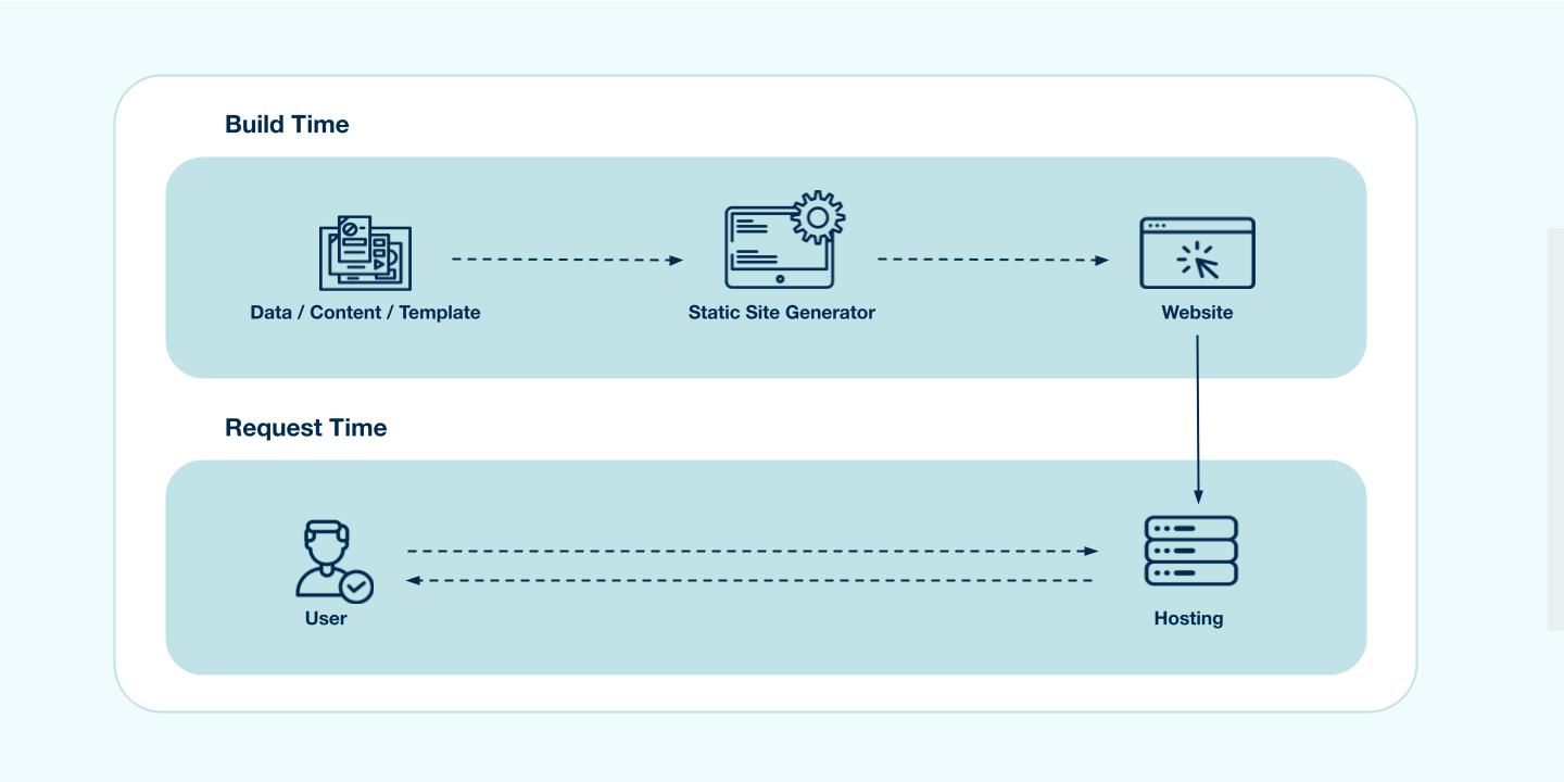
In essence, SSG simply means that the HTML is generated at build-time and is reused in each request. So whenever someone visits the statically generated page, there is no need to fetch some tidbit from a database or wait for some library to render a template and the the user doesn't need to wait for the Javascript to download and execute before being able to see the initial content.
In Next.js you will use the next build command that will build the production application in your .next folder, you can deploy your application on hosting platform like netlify and vercel. Below image demonstrates the build process.
To build a static page Next.js provides us getStaticProps method:
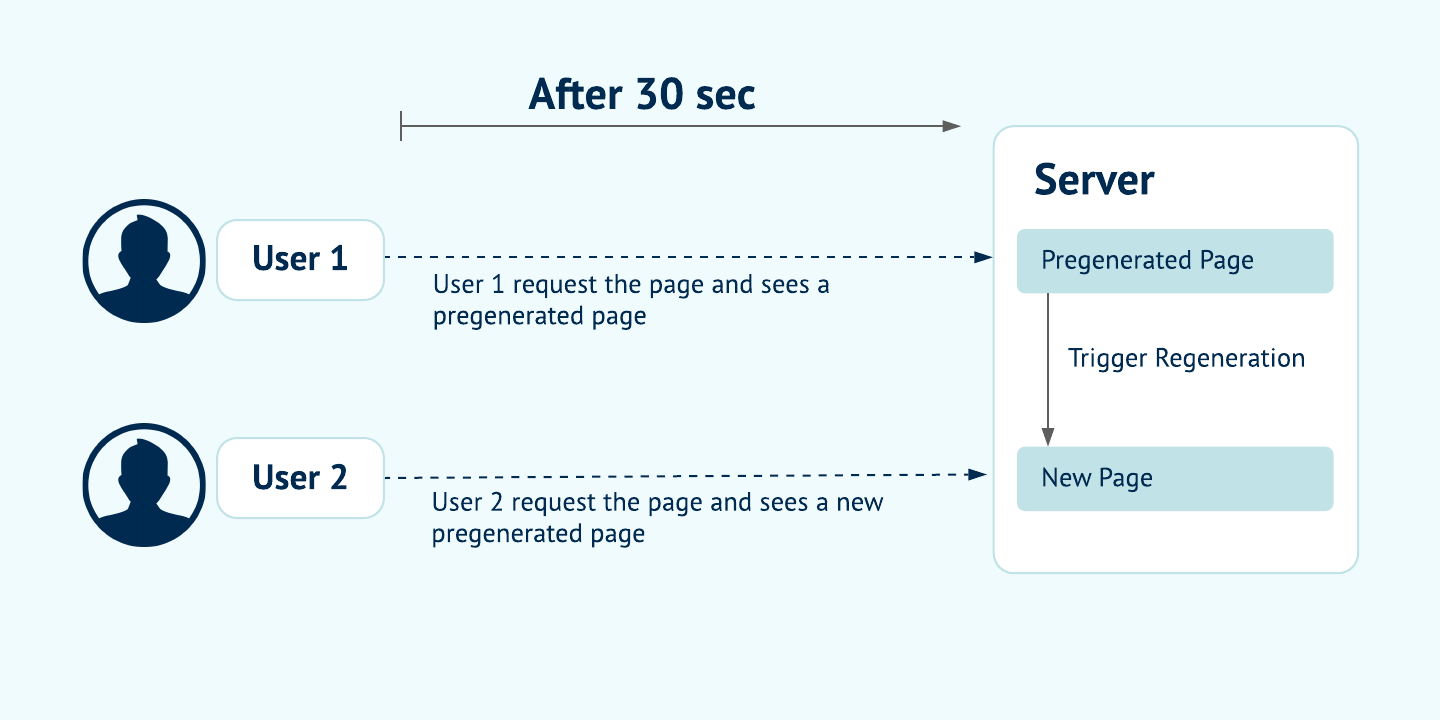
Incremental static regeneration can help alleviate longer build times which becomes quite a headache when you consider rebuilding a very large scale e-commerce site. Traditionally in static site generation if we wanted to make any change, no matter how big or small, we would need to trigger a build that would entirely rebuild our site. This is where ISR comes into picture. This feature of Next.js aims at providing benefits of SSR with SSG by automatically re-rendering of statically exported pages without a full rebuild.
To understand how this works in practise, let's look into the implementation:
In getStaticProps which is used to build a page with static data you'll be able to return a revalidate property that tells Next.js that this page needs to be incrementally generated after given amount of time. The page defines what timeout is reasonable, this could be as low as 1 second.
Below image illustrates what happens when user requests a page using ISR fetching technique:
Note: ISR differs from server-rendering with Cache-Control headers. ISR is based on cache-control stale-while-revalidate http header. You can read more about it here.
This is a pretty old technique. All of your processing is done on the server, every single time a request comes in. Every time a user makes a request the page is served on demand-talking to DB, API'S. This ensures that your user always sees the latest updated data.
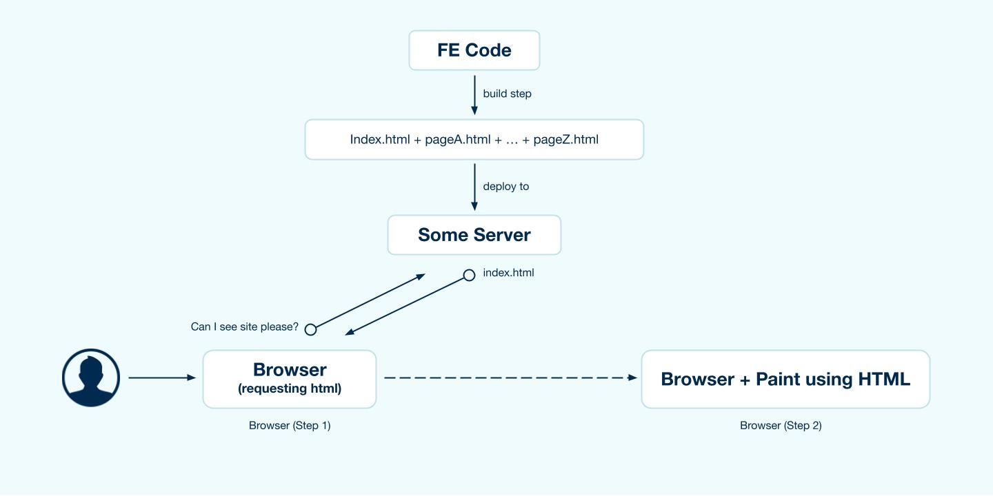
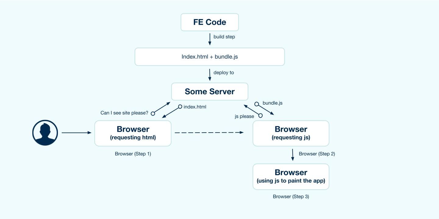
CSR is the most common way of rendering these days. This is also how NextJS by default, renders the page, assuming you do not have a getServerSideProps method exported from your page. The following process unfolds when user requests a resource page :
CSR is the easiest and fastest way for developers to build SPA(single page applications).
Generally you will be using combination of all the rendering techniques to build a real-world application. There is no one way high way solution. Each way of rendering data has it's own pros and cons. E.g: SSG might be Great for SEO and incredibly fast to serve but for larger applications you might want to consider using ISR as slow rebuild for large applications doesn't make it the best solution to serve static data. Similarly to address the cons of SSR you need might want to go with SSG. It just depends on the use case.
If you want to pick one of our experts brain to understand what suites best for your application ,you can contact us here!

Frontend build tools can save a lot of valuable time and make a frontend developers life much easier. They can do almost anything: download libraries, run tests, bundle packages, automatize tasks, and so much more. Lately, PostCSS and Gulp v4 are the talks of the town when it comes to the frontend side of web development. To ride this wave, we've built a frontend build tool coupling PostCSS and Gulp. This frontend build too essentially helps with frontend tasks such as compiling, linting & image optimization. Let's dive into how we built this frontend build tool!
PostCSS is a tool that gives access to a bunch of CSS related plugins to help improve the workflow and writing CSS. This enables a developer to start with a blank slate and select the additional plugins as required. If you are familiar with JavaScript tooling, then you can think of PostCSS as Babel for CSS.
Gulp is a JavaScript toolkit that helps in implementing multiple front end tasks during web development. Gulp is one of the most popular build tools that help with several tasks when it comes to web development.
Ensure that you are using the latest LTS release of Node.js. Start by installing and running Node.js.
To install the required packages, use
Now that the pre-requisites are in order, let’s take a look at some of the features of this tool categorized by the front-end tasks.
Our frontend build tool uses ES6 for managing javascript with the 'Drupal.behaviors' code standard.
Linting Javascript and CSS files along with fixing Linting errors & formatting.
Script to lint JS:
Script to fix JavaScript errors & format JS file:
Script to lint CSS:
Script to fix CSS linting errors:
The images designated for the custom theme can be placed in the images/ folder. We have a gulp task to optimize images.
Run multiple tasks at one time. Like build/compile CSS, JS & optimise images.
Continuous file watch:
OR
Our frontend build tool makes frontend developers life easier by assisting in frontend tasks such as compiling, linting & image optimization. Check out our frontend build tool here - gulp-postcss.
Thank you for reading!

Databases are the backbone of any modern application, be it mobile or web. The database helps store useful information so that it can be queried whenever needed. Let’s assume the database is like a book. It’s easy to read through and find certain things that you like if a book has fewer pages. But for a book with a large number of pages, it will take a substantial amount of time to revisit your favourite quotes, act, chapter, etc. To our rescue, we have pages like “Table of Contents”, “Index” that help us traverse through pages easily.
Creating an index on a field creates another data structure that holds the field value and a pointer to the original record. In MongoDB whenever an index is created it is sorted in ascending or descending order. Given below is an example of how you will create an index on a User’s collection sorted by descending order of age.
Indexes help in the fast retrieval of documents(records). They can drastically reduce query time for large data sets. Without indexes MongoDB performs a collection scan i.e. MongoDB will scan every document and it can be expensive if your application doesn’t need every data or a good chunk.
Example: Fetching a single user’s details from user collection using an id or email that is not indexed. Mongo will scan every document every time whenever that particular query is executed.
Under queryPlanner > winningPlan > inputStage > stage the value is “IXSCAN” which means an indexed scan was the winning plan and not the whole collection was searched. Let’s now execute the same query but now with fields reversed.
And the result was as following:
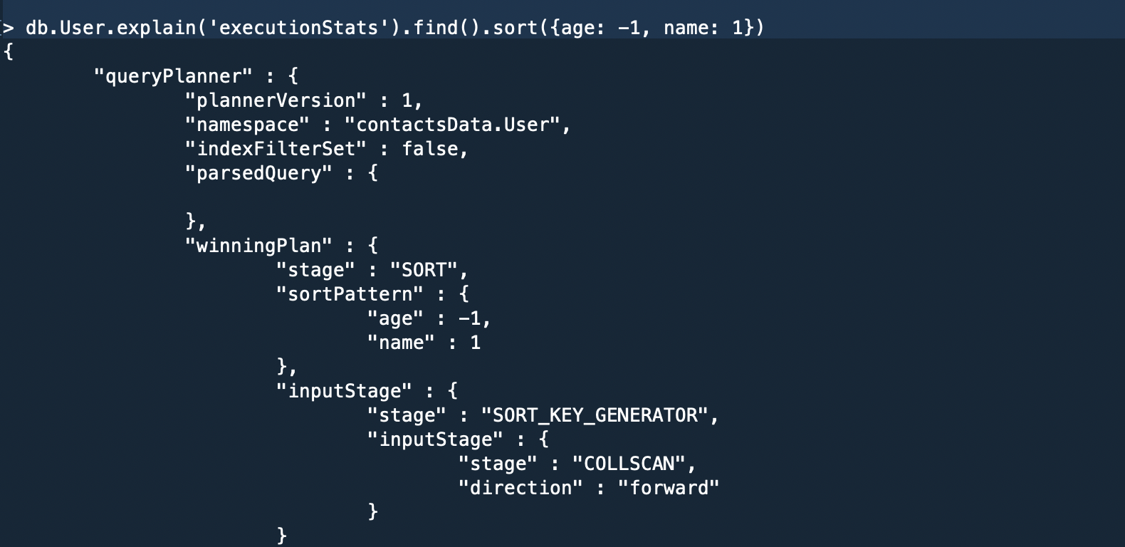
Here in the “winning plan”, we can see the whole collection was scanned.
Note: For a query to use a compound index for a sort, the specified sort direction for all keys in the cursor.sort() document must match the index key pattern or match the inverse of the index key pattern. This means for the above example both {email: -1, age: 1} and {email: 1, age -1} is supported but not {email: 1, age: 1} or {email: -1, age: -1}.
Query to create Partial Index:
In the execution statistics mentioned below, the winning plan was “COLLSCAN” because we created a partial index for indexing documents having a “score” above 33, and our query is searching for a value above 32 therefore MongoDB rejects index scan and performs collection scan to avoid the incomplete result.

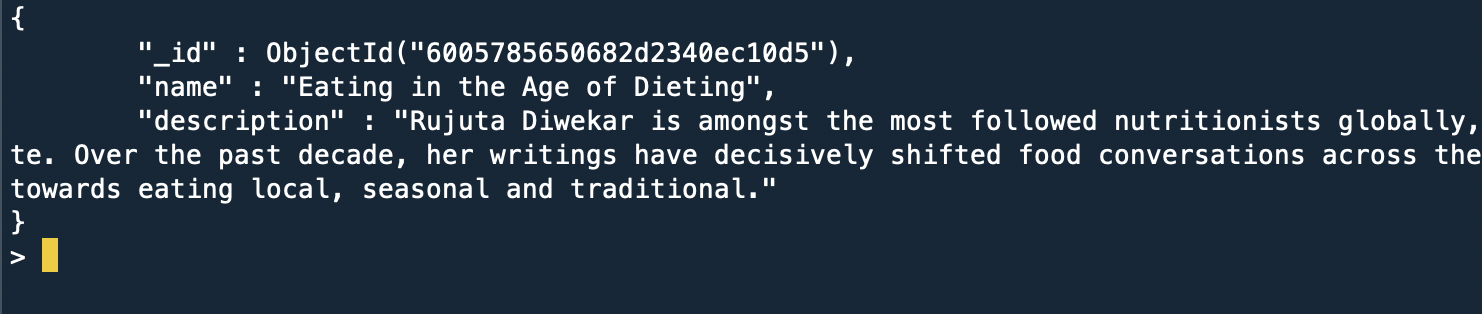
To search a collection having a text-based index, the query looks something like this:
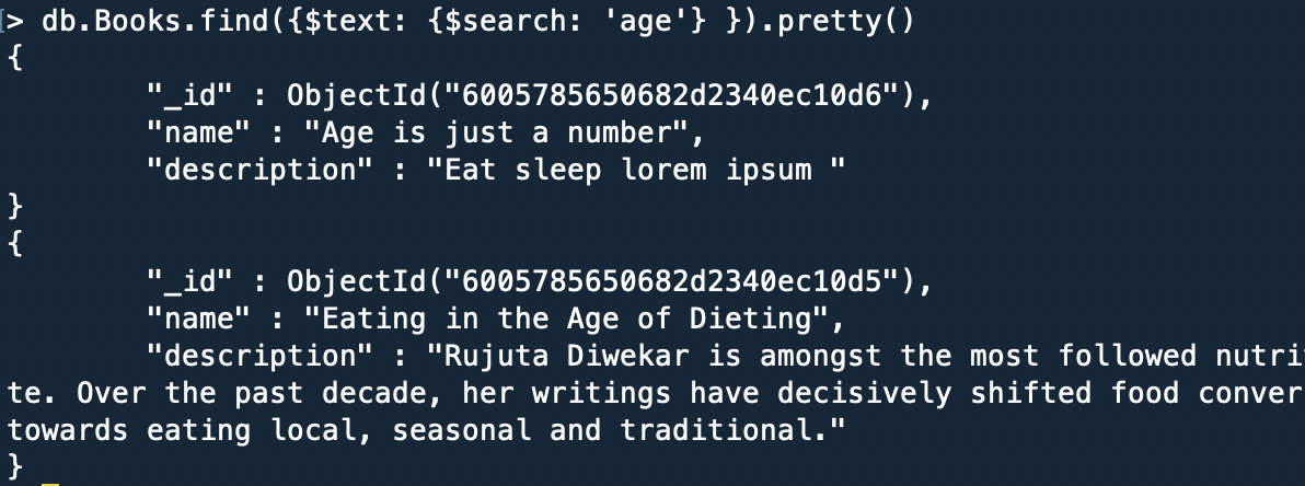
Word Exclusion: MongoDB also has the feature to exclude words from the search query. Simply add subtract before the word that is to be excluded.
For example:
Result: The document having the name property “Age is just a number” is excluded.

Now I get it. If we index all our fields it will make our application fast. Not true!!!
Indexes come at a cost, it takes substantial time when creating new documents when a collection have various indexes set on it. All the existing indexes will be re-calibrated every time a document is added. Also one should not use indexes if a query returns a major chunk of your collection because it adds an extra step of going through indexed fields and fetching corresponding documents.
Above mentioned indexes are some of the widely used indexing methods. Indexes can be introduced and used at any point of time in the development cycle. So, play with indexes create them, drop them and find out their execution status to choose what best works for your application.
Happy Coding!!!

Hoping you all are familiar with the term Headless/Decoupled Drupal, I won't be diving into the details. However, if you'd want to know more about what Headless Drupal is, you are just one click away from finding the secrets of the Headless world! Today we will demonstrate how Drupal's JSON API can be leveraged to create a Decoupled application with Next.js as our rendering layer and Drupal Commerce as the content hub.
Note: We will follow this up and cover checkout functionality in another blog post.Here is a link to the starter package. This is still a work in progress but good to get you started
Drupal Commerce provides you with a starter project. This will make your content work easier as it provides you with some preconfigured products. Alternatively, you can set up your site from scratch by following the Commerce documentation here.
Here is a link to the starter package. This is still a work in progress but good to get you started. Go through the readme file to check how to set up your Next.js site.
This is how your homepage should look like:

Here are some of the Next.js functions we will be using to fetch data at the build and run time.
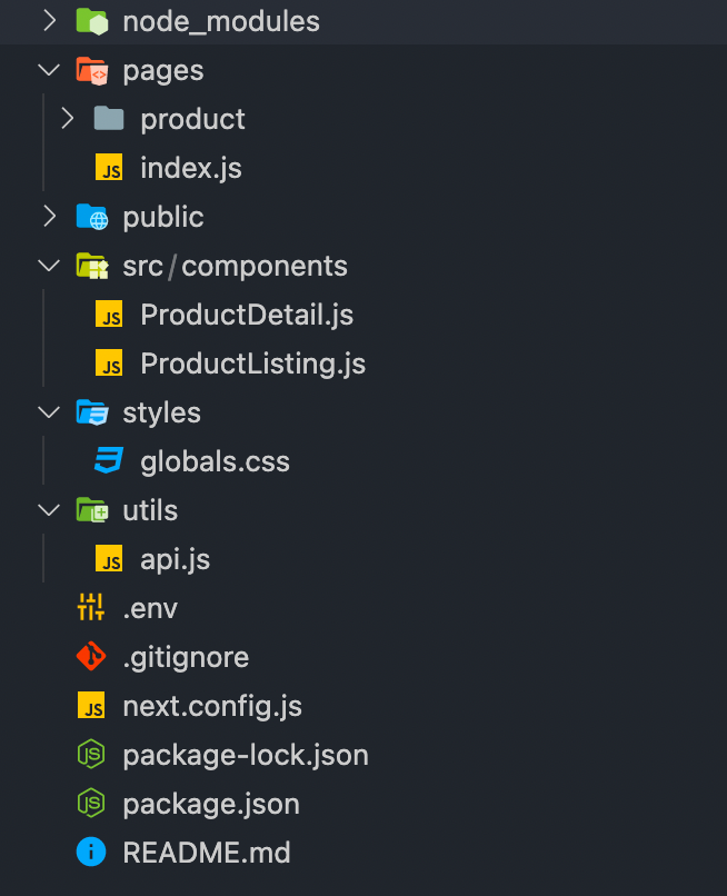
As mentioned above each page in Next.js is associated with a route based on its file name. So the index.js file inside the pages folder will work as our homepage.
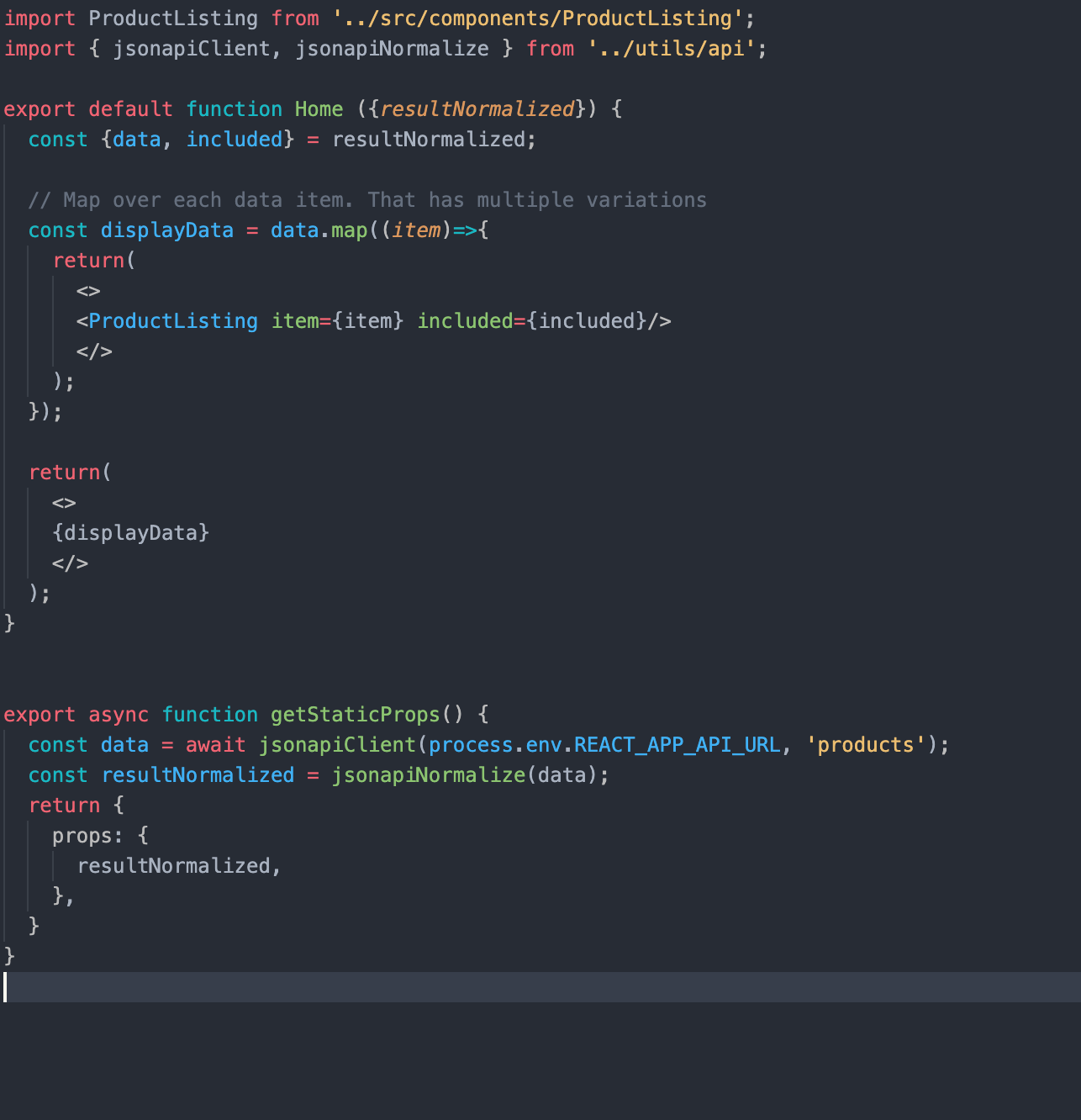
In getStaticProps, we are using our JSON:API Client (you can find the relevant code in the api.js file) to fetch the relevant data and filter it as per our needs. getStaticProps function returns the data as props to our default component which is further manipulated to get the desired result.
Next.js also supports dynamic page routing. In Next.js you can add brackets to a page ([param]) to create a dynamic route. Inside the product folder in the pages folder, we have created a file [id].js which will be responsible for creating our product detail pages.
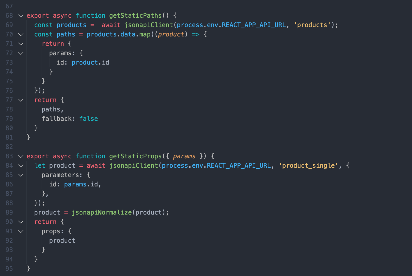
Here, getStaticPaths fetches the products id's for us and passes them as params to getStaticProps and get static props to pass the product data as props to the default product component.
Note that we are using the product id here. Because with JSON:API in Drupal you can't filter by path alias due to technical limitations. JSON:API filters translate to entity queries on field values; because Drupal path aliases aren't fields you can't use the filter query param to look up articles by their alias.
Another thing to note here is that for better a developer experience in development mode, getStaticProps and getStaticPaths run on every request otherwise they only run at build time.
This is it! You have set up a Decoupled site with a simple listing page and detail pages. As this is still a work in progress. If you face any difficulties please add your queries in the comments section below and I will be happy to answer!

Having a map is a vital tool for engaging with audiences for many online businesses. Interactive maps allow direct interaction with your site visitors. It also responds and anticipates the needs of your users/customers. In this article, we are going to develop a simple interactive map that shows the state and union territory wise Covid-19 cases in India using Leaflet JS and React.
Let’s get started.
Leaflet is an open-source JavaScript library for developing interactive maps. Weighing just about 39 KB of JS, it has all the mapping features most developers ever need. It’s a lightweight, open-source mapping library that utilizes OpenStreetMap. It has more than 30k stars on GitHub.
We need to install react-leaflet in our React project. Please follow the steps provided in the following guide.
Once the react-leaflet is added to our package-JSON file, we need to add a few more things to view our map correctly.
Now we need to add some CSS to our file to start using the map straight away. You can do that either by including the CSS link tag in your head, or you can simply copy-paste the CSS from the file below directly into your project(index.html):
We need to set the width and height of the .leaflet-container that the map renders itself into, otherwise it won’t be visible because the div will have a height of 0px:
Once this is done we are ready to get started. The below code displays the code required to render the Leaflet map in the React App. Here we have imported the MapContainer from react-leaflet (along with some other packages which we’ll use in later stages) and we’ll return it from our App component.
MapContainer component: It initializes the map. We set the center position of the map by adding latitude and longitude along with the default zoom level of the map.
TileLayer component: A tile layer is a set of web-accessible tiles that reside on a server. We have added the URL and attribution to our TileLayer component.
To display the data in our map as markers, first, we need the data source. I have created the data source in a JSON file that contains all the state-wise(and union territories as well) covid details in India. We will load this data locally from a JSON file, but to get an idea how our data looks like, here’s an example:
Once the data source is created, we can map through the data inside our MapContainer component, which returns a marker component for each of the state-wise data related to covid. A Marker component is used to display clickable/draggable icons on the map. It requires a position property to display the render location on the map. It takes an array of [ latitude, longitude ], the same as the center property in MapContainer.
In addition to this, we have initialized a useState hook with null. Inside the click eventHandler we will set the activeCovid when the user clicks on the marker. It will show the information to the user about the particular selected stated in a map popup.
Since we are tracking which state or union territory the user has clicked on, if the data is available for that state or union territory then we can display the Popup. The Popup component will display a white rounded rectangle shape that can be closed, and much like a Marker component, we need to give a position so it will know where to render on the map. Inside the popup, we can pass our HTML to show the total cases, new cases (1-day *), cases per 1 million people for the selected state or union territory.
There is an onClose property/event on the Popup component. When a user closes the popup it will help us track and update the setActiveCovid state hook accordingly.
Now we can add our custom icons as well. It is very easy in the leaflet to add our custom icons. First, we need to import the icon from the leaflet itself. With that, we can create a new icon instance by providing the URL location of the image along with its size.
The Marker component provides an optional property icon that can be set to the covidIcon variable that we created. Once the custom marker is added our website will look like this.

In this article, we have learned that React-Leaflet is a great open-source free mapping library alternative to Google Maps and MapBox. It is an extremely easy-to-use package and is extremely lightweight (39KB of JS). We have also demonstrated a small use case where we have displayed the state or union territory wise Covid-19 cases in India using Leaflet-react. Feel free to play around with this code to develop your own interactive maps. And share your experience with us in the comment section below!
To know more about how to implement navigation with Leaflet Maps click here.

Today, we are going to see how we can add routing to our leaflet maps. This blog will show how we can make use of the leaflet maps to show the route between a source and a destination. For achieving this we will be using the Leaflet Routing Machine module.
Leaflet is an open-source JavaScript library for developing interactive maps. Weighing just about 39 KB of JS, it has all the mapping features most developers ever need. It’s a lightweight, open-source mapping library that utilizes OpenStreetMap. It has more than 30k stars on GitHub.
Leaflet Routing Machine is an easy, flexible, and extensible way to add routing to a Leaflet map. Using the default is just a few lines of code to add fully functional routing, but you can still customize almost every aspect of the user interface and interactions.
We need to install react-leaflet in our React project. Please follow the steps provided in the following guide. Once the react-leaflet is added to our package-JSON file, we need to add a few more things to view our map correctly.
Now we need to add some CSS to our file to start using the map straight away. You can do that either by including the CSS link tag in your head, or you can simply copy-paste the CSS from the file below directly into your project(index.html):
We need to set the width and height of the .leaflet-container that the map renders itself into, otherwise it won’t be visible because the div will have a height of 0px:
Apart from the react-leaflet, we need to install a leaflet-routing-machine package as well:
And afterwards, we need to import the below files in our routing component:
Import library's CSS file:
Import library's JS file:
So for our current use case, we will create a simple leaflet map and add routing to it. Users will be able to enter source city and destination city, based on which it will show the routes between the two locations. Just for our understanding, our website will look like below:

First, we’ll render the leaflet map in our React app. We can do this by importing 2 components from the react-leaflet:
Once the import is done now we’ll display the map with the help of the imported component.
This will render the leaflet map in our React app. So the basic functionality of the imported components are:
MapContainer component: The Map component requires that we set a center position, which is an array containing latitude and longitude, along with the default zoom level of the map.
TileLayer component: A tile layer is a set of web-accessible tiles that reside on a server. We have added the URL and attribution to our TileLayer component.
Once the Map is loaded in our React app now we add two Autocomplete dropdown menu’s in our React app and we will create a data source containing data of all the major cities around the world as below:
In the above dropdowns, we are saving the value of our selected city using setSourceCity & setDestinationCity using theuseState on the onChange event in the dropdown. Once we get our selected city we will pass these values to the Routing Component as props.
Now in our Routing component, we will destructure the props to sourceCity and destinationCity.
Now we will use the useMap hook which will provide the Leaflet Map instance in any descendant of the MapContainer.
Then we will instantiate a new routing control with the waypoints. We will initialize the waypoints with the latitude and longitude coming from the de-structured props sourceCity and destinationCity. Then we will add that to our map.
That’s it we have added the route to our map. It’s that simple. So our final website will look like below:

In this blog, we have learned how to add routing to our leaflet maps using the leaflet-routing-machine module. Also, we have developed a small use case where we can select the source city and destination city from the dropdown and it will show the route between the two cities. You can access the complete code of this tutorial here. If you would like to know more about how to build interactive maps with Leaflet and React click here.

Next.js is a result of the combined work of 1600 community developers, industry partners like Facebook and the core Next.js team. Its philosophy has always been to make DX (Developer Experience) as good as UX (User Experience). And this really shows with all the different features Next.js has introduced over the last few years making it the first hybrid framework to succeed at scale. Providing features to build both static and dynamic websites with blazing fast speed.
Whether you’re starting with a single static page or deploying a dynamic site with billions of pages, NEXT.JS is the hybrid framework that meets you where you are and grows with you.
– Vercel CEO Guillermo Rauch
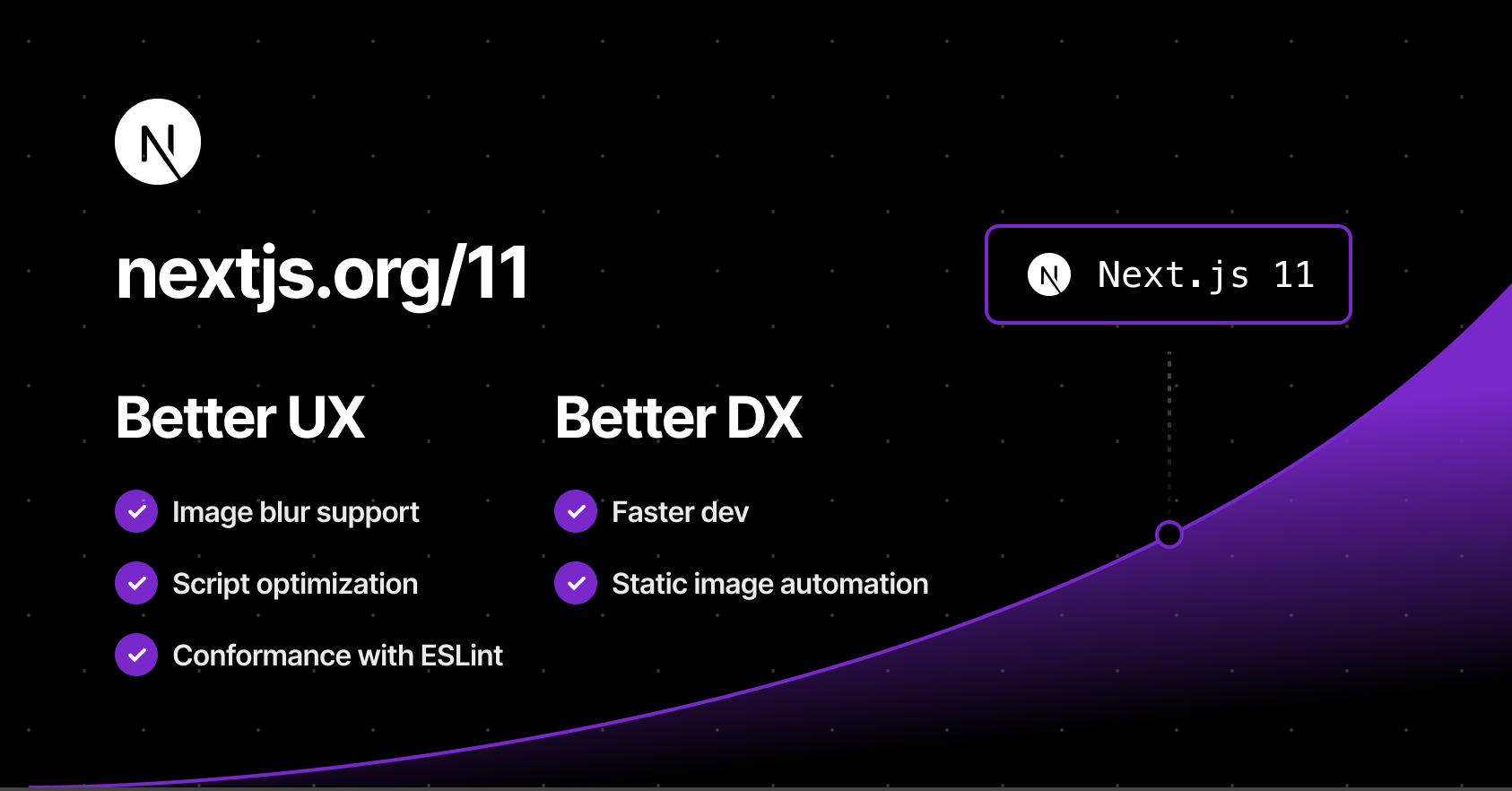
Vercel, the company behind the React and JavaScript framework Next.js, announced the release of Next.js 11 yesterday at its Next.js Conf.
Source - Nextjs.org
Let's dive into some of the important new features that Next.js has introduced in their latest Next.js 11 release.
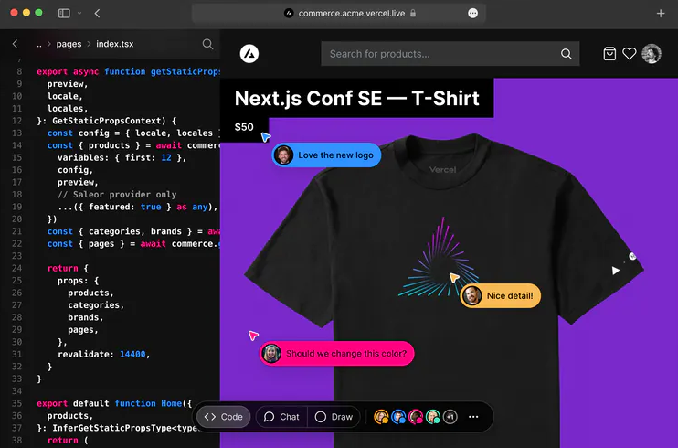
This is basically Figma for developers. This feature will let you code in the browser, with your team, in real-time. This is probably the most important feature and will simplify team collaboration to a large extent.
Source - sdtimes.com
How this works – You need to be a part of the team which has deployed the application to the Vercel platform. If you are a part of the team all you need to do to get started here is to simply change your URL from .app to .live and Hola! This feature does not support collaborative editing inside the editor yet, which means that it will only update the changes in the UI and not in the editor.
Conformance is a methodology used by Google internally from their experience over the years of building web, to codify best practices in a way that they are automated and enforceable. Google's web platform team has now begun open-sourcing their system for different frameworks.
In simpler words, it's basically a linter that does something more than just code analysis. You can simply type npx next lint after upgrading to Next.js 11 to get started.
You can read more about conformance here.
Images are essential to performance for any website and one of the most commonly used elements on the web. Since version 10.0.0, Next.js has a built-in Image Component and Automatic Image Optimisation. In Next.js 11, the image component has been upgraded to support:
Next.js 11 comes with a new component named next/script which will let you prioritise the loading of 3rd party scripts. In practice all you need to do is define the strategy property on the Next script tag and Next.js will take care of optimally loading it as per the strategy value. E.g:
In Next.js the CSS of fonts are automatically inlined at build time hence eliminating the round trip of fetching font declarations which as per Next.js will improve the FCP and LCP by as much as five seconds. Next.js also uses a pre-connect tag by default, establishes a connection with the underlying font files even faster. It supports both Google fonts and Adobe kit.
This feature is currently experimental, considering the issues encountered while migrating a React application to Next.js. To convert your React app into Next.js you simply need to use the following command
This will transform your React app into the Next.js app while taking the React app compatibility into consideration.
With Next.js 11, there is no need for any custom added configuration to make webpack 5 work for your Next.js app. Webpack 5 is now enabled by default, removing the manual overhead of adding the configuration in your next.config.js. Here is the upgrade documentation for webpack 5 you can follow.
Next.js 11 includes significantly faster starts and changes, real-time feedback, instantaneous live collaboration and significant image optimisation enhancements. Learn more about Next.js 11 updates here. You can also check out the upgrade guide for upgrading your Next.js app from version 10 to 11.

This article is a simple introduction to Redis and how to cache your Node.js application with Redis. Here, you will learn the utilization of Redis for caching through an example and how you can use it to improve your application speed and performance. Before that, let us understand what caching & Redis is.
Caching is the process of storing copies of files in a cache or a temporary storage location so that they can be accessed more quickly. The goal of caching is speeding up data access operations better than a database or remote server could allow. It is ideal in the case of expensive (in time) operations. As a back-end developer, our task is to complete the clients’ requests as fast as possible. Sometimes, queries require several operations like retrieving data from a database, performing calculations, retrieving additional data from other services, etc., that drag our performance down.
With caching, we can process the data once, store it in a cache and then retrieve it later directly from the cache without doing all those expensive operations. We would then periodically update the cache so that users can see updated information.
Redis is an open-source (BSD licensed), in-memory data structure store used as a database, cache, and message broker. You can think of it as a No-SQL database, which stores data as a key-value pair in the system memory. If needed, Redis supports disk-persistent data storage too.
Redis is best in situations that require data to be retrieved and delivered to the client in the least amount of time. Now that you have an understanding of what Caching and Redis are, let’s build a basic project that implements caching using Redis.
If you are an OSX user, you can install Redis using the command below. For other platforms, please follow the guide on https://redis.io/download.
Create a new directory for the application by running the following command on the terminal:
Initialize the directory to create a package.json file by running
After running the above command, you should have a package.json file in the redis-nade-cache directory. Now, we are going to request a json placeholder API https://jsonplaceholder.typicode.com.
Start by creating a simple Express server in index.js:
Now, start the server by running node index.js and open postman to request the photos endpoint.
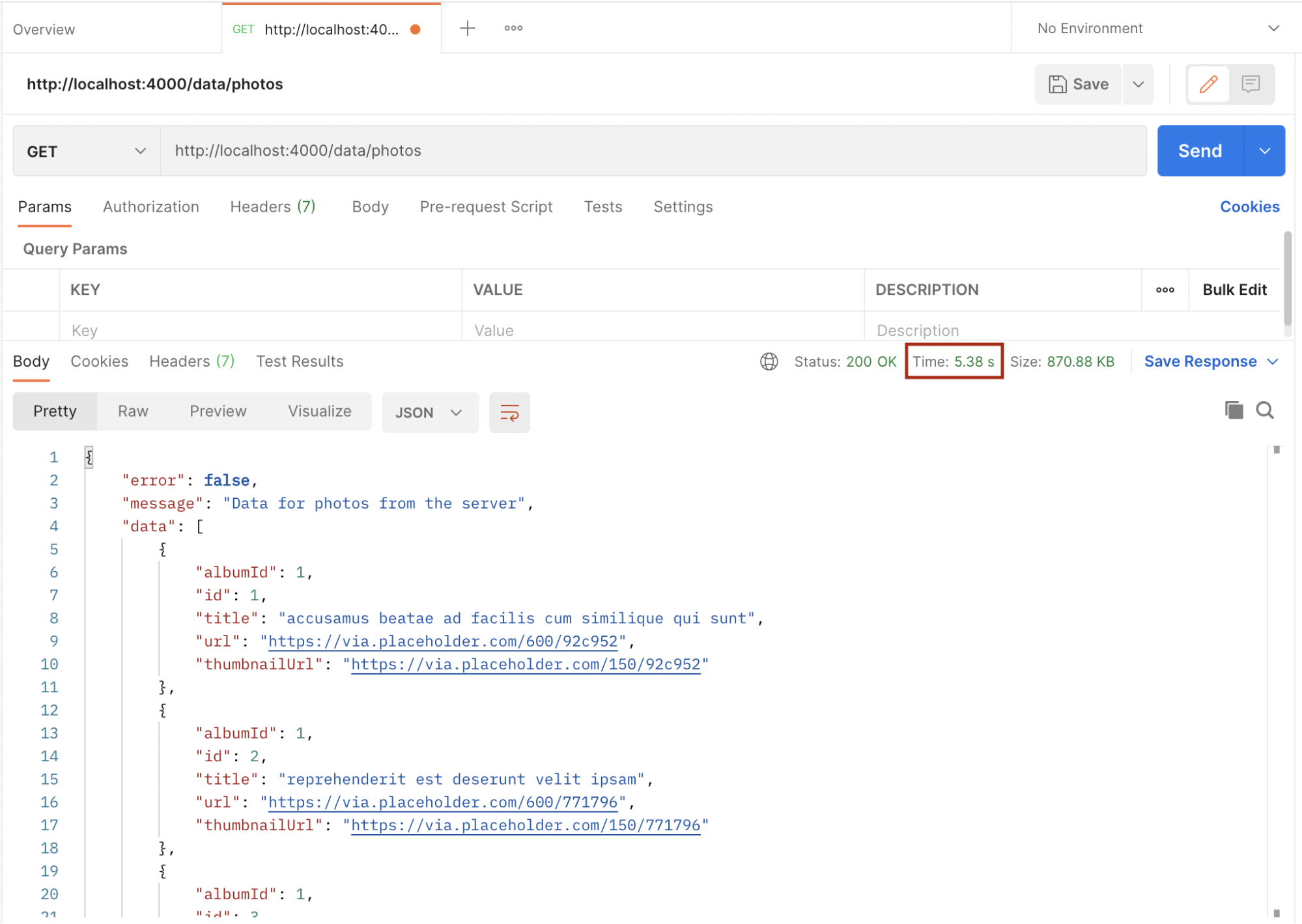
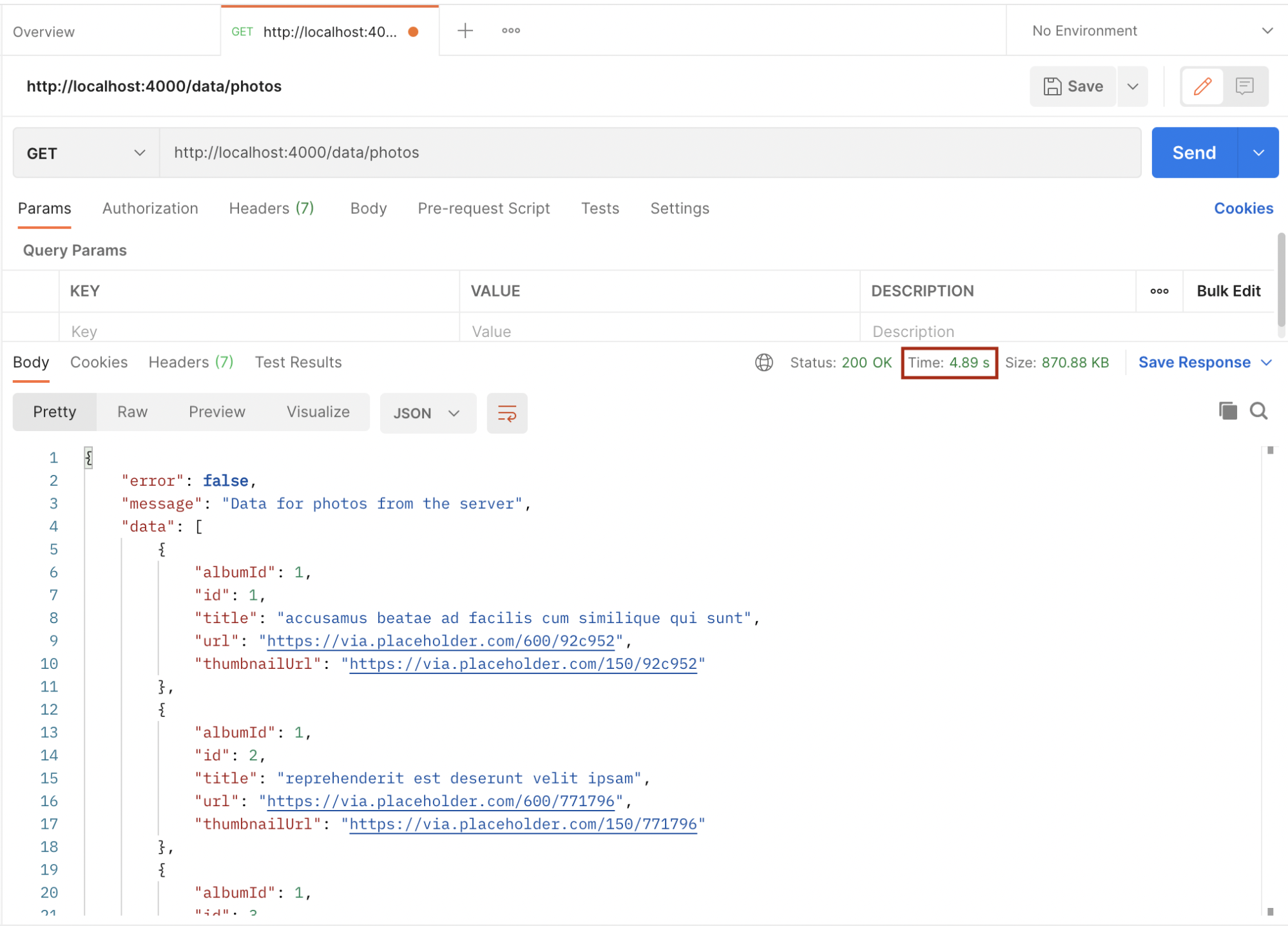
Take note of the time from the above images. The first request took 5.38 seconds while the second one took 4.89 seconds. We will improve this by implementing caching using Redis. Let’s implement Redis in the above example.
Install Express, Redis, and node-fetch npm modules with the below command:
Now that we have successfully set up Redis, the next step is to use it in our application to improve it by reducing the turnaround time of request and response. Now we will add the following changes to the index.js file.
First, we create a Redis client and link it with the local Redis instance using the default Redis port (6379)
Then, in the /recipe route handler, we will try to get the appropriate matching data to serve the request by checking for the key in our Redis store. If found, the result is served to the requesting client from our cache and there is no need to make the server request anymore.
If the key is not found in our Redis store, a request is made to the server and once the response is available, we store the result using a unique key in the Redis store:
Hence, subsequent requests to the same endpoint with the same parameter will always be fetched from the cache, so long the cached data has not expired. The setex method of the Redis client is used to set the key to holding a string value in the store for a particular number of seconds which in this case is 1020 (17 minutes).
Now, let’s test the application after implementing cache. Open postman and request the same endpoint as before.
If the key is not found in the cache, the request is sent to the server which takes 566 minutes to complete. Since the key didn’t exist in the cache before, it is now saved in the cache and subsequent requests with the same data will be fetched from the cache which makes it faster, and also reduces the load on the server. Below is the response time after the cache:

As we can see above, it took a blazing 48 milliseconds for the request to be completed because it was fetched from the cache.
Redis is a powerful in-memory data store that can be used in our applications. It’s very simple to save and get data without much overhead. Refer to https://www.npmjs.com/package/redis for more use cases and refer to https://redis.io/commands for more Redis commands.

React 16.6 has added a <Suspense> component that allows you to “wait” for some code to load and declaratively specify a loading state (like a spinner) while you’re waiting. React Suspense was pitched as an improvement to the developer experience when dealing with asynchronous data fetching within React apps. This is a huge deal because everyone who is building dynamic web applications knows that this is still one of the major pain points and one of the things that bring huge boilerplates with it.
Let’s see what suspense is and how it’s used.
Suspense is a component that wraps the custom components and enables them to communicate to React that they’re waiting for some data to load before the component is rendered.
It is important to note that Suspense is neither a data-fetching library like react-async nor is it a way to manage a state like Redux. It simply prevents your components from rendering to the DOM until some asynchronous operation (i.e., a network request) is completed.
Here, the StudentList component is wrapped with a Suspense component that has a fallback prop. This means that if StudentList is waiting for some asynchronous operation, such as getting the lists of students from an API, React will render <p>loading..</p> to the DOM instead. The StudentList component is rendered only after the promises and API’s are resolved.
This can also be written as –
What If StudentList was the one who triggered the operation?
In that case, we would have to move the loading check from the parent component to the StudentList component.
What if there are more components apart from StudentList, each triggering their async requests?
This would mean that each child component would have to manage their loading states independently, and that would make it tricky to organize the data loading operations in a way that doesn’t lead to a janky UX.
Take a look at the example below –
Here's an example that I have implemented on the CodeSandbox:
https://codesandbox.io/s/suspense-example-rvi1e
React comes with the support of lazy components. Instead of handling the dynamic import Promise, React.lazy allows you to use the dynamic component like a statically imported one. React.lazy() is a new function in React that allows you to load react components lazily through code splitting without help from any additional libraries.
Lazy loading is the technique of rendering only needed or critical user interface items first, then quietly unrolling the non-critical items later. It is now fully integrated into the core React library itself. We formerly used react-loadable to achieve this but now we have react.lazy() in the React core.
Suspense is a component required by the lazy function basically used to wrap lazy components. Multiple lazy components can be wrapped with it. It takes a fallback property that accepts the react elements you want to render as the lazy component which is being loaded.
React.lazy takes a function that will execute the dynamic import. It returns a component that will run this function during its first rendering.
The resulting promise status is used by Suspense:
Suspense helps us to coordinate asynchronous resources with our loader component rendering. We have already used it in the above example.
We have seen how to get started using the lazy and suspense components provided by React to load components lazily. The above example is a basic one as compared to the numerous possibilities these new features bring.
This was a quick introduction to “React.Suspense” and how it is used with code splitting. Stay tuned for our upcoming blog on ‘What Suspense will become in the future.’
A hint – It will be used for much more than just code splitting!
Here's a glimpse of the React team’s vision for what the future of React might look like, including some never before seen prototypes.

Over 4 billion people are using the internet today. It is used by different businesses (like e-commerce, social media, etc.) for attracting more customers. Every business is going online (especially during this pandemic) with the notion of gaining the upper hand on the competitors with different marketing strategies.
One of such marketing strategies is Multilingual websites to attract more customers, by catering to different demographics.
As the name suggests, a multilingual website is a website that has content in more than one language.
English might be the most widely spoken language globally but there are other well-known popular languages like Mandarin, Spanish, etc. A website that displays its content in more than one language is reachable to more people comparatively.
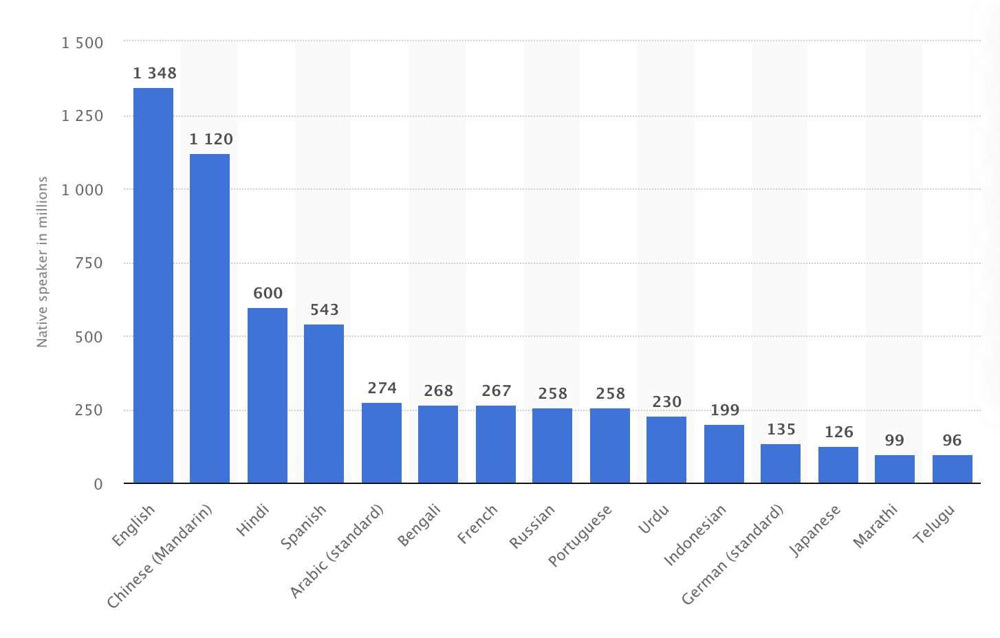
The most common languages used on the internet as of January 2020, by the share of internet users are -

Source: Statista
Human beings have a special regard for their native language even though they can speak and read English well enough and it is a normal thing. Similarly, if the website displays content in the region’s native language, it will connect with people easily. It also shows that your business truly cares about the non-English speaking customers and their language is just as important.
The most spoken languages worldwide in 2021:
Source: Statista
As you develop your website in multiple languages, your target audience is getting bigger. There will be an increase in the number of customers and as a result, the sales will also increase.
There is a famous quote by Dr Seuss:
No matter what your business is, it faces market saturation and huge competition these days. A multilingual website is a great way to stand out from your competitors.
On Google, there are a lot of languages to choose from. If you have a multilingual website then search engines will show your website’s result in the user’s preferred language.
Now the question arises of how can we make our website multilingual. There are a lot of options available in the market but today we are going to discuss how we can achieve this with Strapi (Headless CMS).
A Headless CMS is a back-end-only content management system where the content is built from the ground without its head, which is the front-end. It makes the content accessible via API for display on any device.
Strapi is one of the most popular open-source Headless CMS right now. It has more than 35k stars on Github with growing popularity each day. Strapi enables content-rich experiences to be created, managed, and exposed to any digital product, channel, or device. It gives a very user-friendly experience that you can stack up with any technology. Please check out their Github repo below:
https://github.com/strapi/strapi
There is no plugin available for making a website Multilingual. As per the below road map, the plugin is still in the testing stage and according to the recent update, it will either be launched at the end of Q1-2021 or might get postponed by a few weeks into Q2-2021.
Roadmap link: 19-content-internationalization-ce-ee-v3
Firstly we need to do the local setup for Strapi. Please follow the instructions mentioned in the guide: Installing from CLI
URL: http://localhost:1337/admin/
Step 1 - On the left panel of the dashboard, click content-types builder, it will give you an option to create new collections. Click on it and name the collection as ‘article’ and click continue.
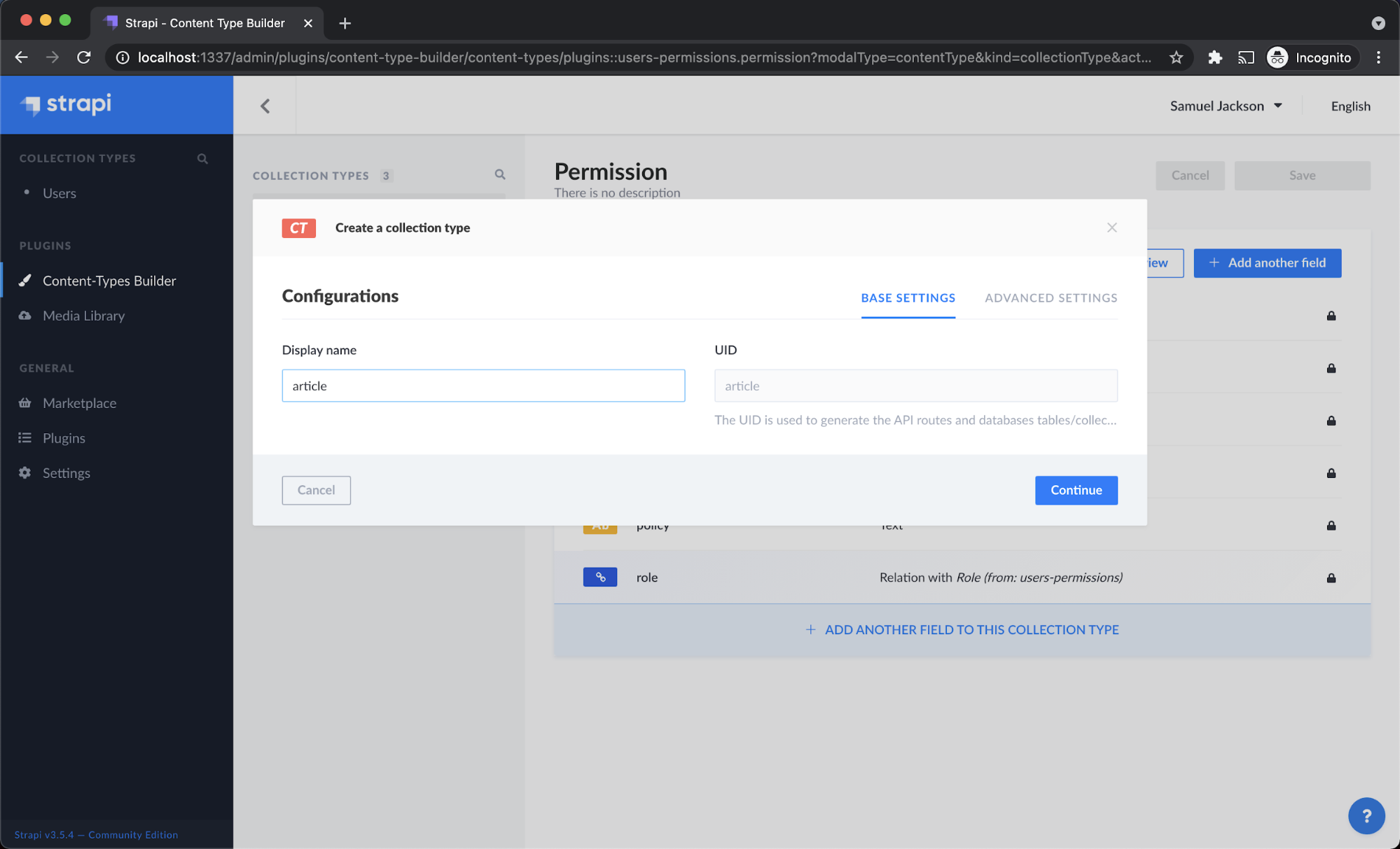
Step 2 - It will now ask you to add fields for the collections. Since we are building a multilingual website, we will specify each field name with the language code as a suffix in the field name just to differentiate between each language.
For eg: If we need to specify the field ‘title’ for the English language then the field name can be mentioned as ‘title_en’. In the same way, we can mention the Hindi language as ‘title_hi’.
Likewise, we need to add the title and description along with the language code as the suffix for the field name. After adding all the fields, click Save.
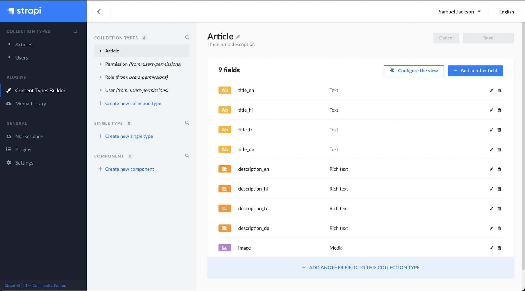
Here is the list of all field names created for this multilingual website:
We are using 4 languages here English(en), Hindi(hi), French(fr) and German(de). Article collection will have the following fields:
Step 3 - Now, let’s add a few articles to the created collections. In the left side panel, under collection types, click on ‘Articles’ and then click on add New Articles.
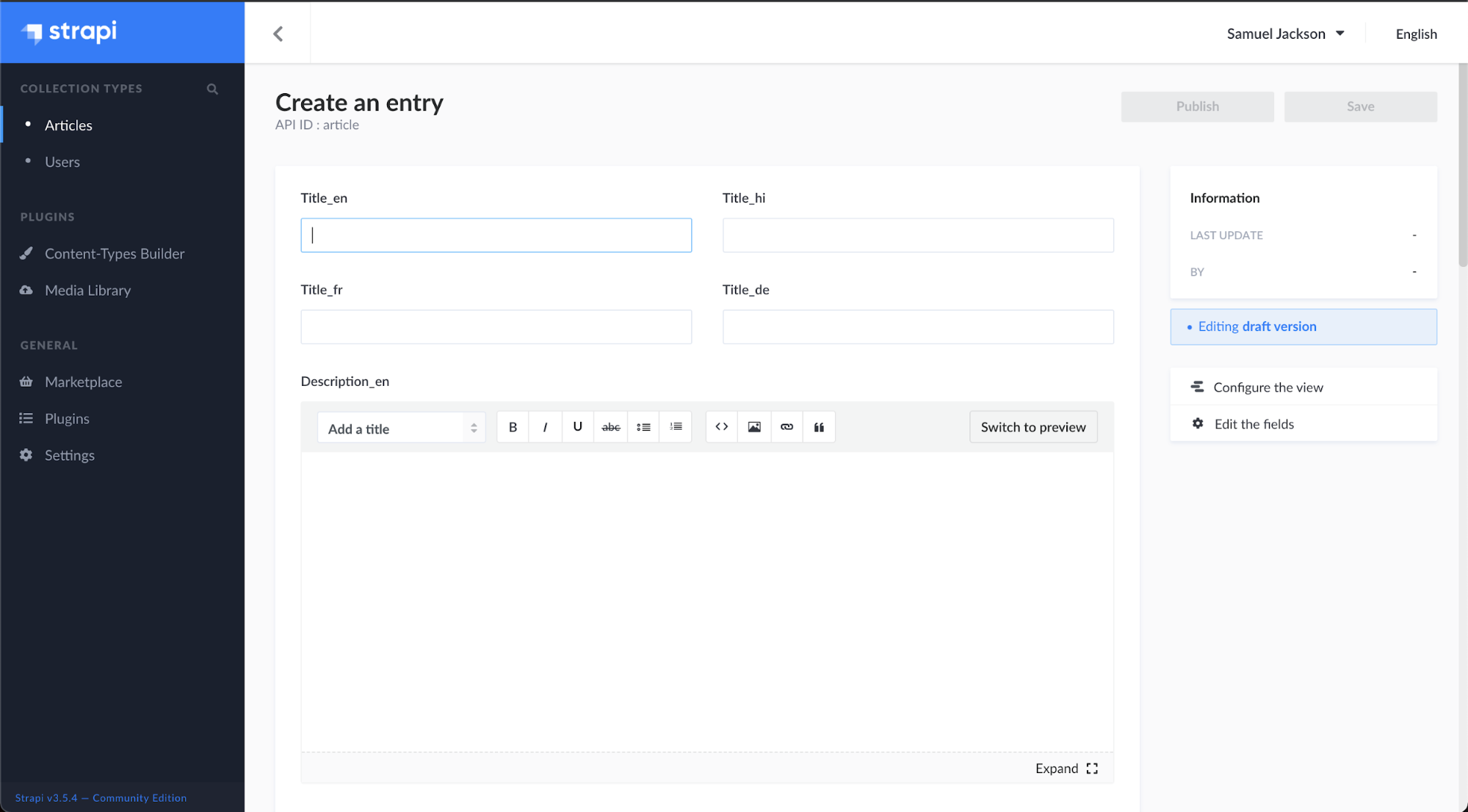
Now as per the defined language suffix, type the content in its specific language field as shown below:
Title_en: Munnar Travel Blog – Tourist Places
Title_hi: मुन्नार यात्रा ब्लॉग - पर्यटक स्थल
Title_fr: Munnar Travel Blog - Lieux touristiques
Title_de: Munnar Reiseblog - Touristenorte
The same needs to be done for Description fields as well. This will help in distinguishing different languages to display in the front-end by using their field name. We can easily differentiate with the help of the language code provided in the Suffix.
The full approach for adding an article is below:
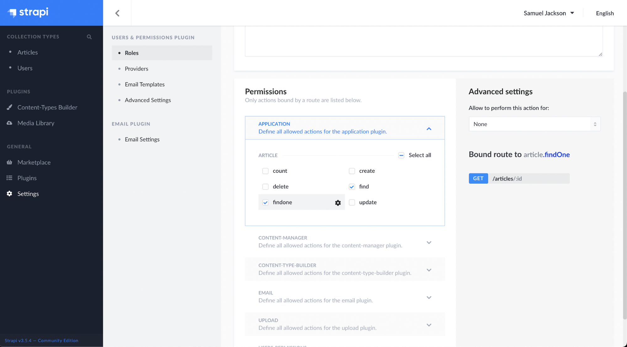
Step 4 - After adding a few articles, we need to provide the ‘Article’ collection permission to send the API requests to fetch the data from Strapi. For That Click on settings > Roles > Public.
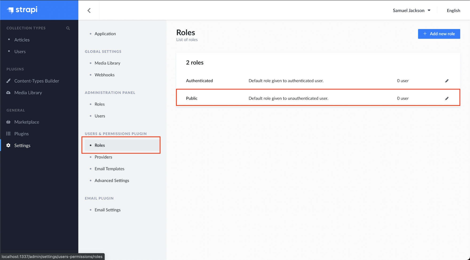
Scroll down to the Permissions and check the find and findone boxes. Save it and we have successfully given permissions to our Article collections.
App.js:
Here we are fetching all the data from the Strapi using the URL ‘http://localhost:1337/articles’ and then feeding the JSON data to our header component as props.
index.js(Header Component):
The data from App.js is used here as props to display the content in multiple languages.
Now, we’ll handle the multiple languages by creating a Header for our blog.

Here, we have created 4 radio buttons for each language (English, Hindi, French, and German) and on selecting any one of the languages, our content will display in that particular language.
Here, the default selected language will be English and if the user selects any other language our function handleChange will get invoked and the useState hook will set the new value for that language code. With this, the page will start showing the content in that language.

In this tutorial, we have learned how to build multilingual sites with Strapi. We first started by developing our back-end with Strapi and added collections with articles, then we went on to build our front-end with React to display content fetched from Strapi. You can access the complete code of this tutorial on Github.
Backend: multilingual-with-strapi-backend.git
Frontend: multilingua-with-strapi-frontend.git