

Compelling designs are capable of impacting and leaving lasting impressions. At QED42, designing has always been an exciting process. Ideas, theories, and endless possibilities have defined the team, which has grown leaps ever since it first was introduced.
Our team of designers includes UX strategists, UI designers, UX researchers, UX writers, and visual designers.
We believe in the idea of finding the right balance between experience and cultural fit. We look for people who are driven by design irrespective of their background. In this blog we’ll provide you with a sneak peek into how design team interviews are conducted at QED42, thus helping you prepare for a possible exciting career with us!
Our interview process consists of a talent acquisition call, a video call with the design lead/manager, and take-home assignments focusing on your work, how good you are at managing work/teams, how you manage time during multiple projects, reaching goals, synthesizing data and your level of creativity.

The search for the best creative mind starts with a brief 30-minute talent acquisition call with a recruiter. The purpose of this call is to get an understanding of your professional experience with a focus on what you bring to the table and your aspirations. You will also get some insights on how this position can benefit you and details about QED42’s culture.
This is usually a 40-45 minute video call, with the design lead and other members of the design team. In this round, we would like to know more about your past work experiences focussing on problem-solving skills, UX thinking, and design thinking.
The design process is at the heart of the conversation where we would like to talk about what process you followed to get to the design based on your research, whether you were able to solve the business problem, and was the output impactful.
We expect you to provide a walkthrough of 1 or 2 projects that you’ve actively been a part of and contributed directly. The focus should be on different aspects that include and aren’t limited to - cross collaborations, stakeholder management, data and experimentation skills, and your method of driving the design process.
We will need an in-depth overview of where and how you were responsible for the project, from its inception to launch. We encourage you to keep supporting documents handy, i.e. - wireframes, sketches, approaches, mock-ups, and finished designs. This will help us to discuss and understand the process and details of the project better.
Dig in and go deep to provide all you’d like on team set-up, product context, your approach during each process, your contributions and ideas, collaborations, testing, and your overall ownership of the product cycle. We want to know the challenges, solutions, and outcomes of the project. Tell us more about what you did, how you did it, and what contributions you made.
At QED42, we like to know people, both for the experience and ability to adapt, so be well-prepared to engage in some Q&A sessions and fruitful discussions.
We would want you to create a deck using the given framework to showcase your project.
Describe the challenges faced and the metrics set for success. Give a brief introduction of your team and the role you played. Walk us through the research methods opted for (can include benchmarking, user interviews, etc), describe the pain points, and showcase the process and iterations.
In case there is validation and prototyping, we’d like to see those too. Explain how you worked with teammates and stakeholders.
Share the final output, and sum up the results and learnings while giving insights into how the user was impacted positively.


This step is level and role-specific, depending on whether you’ve applied to be a visual designer, UX strategist, or UI designer. It mostly consists of a task that helps design team stakeholders make a well-thought-out decision and also to understand your process better.

Like every interview, our purpose is to get a clearer vision of what makes you a good fit for both the team and the organization. Our interviews are interactive, knowledge-sharing, and fun, it involves connecting with all the major design team stakeholders.
We’re attaching a document containing some of the possible questions that are usually asked in our interviews so that you can be well-prepared.
Our questions focus on how committed you are to your craft and your work ethic. We try to understand your ability to work in a team, and how open you are to taking differences of opinion. While we look into how you might set into a team, we also try to gauge whether you’d be a good cultural fit for the organization.
We are excited to meet you and have you as part of the team. So, head to our careers page and apply for any suitable positions.

Design plays a crucial role in the success of any product or service. Good design, in all its forms, naturally benefits users by being easy to understand and interact with. While it's easy to distinguish between good and bad design, identifying the same for UX research can be a little tricky.
UX research, or user experience research, is understanding how users interact with a product or service. It involves various methods like user interviews, usability testing, and surveys to identify user needs, pain points, and preferences.
By conducting UX research, businesses can gain valuable insights into the user experience, leading to better product development and optimization.
The value of UX research is not well-established, but considering the following points can lead to understanding the tangible nature of some benefits:
UX research fosters the creation of intuitive products, ultimately driving faster adoption, higher satisfaction, and increased sales.
As explained in the ROI of UX Design, ROI is a financial metric used to analyze the scope of investment and figure out the scope of improvements. In UX design, these metrics could be described as measures that calculate the effect of an investment in design. ROI measures also help to achieve design goals from a business point of view. So, ROI is simply a ratio of money gained over the money invested.
Businesses can assess the ROI of UX research by tracking universally accepted metrics. Here's how you can measure some of them:
Track your platform using analytics tools like Google Analytics and observe changes in traffic patterns following improvements made based on UX research findings.
Track conversion rates for specific actions you want users to take on your website, noting any increases post-implementation of UX research findings and making improvements.
Measure this by conducting surveys or using tools to gather CSAT scores after user interactions with your product or service, looking for improvements in satisfaction scores.
Measure this by conducting NPS surveys to assess customer loyalty, and observing any increases in NPS scores post-implementation.
Measure this by tracking the volume and nature of customer support inquiries, noting any decrease in inquiries related to usability issues after implementing UX research.
These are some of many such metrics. The specific metrics you choose will depend on your specific goals and the type of product or service you offer.
By monitoring these metrics before and after implementing UX research findings, you can build a case for the positive quantitative impact of UX research on user experience and key business goals.
Combining data from different sources can provide a more comprehensive understanding of the impact of UX research on your users and your business.
Imagine your happy users as your loyal friends – these are the ones who keep coming back and recommending you to others. That's the power of a happy user base! UX research is like having a secret ingredient to understand what makes those friends click.
The loyal user base helps to drive repeat business, positive word-of-mouth, and ultimately, sustainable growth.
By investing in UX research, you're not just creating a better product, but fostering a thriving ecosystem where both users and businesses benefit.

The word "Design System" has been around for quite some time now. The design systems were initially used and build as manuals of standards used for signs and brand books, which later came to web word with CSS frameworks, like the famous Twitter Bootstrap functioning and serving as a set of UI elements. Over time, the Design System has become more mainstream with the Atomic Design methodology, adopted patterns, and guidelines.
Over the years, we have seen the world's top companies create their unique design systems. They have changed the way we design digital products by utilizing a set of standards to create a scalable, consistent innovation pace. Airbnb, IBM’s Carbon, Apple, Material design by Google, Polaris by Shopify, UBER — each of these companies build amazing user experiences through their design system that reflects a coherent and recognizable company voice.
While most of us know what a design system means, some of us find it difficult to implement, for some people it's a library of components and some confuse it with style guides and pattern libraries. Well, it's simple, as simple as a consistently updated app that feels the same every time we use it. What makes that work? — a single source of truth build together by design and development teams.
Often, the library of UI components is considered the core of the design system, but there is more to building a source that is scalable, flexible, stable yet completely maintainable.
A Design System is a continuously evolving comprehensive guide that saves time and creates seamless processes to operate within teams. Creating a design system needs rules, constraints, and principles which get subdivided into smaller parts under foundations, components, content, and the remaining technical and design stack.
Designer Daniel Eden speaks of the design systems as an interaction between tools and people. He describes the design tools to be as richly interactive as Lego and advocates that a design system is about people: how they interact, how they understand one another, and how they work together to achieve a common goal. It’s made by people, used by people, and experienced by people. It’s challenged and shaped and broken by people. This is by far one of the most humane definitions of the design system which speaks of its process as a co-creation rather than a source.
Developers have their understanding of the design system, Designers contribute differently, design writers may write a different definition and all companies big, small, or agency models have a different set of values, rules, and governance processes for creating the design system but the aim remains the same which is to reduce the technical and design debt. The design system is not set in stone — they are a constant work in progress, open to iteration to improve, adapt, and scale, building a unified codebase and design under the similar building blocks — Rules, Constraints, and Principles.
The design system comprises of rules, constraints, and principles. These building blocks are created with consideration of how they will scale across the entire product and create a consistent user experience. Let's look deeper into the same.
1.Rules
How do you build an environment to set up the design tools? How do the creators and contributors ensure that everyone is working from the most recent version of the design system?
Rules are laid for everyone to understand and interpret what's inside of a design system. They are subdivided into values and purpose as resources that help everyone in the team and new users in creating designs from existing elements. They are a governance system that lays the foundation for the design system's workflow.
A system is a framework. It’s a rule book. It’s what tells you how those patterns work together.
— Brad Frost

The value part of this rule book governs the processes of the design system. They unify the team around governing constraints and principles. They are a source of truth and a system of record for design and code. The purpose defines how individuals can contribute back to the design system with new elements. They establish a shared language and communication across the team, which, in turn, creates better communication, reasoning, confidence, and optimism.
2.Constraints
The journey to creating and maintaining an effective design system can be challenging. There are numerous little decisions — How many fonts should be defined? How should we structure the use of colors? Where do we stop? Constraints in a design system helps to simplify every decision with some limitations and more possibilities.
The constraints define general guidelines for the use of colors, sound, layouts, multimedia, typography, data visualization, form design, mobile behavior, etc. They leverage their unique differentiation and elements of brand character throughout the design system to make every digital touchpoint a unified experience.
When designers design and build interfaces from a common point of constraints, limitations, and possibilities the users always know what they will experience when they regularly encounter the product. From the UX perspective, designing interfaces with scalable, common, and consistent constraints creates familiarity for users. From a technical perspective, constraints mean more efficiency, scalability, and less re-work for developers.
3.Principles
The principles of a design system provide the answers to the questions that may seem unseen initially. Design and development teams often operate with their own elementary set of standards. These standards help to assess the quality that is required to maintain a consistent digital experience. But, as we create a unified design system it becomes important to unify all sets of standards as common principles.
How do you define the necessary principles? How do you know what's indispensable and what's erratic? How do you know these are the principles that can guide your vision and purpose?
The principles of a design system act as reusable standards for everyone. These principles should replace instinctive standards with a shared understanding of how are they going to shape the experience for the users. They should be drafted to help navigate the complexity of designing software from the ground up!
The Carbon Design System by IBM defines its principles as the intent behind an outcome. They believe that great experiences deliver meaningful outcomes to your user. They reach both head and heart. To design for great user experiences, you must understand how they are put together and why they can touch people at a deeper level.

While writing down the principles of a design system teams should focus —
The principles of a design system through a series of clearly defined processes, guidelines, and standards, each with different objectives act as interdependent levels of attainment that, when used together, improve the odds of arriving at solutions.
The process that supports the creation of a design system — the Governance system helps to create an understanding of the roles and responsibilities of each team member involved in bringing the right people in at the right times, making everyone’s involvement beneficial to the quality of the output.
It's important that the governance system decides to invest time in setting the rules, constraints, and principles from the start. while most companies have more people representing their voice than you’d expect, from a product point of view all three building blocks should be written in a similar tone and voice. By having a source of truth and creating it together with strong building blocks you can offer users an amazingly awesome and consistent experience.
Here is how it works, it's like playing with LEGO — One single brick can be added to many constructions. The brick remains the same but each time the builder uses it differently to construct a new design, letting go of the restrain. Identically, the building blocks of a design system can be implemented to all levels of designing and creating the product to unleash their full potential, configured in many ways, creating a different style, a new design each time.

Define is the second stage of the design thinking process, it is preceded by the empathy phase. This phase is about synthesizing observations about users from the empathy phase and defining an actionable problem statement. Defining the problem statement requires the articulation of the problem to establish a detailed problem statement.
If I had an hour to solve a problem, I’d spend 55 minutes thinking about the problem and 5 minutes thinking about solutions.
Albert Einstein
The purpose of a problem statement is to capture what we want to achieve with our design. It is generated through a variety of questions, through different options, opinions, perspectives, and different ways of thinking about the problem. What difficulties are the users facing? What are the patterns of their everyday behavior? What needs to be changed and what should remain the same? These many questions frame the problem statement in a user-centered way.
A defined problem statement brings in focused clear direction for the stakeholders, project managers, and the team members about the final achievements and deliverables. The goal is to frame a meaningful, detailed, and actionable problem statement which leads to various solutions to ideate, which is the third phase of design thinking.
All phases of design thinking are a way of solving problems, strategizing, and designing in a human-centered way. A good way to define a problem is to frame a problem statement and write down the observations from analysis to synthesis.
To analyze the problem break down the complex concepts into smaller, easier to understand parts from the information collected during the phase of empathy in the empathy map.
The empathy map can be studied and observed further with the below categorization which helps in creating an actionable and tangible problem statement.
Involves putting these pieces back together to form the whole problem statement.
For example, the problem could be —The changing world with social distance norms has affected the mental well being of people.
Now we have to consider, Who is being affected by the problem? Who are we empathizing with? — People who are staying away from home, working remotely, and are unable to meet their friends, family, and go out to make new connections.
A defined problem statement after considering the details would be, "We need to provide a way of easy connection for the extroverts, extroverted introverts who miss going out and one's who are used to going to work every day".
Now, is more information need to be observed? like the environment of the problem, where are the users located?
A more defined problem statement would be "We need to build an app for people in urban and sub-urban cities who feel alone and need to feel connected while also creating a new connection, while they stay at home and work remotely".
There are other points that could be factored in while defining the problem further. Why does it matter? What will this problem solve? A more defined problem statement after factoring all aspects would be, "People who are used to being social and active on a daily basis, need an app where they can interact, indulge in group discussions, play games, join groups and go live to stay connected to people with similar interests and ideals because shared experiences can bring people closer and create a sense of belongingness all over again".
Not all points are required to be implemented in a single problem statement but it's important to ask questions and consider as many factors. By the end of the define phase, the phase of empathy turns into a workable and user-centered problem statement.
The well thought, actionable, and tangible problem statement backs up the next phase of design thinking. In this third phase of design thinking, the team constantly brainstorms to come up with many potential solutions.
Finally, from the quantitative approach of creating as many solutions as possible, the most compelling solution comes into being through cognitive thinking with fun experimental ways of the third phase, Ideate.

Design thinking is a humanized and creative way of solving problems. It’s human-centered, It's iterative, It’s cohesive, It’s feasible, It’s productive. It comprises five core phases: empathy, define, ideate, prototype, and test.
Design thinking has been embraced by the world's top design-oriented brands including IBM, Google, and Apple to create an absolute connection with the users. Design thinking is not just applicable to the design industry and practiced by designers, It is applied across a variety of industries, organizations, and practices.
The goal of design thinking is to let people feel free from the standard processes by focusing on human needs, create improved products, services, and work culture. It's a way to approach the problem and encourages collaboration while solving a problem.
Therefore all people involved in the process of design thinking, are responsible for creating a product that is user-centered, aesthetical, functional, and commercially viable. In this article, we will explain the phase of empathy and how to create an insightful empathy map.
Empathy is the first phase of the Design Thinking Process. It is the ability to understand people and see the world through people's eyes, and it is to step in people's shoes to feel what they feel. It is an intentional attempt to keep aside preconceived notions and uncover the real unspoken needs to truly resonate with the users.
This encourages creating solutions that are sustainable and focused on all areas that affect in a long term. According to the design researcher Froukje Sleeswijk Visser, there are four phases of research within empathy and in each phase, the relation of the practitioner with the user changes.
There is always something new to learn about users. Conducting detailed and well-planned research following the four steps mentioned above can help create valuable user insights that assist in creating an empathy map to further Define, Ideate, Prototype, and Test in the process of Design Thinking.
Empathy maps help to externalize user research and create a shared understanding to make decisions and uncover unspoken needs and insights. It is a tool that helps to connect with the ideal user and relate with them in the right way.
As explained by the Neilsen Norman Group to create a solution that really works in the long term it's ideal to create an empathy map. An empathy map is a simplified visualization of the information in hand about particular users.
There is a thin line between empathy and sympathy. When you empathize it is to feel and share someone's experiences, feelings, and attitudes. Sympathy is feeling sorrowful, pity, and sorry for their troubles.
Empathy map has taken the enterprises by storm. It has been featured in the Stanford D School curriculum of Design Thinking and also as “Three Creativity Challenges from IDEO’s Leaders.” by David Kelley, founder of IDEO, and his business partner Tom Kelly at Harvard Bussiness Review.
The format of the empathy map varies, but all of them have common core elements and purposes. The revised empathy map is a large sheet of paper or a whiteboard sketch divided into different sections with the user at the center. Xplaner founder and the Empathy Map creator. Dave Gray originally called it the big head exercise.
The Empathy Map is divided into 7 parts and each one is correlated to another.

An empathy map is an essential method for simplifying and humanizing products, services. A collaborative focus on this process offers unique emotionally resonant user experiences.
When a product deeply connects to a user's desired purpose, it gets easier to create an experience and a brand that connects. Such experiences of products or services tend to remain meaningful to the users. Adopting an empathetic approach in design thinking isn't easy but it helps create a loyal user base and enable brands who apply the phases of design thinking. Talk to our experts to know more about how we can customize design solutions that fit your needs.

As our planet changes, a complex challenge that has emerged is climate change-induced human migration. Millions are being forced to leave their homes, seeking safety and stability. Recognizing this critical issue, the United Nations (UN) leads coordinated efforts to support vulnerable communities.
The International Organization for Migration (IOM), the UN migration agency, promotes orderly and humane migration that benefits all. We had a great opportunity to join forces with IOM, contributing our expertise to a data-driven solution that sheds light and raises awareness on this complex issue.
.webp)
Recognizing the urgency of climate change and its profound impact on human mobility, IOM has taken a leading role in addressing this global challenge. At the recent COP28 (28th United Nations Climate Change Conference) summit in Dubai, IOM aimed to foster international collaboration and drive ambitious action towards a low-emission and climate-resilient future.
As part of its strategic approach, IOM’s Global Data Institute (GDI) wanted a data-driven solution that leverages analytics to forecast where and when populations worldwide will be exposed to mobility-related climate hazards, such as floods, storms, and droughts so that decisions can be made based on evidence. This initiative helps the world understand climate-related displacement risk better and explore ideas to address it properly.
We designed and developed an interactive data visualization solution that IOM could use to present its research and approach at the COP28 summit.
We used the power of data and its ability to reveal hidden patterns and insights. Our solution processes large datasets and employs advanced analytics techniques to visually represent the complex dynamics of mobility-related climate hazards. It analyzes future trends and identifies emerging patterns based on state-of-the-art climatic, demographic, and economic datasets.
Take a look at GDI’s Climate Mobility Impacts dashboard on the Global Migration Data Portal. Users can explore and analyze how different climate hazards are expected to affect humans in the future.
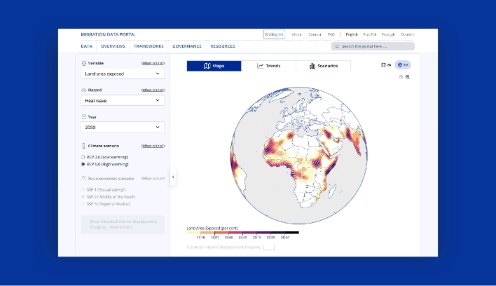
This data-driven visualization approach provides a vital foundation to allocate resources and make informed policy decisions. International organizations can now interactively explore where and when climate hazard exposure, high population densities, and economic vulnerability will coincide in the future. It enables them to provide effective and targeted support for vulnerable populations.
This shift towards evidence-based decision-making ensures that aid and resources reach those who need it most, maximizing their impact and fostering a more resilient future for all.
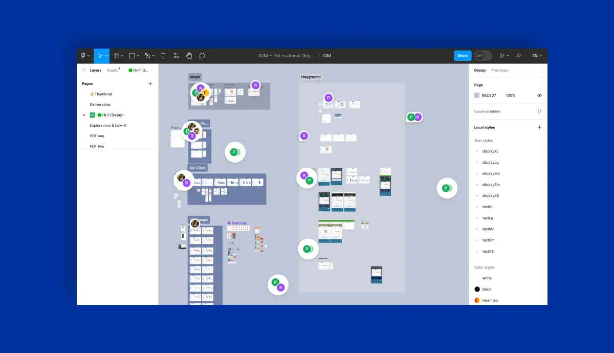
This was a high-priority project for us with tight deadlines to meet. We had to design a portal that reads climate change data and presents it in interactive 2D and 3D maps, graphs, and bar charts.
This project demanded strong collaboration and dedication from a diverse team of experts. Our team of designers and JavaScript developers closely worked with the IOM team to research extensively, design, and develop a solution that meets current goals and is scalable for future goals.
Agile methodologies were at the core of our approach, and we were able to adapt to emerging challenges and navigate complexities with remarkable efficiency. Our team’s commitment to agility proved invaluable, enabling us to successfully deliver the project on time and within budget.
We will delve deeper into the design and development of our data visualization portal, offering insights into its features and unique capabilities in our case study. We believe that by sharing our knowledge and expertise, we can inspire further collaboration and advancement with data as a catalyst for positive change.
We are glad that we could help IOM present its data and approach visually to empower communities to navigate the complexities of climate change-induced migration. We look forward to working on more solutions that will positively impact lives worldwide. Talk to our experts to know more about how we can customize digital solutions that fit your needs.
.webp "Validating design solutions with usability testing for Stanford GSB’s course research & registration platform")
The Stanford Graduate School of Business, known as GSB, is a top business school worldwide. It has diverse students and faculty from all over the world. The school offers different business degrees and many subjects to choose from.
Before students enroll, they spend weeks researching courses to learn about the subjects, instructors, ratings & reviews from previous students, past curriculum, credits, timings, and much more.
Big decisions like college, courses, or career changes need planning, and informed students make smoother transitions. To help navigate these choices, online resources should be clear, and informative that guide students towards making well-informed life decisions.
Students faced significant challenges navigating the outdated Course Research & Registration platform. Here's what frustrated them:
These challenges made the course research and registration process unnecessarily complex and time-consuming. To address these shortcomings and improve the user experience, we adopted a design approach focused on clarity, efficiency, and user needs.
Our journey to improve the user experience began with focusing on student needs. We collaborated closely with the GSB team, gleaning valuable insights into how students typically research courses.
Their research, combined with our exploration of the platform, provided a comprehensive understanding. This ensured we weren't just working with theoretical data, but with the actual functionalities students encounter when researching and registering for courses.
Next, we focused on making improvements guided by user needs. Studying the user journeys and personas — detailed profiles of typical users — provided a roadmap to areas that needed enhancement.
We streamlined the platform by removing unnecessary features and making existing ones more intuitive. This reduced clutter and made the platform easier to navigate and use for students.
Based on our findings, we introduced new functionalities to better address student needs and simplify tasks such as course search, registration, and schedule building.
Throughout this process, agility was key. We employed a rapid design approach, creating low-fidelity prototypes that could be quickly tested with real users. This iterative cycle allowed us to incorporate their feedback and refine the design efficiently.
User feedback proved invaluable in identifying areas for improvement and ensuring the final design met student needs. While challenges inevitably arose, such as technical limitations or conflicting priorities, they pushed us to think creatively and find innovative solutions.
This resulted in a more user-friendly platform that streamlined the course research and registration process for students.

.png)
Since students were the key users of the GSB Course Research and Registration platform, their feedback was essential. We designed tests to see how easy it was for students to use the platform and make sure they liked it.
Through collaboration with the GSB team, we successfully recruited 11 students to participate in our testing sessions. These sessions were recorded, allowing us to capture detailed user interactions and feedback. The students' candid conversations provided invaluable insights, revealing perspectives we hadn't previously considered.
The platform had many different features and ways to get things done. We wanted to make sure each part worked well. So, instead of giving students specific instructions, we gave them tasks that mirrored what they might actually do on the platform.
For example, instead of saying "Find FINANCE 123," we might say "Find a specific course and see all the details about it." This way, students had to explore the platform on their own and use different features. We created several tasks like this to test all the different screens we had designed.

To get the most accurate feedback, we had clear rules for how we interacted with students during testing. We didn't tell them what to do or how to use the platform. Instead, we watched them and asked questions to understand their thought process.
For example, we might ask: "Why did you click there?" or "What were you expecting to happen?" or "Do you find this section easy to use?" The questions we planned to ask and these rules helped us run successful user testing sessions.
The testing sessions provided a wealth of information to guide our revisions. While we couldn't address every suggestion, we focused on identifying common themes that emerged from multiple users. This helped us prioritize the most impactful changes to the platform.
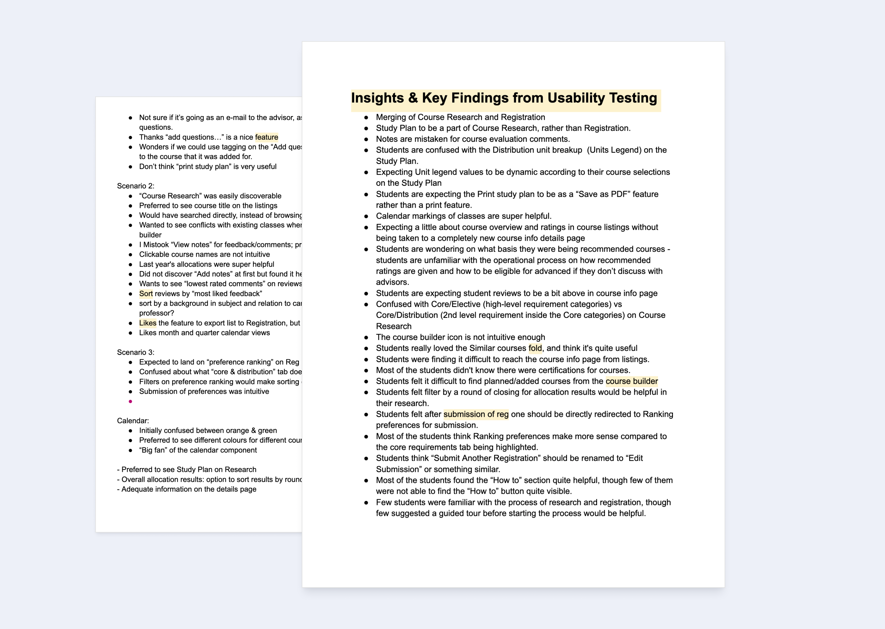
The user testing sessions were an eye-opener. We saw how students interacted with the platform and discovered areas that needed improvement. In addition, the GSB admin team provided valuable suggestions for functionalities that would enhance their ability to manage the platform efficiently.
We took all this feedback and moved on to phase 2 of the project. This phase focused on incorporating user insights and admin suggestions to refine the platform's design.
.png)
.png)
.png)
Usability testing proved to be a powerful tool. By observing how students used the platform, we were able to identify and address their pain points. This data-driven approach led to improvements in information discoverability and overall user experience.
The collaboration with the GSB team was instrumental in achieving this success. Their input on platform management functionalities ensured that the revised platform would be not only user-friendly for students but also efficient for administrators.
Through this collaborative effort, we transformed the platform into a smooth and effective tool, enabling MBA students to navigate the course selection process with greater ease.
Download our discovery playbook with actionable templates to guide you through conducting effective user testing sessions
Dive deeper into our successful collaboration with the Stanford Graduate School of Business! Read the complete case study — Migration & Design System Implementation for Stanford Graduate School of Business

UNICEF, also known as the United Nations International Children's Emergency Fund, is a global organization dedicated to improving the lives of children worldwide. It was established in 1946 to provide emergency aid to children and mothers affected by World War II.
Since then, UNICEF's mission has expanded to encompass a broad range of areas that impact children's lives, making it an essential component of the United Nations system.
Recognizing the crucial role of knowledge, the nonprofit created ShareX, a knowledge management system designed to make its vast information accessible to everyone.To enhance ShareX's user experience, UNICEF partnered with us to conduct extensive research to better understand users' needs and redesign the platform.
Our research process allowed us to identify areas where this KMS could be improved, and we made data-driven changes to make ShareX better for everyone. As a result, we were able to speed up the process of design and make critical improvements, to the platform.
During the initial calls with the client, it became clear that UNICEF was struggling with scattered valuable information across different websites, leading to difficulties in finding what they and their users needed.
The stakeholders shared that — UNICEF faces challenges in making sure that their partners can easily access their technical content and find relevant information. During emergencies, managing a large volume of content becomes a priority. To make it easier to access this information, UNICEF is creating a central place to find technical knowledge about children's issues.
They are also working to make it easier to find products made at the CO/RO level. UNICEF wants to make it easier to find shared materials and reduce the need for multiple sites. Simplifying the content search process across platforms is crucial for improving user experiences and making sure important information can be found quickly.
The kick-off further helped to identify three main problems — information scattered everywhere, lots of repetition, and systems not working together.
With these insights in mind, we created a custom research plan that included fundamental information such as why we chose a specific research methodology and how it would be beneficial.
we started the project by working collaboratively with the client to deliver a simple, centralized, and efficient knowledge management system.
The Design Workshops were planned carefully to align with the platform's vision and included the Business and On-Field teams from UNICEF. The aim was to empathize with the users, what ShareX should look and feel like, and gain other important insights.
During Workshop 1, we examined business insights and understood users' needs using value proposition mapping. The focus was to strike a balance between what the business aims for and what users expect. Workshop 2 focused on empathy-building exercises, like creating personas and mapping emotional journeys, to gain a deeper understanding of the user experience.
Insights and Outcomes
The workshops helped identify the needs and motivations of primary and secondary users. This led to a better understanding of users' needs in line with the non-profit's goals. Clear statements were created to define Share X's personality, functions, and how it should make people feel.
These statements served as a roadmap for Share X's future, ensuring that it grows in the right direction while adhering to its goals and values.
.png)
.png)
Affinity mapping was a highly effective tool that helped us organize and categorize the main ideas by theme. It provided a comprehensive framework for the project, consisting of three axes:
The first axis, Functional to Emotional design, ranges from practical to emotional design. This axis ensured that the design decisions we made were aligned with the project's overall objectives and priorities while considering the emotional and psychological needs of the users.
The second axis, Fundamental to Distinguishable attributes, spans from basic to unique features. This axis helped us prioritize the key features and elements essential for the success of ShareX and ensured that we focused on the most important aspects of the project.
The third axis, Assumed to Absolute aspects, transitions from things we're guessing about to things we're sure of. This axis helped us gain insights into the project and identify areas that required further research and investigation.
The insights we gained from affinity mapping provided guidance and direction, ensuring that our design decisions were in line with the project's overall objectives and priorities. It also helped us prioritize the key features and elements essential for the success of ShareX.
.png)
Insights and Outcomes
The insights from the research helped us create a comprehensive UX strategy that was aligned with both the users' expectations and UNICEF's objectives. Our strategy was based on four key actionable insights.
We kept in mind these insights while crafting the design that would meet the expectations and goals of the primary and secondary users of the Share X platform. As a result of our efforts, our strategy and design principles were successfully aligned with the objectives of both the users and UNICEF.
.png)
We decided to revamp ShareX and introduce some key features as part of our strategy. These include:
Throughout the design process, we engaged in a continuous journey of iteration and validation. Collaborative sessions were conducted every week with participation from both developers and stakeholders. Our key priority was to ensure that the designs remained technically feasible, to speed up the delivery process.
Through this collaborative effort, we were able to create an exceptional user experience while remaining aligned with both the user requirements and UNICEF's objectives.
The key to Share X's success is its user-centered design. This platform prioritizes the user's needs, demonstrating how good design can simplify knowledge management, making it more efficient and effective. The backbone of good design is always good research. By paying attention to users, putting ourselves in their shoes, and making data-driven decisions, we can create purposeful experiences that can help make a real difference in the world.
Download our discovery playbook with actionable research templates!
Dive deeper into our successful collaboration with UNICEF. Read the complete case study — Building Drupal-powered Knowledge Management Platform for UNICEF

.png)
Dr Reddy's Laboratories (DRL) was founded in 1984 with a clear mission to make essential medicines affordable and accessible for everyone. This focus on affordability and reach has allowed DRL to serve over 5 million patients, particularly in low- and middle-income countries.
Keeping doctors on the front lines up-to-date on the latest treatments and research can be challenging. DRL understood the critical need for continuous and reliable information to deliver the best possible care.
DRL partnered with us to bridge the knowledge gap worldwide for healthcare professionals (HCPs). Their vision was for a one-of-a-kind platform designed to connect HCPs with reliable information in an engaging and user-friendly way. This platform aimed to revolutionize learning and engagement among healthcare practitioners.
We'll take a behind-the-scenes look at the design process, focusing on how they made the platform user-friendly for busy healthcare professionals. We'll talk about how they achieved features like scalability, easy navigation, and personalized content – all to enable HCPs with the information they need.
At the start of the project, the team immersed themselves in understanding Dr Reddy's Laboratories' vision for the Healthcare Engagement Platform.
This involved extensive research into the company's background, objectives, and the specific challenges they aimed to address. Key stakeholders were interviewed to gain insights into the company's goals, target audience, and desired outcomes for the platform.
This initial phase laid the groundwork for aligning design strategies with Dr Reddy's global vision of delivering credible and personalized content to healthcare practitioners.
.png)
Initial calls with the client provided valuable insights into the challenges faced by Dr Reddy, such as scattered information, repetitive content, and disjointed systems.
Stakeholders shared their perspectives on the ideal user experience, highlighting the need for a seamless content search process and personalized content delivery. These collaborative efforts ensured that the design approach was not only user-centric but also aligned with the business objectives of Dr. Reddy's.
Workshops played an important role in fostering collaboration and aligning project objectives with user needs. Design leads, senior UI/UX designers, and key stakeholders participated in these workshops to comprehensively understand user motivations, pain points, and expectations.
Through value proposition mapping exercises, the team identified the core value that the platform needed to deliver to its users.
.png)
In-depth interviews with stakeholders, healthcare professionals, and end users were conducted to uncover the underlying problems and pain points.
Users expressed concerns about the perception of brand-focused content, the lack of access to credible information, and the need for a simplified content search process. These insights were invaluable in shaping the design strategy, focusing on addressing the core problems identified during the discovery phase.
.png)
Empathy mapping exercises allowed the team to gain a deep understanding of users' emotions, motivations, and pain points. This empathetic approach guided design decisions, ensuring that the platform resonated with users on a human level and addressed their specific needs.
Affinity mapping was instrumental in organizing and prioritizing ideas, features, and design elements. It provided a structured framework for aligning design decisions with user expectations, business goals, and technical feasibility.
.png)
Armed with insights from workshops, client calls, interviews and empathising with the user’s needs the design team crafted solutions tailored to address the identified problems. Personalized content delivery emerged as a key solution, allowing users to access content based on their preferences and interests.
Detailed author profiling enhanced the credibility of the content, providing users with information about the authors' backgrounds and expertise.
A wide variety of content formats with a seamless switch experience were introduced to cater to diverse user preferences. The mobile-first approach ensured that the platform was accessible and user-friendly across devices, particularly important for busy healthcare professionals who often access content on the go.
.png)
The iterative design process involved continuous validation through prototyping, user testing, and stakeholder feedback. Collaborative sessions with developers and stakeholders ensured that designs remained technically feasible while meeting user needs effectively. Each iteration brought the design closer to achieving Dr Reddy's objectives of a user-centric and impactful platform.
.png)
During the discovery phase, we conducted a thorough research process that enabled us to gather valuable insights. These insights have proven to be immensely significant, particularly for healthcare professionals. They have helped us create a platform that will revolutionize how healthcare professionals experience and use it in the future.
This achievement was possible due to the selection of the right research methodologies, collaborative efforts, and data-driven decision-making, combined with human judgment. The success of our research process has allowed us to create a platform that is tailored to the needs of healthcare professionals and will benefit them greatly.
You can download our discovery playbook with actionable research templates!
Dive deeper into our successful collaboration with DRL. Read the complete case study — Dr Reddy’s Laboratories — Building the Future of Healthcare Engagement with Lean UX and Drupal

When we talk of user experience design, the discovery phase plays an important role in shaping the direction of a project. As a UX designer, channeling qualitative and quantitative data is crucial for making informed decisions. In this blog, we will dive deep into the differences and similarities between these two data types and explore real-time scenarios where combining them can lead to ideal outcomes.
Quantitative data involves numerical, measurable information and metrics. It uses numbers to answer questions and collects measurable data to test ideas and see patterns. Here the data answer the questions “how much,” “how many,” “how often,” or “to what extent.”
This data is collected through analytics tools, A/B testing, and surveys with closed-ended questions. Quantitative data offers statistical insights, allowing designers to measure user behavior at scale.
Quantitative data helps validate design hypotheses, measure the success of features, and identify areas for improvement. Metrics such as conversion rates, bounce rates, and user engagement provide a quantitative foundation for decision-making.
Qualitative research delves into understanding the "how" of phenomena, employing non-numerical data. Data collected through qualitative research methodologies provide insights into users’ thoughts, feelings, and behaviors. It is often collected through methods such as interviews, surveys, and usability testing.
This type of data is rich in context and offers a deep understanding of user experiences.
Qualitative data serves as the foundation for empathy-driven design. Understanding the user's pain points, preferences, and motivations allows for the creation of user-centered solutions. It helps identify patterns, uncover hidden issues, and refine the design based on real user feedback.
The main differences between quantitative and qualitative data lie in what they tell us, how they are collected, and how they are analyzed. Let’s summarize the key differences before exploring each aspect in more detail:
In the discovery phase of UX design, a successful approach involves weaving together the threads of qualitative and quantitative data. The nuanced understanding provided by qualitative insights complements the broad perspective offered by quantitative metrics. By leveraging both data sets, UX designers can create user-centered designs that are not only aesthetically pleasing but also functionally effective. In UX design, the synergy of qualitative and quantitative data remains a cornerstone for making informed decisions and driving successful outcomes.

Laaha, a UNICEF initiative, is dedicated to enabling girls and women by providing safe and accessible platforms for critical information and services related to sexual and reproductive health and gender-based violence. Their mission aligns perfectly with UNICEF's vision of a world where everyone can live a healthy and dignified life.
In a powerful collaboration, we partnered with Laaha, a beacon of hope for women under UNICEF's umbrella, to redesign and rebuild their digital platform. This project exemplifies our deep commitment to human-centric design.
Guided by extensive research and user insights, we focused on ensuring that girls and women in conflict zones with limited internet connectivity can access crucial information on sexual and reproductive health and resources to combat gender-based violence.
Our visit to their Geneva office fostered a more cohesive team and significantly improved the project in several ways. Our time there allowed us to leverage UNICEF's resources and delve deeper into user needs. We collaboratively identified pain points and planned a strategy for this impactful social digital platform.
Collaborating with their IT and Tech departments unlocked access to their expertise, significantly enhancing Laaha's development and implementation. This partnership harnessed the collective strength of both organizations, creating a more impactful and effective solution.
.webp)
By interacting closely with the UNICEF team, we gained valuable insights that streamlined our processes, ensured smoother execution, and kept us on track with project timelines. Additionally, their expertise proved instrumental in tackling potential technical hurdles, particularly regarding Laaha's functionality in low-connectivity areas.
The visit also focused on understanding user needs. Through the initial discussions, we gained crucial data on the target audience — women and girls who might benefit from Laaha. This knowledge directly informed the platform's features and functionalities, tailoring them to better meet specific user needs and challenges faced in conflict-ridden areas.
This visit solidified our shared commitment to a meaningful cause. By aligning with UNICEF's vision, we're working together to help women and girls, combat gender-based violence, and make Laaha a beacon of accessible information and support.

To delve deeper into the challenges faced by Laaha's users, we crafted a comprehensive research strategy. This involved facilitating workshops with stakeholders and users, incorporating a variety of exercises

Through these exercises, we identified
These methodologies, combined with rigorous user testing across various countries, provided a deep understanding of the target audience's nuanced needs and pain points. This rich data informed our design strategy, allowing us to not just meet, but exceed user and client’s expectations by creating a truly impactful platform.

Building Laaha, a platform for women in conflict zones, hinges on a deep understanding of user needs and potential obstacles. Through various research methodologies, we identified key challenges and risks that guided our design decisions.

By proactively addressing these challenges and risks, we aimed to create the Laaha platform that enables women in conflict zones by providing a safe, secure, and culturally-sensitive space for information access, peer support, and access to critical help resources.
Our collaborative research with UNICEF for Laaha is complete, and the insights gained are guiding the platform's design and development. Through intensive user studies, strategic workshops, and innovative UX solutions, we've established a clear roadmap for Laaha that is built on an established human-oriented research foundation.
This approach has informed every aspect of the platform, from the user-friendly interface and multilingual support to the integrated forum and chatbot features. Each element prioritizes accessibility, safety, and user-centricity, ensuring Laaha effectively addresses the needs of women and girls in conflict zones.
To learn more about our research methodologies, you can download our discover playbook, with actionable research templates.

A business is as profitable and successful as its users are satisfied with its products, services, and the experience they build around them.
Many businesses devote considerable resources to optimizing their websites, aiming to increase conversions and improve user experiences, which are critical drivers of overall business success. However, despite these efforts, achieving desired outcomes can be challenging without a comprehensive understanding of underlying issues.
Meeting users' expectations with an easy-to-use digital platform and personalized experience is essential for business success. This requires continuous monitoring and identification of why websites or apps encounter specific issues. By gaining insights into these challenges, businesses can effectively allocate resources and efforts in the right direction.
Take, for example, a prominent online retailer that struggled to boost sales despite extensive efforts. Upon engaging a UX specialist and conducting thorough audits and research, a significant issue was pinpointed in the checkout process — The problem stemmed from requiring all users to sign in before making a purchase, leading to frustration among both new and returning customers.
Recognizing the need for change, the expert implemented a simple yet impactful solution: introducing a "Continue Shopping Without Signing In" button. This minor adjustment yielded a substantial increase in revenue within a year.
This story highlights the critical importance of accurately identifying and addressing underlying UX problems, as well as understanding why they occur.
Starting with "why" is crucial in UX research. It's about getting to the heart of why users behave the way they do before diving into specific research methods or solutions. While traditional methods might tell us "what" users do, focusing on "why" unlocks a deeper level of understanding.
.webp)
UX audits provide a practical approach to understanding the "why" behind user experiences, offering valuable insights that inform the right research methodologies. These audits encompass a thorough assessment of the user experience, guided by heuristic principles.
This involves analyzing the user journey, pinpointing pain points and bottlenecks, and evaluating the overall usability, content, and accessibility of a website or application.
Consider, for instance, conducting a UX audit on a higher education website, which may uncover why prospective students struggle to access relevant program information due to unclear navigation structures.
Similarly, in healthcare technology, users may encounter frustrations stemming from a lack of integration between medical records and appointment scheduling. These issues could be attributed to poorly placed buttons or cluttered navigation elements.
In a banking app, users might be discouraged by complex account registration processes, leading to a higher churn rate and impacting their financial management capabilities.
By conducting a UX audit, businesses can gain a deeper understanding of why users face difficulties, enabling them to effectively address these challenges.
This insight serves as a foundation for further research, guiding the selection of appropriate methodologies and streamlining the design process. Ultimately, investing in a user-centered approach facilitates informed decision-making and fosters the development of solutions that align with both user needs and business objectives.

With over 63% of the global population now digital, the perception of digital experiences and products has undergone a significant shift.
Even seemingly minor design flaws can compound over time, resulting in a frustrating user experience. Whether it's an extra click, a confusing label, or a lengthy onboarding process, these issues can lead to user churn and lost revenue.
Investing in a deep understanding of user needs and preferences is paramount for long-term success. It's about delivering seamless user experiences that meet expectations and drive tangible business outcomes, ultimately promoting responsible impact, attracting customers, and gaining a competitive edge.
Providing the right experience demonstrates that your business cares about its users. By earning users' trust in one area, businesses can leverage this trust to encourage the adoption of new functionalities and services.
Conducting a UX audit can expedite the implementation process and empower the design team to create solutions tailored to user needs. By enabling users to accomplish multiple tasks seamlessly, businesses can enhance their lives and foster trust in their brand.
So, if your website or app feels cumbersome, if onboarding processes are lengthy, or if you're targeting a new audience, consider a UX audit. It's akin to a checkup for your product, identifying underlying issues and pain points before they escalate into major obstacles.
Investing in understanding your users is essential – a smooth user experience is the cornerstone of long-term success.
If you require assistance with UX audit and redesign services, contact us. We're here to help you create exceptional user experiences tailored to your business goals and users' needs.

Knowing one's way around UX, UI and several design terms can help ease the pressure a little for new designers, not to forget, the confidence to freely engage in design conversations, networking, hiring designers, or collaborating with design agencies/teams.
We’ve collected and put together a list of all possible terminologies and jargon that are often used in all things UX to help new designers, people who with designers, also for those looking to know about design, to become a part of conversations, or simply attempt to understand them!
1080p: is a commonly accepted standard in digital resolution among digital displays. It is a jargon term referring to 1920 pixels in width and 1080 pixels in height with the p meaning progressive video.
720p: is a progressive HDTV signal format with 720 horizontal lines and an aspect ratio (AR) of 16:9 (1.78:1). HDTV broadcasting standards include a 720p format which has a resolution of 1280×720.
Accented edges: this is a brush stroke filter available in Adobe Photoshop and Illustrator. It accentuates the edges of an image.
Adobe XD: is one of the most popular UX and UI design tools. Part of the Adobe Creative Cloud suite, it’s a vector-based design tool used for creating wireframes, prototypes, animations, and UI designs.
Alignment: is the position of text or graphics, whether left, right, centered, or fully justified.
Adaptive: the interface is a collection of layouts designed specifically for different devices. it detects the device type being used and displays the layout designed for it.
Agile: an incremental approach to software development. Instead of building the entire product at once, it breaks it down into smaller bits of user functionality and assigns them to bi-weekly cycles, calling them “iterations.”
Analytics: measures human behavior on a site.
AJAX: stands for Asynchronous JavaScript and XML. It is typically used for creating dynamic web applications and allows for asynchronous data retrieval without having to reload the page a visitor is on.
Anti-aliasing: is the smoothing of the jagged appearance of diagonal lines in a bitmapped image. The pixels that surround the edges of the line are changed to varying shades of gray or color to blend the sharp edge into the background. This technique is also called "dithering.”
Abstract mark: this is a logo that uses the emotive qualities of color and form to convey your brand. It is the use of shapes to represent a brand.
API: or Application Programming Interfaces, are pieces of software that help different applications communicate with each other.
Avatar: represents users online who have not uploaded an image for themselves.
Explicit (obvious) affordance: is based on widely known and typical prompts that direct the user to a particular action.
Implicit (hidden) affordance: is hidden and may be revealed only in a particular flow of users’ actions.
Animated affordance: when applied to user interfaces create a strong connection between the physical and virtual world. It mostly imitates interaction with real things.
ALT text: in HTML, it is a short text description of an image. It is added to aid non-graphical browsers and appears if the image cannot be displayed.
A/B testing: also known as split testing, it is the practice of comparing two versions of a web page with a single variable online to determine which one performs better. Assistive technology: any technology or product designed to assist an individual with a disability in using a website or application.
Accessibility: this is the ability of a website to be used by people with disabilities, including visually impaired visitors using screen readers, hearing impaired visitors using no sound, color blind people, or those with other disabilities.
Animation: is a simulation of movement by the rapid appearance of images in sequence.
App icons: are interactive brand signs that present the app on different platforms by supporting the original identity of the product.
Ascender: the part of a lowercase letter that rises above the main body of the letter.
Anchor text: is the text a link uses to refer to a site. It can make a big difference in a site’s search engine results.
Automagically: is a combination of the words “automatically” and “magically.” It refers to something that has a complex technical process that’s hidden from users so that something almost appears to work by magic.
Accordion: in UI design, it is a type of menu that vertically stacks items that let the user expand and collapse the content.
Brand guidelines: consist of the rules and guidelines needed for using graphical elements of a brand (e.g., logo, brandmark, typography). They are commonly compiled into a corporate identity manual.
Brand identity: includes all of the visual elements (e.g., logo, colors, typography) an organization uses to visually represent itself to its users.
Brand mark: a symbol or graphic element that is used in the logo. It is usually isolated without any words or letters.
Back-end development: Back-end powers the front-end but isn’t necessarily visible. It generally includes the information structure, applications, and CMS controlling content on the site.
Button: the element that enables a user to get appropriate interactive feedback from the system within a particular command.
Body text: is the main written content of a page.
Banner: typically located at the top of a page or in a sidebar, they are advertisements that link to other websites.
Baseline: used in typography, it is the imaginary line upon which a line of the text rests.
Benchmark testing: testing an application against a set of standard best practices or pre-established criteria.
Branding: is the deliberate process of creating individuality and market value around the concept of a product name.
Branding elements: are the graphics, text, theme, etc. used to create branding.
Bleed: this is when a design actually extends past its printed edge so there’s no chance of white borders when it’s trimmed down after printing.
Background images are images, pictures, or patterns that appear behind graphical user interface elements on a web page.
Bounded/unbounded fields: while an unbounded field is a free-form entry field, a bounded field sets the parameters for selection or entry for the user.
Breakpoint: the predetermined ranges in screen sizes that require particular changes in layouts.
Bitmapped: an image that follows a pattern of square-shaped pixels.
Bandwidth: can refer to two different things: the rate at which data can be transferred or the total amount of data allowed to be transferred from a web host during a given month (or other hosting service terms) before overage charges are applied.
Branding signs: include logos, corporate signs, and colors that are applied to the website/app giving an immediate hint about the connection of the UI to the particular brand. Acts as a strong affordance for loyal customers.
Breadcrumb trails are navigation elements that generally appear near the top of a page to show users the section hierarchy of the current page.
The baseline is the lowest point of all uppercase letters and most lowercase letters.
Backlinks: links from other sites back to the original owner. They’re sometimes also referred to as “trackbacks” (especially on blogs). Backlinks have a huge impact on a site's search rankings.
Bounce rate: the percentage of people who leave the site from the same page they entered the site, without clicking through to any other pages.
Browser: refers to the program a website visitor is using to view the website.
Bento menu: is a menu with gridded items. It provides an overview of multiple items at once.
Campaign identity: the visual look that is created as a specific marketing or communication collateral. It is often used for internal initiatives as well.
Container: This is a UI element designed to contain page elements to a certain width based on the size of a user’s screen.
Chatbot: lets the user ask the system questions via a chat interface.
CX: also known as customer experience, it refers to all the different interactions a user has with a brand through its different channels and products, and how the user feels about them.
Clickstream: when landing on a site, users click their way through it to complete a task. This is what a clickstream represents, i.e. - the path of clicks taken to accomplish a goal.
Contrast: is achieved by including elements within the design that look measurably different from one another. This includes the use of color, shape, texture, size, or typeface.
CSS: is a mechanism used for specifying how a web page looks without affecting its HTML structure. The styles define attributes such as color, font size, alignment, and spacing.
CSS framework: is a collection of CSS files used as the starting point to make XHTML and CSS websites quickly and painlessly. They usually contain CSS styles for typography and layout.
Checkbox: a graphical UI element that is used to mark a particular piece of content, usually setting the choice for the binary options. Checkboxes can be found at any time in a user interface, especially in sections of users, screens, or page settings.
Conversion rate: the percentage of users who complete the desired action.
CTA: a widely used abbreviation that stands for ‘call to action.’ It is a word or phrase that stimulates a user to interact with a product in the way it has been aimed and designed for.
Copy (language) affordance: image along with copy helps decode messages and avoid misunderstandings. Copy clues and prompts help users what to do/expect/what information to keep in mind, when interacting with the UI. However, it shouldn’t be overpowering and should be well-balanced along with the image.
Composite image: a graphic image that’s made up of a combination of images.
Crop: this is when a designer cuts or crops unnecessary parts of an image to improve framing, highlight a specific subject or alter the image’s aspect ratio.
Composition & layout: the arrangement of design elements to form a complete image. A successful composition entices the viewer and guides their eye across the design. In graphic design, it is often referred to as ‘layout’.
Color models: a system that helps to describe colors using numbers or letters.
Color theory: consider the psychology, legibility, and culture of colors to see which best supports a message across diverse cultures, global regions, and learning styles. It also considers the colors that will be easiest to read for audiences with varying vision abilities.
Color Wheel: consists of multiple colors and helps to understand how different colors relate to each other and how they can be combined. It is built of primary, secondary, and tertiary colors which are also known as hues.
Color depth: the number of colors a computer screen can display, based on the number of bits per pixel.
Color palette: a small combination of colors for a new design. The UI designer will use these to visually represent the brand, be visually pleasing and communicate different information.
Cool colors: are the ones on the green-blue side of the color wheel. They are called cool colors because they give a cool, relaxed, and peaceful feel.
Counters: in typography, which we explain below in number 90, a counter is the area of a letter that is entirely or partially enclosed by a letter or symbol.
Critique: allow designers, researchers, and content strategists to come together and provide constructive criticism to improve a product.
Corporate logo: is a graphic symbol that gives visual representation to an organization. Users identify brands with their company’s logo.
Creative brief: concisely outlines the strategy for a creative project. It contains details about business needs, target audiences, brand tone of voice as well as desired outcomes - all essential elements of a strategic design process.
Clarifying icons: are aimed at explanation, visual markers that explain particular features, or marking out categories of content.
Comment: in web design terms, it is a bit of information contained in a site’s HTML or XHTML files that are ignored by the browser. Comments are used to identify different parts of the file and as reference notes.
Clickability cues: are visual indications that a given word or item on a Web page is clickable. Cues that can be used to indicate the clickability of an item include color, underlining, bullets, and arrows.
Cache/Caching: these are those files that are saved or copied (downloaded) by a web browser so that the next time that user visits the site, the page loads faster.
Client-side: refers to scripts that are run in a viewer’s browser, instead of on a web server (as in server-side scripts). They are generally faster to interact with, though they can take longer to load initially.
Card: group-related content side-by-side so that users don’t have to scroll through a list to find the information they are looking for.
Carousel/image carousel: a post containing more than one photo or video, which users can view by swiping left on a post through the phone app.
CMS: Content Management System is a backend tool for managing a site’s content that separates said content from the design and functionality of the site.
Design: composition, balance, proximity, alignment, repetition, contrast, white space, hierarchy.
Design patterns: in UX and UI design patterns are repeatable, reusable design components used to solve usability issues that users commonly experience.
Design systems: are a universal source of truth for the design team — a collection of design assets, guidelines, constraints, and best practices to adhere to when embarking on a new design project.
Disabled: is the form-field state that lets users know that this element isn’t currently available for interaction. It informs users that they either need to complete something else first or that this option is not available.
Design validation: is an assessment of a website's functions and elements correspondence as identified initially with the design and the end user's actual needs.
Design accessibility: looks into whether all users can access and interact with a website/product/service. It focuses on designing experiences that people with disabilities can use and access effectively.
Date or time picker: allows users to select a date and/or time from a digital calendar or clock. The chosen date or time is then formatted and put into the system.
Design workshop: a meeting of two or more individuals who collaborate to either start or finalize a design or to make progress on overcoming an obstacle to an existing design.
Deprecated: is code that is no longer included in the language specifications. Generally, this happens because it is replaced with more accessible or efficient alternatives.
Design debt: all the good design concepts or solutions that are skipped to reach short-term goals.
Döner menu icon: consists of three lines stacked on top of each other but each line descends in length. The top line is the longest, the middle line is shorter and the third line below that is even shorter.
Dribbble: is the go-to spot for all designers. It’s a social media platform that focuses on building a strong community of designers, whether for inspiration or collaboration. It’s an excellent resource for connecting with other designers or looking for feedback.
DHTML: stands for Dynamic HyperText Markup Language. DHTML fuses XHTML (or any other markup language), DOM, JavaScript (or other scripts), and CSS (or other presentation definition languages) to create interactive web content.
Dither: in GIF and certain other image formats, there is a limited color palette used for each image. Because of this, not all colors in an image are presented. It is used to approximate these colors by combining pixels of different colors side by side.
Design thinking: is a 5 stage-method designed for creative problem-solving. The steps include - empathizing, defining, ideating, prototyping, and testing.
DSM: is the abbreviation for Daily Standup Meet. It refers to internal design team meet-ups to discuss project progress, blockers, alternatives, tasks completed, and to be done.
Define: is the analysis of observations to synthesize them and define the core problems identified during the empathizing stage.
Design formats: are chosen by designers when trying to decide how to best convey a message visually. It depends on the complexity of the information, target users, and channel in which the organization will share it, i.e. - website, social media, or print collateral.
Design specs: provide detailed information on how an organization needs to design, develop and/or print its visual elements. These include required dimensions, image resolution (quality), colors, and character styles. They are especially important when designers are working with websites, software, and product developers to fit a design into an existing framework.
Descender: is the part of a lowercase letter that descends below the main body of the letter.
Data entry field: is a visually well-defined location on a page where users may type data.
Empathy maps: are collaborative tools that help us visualize user behavior, attitudes, and feelings. They are split into 4 equal quadrants containing information about what the user is saying, thinking, doing, and feeling.
Dropdown/dropdown list: these are similar to radio buttons, but they save a lot of space on the screen. The action happens when a user selects an item from a list and the menu drops down to reveal more information.
Dropdown button: this is the clickable button used in a dropdown list to reveal, a list of items.
End users: the people for whom a design is being made/implemented.
E-commerce: is a shortened name for electronic commerce. It’s the buying and selling of goods online, through websites.
Eye-tracking: enables the measuring of user eye activity using specialized tools, showing where users look and in what order.
Emblem: uses frames and shapes to enclose the company or organization name.
Elastic layout: is one that uses percentages and ems for widths paired with a max-width style to allow the site layout to stretch when font sizes are changed.
Element: in XML, an element is the central building block of any document. Individual elements can contain text, other elements, or both.
Entertaining & decorative icons: are aimed at providing an aesthetic appeal rather than functionality, and are often used to present seasonal features and special offers.
Embedded style: An embedded style is a CSS style written into the head of an XHTML document. It only affects the elements on that page, instead of site-wide as a separate CSS file does. Style in an embedded style sheet will override styles from the linked CSS file.
Engagement: capturing the user's attention or interest or maintaining their interaction.
Experience architecture: is a multidisciplinary approach to technology involving information architecture, interaction design, and experience design practices that aim to provide a good user experience and benefit a business.
Empathize: is the empathetic understanding of the problem statement to be solved, typically through user research.
Easing: or ease-in and ease-out, is the slow and gradual movement of an animated UI element.
Field: provide spaces for users to input necessary data. It is primarily an interactive element.
Front-end development: front-end is what is visible. Think buttons, text, beautiful colors, and the layers seen on the screen when interacting with a product.
Fold: is defined as the lowest point where a Web page is no longer visible on a computer monitor or screen.
Full-stack designer: a designer who has the skills and know-how to take on all the “stacks” (or layers) of the product design and development process.
Fixed-width layout: has a set width (generally defined in pixels) set by the designer. The width stays the same regardless of screen resolution, monitor size, or browser window size. It allows for minute adjustments to be made to a design that will stay consistent across browsers.
Font: a particular size, weight, and style of a typeface.
Font spacing: the vertical and horizontal spacing of a font is often altered to change its appearance.
Favicons: are the icons that represent the product or brand in the URL line of the browser as well as in the bookmark tab.
Font weight: refers to how thick or thin (bold or light) a font looks.
Flat design: is a minimalist user interface design style. It is characterized by simple, two-dimensional elements and vibrant colors.
Focal point: is the spot on a webpage that the eye is naturally drawn to. This could be an image, a banner, text, Flash content, or just about anything else.
Flowchart: illustrate the steps a user can take to complete a task on a product.
Feed: usually displays user activity in chronological or popular order but some are determined by an algorithm.
Figma: is a browser-based interface design tool that empowers fast design and prototyping and a smooth, collaborative workflow.
Font style: beyond spacing and case, fonts can also be altered by scale, weight, and style.
Font family: is a group designation for defining the typefaces used in CSS documents. The font family tag generally lists multiple fonts to be used and usually ends with the generic font category (such as “serif” or “sans-serif’).
False affordance: is what designers should avoid. These are the wrong prompts that lead users to a different action or result, not the one which is expected behind the prompt.
Fluid UI: this is a prototyping and wireframing software tool used to design mobile touch interfaces. It comes with extensive component libraries, easy animations, and real-time collaboration options.
Footer: design elements repeated at the bottom of every page.
Font weight: specifies the boldness of a font.
Font color: the color of the text.
Font size: the height of a font measured in points.
Font readability: how easy or difficult it is to read a collection of words in a specific type style.
Form: refers to an object’s shape and surface qualities giving a 3-dimensional aspect to the object.
Fluid layout: is when a page contract and expands horizontally inside a person's web browser despite the size of the browser window or the resolution of the monitor.
Gradient: this is a popular design trend that slowly and gradually blends from one color to another color and sometimes to additional color(s). They are versatile and modern, adding depth to the design, and can be both bold and subtle to capture the user’s attention.
Gutters: are the vertical strips between columns in grids that are used to prevent elements from bumping into each other.
Gestalt principles are a set of psychological laws that define people who do not visually perceive items in isolation but as part of a larger whole. They can be used to inform design decisions and shape a user’s interaction with a product. These principles include human tendencies towards similarity, proximity, continuity, and closure.
Graphic elements: are elements of a user interface that displays information or can be manipulated by the user to pursue a task.
Graphical user interface: also referred to by its acronym: GUI, it uses an input device (like the mouse) and visual representations of how the user can interact with a web application.
Gamification: is the process of integrating game-design elements and principles into products to drive user engagement.
Grids: a series of intersecting vertical, horizontal, angular, or curved lines used to organize graphic elements on a page, as well as about one another.
Graphic affordance: is presented with visuals applied to an interface and helping users scan its functionality. Graphics of all kinds are perceived quicker and can easily be memorized compared to copy.
Hierarchy: this is a UI design principle used to present information with different levels of emphasis according to its importance.
Heat map: a graphical representation of the areas on your product that receive the most user attention.
Hamburger button: the button that hides the menu; clicking or tapping on it, shows the menu expansion. It is called so because its form consists of three horizontal lines that look like a typical bread-meat-bread hamburger.
Human-computer interaction: is a field of study concerned with the design and use of computer technology. It explores how people interact with interfaces and computers today.
HTML: stands for HyperText Markup Language. It is the standard coding language for websites that creates all of the fonts, colors, graphics, and links that are seen online.
HTML tag: also referred to as an HTML element, it is the bit of code that describes how that particular piece of the web page it’s on is formatted.
High-fidelity prototype: an interactive prototype that simulates the real system or site's functionality and design details.
A hyperlink is a link from one web page to another, either on the same site or another one. Generally, these are text or images and are highlighted in some way (text is often underlined or put in a different color or font weight).
Hypertext: any computer-based text that includes hyperlinks. Hypertext can also include presentation devices like tables or images, in addition to plain text and links.
Hybrid-navigation model: is a combination of navigation structures that incorporate some combination of components possibly including sequential and/or hierarchical IA designs.
Header: design elements repeated at the top of every page.
Icons: help organizations visually convey meaning to help audiences quickly understand a message. They are several images that work as symbols that are universally understood.
Information Architecture: is the practice of arranging content in a product in an understandable manner. It involves organizing the content users interact with, as well as the different structures, such as the website’s navigation, needed to interact with it.
Icon graphic: an image that is usually interactive and represents an object or action or marker for entry into information.
Inline validation: if a user has successfully or unsuccessfully completed a field, this form-field state usually appears with a green tick or a red X.
Image links: a clickable image hyperlinked for internal linking and website navigation without supporting text.
Interactive icons: are the ones that are directly involved in the interaction process. They are clickable or tappable and respond to the user's request of doing the action symbolized by them.
Ideate: looking for alternative ways to view the problem and identify innovative solutions to the problem statement created during the define stage.
Image placeholders are texts that provide users with descriptive information about a graphic while it is downloading.
Interaction design: or IxD, is the practice of designing interactive digital products and considering how users will interact with them.
Interface: a view or digital presentation of an object or program.
Iterations: the practice of breaking down development into small parts.
Illustrations: Theme illustrations and mascots have the potential of giving clear and distinct prompts to users regarding what to expect.
InVision Studio: is another powerful tool that all designers should be familiar with. It includes features and functions for drawing, wireframing, prototyping, and animating.
Input control: these are the interactive elements used on any interface. These include checkboxes, radio buttons, dropdown lists, list boxes, buttons, toggles, text fields, and date fields.
Input fields are a place where users can enter content into a system.
Informational components: in UI design, these are elements that tell users what’s going on.
JavaScript: the third pillar, that defines how both the HTML and CSS should behave.
Kerning: the adjustment of space between pairs of letters in the same word.
Kebab menu: consists of three vertical dots that represent a set of grouped options for a user to navigate.
KPIs: or Key Performance Indicators are measurable values that help us understand and track how well a product is doing.
Logo types: include abstract marks, emblems, letter marks, pictorial marks, mascots, and wordmarks.
The logo is a symbol or a small design used by companies, brands, organizations – anyone – to identify their products.
Links: words or images that can take users to another page.
Loremipsum: also known as ‘dummy text’ is used as a placeholder that will be swapped out later with an actual copy.
Layout graphics are graphic elements that serve to delineate, divide or identify content on a webpage.
Link farm: any website set up specifically to increase the link popularity of other websites by increasing the number of incoming links to that site.
Landing page: a single page that appears in response to search engine results. It is used for lead generation.
Lettermark: Features one or more stylized letters (for example, a company’s initials) to identify the brand.
Line height: or leading pronounced “ledding,” is the space between two lines of text.
Lean UX: Lean UX, similar to Agile, is a collaborative user-centric approach that prioritizes “learning loops” (building, learning, and measuring through iterations) over design documentation.
List boxes: allow users to check single or multiple items at a time. They are great for saving space on a screen as they are compact and can carry a long list of options for the user.
Low-fidelity prototypes: are low-cost, illustrated designs or concepts usually sketched on paper or created as flat images.
Liquid layout: is one that is based on percentages of the browser window’s size. The layout of the site will change with the width of the browser, even if the visitor changes their browser size while viewing the page.
Loader or loading bar: are designed to let users know how long an action will take to complete, instructing us to wait or be patient. They come in different shapes and sizes.
Menu: a core navigation element. It is a graphical control that presents options for interactions with the interface. It can be a list of commands (save, delete, buy, send) or a categorization of organized content in the given interface.
Mobile web: refers to jumping online on a mobile device.
Median or x-height: fonts are where most lowercase letters should reach their maximum height. It is set from the height of the x in a font.
Mascot: rely on a character or brand spokesperson to represent a business.
Mock-up: a real or digital model used to test early design ideas and see how they could look in the real world.
The masthead is the graphical banner at the top of a web page that identifies the organization or group that hosts the website. A masthead typically contains the name of the organization and site (if different) and an organizational logo.
Monospaced font: a font whose letters and characters each occupy the same amount of horizontal space.
Markup: refers to the coding applied to a text document to change it into an HTML, XML, or other Markup Language document.
Margins: are the areas sitting left and right of a grid.
Moodboard: are essentially a collage of images, text, and samples of objects in a design composition. They’re visual presentations used in the brainstorming stage of a product.
Marvel: is a design tool that promises all the core functionality you need to design and build digital products, including wireframing, prototyping, and design specs for handoff.
Material design: often called just material, is a design language developed by Google and used in Android devices.
Meatball menu: is a set of three horizontal dots. When the user clicks on the dots, more options are revealed.
Microcopy: the small bits of text one sees on apps or websites that help in navigating it. Eg: labels on buttons, error messages, placeholder text in input fields, and text on tooltips.
Modal: message boxes are also known as modal windows and they work in the same way.
Message box: this is a small window that pops up, providing information to users and asking them to take action before they can move to the next step.
MVP: or Minimum Viable Product, refers to the essential set of features we can launch a product with to get the ball rolling.
Negative affordance: give users a prompt that some elements or operations are inactive at the moment.
Native file: an original design file where a designer creates a graphic or image, such as Photoshop (PSD) or InDesign (INDD). It generally includes design elements like layers, and text styling and cannot be edited in other software programs, such as PowerPoint.
Navigation: is defined as the set of actions and techniques that guide users through an app or website, enabling them to fulfill their goals by successfully interacting with the product.
Navigation design: this is a design phase that interprets information architecture and task flows into wireframes or mockups to demonstrate and test the site structure and visual direction.
Navigational components: are elements that allow the user to interact with and use a product.
Notifications: are designed to provide hints to the user about something being missed out on or requiring attention.
Neutral colors are absent on the color wheel and include the colors gray, brown, and beige.
Navigation bar: is a set of links repeated on each page that often includes links to pages like “About us”, “Products,” “Contact us” and “Testimonials.”
Open-source: is available for public use, and free. It can be used, modified, and build with it without running into trouble.
On-hover: this is the form-field state that occurs when the user’s cursor hovers above the form field. Users won’t see this option on mobile, touch, or swipe devices.
Origami Studio: is a free design tool that was created by Facebook. It’s primarily a prototyping tool, enabling designers to rapidly build and share interactive interfaces. However, it’s not recommended for beginners.
Picker: allows users to pick the point from the row of options. It usually includes one or several scrollable lists of distinct values.
Plus button: the button that is clicked or tapped to present the user with the ability to add new content.
Pristine: is the default form-field state before a user interacts with it.
Panels: these are visually and thematically defined sections of a Web page. They are frequently placed in the left and right margins of pages and often contain navigation aids, including related links. Content is not usually placed in left or right panels.
Persona: is a representation of the target user. They aren’t necessarily a real individual but are constructed using real information and data based on real users.
Photoshop 3D: this is a palette used in Adobe Photoshop.
Paper prototyping: this is a prototyping method in which paper models are used to simulate computer or web applications.
Page view: a request for an entire web page document from a server by a visitor’s browser.
Photos: Theme photos, item photos, avatars, and title pictures presents visual support, and provide information on what users can do with the app or website.
Pictorial marks are non-abstract, visual icons that represent your company name or service.
Permalink: short for “permanent link.” Generally used only on blogs, a permalink is a link that is the permanent web address of a given blog post.
Parallel design: is a design methodology that involves several designers pursuing the same effort simultaneously, but independently, to combine the best aspects of each for the ultimate solution.
Point size: the size of the text. There are approximately 72 (72.272) points in one inch.
Prototype: a preliminary model of a product used for testing.
Proximity: is how design elements are grouped or spaced on a page.
Page flow: a hierarchy or sequence suggested by the arrangement of elements on a page.
Page density: is a measure of the percentage of the screen that is filled with text and graphics.
Page templates: are predefined layouts or formats for sets of common web pages.
Page title: refers to the text located in the browser title bar (this is the bar found at the very top of the screen of common browsers).
Paging: this is a website design methodology that requires users to follow a series of "next page" links to read an entire article. Moving from page to page is an alternative to scrolling through long pages.
Physical consistency: refers to the "look and feel" of a website. Physically consistent web pages have logos, headers, and navigation elements all located in the same place. The pages also use the same fonts and graphic elements across all pages on the site.
Pagination: dividing information into separate sequentially numbered or linked pages.
Product design: is the design of consumer products that consider usability, human factors, ergonomics, and appearance while still maintaining function.
Pixels: are tiny colored squares that combine to form a picture. An image with more pixels per inch is of higher resolution. Raster images (different from vector images) use pixels. Raster images cannot scale up or down without losing quality in the way vector images can. Common file formats that use pixels are JPG, PNG, GIF, TIFF, and PSD.
Pattern affordance: is based on the power of habit and presents a huge factor in effective interaction design.
Proportional font: a type with spacing apportioned according to the shape and width of the character.
Palette: the range of colors used in a design. These are colors that work well together and are often aesthetically pleasing.
Progress bars: are used to visually tell a user where they are in a multi-step process.
ProtoPie: is a flexible yet powerful prototyping tool praised among the design community for its easy-to-use interface and almost non-existent learning curve.
Progressive enhancement is a strategy for web design that uses web technologies in a layered fashion that allows everyone to access the basic content and functionality of a web page, using any browser or Internet connection, while also providing those with better bandwidth or more advanced browser software an enhanced version of the page.
Primary colors: three pigment colors that cannot be formed by any combination of other colors. They serve as the base of the whole color system. A subtractive system is based on cyan, magenta, and yellow, while red, green, and blue colors form the additive system. And the painting system RYB includes red, yellow, and blue.
Primary buttons: if there are multiple CTAs on a screen, the primary button informs which action is the most important.
Pseudo element: an element used to add a special effect to certain selectors.
Padding: is the spacing inside grid columns and it acts like a cushion around the edges. It allows for more breathing space in a design
Repetition: helps give a design a unified look. Designers often repeat elements throughout a design for the same.
Resolution: refers to the physical number of pixels displayed on a screen (such as 1280x1024).
Radio button: is a screen-based control used to select one item from a list of mutually-exclusive items (i.e., use radio buttons when only one item in a list of several items can be selected).
Rapid prototyping: quickly generating mockups of what a system will look like to facilitate internal review or testing.
Readability: the degree to which users can easily and accurately read the information on a web pa:e.
Rollovers: are state changes that involve one element being replaced by another upon the mouse going over it.
Responsive design: websites that adapt to fit the device they are being displayed on. They are designed in a single layout that shrinks and stretches and rearranges the content to be easily viewed on each device type.
Refactoring: this is the process of cleaning up and tidying code without affecting functionality, essentially increasing its quality. It isn’t done all at once but rather in small, incremental steps.
Rule of thirds: this is a technique that designers use to determine a focal point. Using a grid of three rows and columns, a focal point is indicated at the junction where the lines converge.
Regular critique: this happens in a group setting, the wider team will sit and discuss the design journey of the product.
RSS: also referred to as Really Simple Syndication is a standardized XML format that allows content to be syndicated from one site to another. It’s most commonly used on blogs. RSS also allows visitors to subscribe to a blog or other site and receive updates via a feed reader.
Switch: a control that lets users switch an option on or off. Modern interfaces present a direct imitation of switches that people use in real life. Like checkboxes, switches too can be found in any type of user interface, especially in the sections of user, screen, or page settings.
Style sheet: a set of statements that specify the presentation of a document. It may have three different origins: they may be written by content providers, created by users, or built into browsers or plug-ins.
Selected/focused: when a user interacts with the form, this form-field state tells them to input information. It should be visually different from other form field states.
Share button: the button that enables a user to share some content or achievement directly to social networking accounts.
Silent critique: using post-it notes on a whiteboard, your colleagues will write feedback as a question.
SaaS: Software as a Service, is a software distribution model in which software is licensed on a subscription basis and hosted on external servers.
SDK: is a software package that contains the tools required to develop products for a specific platform or operating system. They help expedite the development process by providing “parts” developers can use instead of having to write the code for them from scratch.
SEO: search engine optimization is the process of increasing a website’s visibility in free, or organic, search results. It often involves writing useful content on a website around words and phrases users use in searches related to the brand’s product or service.
Site map: a visual representation of a website’s pages and hierarchy.
Sketching: this is a quick freehand drawing intended to help us brainstorm and jot down ideas. Sketches aren’t really polished or finished products — they are similar to visual note-taking.
Sketch: is a vector graphics editor used for drawing, wireframing, prototyping, and design handoff — essentially everything needed to bring designs to life.
Scrum: an agile software development framework.
Sprints: in agile software development, we call defined periods of time assigned to complete certain tasks “sprints.”
Storyboard: a visual representation of a user’s experience with a product or problem space.
Secondary button: is still an important CTA but it is less important than the primary button. It should be less visually dominant and should not clash with the image or appearance of the primary.
Small caps: or ‘small capitals’ are uppercase characters that are the same height as lowercase letters. They are used to prevent capitalized words from appearing too large on the page.
Secondary colors: appear by the combination of two primary colors. As each system has different basic colors, the secondary colors vary too. Here’s a schematic explanation of secondary colors appearing in each system -
RGB
green+red = yellow
red+blue = magenta
blue+green = cyan
CMYK
yellow +magenta = red
magenta+cyan = blue
cyan+yellow = green
RYB
yellow+red = orange
red+blue = purple
blue+yellow = green
Search field: often called a search box or search bar, it presents the interface elements that enable a user to type keywords that in turn help locate pieces of content being looked for.
The sidebar is the left or right-hand column of a page typically used for either vertical navigation links or advertising. May also contain site search, subscription links, or social media buttons.
Scale: the size of an object about another object. It is used to create interest and grab a viewer’s attention.
Scroll bar: is visible along the right edge of common browsers. It is defined as a movable box that runs on a vertical or horizontal axis.
Scrolling: this is a method of traversing a Web page wherein users either roll the scroll wheel on their mouse or manually move the scroll bar located on the right side of their browser's screen.
Stock photos: are licensed images created by a third party.
Scanability: how easy it is to read and understand a body of text.
Slider controls: allows users to set or change a value.
Stepper: are quite similar to sliders, in that they let users adjust a value. However, steppers only allow users to alter a value in predefined amounts.
Scanning patterns: when planning the layout of a web page or application, designers must carefully choose the placement of important text or images to accommodate the “scanning” styles of readers. There are two types of scanning patterns — F pattern which is scanning a page horizontally and reading left to right, back to left, down, and left to right, users read in an F-shape. The other is the Z pattern which is scanning a page left to right, diagonal down, and left to right, users read in a zig-zag or Z-shape.
Specification: this is a document that offers an explicit definition and requirements for a web service or technology and generally includes how the technology is meant to be used, along with the tags, elements, and any dependencies.
Slack: is an internal messaging platform for teams. It is huge in product development.
Tertiary colors: a mix of primary and secondary colors gives tertiary colors which usually have two-word names such as red-violet or yellow-orange.
Task: a procedure that includes goals, steps, skills, start state, inputs, end state, and outputs to accomplish an activity.
Thumbnail image: a small copy of a larger image.
Tracking: is the adjustment of space for groups of letters and entire blocks of text. It affects every character in the selected text and is used to change its overall appearance.
Task analysis: is the process of listing tasks or the steps a user takes to complete any given goal from the user’s perspective. It is typically done during the early stages of product development to help in identifying and communicating problems in the user experience.
Technical debt: this is similar to design debt but takes it on the code instead of taking a toll on the design system. Products accrue technical debt whenever an easy but messy development solution is favored over a better yet more time-consuming alternative.
Type: is the very basic description of any text or lettering on a screen.
Tag: is an interactive element that is presented with a keyword or phrase to enable the user to move quickly to the items that are marked up with it.
Tab bar: a graphical navigation element that is most often placed at the top of a webpage. Effective tabs should be designed so that they resemble real-world file folder tabs.
Trim the final size of a printed piece after it has been trimmed from its page.
Typography: is how a company chooses to arrange and style letters and texts to help them look clear, easy to read, and also visually appealing. It includes several fonts, styles, and colors the company uses across all of its brand-based communications.
Thumbnail sketch: the small, rough drawings a designer creates, to explore more ideas during conceptualization.
A tagline is a phrase or short sentence placed directly below a webpage's masthead. It functions to quickly identify the purpose of the website and maybe a subtitle, an organizational motto, or a vision or purpose statement.
Target audience: the set of users for which a system is designed or intended.
Template: this is a file used to create a consistent design across a website. Templates are often used in conjunction with a CMS and contain both structural information about how a site should be set up, but also stylistic information about how the site should look.
Test: this is the rigorous testing of the prototypes to see which serves user needs the best. It is an iterative process in Design Thinking wherein teams often use the results to redefine one or more further problems.
Text fields: allow users to enter text. Used in forms or questionnaires, the users can enter single or multiple lines of text.
Toggle: buttons act like an on and off switch, allowing users to change a setting between two states.
Thumb reachability: also referred to as the rule of thumb. It is when people use their mobile phones, they can usually operate them with just their thumbs. The extent of the reach is referred to as thumb reachability.
Tooltip: when a user hovers over a certain item, a tooltip appears to explain it further.
Typeface: is the design set of lettering. It can vary in size, weight, slope, width, and so on.
Typography: is the art of lettering itself. It refers specifically to how letters are arranged and styled.
UX: or user experience is how a person interacts with a brand and its products and services and what that experience is like, for them.
UX design: involves designing experiences for a good user experience. It concerns identifying and understanding a specific user problem and designing products or services to address the problem in a way that centers the user.
UXPin: is a popular UX and UI tool, used by both new and seasoned designers alike. It is an end-to-end platform capable of delivering polished, interactive prototypes, with no coding skills required.
UI: is the interface (i.e. - a webpage or app) that a user uses to interact with a product/service. UI design is often referred to as the graphics and visual elements that are used to create appealing and easy-to-use interfaces (i.e. - colors, graphic design, visual design, typography, and layout).
User interface design: is the process of designing user interfaces. It takes care of how digital products look, feel and behave for the end user.
UI element: are all the different parts found on an interface we need to trigger specific actions or get around an app or website.
UI patterns: are reusable solutions to common usability problems in products or on the web expressed as a collection of UI elements.
Unit testing: this is the process of testing parts of an application to ensure they’re working properly. It can be done manually or can be an automated process.
Usability testing: is a research method that lets designers evaluate how easy a product is to use by testing it on a group of representative users.
Uizard: is a UI design platform for those who want to create digital products but don’t necessarily have advanced design expertise.
User-centered design: or UCD, is an iterative design framework in which users and their needs are always kept at the center of every decision.
User flow: describes the intended series of steps a user needs to take to complete a goal on a product. They often include a name, steps, and a description of what happens during each step.
User journey maps/mapping: these are narrative documents that help us visualize the process a user goes through to accomplish a goal. They document the stages the user goes through, the tasks executed during each stage, user emotions, and product opportunities.
User scenarios: are used in the early stages of a product, and are mini stories that describe the needs and/or context that brings a user to a product. They tell designers who the user is, why the user is interested in a product, and what his or her goals are.
Usability: refers to how easy it is for a visitor to your site to use your site in its intended manner.
User stories: share actions different kinds of users can take in a product.
Vector images: are created by designers using mathematical formulas to establish points, lines, curves, and shapes on a grid. The benefit of a vector image is that it can be scaled to smaller and larger sizes, as per the needs of the organization, without having to sacrifice image quality.
Visual communications: combines graphic design with data visualization to deliver information persuasively. It uses various visual elements to develop a story and makes use of multiple formats to reach large audiences.
Visual design: considers the aesthetics of an app or website. There is a heavy overlap between visual design and UI design but one distinction commonly made is that visual designers consider the overall visual brand and identity, rather than focusing on individual designs.
Warm colors are the opposite to cool colors due to the warm, hot, and fiery disposition they are associated with. Yellow, orange, and red are the colors most often associated with warm colors.
Web standards: are specifications recommended by the World Wide Web Consortium for standardizing website design.
Waterfall: In software waterfall development, each phase must be completed before the next phase can begin. So, all the designs would have to be completed before developers could begin any work.
Whiteboard challenges: are designed to assess a candidate’s communication and problem-solving skills. In it, candidates are given a problem and a whiteboard to develop the solution on.
Website elements: consist of a header, navigation, navigation bar, breadcrumb trail, landing page, HTML, user interface, and wireframe.
Wordmark: relies on custom typographic treatment of text to illustrate a brand.
White space: also called negative space, is a part of the design left unmarked by imagery or text.
Wireframe: basic images that display essential functions of a website. Designers use wireframes to show how a page or site works.
WYSIWYG is the acronym for ‘What You See Is What You Get.’ It describes how the layout on the graphical screen is a representation of the printed version of the document.
Widgets: are screen-based controls that are used to interact with a website and other systems. They include push buttons, selection lists, radio buttons, sliders, etc.
XML: or Extensible Markup Language is used for writing custom markup languages. In other words, XML describes how to write new languages (it’s sometimes referred to as a “meta” language because of this). It also serves as a basic syntax that allows different kinds of computers and applications to share information without having to go through multiple conversion layers.
X-height: when deciding on font and its size, designers will use the height of a lowercase x to determine the height of all lowercase letters in a typeface.
Zeplin: is a cloud-based software that bridges the gap between UI designers and front-end developers. It provides an organized workspace to publish your designs and generate specs, assets, and code snippets for a smooth developer handoff.

If interface elements do not exhibit basic motion design principles, then usability gets undermined. In UX design, motion aids in extending the reach of visual communication. It is a captivating force that strengthens product engagement and expands the spread of design communication.
Motion is more than a few moving elements on a screen.
The user's interaction with an interface, irrespective of human or digital, generally consists of a series of actions and reactions. The connection between these actions and the desired user reaction is reinforced and simplified by motion design. Motion UI influences animation and movement within an interface to guide the user experience.
It conveys a sequence, action, or transition for a web product by simultaneously combining audio, video, and text. Motion is also largely used as a branding tool to reinforce interactions and visual cues that may be associated with a brand. Simply put, Motion UI is a SaaS library that helps to develop customized CSS transitions and animations.
When a user clicks a button on an application, they expect a reaction. The animation present in applications enables that reaction. Given below are examples of how adding motion design in UI, helps increase the usability of the app/website and leads to a satisfying user experience. With the help of motion UI, a brand can be made more human, with a personality, and diversified from static to dynamic.
Motion UI enables users to understand the connection between two items on a website. Transitions help users to connect the data present, from one location to another and divert the focus of the user when moving from one feature to another. Jakob Nielsen in his 1993 book Usability Engineering speaks about how a user spends 0.1 seconds to see whether the system reacts instantaneously. If the transition in-between screens take any longer, a user starts to lose focus.
Motion design helps a user understand a website/app flow between screens by making the navigation smooth, easier, and engaging. It is also helpful in transitions during loading times. Motion UI with the help of animations helps in holding onto the focus of the user as necessary data is downloaded. It also helps to shorten the wait time.
Micro-interactions help to create a moment of engagement with the user to get the desired response. They’re usually found all over an app/website. Most micro-interactions start with an animation that acts as a trigger to cause a reaction. This helps the user know what is happening and navigate inside an app/website easily.
Micro-interactions as the name suggests, are small interactions that trigger feedback. Elements such as digital alarms, swiping animation, scrollbar, and pull to refresh, all fall under micro-interactions. Similar to these elements, initiate chat, action button motion, hamburger animation, and loading also help in interacting with users.
Animation helps to set the tone for a brand’s identity. It acts as a personality booster. Designers use animations to elicit emotions. For example - we often relate to a person through the way they talk, walk, react, and laugh, i.e. - their personality. Similarly, when it comes to brands, it is the tone that helps strike a chord with the user.
Designers design animated logos for branding and this is a great solution to ensure extra attention. This technique ensures brands are able to draw a user’s attention to the organization’s identity and in turn increase brand awareness. Motion design acts as an effective tool for authentic and stylish product presentation. Interactive websites often enable designers to engage the user and draw their attention to a product, brand, or organization.
Animation can also be used as a decorative element too, as long as it does not affect a user’s experience negatively. While they may not always be an essential feature, it adds to the appeal of the product, often helping make an unpleasant experience a little better. Sometimes, by opting for a cute and funny animation, a positive experience can be built, especially for a page that might be inherently negative, eg. - error 404. Animations also help to hold onto the user’s attention.
Motion design is an effective tool that helps to keep an app/website user-oriented. It can make monotonous tasks such as scrolling lists and entering passwords, fun and quick. With growing digital usage and demand, users are expecting fluid interfaces that provide quick responses to touch. A design is able to come alive when it responds to touch and meaningful connections are built when the response is delightful.
The future of design will include the advent of advanced motion tools that will enable designers to better visualize and test the UX of products. The application of motion to different elements of design in order to achieve those principles will pose a strong tool for designers. Motion will have the ability to convey a story, through enhanced personality building and creating a lasting relationship with the user. It is also necessary to assure that motion design is baked into the design process to ensure its effectiveness.
While design is all about problem-solving, motion design acts as a strong tool to achieve that. It provides a sense of realistic interaction. With changing times as everything becomes interactive, user experience also tends to become quicker and more compelling. Motion design helps to solve problems while adding new interface design solutions. This ensures a better and more practical user experience.
Incorporating motion design as a necessary tool during the crafting of an interface helps to create a user-oriented app. Motion UI helps designs come alive and create better connections with users through better usability and unique experiences.

Creating solid user experiences needs a great understanding of the users, their pressure points, what are their expectations from interacting with the product. And while products are designed keeping all this in mind, it is essential to have them tested with real users to ensure that they live up to their purpose. Usability testing helps with just that. It, not just assists in pointing out probable flaws in the design but also enables picking out how and why those might stand as problems.
In this blog, we will be discussing all usability testing, including its purpose, the different types of usability testing, when and where to use them, and the complete process of conducting them.
Most industries are dedicated to creating exceptional and familiar products, services, and apps for people to use. And in this regard, usability testing stands paramount. The primary goal of usability testing lies in informing the design process but from the user's viewpoint. Usability testing aids in seeing how easy to use a product or design is. This is done by testing it with users in real time.
Over time, UX researchers have developed several techniques over the years for both testing and validating a product’s hypotheses as well as specific design decisions. The methods for this would range from well-known lab-based usability methods to those that were comparatively recent in their development.
In most cases, real-time users are asked to perform and complete tasks. During task performance, they are observed by a researcher to pick out where they may be encountering possible problems or experience probable confusion. If multiple people are seen to be encountering similar problems, recommendations are made to help overcome those usability issues. It is what helps differentiate a good product from a great one.
Usability testing is essential to UX design because it acts as a method for uncovering possible usability issues, while also indicating what might or might not work. It requires paying close attention as intuitive and self-explanatory steps might not easily get noticed by participants during a usability test.
Usability tests do not just aid in identifying a product’s primary pain points. It also checks whether the navigation is user-friendly. It helps observe how quickly and easily people are able to accomplish tasks, while also validating the value proposition of the app/website.
Usability testing also enables testing of competitor solutions and seeing whether potential customers can understand the solutions that have been designed.
While there are two main types of usability testing methods; moderated and unmoderated testing methods, these can be further divided into several other sub-types. While picking a specific testing method, it is necessary to have a clear understanding of the target users, availability of resources (in the form of time and money) as well as research objectives. This will not just help select a relevant testing method but will also aid in adjusting the questions and tasks for test users.

Moderated testing methods occur in the form of real-time interviews with a user, who sits to test the product or service on offer. This can also be a concept, prototype, or simply a design of that product or service. This is usually done remotely or in person.
When done remotely, the interaction with the user occurs in real-time and in the same ‘virtual’ space. Users connect using remote conferencing tools and interact with the moderator and service/product. Some of the most common and often used moderated testing methods are -
It is the most simple form of usability testing. It requires going to public places to ask people about the prototype. Test participants are chosen at random and are then asked to perform a quick usability test. This is usually done in exchange for a small gift, such as a free cup of coffee. It is low-cost and is a simple testing method that enables real-time user feedback.
When to be used
Guerilla testing usually works best during the early stages of a product development process. It helps when there’s a tangible design with wireframes or lo-fi prototypes and the designer wishes to know whether they’re moving in the right direction.
Guerilla testing is also a good method for the collection of personal opinions as well as emotional impressions regarding different ideas and concepts. However, it is necessary to keep in mind that the test participants may not essentially be the product’s target users, which is why it might be ideal for testing niche products requiring special skills.
Lab usability testing is usually done in special environments (laboratories) under the supervision of a moderator. The moderator is a professional that looks to gather feedback from live users. During a moderated test, the moderator facilitates the test participants via tasks, and from the answers to their questions and replying to their feedback.
When to be used
Lab usability tests work best when there is a need for in-depth information regarding how real users interact with a product and what are the possible issues they face. It aids in investigating the reasons behind specific user behaviors. As this method of testing is moderated vs. unmoderated, it enables the collection of more qualitative information. However, lab testing is expensive to organize and run, primarily because it requires a secure environment, hiring of test participants as well as a moderator. Another issue is with the number of test participants for a single round. Usually, there are 5 - 10 participants for every research round, in a controlled environment. Thus, it is necessary to ensure all the test participants are reflective of the actual customer base.
Everything comes with its own set of pros and cons and moderated testing methods are no different either.
Pros
Cons

Unmoderated testing methods are when users are asked to complete predetermined tasks on their own, without any external guidance from a moderator. The users decide on when and where they’d like to complete a test and then provide feedback while recording their session.
While completing tasks, the user thinks out loud and the researcher is able to review the recorded sessions at a later time. Unlike a moderated test, the research doesn’t communicate with the user in real-time.
However, they might include follow-up questions to be a part of the test or after the viewing session, to be followed up with the user. Unmoderated testing methods also require more effort in comparison to moderated testing methods since it isn't possible to get modifications done in real-time with the user.
Unmoderated remote usability testing as the name suggests occurs remotely with the presence of a moderator. It provides quick, robust, and affordable user testing results that can be used for further study and analysis. The test participants are asked to complete tasks in their preferred environment with their own devices. This leads to the service/product being used naturally. Also, the cost of this testing method is comparatively lower, but it also offers less detailed results.
When to be used
This testing method works best when there is a need to obtain a huge sample to prove critical findings from initial moderated research. That is, when there is a particular hypothesis that requires validating on a large segment of users, unmoderated remote usability testing will enable the testing of a particular question and observe user behavior patterns.
Contextual inquiry is less of a usability testing method and more of an interview/observation method that helps product teams that obtain information regarding the user experience from real users. The test users are initially asked a set of questions regarding their experiences using a product and then observations are drawn and questions asked as they work in their preferred environment.
When to be used
This technique is ideal for getting rich information on users, such as their workspace, personal preferences, as well as habits. Getting access to all this information at the beginning of the design collaboration process helps the product team to design well-tailored, user-centric experiences. It also works well for shipped products, as it becomes easier to prioritize usability issues when seeing them from a first-hand experience.
Contextual inquiry is a good method to opt for when looking to test user satisfaction with a product.
Phone interviews are remote usability tests wherein a moderator provides instructions to participants verbally and asks them to complete tasks on their devices. Then feedback is collected automatically, through the user’s interaction which is recorded remotely.
When to be used
Phone interviews serve as an ideal way to collect feedback from test users, especially if they are scattered in different parts of the city/country or world.
Card sorting is an excellent method often preferred for prioritizing content and specific features in a user interface. The technique is comparatively simple, as one simply needs to place the concepts, i.e. - content and features on the cards and then allow the test users to manipulate the cards into separate categories and groups, as per their preference. Once the test users are done sorting the cards, the moderator asks them to explain the logic behind the categorization, as it enables them to understand their reason better.
When to be used
Card sorting can be considered a good option when looking to optimize a product’s information architecture, prior to building lo-fi mockups with the help of a wireframe tool. Getting feedback on the navigation structure enables designers to make better and more data-backed decisions.
Session recording is the process of recording actions that are taken by real (but anonymized) users when interacting with a site. Data collected from these sessions help in better understanding of what content/features are considered the most interesting for users (using heatmap analysis) and also to see what interaction problems are faced by users when interacting with the product.
When to be used
Session recording aids in understanding major problems that users tend to face when interacting with a product. It usually works best when combined with another type of usability test. While analyzing session recording results helps form a hypothesis on the problems being faced by users, there is also a need to conduct another round of testing to comprehend why users are facing that particular problem.
Similar to the pros and cons of moderated testing, there are quite a few pros and cons to unmoderated testing as well.
Pros
Cons
Usability testing can be utilized in multiple ways throughout a project’s lifecycle. With umpteen different methods available, it might get a little difficult to select the specific method that would be best suited for a product. However, it is still the best possible solution for ensuring a website is able to support users to achieve their goals both quickly and easily.
When businesses are able to meet the needs and expectations of their target users, they’re likely to develop a useful and successful service. It is important to opt for a method that will not just be good for the project but would also be flexible enough to change the direction of the product/service if the need arises. It is necessary to ensure that the testing method being opted for, aligns with both resources as well as service objectives.

Design is an ever-evolving landscape. It’s grown from strength to strength in the past few years, with more and more people looking to invest time and effort into understanding and utilizing it. While initially it was limited to hoardings, billboards, banners, and the like, the growth of the digital sphere has seen design expand its horizon. It has slowly become a necessity fundamental to people's experiences when interacting with a virtual world. However, the impact of a necessary commodity requires adherence to specific rules and regulations; ethics to ensure everyone has a fruitful experience and equal access to what’s on offer.
Ethics act as a set of unwritten rules that every designer adheres to when designing a product. These rules take into account, business requirements and user needs while ensuring the product is both useful and helpful to society at large.
In this blog, we will be talking about the ethics of design and why it is all the more relevant in today’s day and age.
Users consider technology as a way of making things easy in life. Especially in today’s growing digital ecosphere where everyone stays connected and has easy and quick access to important information in the blink of an eye, ensuring all users have access to various outlets that keep them all well informed about the happenings of the world.
While these are all beneficial outcomes of the pervasiveness of technology, at the same time ethical issues with products from largesse companies also demonstrate that if a user puts their trust into a user experience, it is obvious that they would also feel betrayed and disappointed if that very trust is manipulated with.
Ethical design aims to ensure that the experiences being designed for users are not just ethical but also live up to the trust and faith a user places in a company. And with so many things to keep in mind while designing a new product or redesigning an old one, the ethics of different design choices might get missed. Also, ethical considerations aren’t always given due emphasis during UX training programs and business settings, which is why their importance too tends to decrease.
Design ethics aren’t the easiest to define. Every individual asked will have a different take on it. However, it can be boiled down to two basic ideas -
For users, securing an ethical user experience is validated through the trust a user places in a product and through a sense of feeling good and content about their decision to use it. Even if a user doesn’t realize it, a user experience that is devoid of any form of psychological or emotional discomfort and or exploitation is bound to be more enjoyable.
Thus, it becomes increasingly necessary for UX design to be rooted in the foundation of ethics.
Chris Kiess in his article in the User Experience Magazine divides UX design into three prime categories. These three categories serve as a framework through which a UX design is able to examine the ethics of the experiences they provide to its users.

Existential values are a result of a designer’s individual sense of ethics and concern for the products that they work on and cater to their concept of right and wrong.
At senior levels, this might require ensuring that the company one works for has goals and values that align with one's own. It also includes the way in which a company wishes to position its offerings. For example, if one worked for a clothing company, then one might feel comfortable with their inclusive approach to ensuring people of color and all shapes or sizes are treated with equal importance. However, the question arises as to how the designer would feel if asked to create sections of an app that clearly differentiates between people of different shapes or sizes or puts out content that discriminates between the two.
This is where UX designers’ individual ethics come into play. They should have a consistent and well-defined system of values and principles that can help to guide them in any and every difficult and questionable situation. It is what ethical design helps to accomplish.

It is the most obvious category when it comes to designing ethical user experiences that contain issues. Designers who focus on business requirements first and then look to create designs, that often exploit and harm the users are often guilty of ethical lapses.
However, like UX designers, businesses too are looking to serve their users. Design patterns that lead someone to spend more time than they would like with a digital product or buy something they don’t intend, might serve a company’s purpose in the short term but fails to improve the relationship between the user and the brand.
For example, dark patterns are often added with the aim of tricking the user. They often lead the user to inadvertently agree on sharing more personal information than planned or the sudden appearance of additional charges in the final checkout process. While it may seem harmless when a design specifies a large and colorful button to accept an app’s terms and conditions but the button to decline it is made small and dark, and its influence on a user's behavior often ends up crossing the ethical line.

As UX designers, the prime focus is always on user needs. They tend to let go of temptations related to dark patterns and UI, only to ensure the user is able to freely and easily interact with the product. However, even with the best of intentions, sometimes one may inadvertently end up creating a design that follows through with some or the other ethical issue. These issues primarily occur due to existing design processes within organizations or because there’s difficulty in predicting how a product might be consumed and interacted with, in different real-world situations.
Most of these ethical issues aren’t always evident during the design or development phase. Sometimes they’re not evident to designers, well into the release, which is why it ends up undermining the importance of designing and sustaining an ethical awareness of both their potential impact and existence.
For example, if a design isn’t accessible to all potential users or is selectively serving information based on what is known about a user, it will end up limiting the information the user will be exposed to. While these consequences of well-meaning user experiences are mostly unintended, by being vigilant about ethics throughout the design process, one may be able to minimize these issues a little.
Ethical design helps in taking a step back to pause and reconsider users on a deeper and more intimate level.
Most importantly, even though a design aims to ensure that users return to a product, designers should ensure that it isn’t done because of addictive design patterns. These include and aren’t limited to, exploiting the users’ fear of missing out on using messages regarding what’s happening on an app/website or providing varying rewards and social validation in the form of likes or responses.
User experience designers must aim to live up to the conviction their user's place in them; by ensuring that their designs always remain ethical. They should try to put the needs of the user before that of business concerns. If a project’s business requirement seems to raise ethical red flags, then a UX designer must question and convince against implementing them.
Existential values stand key to a designer's individual consciousness. However, it is equally important to ensure that the right and wrong of it are well incorporated with the business ethos and user needs of a product. This helps to ensure a consistent balance between business goals and user requirements so that neither is compromised.

The first stage in creating a design system is building a solid foundation. This includes the core elements of a design system, such as colors, typography, layout, icons, and the like. Once the foundation is sorted, the next step is to define the components, patterns, and templates.
Colors form one of the key components of creating a Design System, other than typography. A graphical user interface may not necessarily contain icons, panels, or pictures, but it always contains text and color. This is why, picking out the correct set of tones, variations, and shades can be very important.
The process of generating a design system's color component is depicted below.
Choosing the correct naming convention is the first step to building the color component. It should be done before defining the colors and numbers of tones. The names chosen for colors in the design system should be reflective of the purpose they will help solve. This is why they are given the names Primary, Secondary, and Tertiary instead of the usual red, green, blue, and yellow. This provides greater flexibility and ensures that even if a project goes through a phase of rebranding, the names of the colors stay consistent, in the UI library.
Primary colors are the core colors of a brand and they define the overall look and feel of a brand and product. They are the main brand colors and are used everywhere, including neutrals.
Primary colors are also the most frequently used ones across the UI to give a distinct identity to a brand. These colors are set by the brand to set apart its identity. Opting for brand colors as primary colors also helps strengthen a brand’s overall awareness.

Secondary colors are used to complement and highlight the primary colors. They are mostly used sparingly to help specific UI elements stand out and are defined in brand guidelines. A brand often has around one to six secondary colors.
Secondary colors aid in section navigation for keyboard users. They also highlight titles or headings. Secondary colors also inform users about the active sections that are currently being viewed.

Neutral colors include various shades of grey, right from white to black. They are mostly used for backgrounds, and text colors and aid in forming a majority of the UI.
Though neutral colors may not seem as vital as primary colors, they are used practically everywhere. Neutral colors serve as supporting colors by reducing eye strain.
Semantic colors by definition are those colors that are used to communicate a specific purpose. They aid users to convey certain messages. For example, the colors used for the warning are generally red, for an alert is generally yellow, for success is generally green, etc.

A color palette consists of a set of colors that are to be used in a design. It mostly consists of a group of colors that work well and gives a sense of uniformity in its use in design, creating a sense of consistency regarding how it is leveraged in certain products.
A color palette ties everything together and gives visual harmony to the colors being used to define a brand or product. Designers opt for color palettes to give a unified look and feel to a product while defining emotions and providing visual hierarchy. While a color palette usually consists of three to five colors, it might have more as well, depending on the requirements.
Once a color palette has been defined, it is equally important to test its accessibility and ensure that it matches the colors of the existing user interface.
The best tint stacks envision more than a color combined with HEX codes, code variables as well as other indicators, like prohibited overlaid type. Create as many lighter and darker tints of the primary, secondary and semantic colors, as possible. This can be done with a quick scan. Stack colors are available in each hue, treating the stack as a visualization to be able to include necessary details concisely. To get light tones on Figma, choose the color and boost the brightness.
You can experiment with HSV and make a brand-new palette. (HSV-Hue, saturation, and brightness value).

Users can choose colors more quickly with fewer alternatives.
As a responsible designer, selecting the tones and blending them to offer well-balanced color selections. Truncating the swatches aid in removing colors and shades that are quite close to each other.

Color themes are conceptualized with the idea of being harmonious while being accessible and having distinguishable UI elements from each other. Theme colors are often applied to predictable accents throughout the UI, such as in the form of a button background color or as an active tab background color. However, theme colors should be designed to ensure that they do not alter the other bits and pieces, such as long-form type or a link color, making it go invisible.
Focusing on the accessibility of color contrast needs to be a core practice when looking to set up the color component in a design system. It is necessary to utilise accessibility practices into a workflow to kindle and spread the values of accessibility across enterprises. It is imperative to ensure that all colors and their varied shades adhere to the WCAG (Web Content Accessibility Guidelines). It is crucial to keep in mind that color is critical to a design system, similar to how accessible color contrast is crucial to color.

A major drawback of WCAG guidelines is its obvious threshold: a color pair that might pass or fail. This often makes a designer crave more, leaving stakeholders bewildered over how badly a color pair is failing or how much is needed for it to change. Adjusting the hue, saturation, and value of colors to develop the right tone is the ideal solution.
A spectrum of choices along with a line indicating pass and fail should be fairly evident. This helps in transforming the whole process from trial and error to the organized tuning of a dial. A rational discussion focussed on balancing the visual tone, brand identity, and accessibility sensitivities ensure the result is perfect.
The final goal is to provide the optimum user experience by using soft color contrasts that are both pleasing to the eye and also create a positive outlook. It is of prime importance to adhere to the fact that anyone with a visual impairment can read the result just as easily.
The naming standard requires selecting a name that quickly associates itself with a specific category of colors. For instance, instead of naming the primary brand color red, call it a primary color instead. This is done to enable the making of quick adjustments for future changes.
With regard to the enlarged palette, pick a number and multiply it by 10s, 100s, or 1000s instead of labeling the colors ‘Primary light, Primary lighter, Primary lightest, Primary dark, Primary darker.’ This way of naming makes the various color variants in the palette simpler to understand and remember.

When looking to create a UI library for your Design System, it is important to set proper colors that are consistent and help in establishing a foundation of different shared styles. While the primary colors, make up the brand's core colors, secondary colors, go well with the primary colors and are used to highlight sections. Similarly, neutral colors, need to add depth and help to reduce strain, and semantic colors, serve a more general purpose because they are commonly accepted as the color of function.
When it comes to naming conventions, consider the purpose of the specific color and then plan adequately for all the additional tones. Make a tint stack after adjusting the HSV values. Limit options to develop a palette. Keep them in check. Name them now according to their purpose and tone number. Mention the hex value of the tint too. In this manner, it will be simple to access the color again.
_0.png "Understanding Typography in Design Systems")
Regular digital interfaces come with a large variety of visuals, images, and graphics. What is common in all of these is that; they’re all made up of words. As teams consistently design and develop code for usable, frictionless interfaces using systems, it is necessary to ensure these words have a powerful foundation of typography backing them. Typography is inarguably one of the most essential aspects of a webpage and is one of the most basic building blocks of a UI. A successful design system needs to be built on a foundation of sound typographic understanding. Strategic typography makes content readable and legible.
In this blog, we will be discussing the basics of typography and asses the best ways of developing a font library that has adequate style to fit in both the present and future of a brand’s design system.

Before digging deep into further details, it is necessary to settle on the basics; fonts. Explore, compare, analyse and research to pick out the best options. It is important to pick a typeface that adds a personality to the app and aids in building brand awareness.
A typeface is the font family and fonts are the different members belonging to that family. Which is another way of saying that if a typeface is the name of the main text style, fonts are variations of that typeface. So, typefaces show a collection of related fonts whereas fonts depict the difference in the weight, width, and style of that particular typeface.
Also, while it may be tempting to use multiple typefaces in the UI library, it is best to stick to one or two font families at best; one for heading and the other for text styles. This helps to maintain consistency across the Design System.
The correct use of typography requires using it invariably with an established well-defined hierarchy. Creating and enforcing this hierarchy requires a sizing scale that defines a base size and ratio that helps determine how size increases steadily, across different styles. This primarily works because, as the sizes increase, minor variations become unnoticeable. Instead, it is best to eliminate unnecessary similar sizes to ensure a broad range of usable sizes within the system.
Display font is primarily for larger headings instead of body text. The body text used in passages or the content that comes under the display typeface is referred to as passage font. Body font or passage font is usually smaller in size because it is designed to be read and consumed in larger quantities.

Using both size and font together can help construct a system that looks somewhat like this -
This method of giving a definitive size helps give the style count to a few specific core sizes. Titles, subtitles, body passages, and other elements can be arranged using a typography hierarchy to make it easier for readers to consume the information. This is more than enough to execute consistency, allowing flexibility in the design of UI components. Also, it is necessary to ensure that the size of the font is such that it doesn’t cause readability issues while maintaining its aesthetics.
A couple of key points to keep in mind when choosing display fonts and passage fonts are -
Font weight helps to adjust how bulky or sleek a text is to appear on the screen. It is what determines whether the text is accessible as well as aesthetically appealing to the viewer/reader. Different font weights indicate important information and help in drawing attention to the same as well as help to maintain text hierarchy.
Also, extreme weights make a text difficult to read, especially if it's a body text. If the goal is to provide proper clarity of design, it is best to avoid weight-heavy texts, that are unnecessarily bulky and low on readability. However, in certain cases, boldening letters can help them stand out as well; depending on the size and font being implemented, such as for Heading I or Heading II.
It is necessary to offer alternative options in chronological sequence if a font family is not accessible. They are referred to as "fallbacks.” In the event that a font family is unavailable, fallback options are available. The system runs smoothly because of the optional typefaces.
Text hierarchy is the order of arranging texts according to their size. It provides visual organization and makes the text easier for readers to skim. Titles, subtitles, body passages, and other elements can be arranged using a typography hierarchy to make it easier for readers to consume the information.
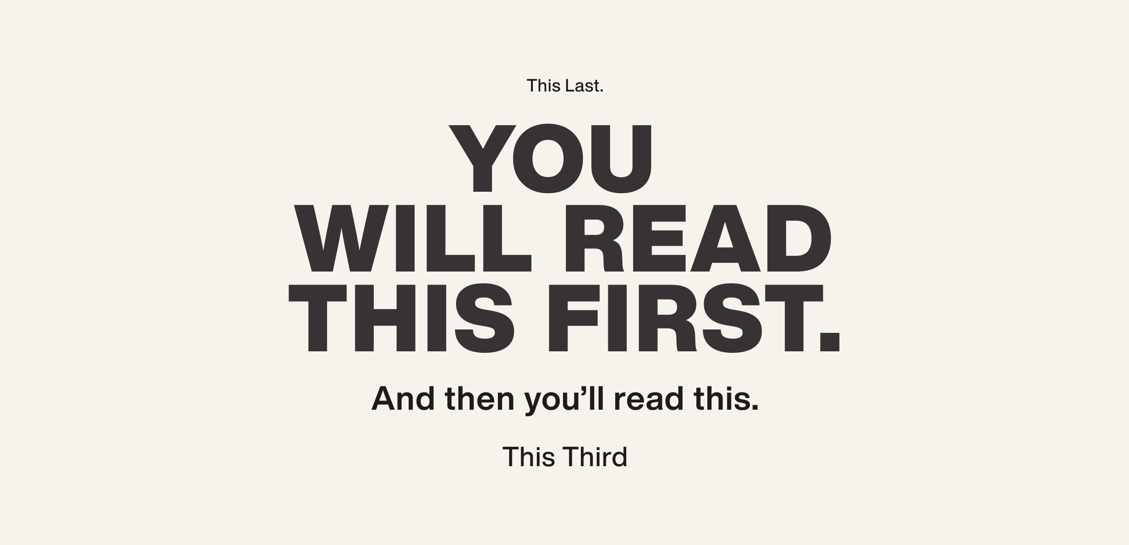
When smartly put, font color captures the reader's interest and directs them to read the content in random order.
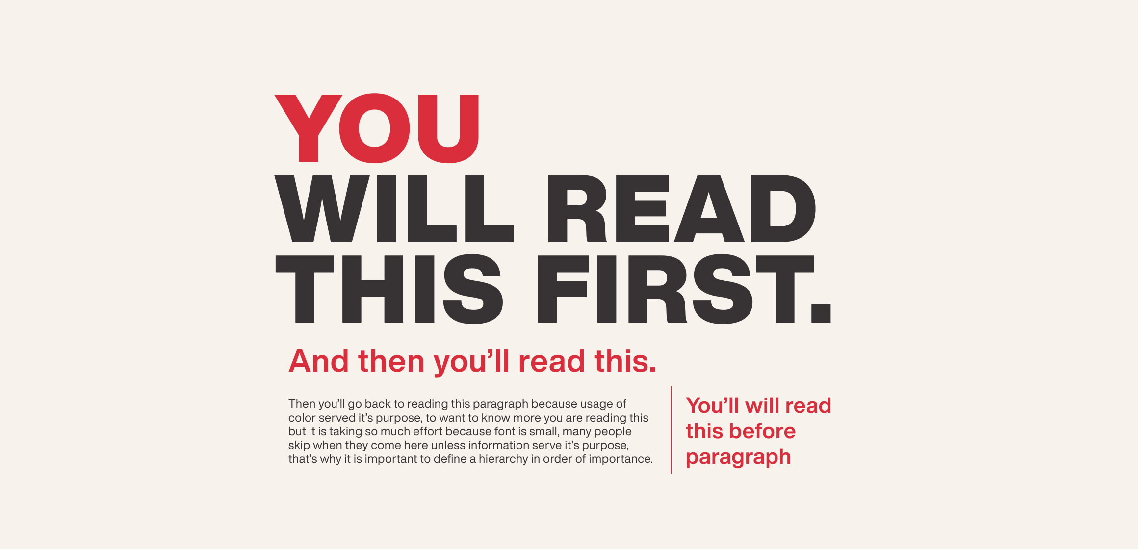
Line height: The entire height of all font letters, measured from top to bottom, is known as the "line height.”
Baseline: The horizontal line on which all the letters sit, that acts as a base.
Leading(line spacing): Leading is the space between two baselines.
Ascent: Some small letters are taller than others, and occasionally they are even taller than capital letters. Like l, b, and h. That extra top portion is ascent.
Descent: Some letters descend past the baseline. Like g, y, and q. This additional bottom portion is decent.
X-height: The height from the baseline to the tangent line where all small letters stand.
Cap-height: Cap-height is the height of the capital letter.
Letter spacing: Letter spacing is the distance between individual letters.
Line box: The line box is the box within which the font is placed with uniform paddings from both sides.
Tracking: For the content to flow in a rhythm, we use tracking. Tracking is done by checking letter alignment and character spacing.
Typography scaling helps in creating a smooth and well balanced and friendly font sizing, using a wide range of type sizes related to each other, as they grow by a similar ratio. This helps in developing a typography system that is both adaptive as well as scalable. So, as scaling is carried out using ratios, we scale with 2x, 3x, etc. if size x is the smallest.
Typography scaling brings visual harmony. Scaling should be considered and tested when choosing specific typographies for a design system.
Design systems provide centrally-tuned responsive type sizes via a wide range of a predictable set of breakpoints. For body text, the size increases gradually. Similarly, large headings can also increase significantly across similar breakpoints.
However, it is best to avoid mixing up responsive typography with scaling. Scaling refers to the ranges that are available, while responsive typography refers to the capacity to adapt to various web settings.
The most important aspect when choosing typefaces for a design system should be its readability. Good typography serves its job by making the readers go through written content effortlessly. Readability is also how legible a typeface is in different sizes and proportions. When selecting a typeface, reflect on the kind of products the design system is going to serve. Think about the message the product is supposed to give. Browse through various websites and note the tone of voice. Check how it balances out with the chosen typography. A serious business such as the medical field cannot have a casual font. A product that has a friendly personality can go for a semi-decorative font. Don’t go overboard with the chosen typeface. Stick to what works.
Check the compatibility of the display font and text font, then pair them together. Give the font the hierarchy they deserve. Use Font Colors only when necessary. If working on creating an original typeface, check the font properties and apply the design principles. Always remember to give scales and present responsive typography. Then test it on real-time users and take feedback. Test as much as possible until you arrive at the number your team agrees upon.